Showing posts with label HP1007. Show all posts

Friday, 17 January 2025

January 2025 - With 3 Things: Art Journal Page {by Victoria Wilding}


Hi friends, it's Victoria  with you for a 'With 3 Things' challenge post. 

This feature on the PaperArtsy Blog is where 3 bloggers are sent 3 items in the post. Typically we will receive a stamp, a stencil and a couple of Fresco Paints, and in 2025, everyone will receive identical products. 

We have no clue what PaperArtsy HQ is going to send, the whole idea of this challenge is to do something crafty in our personal style with these 3 items. We are allowed to bring other PA products into the mix if we feel it is necessary.

So let's take a look at what I received from PA HQ ...


I’m always super excited to open my package and discover what PaperArtsy goodies I’ve been sent to create with. I love the Niagara Falls (FF205) and Gold Rush (FF204) colours from Seth Apter’s collection of PaperArtsy Fresco Finish Chalk Acrylics. Blue greens are definitely my favourite palette of colours and crop up time and again in my makes, as does gold, and whilst this paint isn’t a metallic, it’s golden hue is so yummy. As soon as I looked at PaperArtsy Stencil PS103 I was drawn to the flower section with mask and knew I wanted this to feature as a key element in my project. The stamps in HP1007EZ provide so much variety with text, nature and vintage designs. These designs lend themselves nicely to creating radically different styles of  projects, so it’s been really interesting to see how Floss and Nikki took a totally different approach to using the designs. 

I decided to make a page in my art journal, using my favoured floral and nature elements from the designs. I’m an art journal junkie so this is my favourite kind of project as it really allows you to play with a variety of products in your stash. Let’s take a closer look at the different steps I took to create this page. 

I started off by creating a centre panel for the page, using the flower section at the bottom of PaperArtsy Stencil PS103. Using the leftover ink on my blending brushes, I worked along the strip to apply a light colour to the bottom of the card.

I then used the matching flower mask to protect my ink work and applied a watered down coating of PaperArtsy Fresco Finish Acrylics in Niagara Falls FF205) to the top section of the card.

To create some more contrast to the colour in the top section, I randomly applied patches of blue ink using my blending brush. 


Next I drew some outlines around the flowers using watercolour pencils. I wet the tip of the pencil slightly before drawing, as this activates the colour and creates a darker line. I used the colours Payne’s Grey on the purple flowers, Rose on the pink flowers and Indigo on the blue flowers. 


Then I added centres to the flowers using Nuvo Glitter Markers. 


I wanted to create some extra texture to the sky, so I used the text stamp from HP1007EZ, applied PaperArtsy Fresco Finish Paint in the colour Gold Rush (FF204and randomly stamped some text details. The finished effect is subtle and provides some extra interest to the card.


I finished this part of the project by distressing the edges of the card and applying some brown ink to define the edge. 


After this I moved on to creating the elements to extend the design and finish the journal page. I started by cutting a kraft mat to layer the card on and stamping some text to the outer edges. 


Then I masked off the word flowers from the text sentiment in set HP1007EZ, before stamping on white card and mounting on kraft card. I cut this to size and set to one side. 


I like a lot of white space in my projects as it drains the eye into the focal point and provides a place for the eye to rest. I wanted to add some details to the white journal page to tie into the card, butting didn’t want these to be overpowering. Using the flourish from HP1007EZ, `I stamped and embossed it in gold direct to the journal page in the upper right corner. To judge where to stamp, I placed the card on the page and draw a faint pencil line around the top right corner of the card. Once the flourish was complete I erased this so that it could not be seen on the finished project. 


Finally I stamped the bird stamp from HP1007EZ in PaperArtsy Fresco Finish Gold Rush (FF204and, using an embossing pen drew in some highlights which I set with gold embossing powder. 


To complete the page I adhered the sentiment to the card and then attached this to the journal page with double sided tape, before using foam tape to attach the bird to the bottom left corner. To incorporate the flourish further with the overall design, I applied three small butterflies from my stash.


I really enjoyed creating this page and it would be so easy to adapt to a card making project instead. 
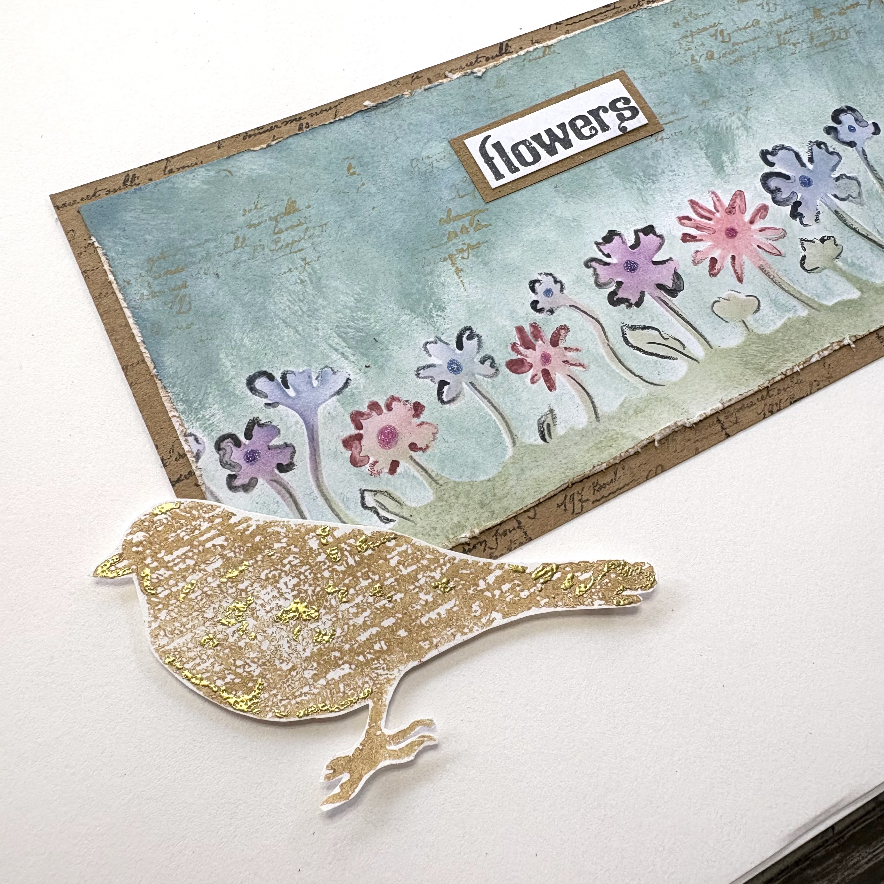

The touches of gold give some extra visual interest and really help to lead the eye into the central panel, where you can then consider the peaceful flower meadow scene. 


I hope you enjoyed this journal page project. Until next time, wishing you a happy creative week!

Victoria


Wednesday, 15 January 2025

January 2025 - With 3 Things: Mirror Image Stamping {by Nikki Acton}

Hi friends, Nikki (a2a.craftwith you today for another 'With 3 Things' challenge post. 

This feature on the PaperArtsy Blog is where 3 bloggers are sent 3 items in the post. Typically we will receive a stamp, a stencil and a couple of Fresco Paints. This year everyone will receive identical products in the post.

We have no clue what PaperArtsy HQ is going to send, the whole idea of this challenge is to do something crafty in our personal style with these 3 items. We are allowed to bring other PA products into the mix if we feel it is necessary.

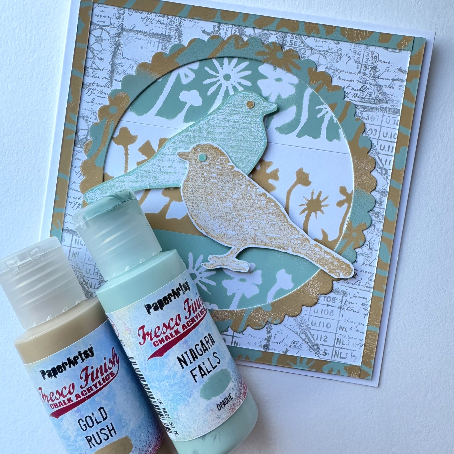
So let's take a look at what I received from PA HQ! This month I received PaperArtsy stamp set HP1007, stencil PS103 (by Darcy) and Fresco Acrylics in Niagara Falls and Gold Rush.


Today I have made 6x6 inch cards using the items above plus some archival ink. I enjoy working with limited supplies, I find it saves me being indecisive!

I did not have a plan when I started but reached for the images that appealed to me and started to experiment.

I was drawn to the mask and stencil of the flowers. Having both elements allowed me to sponge the flowers through the stencil, but then also use the mask to stencil the area around the flowers.

I used both Niagara Falls and Gold Rush.


I wasn't too happy with the result of the Niagara Falls on top of Gold Rush - but I'm glad I kept it - it came in handy later!


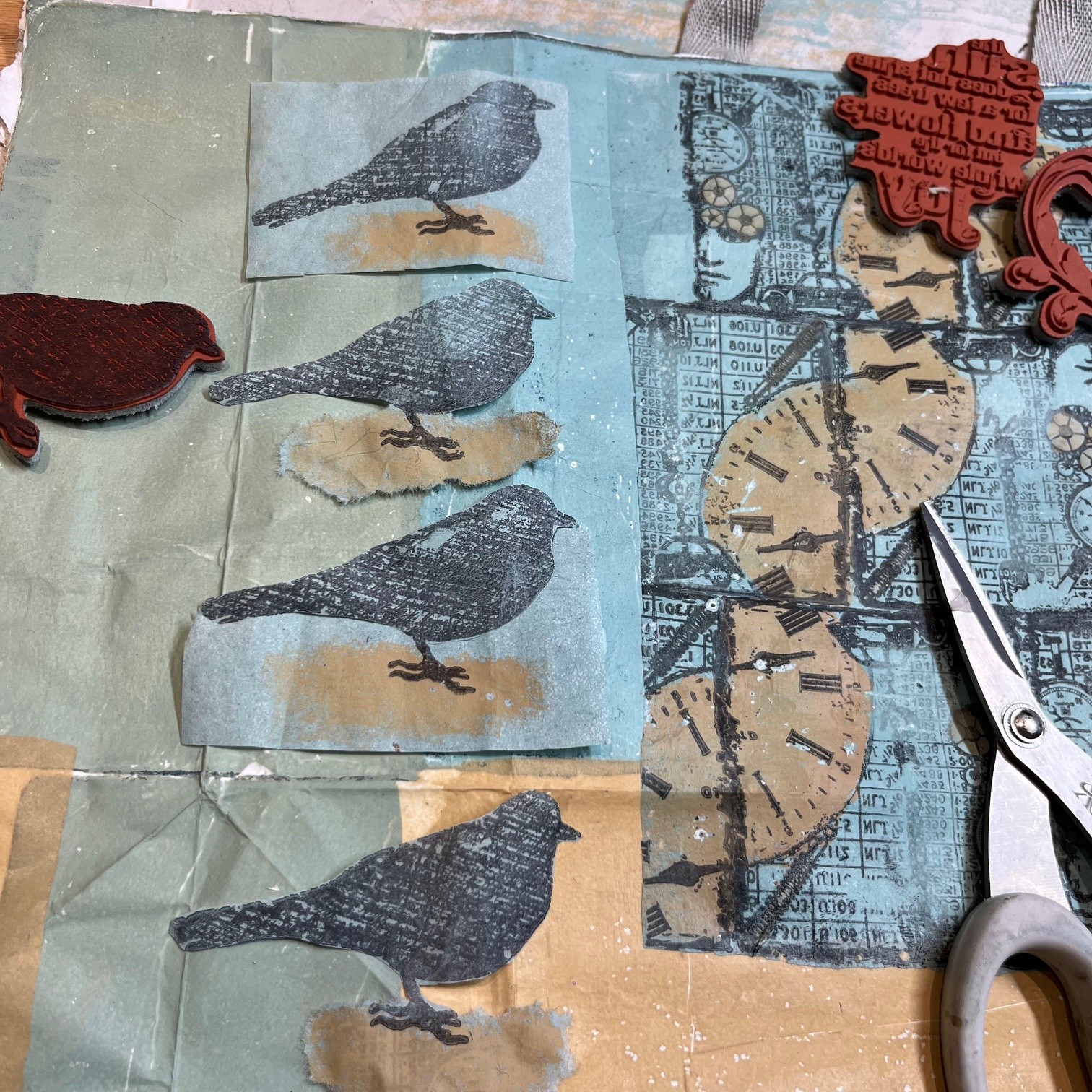
I grabbed my gel plate next and started making some backgrounds, which I didn't end up using! I also used the bird silhouette stamp on HP1007 to create a mirror image of the stamped image. There is a short video here of how to do this. It is very simple - brayer paint onto the gel plate, place the stamp on the paint, gently press before removing and stamping onto scrap paper. Then pull a print off the gel plate.


A plan was now emerging so I also stamped the bird stamp in the same paint colours directly onto PaperArtsy Smoothy Cardstock.


I now had mirror images of the bird. Time to put all these elements together.


First I cut my stencilled flowers into strips and fussy cut the birds.


I used Ranger Archival Ink in Watering Can to randomly stamp 2 of the other stamps from the set onto Smoothy card. I also cut a circle and frame from one of the gel prints - but didn't use this one in the end.


I combined the flower strips to make a background and used the Niagara Falls / Gold Rush combined stencilled paper to cut my frame and create a border. 


I gave the birds a little eye punched out of scraps.


 and then I put it all together.


There were lots of bits left over so I made a second one with a slightly different composition.


This was fun! I always enjoy using a gel plate and the mirror imaged birds made me happy!

Nikki

Monday, 13 January 2025

January 2025 - With 3 Things: A recycled paper carrier bag {by Floss Nicholls}


Hi friends, it's (Floss) from floss_workshop.art with you for another 'With 3 Things' challenge post. 

This feature on the PaperArtsy Blog is where 3 bloggers are sent 3 items in the post. Typically we will receive a stamp, a stencil and a couple of Fresco Paints. This year everyone is getting identical products in the post. 

We have no clue what PaperArtsy HQ is going to send, the whole idea of this challenge is to do something crafty in our personal style with these 3 items. We are allowed to bring other PA products into the mix if we feel it is necessary...I didn't this time...

So let's take a look at what I received from PA HQ ...
The blue and white packaging bag on the right is what I grabbed to include in this photo with the supplies as I knew that I was going to use it with these lovely products!


You know I'm a big fan of recycling card, books and papers in my art and so I deconstructed the packaging bag to decorate the inside of it so that I was able to make a gift bag.  Here is one side


...and this is the other side...naturally there are two folded sides to allow it to be a box shape bag...you'll see the details of those as I explain my workings.


I started by playing on my paper sheet that 'protects' my work space...this paper invariably becomes part of my art as it's where I doodle ideas or play with colour when I'm thinking.  So I started stamping the square part clock image and liked the way that if I used it in 'brick' fashion I could create a spiral.

I then tried rotating the same stamp 90* in a square...I liked both ideas and thought they'd look ok as feature designs on the front/back of the bag, so started looking a colourways.


I needed to incorporate the stencil design and so rolled out fresco chalk finish Gold Rush acrylic paint onto the gel plate and rolled Darcy Marshall's lovely tree design over that.  


I took a couple of prints using copy paper and rice paper too.


I then inked up the Hot Picks stamps and printed them onto my gel plate using Ranger Archival black ink pad.  After I had waited for that to dry I sponged colour over the designs on the gel plate and let that dry too.  


The beauty of printing the stamps onto the gel plate rather than onto a sheet of paper (or whatever you are working on directly) is that you can add colour behind the image. I added the Gold Rush over the bird legs so that it looked like the birds were standing or dancing on sand.

Naturally I mixed both Gold Rush and Niagara Falls together and created a beautiful creamy green colour.  I made several plain sheets of colour so that I could collage the bag. 


I made quite a few bird images as I thought these would look pretty cool down the sides of the bag.


The next step was to lay the packaging bag out open and start looking at positioning the plain collage papers I had made and the designs that I had printed using the HP1007EZ stamp set


I found that by folding each section before I glued anything down was a good way to check the design for each panel individually.


Rather than putting the large designs central in the front/back area of the bag, I thought it could be fun to have the little birds peeking their little faces round the corners...so I moved the big design over to accommodate that thought.

I originally was going to leave the birds with colour blocks behind them but I decided to fussy cut around the bird shape and then tear around the Gold Rush 'sand'.


I glued the seam after I had folded the bag following the original fold lines so that the bag could fold down flat after it was reconstructed.


It was at this point I decided it would be fun to have the birds opposite each other so that the tails would meet at the inside side area of the bag.


I used the stamping platform to position the birds directly opposite each other.  The stamping platform allowed me to make sure the whole image of the bird was stamped leaving no gaps.  I thought this would be the safest option as the birds were being stamped over the seam of the bag.

I also used the stamping platform to add the feature words.


I printed the block of text onto the plain sheets of Gold Rush and stamped the little cars on the gel plate and pulled the print using a half and half mix of Gold Rush and Niagara Falls onto rice paper.  This created some fun labels to add to the bag.  I toyed with the idea of using them as gift tags for the bag...


I used them on the large faces of t the bag instead...


...they fitted nicely onto the side too... 


The rice paper was not only great for printing onto but it was a good substrate to cover the repurposed packaging bag to give it strength but not be too bulky. 


I particularly like the subtlety of the tree behind the collage design and how I had mirrored the image as a reflection.  I do like how the birds are peeking around the corner of this side too!


This project has made me think of how I could create more of these but also how fun they would be on fabric...I hope this project has sparked some creative thinking for you too and that you've enjoyed what I have come up with using my surprise supplies...until next time...
take care, 

Floss 
x x x

Instagram: flossWORKSHOPart


Oh! I nearly forgot...I created the base for the inside of the bag too...It strengthens the base inside...