Showing posts with label Gelli Printing. Show all posts

Sunday, 24 February 2019

2019 #2 Brayers: Dragonfliezzz with EKC {by Ellie Knol}

2019 Topic 2: Brayers

Ellie masters not one, but 2 gel plates with our new brayer, and comes up with some vibrant results in the process. It is just a matter of building your layers and trying out different colour combinations until you find that happy place! ~ Leandra

Hi everyone, it's Ellie from PAPER-STAMPS-COLOR with you today, and I'd like to share with you a project using a gorgeous brayer from Paper Artsy  ....  and some new stamps and stencil designed by Kay Carley!

I chose to do some monoprinting, to be used on the six blank pages in the cardboard book I made, which I showed in my previous post for Paper Artsy (...remember, I promised!).


Ready for action in my kitchen ... Fresco Finish paints, the brayer, masks and two gelliplates. 


I made a gel-plate from gelatin and water (about A4 size) and used that together with a bought Gel-plate and worked on both simultaneously. 


Brayering paints ... stamping into the wet paint ... stamping that paint onto the other gel-plate ... using the masks ... leaving paints to dry on the plates. All these processes gave me some very nice prints!!


I used the above print on two of the pages of a cardboard book...


This second print was used in the book as well


The third print I've cut up was this beautiful print; I've added some white heat embossing and a red and white marker ..... 


On the fourth print I've used the dragonfly masks  ... love the very subtle effect here! 
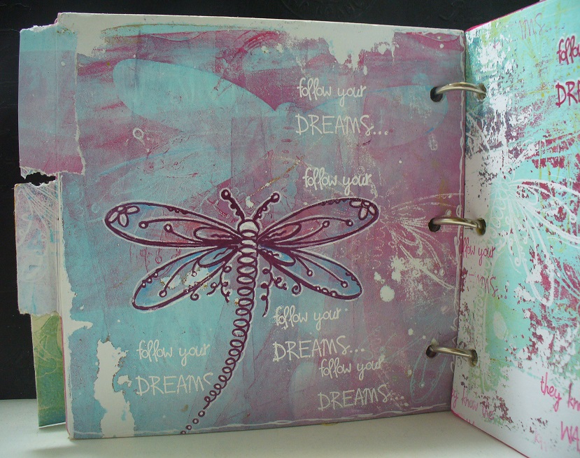


Now for the last one: dried up paints and borders created white, colored and darker parts on the monoprint.


A close up of the beautiful stamps I've used on all prints .. artistically drawn dragonflies designed by Kay Carley!


I am sure there is no better way of playing artfully than with a gel-plate, paints, and of course a brayer, masks and stencils and ... beautiful stamps! I prefer making gel-prints this way... a little bit of paint, 2 plates at a time, and see where it gets me.

Have you tried gel printing yet? You should!! Of course a good brayer is a must for this and the new brayer from PaperArtsy is perfect. Available from stockists now.

I hope you got inspired to go play with your artsy tools, and create one-of-a-kind artsy prints!!

Thanks for visiting today, and of course I'd appreciate if you left a comment, with a question, or maybe a suggestion for me of what you liked, or liked less?!

See you!! 

Ellie Knol 

Blog: http://elliecreahoekje.blogspot.nl/   http://ellieatcs.blogspot.nl/ 
Owner of : https://www.facebook.com/groups/DutchArtJournal/  
Facebook: https://www.facebook.com/profile.php?id=100008479362838 
Pinterest: https://nl.pinterest.com/ellieknol/

Friday, 7 December 2018

2018 #21 Matchbox Art: Family Advent with EKC {by Chris Dark}

 2018 Topic 21: Matchbox Art


Wow! This clearly was a labour of love for Chris, but what a lot of fun to be had filling up these little boxes with gifts ready for tiny fingers to enjoy at Christmas! ~ Leandra

Hi everyone, it's Chris Dark here with you today, and I'd like to share the matchbox Advent Calendar I've made. When I saw the topics for this quarter I was drawn to this one because of a Sizzix matchbox die I have which hadn't had much use, this was the perfect opportunity to work with it again. I pondered on whether to attach all the boxes together on top of each other and make a wrap around them but in the end I liked the idea of all the boxes stacked up on a big plate and searching through them all for each number. I've managed to do a little de-stash of my horde of scrapbook paper for the making of the boxes themselves which is always satisfying but in hindsight perhaps some heavier card for the box structures might have been better as they'll get a fair bit of handling from some tiny hands! 

I chose to do my stamping on top of each matchbox as an additional panel but of course the entire box could be stamped, stenciled and die cut afterwards. The toppers worked up beautifully using gelli plate prints created with Fresco Finish Chalk Acrylics in Tinned Peas, Snowflake, Cherry Red, Turquoise, Limelight, Caramel, ConcreteWinter GreenPewter and Gold and Kay's gorgeous Christmas Stamp set EKC23 and stencil PS120.

Eclectica Kay Carley Set 23 (EKC23)

PaperArtsy Stencil 120 (PS120)


The first print I made I couldn't bring myself to cut up so I kept this one and one other and made them into Christmas cards. The rest I enjoyed even more once they'd been cut down into the panels to fit the boxes. You really can't go wrong with this technique, if you don't like a print just brayer paint over, allow to dry and go again! My prints are made up as multiple layers on top of each other with different colours added and stamps and stencils together. There's lots of interest and layers in them and I love how the stenciling with the translucent fresco's gives the appearance of see through baubles as if they're made of glass.


For my first print, I've added the mask parts of the stencil and brayered paint over them. Many PaperArtsy stencils give you the positive and negative so you have more options with them.


The resulting print reveals the bauble shape as white from the underlying paper colour and the rest is the paint colour.


For this layer of the same print, I've used the stencil and brayered over the negative part to create some red baubles.


I've repeated the previous step of the process to create the green baubles.


Now there's some stamping with the snowflake stamps and there's that lovely border part of the stencil which I sponged in with white paint. I used the mask part of the stencil here to aid the stamping.


I cut down each print, edged them with distress ink and distressed the edges a bit with scissors.


The tops are attached to the boxes and I've embellished with glitter glue, pearls, sparkly pen, die cut glazed numbers and paper clipping Christmas words. After this a little ribbon is knotted and slotted through as a pull for the drawers.


I added all the extra embellishing in stages with the die cut numbers being the last element on all the boxes so that I didn't handle them too much after glazing with dimensional glue. I like that added bit of shine from the glossy accents, it was definitely worth doing.


This project was a labour of love but splitting up the tasks with die cutting over a few days, sticking together over a few nights, gel printing in a few sessions helped a lot. The rest I did a bit at a time when I had an hour or so to spend, I even did the ribbon knotting in my lunch hour at work so overall it didn't feel like a never ending task. Once I'd broken it down into bite size sessions I enjoyed the process and thought about the enjoyment we'd have when we start to open the drawers each day leading up to Christmas and especially this year as my little Grandson is old enough to know about chocolate! The matchboxes are bigger than regular matchboxes which means they'll hold more treats so we can all have something each day......those Christmas tree hanging chocolates and gold coins fit inside perfectly :D! I hope you'll join us in the challenge, there are so many ways to interpret the topic as you'll see from all the guest bloggers and their gorgeous projects.

Thanks for joining me tonight and happy weekend!


To join our challenge and win a £50 PaperArtsy voucher:

Simply make something arty relevant to the topic, and link your creation from any social URL (eg. Instagram, Pinterest, Blog Post etc) sharing your original make to this challenge page.

The current topic link Topic 21: Matchbox Art will close 17:00 (London Time) Sunday, December 9th 2018, and the winner will be announced 2 hours later at 19:00.

All links go in the draw to win a PaperArtsy voucher. Please make sure we can contact you as a prize winner - it helps if you share your contact info from the platform you opt to use.

Good Luck! If you have any questions, don't hesitate to ask!

NEWS FLASH
Annual Sale on now at PaperArtsy
on our new look website

Sale ends Dec 16th
Discount applied at checkout automatically
A good time to stock up, or make your Xmas requests from family.

Friday, 6 July 2018

2018 #12 Transfers: The Courage of Your Dreams {by Alison Bomber}

2018 Topic 12: Transfers


PaperArtsy HQ intro to the post / and the blogger...
 

Hi everyone, it's Alison from Words and Pictures here with you today, with something in a slightly different style from my usual textures and layers.  I've been playing with my Gelli plate and some magazine images, following a great tutorial on YouTube from Birgit Koopsen.

I thought it looked fun, and I had a lovely time experimenting with a variety of paints and various book pages and magazine photos.  The cards that I'm sharing here today - a pair and a trio - are the tip of the iceberg of a pile of trials... some successful, others less so.  And although they're not in my usual style, I ended up loving the atmospheric look.


I found it was best to have a strong colour contrast between the transfer layer and the pick-up layer and I was happiest when I played with simple neutrals, rather than lots of bold colour (no big surprises there!), so I stuck mostly to a dark Payne's Grey for the transfer layer and a soft Titanium Buff for the pick-up (both Amsterdam Acrylics).  And I used two separate brayers just to make sure that, even if the paint hadn't quite dried on the brayer, I wouldn't be contaminating things with completely the wrong colour!


I followed Birgit's suggestion to keep my paint layers nice and thin.  You need a good coating of the Gelli plate for the transfer layer, but it mustn't be thickly applied.  Then just burnish on the image you want to use, face down onto the paint.  When you've made good contact across the whole area, then peel the page away.  The image will be visible on the plate.


You need to let that layer dry thoroughly before applying the pick-up layer.  As you can see, I'm using a really pale colour to contrast with the dark transfer layer.  And again, apply it thinly.  You should be able to see the original image hovering behind.  (Sorry about the huge shadow across the photos - it's my inconvenient window frame.)


Then immediately press your chosen paper/cardstock onto the Gelli plate while that top layer is still wet, and burnish firmly across the whole plate.  For these, I was working directly onto some 7 x 7 inch pre-folded cards.


A couple of things to bear in mind... if there's really nothing showing after you've pressed the image onto your painted plate, then you should probably give up.  Different print qualities and inks mean not all images will play nicely.  But what you see is pretty much what you'll get - so if you've got a good image showing, you'll probably get a good "pull" with your pick-up layer.


Before I started printing my cards, I positioned one directly underneath the Gelli plate.  That means I can use it to line up each print to create a border around the edge.  It also means you have a white surface underneath the Gelli plate so you can see what's going on nice and clearly, and get a good sense of how thick your top layer is when you apply it.


Regulars at Words and Pictures will know I've been playing with the Gelli plate quite a lot recently (often with natural elements from my garden) and I've fallen in love with the textured look which you get from printing with paint.


There was one particular photo shoot which caught my eye in the magazine I was using for these cards.  I loved the slender tree branches they'd hidden the model amongst.


They create a fabulous textured look all of their own in the subtle printed versions - almost a creased or crackled look (and you all know how much I love my crackle!).


For this trio, I gradually decreased the amount of buff paint and increased the amount of Seth Apter's Glacier Ice (from his recent Set 4 Limited Edition) I was using as I printed them, so that there's an ombre shift from card to card.


I really like how the ombre works when you see them as a set with, of course, their added words.


For the trio, I used quotes from EAB07 Dreaming & Doing.  She has such a dreamy look about her.


I stamped the words in Jet Black Archival on a separate piece card, and edged them in black before gluing them in position.  


And for the pair of faces, with the strong simplicity of their expressions...


... I chose quotes from EAB08 Strength & Courage.


These I stamped directly onto the prints and embossed them.  Over the dark background of the first card I used pale embossing powder...


... and over the pale edge of the second card I stamped in black again, and then clear-embossed.  I'm embracing the imperfection of the words hovering in and out of the shadows where the image gets darker!


So, you see, it's a really different look for me... practically CAS, wouldn't you say?  Though not quite single layer, I guess, given that there are two layers on the Gelli plate to start with.


In any case, I had a fascinating time stepping outside my comfort zone.  I enjoyed playing with the dramatic photos, but it's not something I'll probably do very often.  I'm not really a glossy magazine reader, so I don't tend to have these kinds of images lying around, but for those who do, I really recommend keeping pictures which appeal to you and trying this out.  But I also had good results with text and old music manuscript, and I can definitely see those becoming a more regular part of my crafting "language".  

Thanks so much for stopping by today.  I hope you'll be tempted to try out this technique.  Be patient, and be ready to experiment with different paints and different magazines, and you could end up with some really exciting results.

Blog: Words and Pictures
Pinterest: butterfly crafter

If you teach: add venue, dates, booking info with links here for the next 2 months

To join our challenge and win a new Zinski apron:
Simply make something arty relevant to the topic, and link your creation from any social URL (eg. Instagram, Pinterest, Blog Post etc) sharing your original make to this challenge page.

The current topic link Topic 12: Transfers will close 17:00 (London Time) Sunday, 22nd July 2018, and the winner will be announced 2 hours later at 19:00.

NB you have 3 weeks for this challenge due to New Products being announced


All links go in the draw to win a PaperArtsy creative apron. Please make sure we can contact you as a prize winner - it helps if you share your contact info from the platform you opt to use.

Good Luck! If you have any questions, don't hesitate to ask!