Showing posts with label Eyes. Show all posts

Saturday, 10 August 2019

2019 #12 Eyes: Tin can name card holder with ESA {by Etsuko Noguchi}

2019 Topic 12: Eyes


This is such a cool tin by Etsuko, full of goodness with Seth stamps and sooo much more!
~ Leandra
 
Hi everyone, it's Etsuko My favorite things with you today, and I'd like share with you 'Tin Can Name Card Holder' using fabulous Seth's new Mini stamps and collection set stamps.

I came up with I had a tin can of gas-cooked vintage-style Altoids. It was just the size put a name card, so I planned to use it for this project, and it was also a good idea for Seth's new product mini-stamps.


I made collages randomly on A4 Smoothy White card using various characters and papers. Then I painted it with a hardened brush using Ranger's Distress Ink mustard seed, aged mahogany and faded jeans.


This is the top half of the can lid, I added ESA12 gear and EM39 eye with Backed Texture Rocky Road and some doodle on the master board. Also I used Vintage Beeswax in places.


I tried to use it for the lid can at first, but I used Beeswax as a whole, so it became dark and messy and I gave up it.


And made it again the piece to be used on the back side of the lid with the same design. EM43 was centered with embossing powder. It is difficult to see in the photo but I used Beeswax in places for finishing.


I created the master board for the name card, brushed and stamped with five colours Fresco Paints, Double Denim, Venice Blue, Glacier Ice, Buff and Caribbean Sea using the multi ink jet sheet.


Then I shadow stamped the ESA11 and ESA12 with Archival Ink Cornflower Blue.


I removed each card from the sheet and collage using the extra master board on it. Also I painted with Snowflake on these collage papers. After that, I pressed excess white paint with another paper and removed it.


These ten cards were finished with embossing, stitching and doodling. The top card was embossed with Dirty Sand Backed Texture using EM48 on EM33 background.
Below that was embossed with Rocky Road using EM45.


The top card was embossed with Rocky Road and Chunky Rust using EM45 and ESA08
Below That was embossed with Ancient Amber using EM39 and stamped EM41 by Jet Black Archival.


The top card was embossed with Patina Oxide using EM40. Below that was embossed with Rocky Road using EM43.


The top card was embossed with Rocky Road and Chunky Rust using Em42.
Below that was embossed with Dirty Sand using EM48, also stamped ESA08 by Jet Black Archival.


The top card was embossed with Rocky Road using EM37.
Below that was embossed with Rocky Road using EM40 also stamped ESA08 by Sepia Archival.


I affixed a piece of printed information paper on the back of each card.


These were a lot of choices in this topic EYES and I was very confused, but I still came up with my favorite project. It's still difficult to use Backed Texture for overlapping or most of the part, and it's still a lot to learn. But this is fun and difficult, and I'm looking forward to solving it. I think that some of you have received a wonderful Seth's class, so please be sure to show off this new mini stamps and technology. I look forward to seeing it and I hope you enjoy my work today.
Thank you so much for visiting.
Etsuko xxx

Blog: My favorite things
Facebook: Etsuko Noguchi 
Instagram: Pixienest
Pinterest: Etsuko N.

Friday, 9 August 2019

2019 #12 Eyes: I Can See Clearly with LPC { by Kate Yetter}

2019 Topic 12: Eyes


It's amazing how Grunge Paste and infusions can add a lovely interest to any background. Kate often starts a page this way, and on this occasion she has pulled out the infusions to add more colour to her stamped dolls.

Hi everyone, it's Kate (https://kateyetter.comwith you today, and I'd like to share with you an art journal layout featuring the topic: Eyes.

I wasn't sure where I was going to go with this project but since I was using these Lynne Perrella dolls I knew I wanted to showcase the whole stamp with a focal point on the eyes.  I am working through a journal with neutral color backgrounds so I thought this would be a great way to make the stamped images pop.


Looking back I think I would have liked the background to be a bit darker. 


I used my Chalk paints and infusions to paint the images.


My background is vintage paper that I stenciled with grunge paste and then sprayed with Black Knight and Lemoncello infusions.


After painting and fussy cutting my images, I added some gold embossing and clear embossing liquid.


I wanted some contrast so I added a piece of torn muslin directly behind the stamped doll.


I thought it would be really fun to put one of the heads on metal wire. And to emphasize the eyes I cut out another set of stamped eyes and layered them on top, adding some clear embossing liquid which in my opinion, makes the colors more vibrant.


A bit of fiber and brown tissue paper were added in for extra texture.


It was a lot of fun to create this project that was focused on a particular facial feature. I hope you try your hand at it by choosing your favorite feature and centering some art around it.  

Wednesday, 7 August 2019

2019 #12 Eyes: Eye-catching jewellery with ETS {by Dounia Large}

2019 Topic 12: Eyes


Don't be surprised how Dounia's wonderful imagination with this topic kicks into action!! I love the clever effects and relief she has created to make an 'eye' stamp become the focus for this  3D jewellery! ~ Leandra

Bonjour everyone, it's Dounia from France with you today, and I'd like to share with you a way to exploit the relief of good rubber stamps to make three dimensional pieces, here in the form of jewellery.

Eyes are an instantly recognizable shape with a lot of cultural, mystical and artistic meanings. They can be beautiful, haunting, mesmerising or unsettling. I like to put them where you wouldn't expect them for a slightly jarring effect. I find jewellery perfect for that: maybe an extra pair on earrings will help you keep an eye on things! This topic was therefore a handy excuse to indulge myself...


I love a striking eye image so this stamp set by Tracy Scott immediatly caught mine. I like the other stamps in ETS24 too, both bold and deconstructed, but the stylised eye really left a lasting impression. I immediately thought it is a beautiful 3D object in itself so I decided to reproduce it for jewellery.


I wanted to keep the same reliefs as the stamp so stamping in polymer clay was not the way to go. I therefore used some Mix-and-Mold to make an impression of the stamp after triming it closely. I love playing with molds, I feel liking unwrapping a present each time so this was an other treat!


I only had white and translucent polymer clay on hand but wanted to make blue eyes. I decided to tint it with PaperArtsy's Infusions and the tiniest bit of alcool. The different colours of the powders easily made a subtle marble effect.


Once cooked and cleaned, I painted the outside with Fresco Acrylic paints. I first tried a dark brown but finally decided on black. I think it provides better contrast to make the whites pop, which suits the style better. 


I then found the result a bit dull so I added the gold "eye-liner" and some Metallic Glaze on the irises for extra interest. I think I overdid it a little as you cannot really see the marbling anymore...


For the necklace, I cut off the lashes for a more streamlined silouette that resemble a common pendant shape. I like the constrast between the classical shapes and construction and the hight-impact images and colours. In some pieces I managed to keep the catchlight above the pupil from Tracy's stamp but I don't know if the effect really translate well.

The brooch gets to keep its lashes for a bigger and more dramatic look. I like the boldness of it, it really is a statement piece!

For the pictures in this post I was lucky to be able to use as a staging backdrop a table decorated by my mother. So to give a better idea of her work and also for the fun of it:


Making molds of stamps is a great way to use them differently. It can be an easy introduction to polymer clay but you can also use them with UTEE, resin or Grunge Paste. I would first focus on stamps with rather simple and clear designs to make pieces of jewellery but also embellishments or tokens.

Stay creative!
Dounia

Sunday, 4 August 2019

2019 #12 Eyes: Take Another Look with Ink and the Dog Collection {by Amanda Pink}

2019 Topic 12: Eyes


The vibrancy of this reminds me of those kaleidoscope things we used to use a kids. A great perspective using 'rays'  pulls us right in to zoom in on those eyes! A really engaging piece! ~ Leandra

Hi everyone, it's Amanda Pink here and I'd like to share with you the project I have created for the current topic: 'Eyes'. 

Initially I set out to create a 'play on words' project- a note pad that I would cover in eyes and call an 'eye' pad but along the creative road my project morphed into a meaningful Art Panel.  (I explain the meaning further down the post.) Being a larger project (in size) gave me more surface areas to create on and allowed for the finished piece to be multi layered with the 'Eyes' taking centre stage.


My creativity began with the eyes. I cut a few pieces of PaperArtsy Smoothy card into small rectangles and painted them with PaperArtsy Fresco Finish Acrylic paints: Caribbean Sea, Smurf, Limelight and Tangerine Twist


I stamped the eyes using the eye stamp from Ink and the Dog Collection Femme Plate 3 (F3EZ) 

For the surrounding detail I used the dot and small script stamp from Eclectica (Courtney Franich) Collection ECF04. 


A few white pen highlights enhanced the eyes whilst some PaperArtsy Smoothy card framed each of the eye panels. They were arranged and adhered to a square piece of PaperArtsy Heavy Grey/Whiteboard that I painted with PaperArtsy Fresco Finish Chalk Acrylic Paint : Little Black Dress.


For the quote I used the words from the centre of the eye stamp that's included in the Vintage Ink and the Dog Collection ID08EZ 


The quote offered some direction for creating the middle panel. I wanted to create a panel that would both draw the viewing eye in to focus on the focal feature as well as pan the viewing eye out to see the whole project. I hoped to represent through my creativity that 'in life its good to not only look inward and focus on the main feature- the event, problem, issue but its also good to 'take another look' that look being outward to see the bigger picture - the cause, effect and influences'. Pretty deep, huh?! 
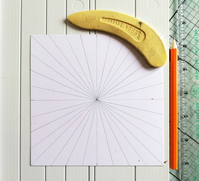
So in a bid to try and achieve this I created the 'effect of 'rays'. 


I drew and scored lines across the centre and diagonals of a square panel of PaperArtsy Smoothy card. I then added colour using Paper Artsy Fresco Finish Paints: Caribbean Sea, Tangerine Twist, Mustard Pickle, Limelight, Eggplant, Snowflake and Little Black Dress.


Snowflake and Little black Dress were used primarily to accentuate the scored lines.
The long thin stamp of numbers from Vintage Ink and the Dog Collection ID08EZ was ideal for adding some detail in between the scored lines.


Stamping around the panel in a 'circular' way coupled with the 'ray like' effect of the scored lines helped (I think) achieve the effect I was after - to draw the eye both in and out. 
The texture and interesting peaks and troughs of the scored lines and paints were a great bonus too.


For the final panel I wanted to compliment and enhance the rest of the creativity so used some of the colours and the detail stamps mentioned above. A PaperArtsy brayer helped me achieve the much lighter colour tones I wanted in the main body of the panel. It also served as the perfect tool to frame the panel with Paper Artsy Fresco Finish Chalk Acrylic paint Little Black Dress. 


The panels were mounted onto a sturdy base of PaperArtsy Heavy Grey/Whiteboard painted with PaperArtsy Fresco Finish Chalk Acrylic: Little Black Dress . A few eyelets were added as finishing embellishments. 


I am pleased that my project morphed from a notepad into a meaningful Art Panel that I can display. For now, anyway as I can see this panel making a great cover for a personal art journal. I reckon the design would also scale down well to notepad size too so who knows maybe I'll end up creating a note 'eye' pad after all.  

Thanks for joining me tonight/today
Keep on Creating 
Amanda 
x
Blog: ink-a-pink
Facebook: Amanda Pink
Instagram: Kynapi10
Pinterest: PinkArt