Showing posts with label ESC10. Show all posts

Thursday, 8 August 2024

2024 Topic 6 : Scrapcosy {by Ann Barnes}


Hi everyone, it's Ann Barnes (@aksbarchitect) here with you today, and I am very excited to share this seashell book that I created for our current PaperArtsy topic: Scrapcosy. 

The end of summer break is quickly approaching which means soon, we will be dropping our daughter off at college. While it's been busy helping her prepare, I have enjoyed being able to spend some time getting creative.

When I began to think about making something special to celebrate all things Scrapcosy, I wanted to create something unique. I love making handmade books, and thought it would be fun to create a book in a seashell. Like often happens when I create, the final piece turned out a bit different than my original vision. Sometimes this can be frustrating, but I am learning that usually, adapting through the changes can be enlightening.


Perhaps this seashell journal will be a treasured keepsake, containing special memories from a trip to the seashore; or perhaps it will be used to store thoughts and hopes for the future; maybe it will simply be used as an art journal for someone who adores the ocean... No matter how it is used, I hope that each time it is opened, the beautiful images hidden inside will transport to a magical place.

One of my favorite aspects of this piece is that, upon opening the shell, you are greeted with the beautiful colored graphic, reminiscent of a treasure map. I also love that some of the pages have spots where you can leave hidden messages, following this quarters' theme "Hidden". Adding tabs to colored stamped images, was a simple way to create a special feature, one I will be sharing with you in this post.


I knew I would be using the PaperArtsy Scrapcosy stamp sets 10 (ESC10) and 12 (ESC12) to create underwater scenes within the pages of the book, so I tried to use colors that would be true to what one would see in an underwater excursion. 

When searching for the shells I would be using for my covers, I made sure to find two that were similar in size and large enough to easily accommodate the stamp designs. If you can't find large shells, you can always stamp partial images on your pages and make it work.


Some may say that getting started is the hardest part, and for this project, I might just agree. Before I could create any base layers, I needed to create the pages for inside my shell covers. Following directions I found in one of my art books (Bound - Erica Ekrem) on bookmaking, I began the bookmaking process. I folded Bristol paper (my preferred art substrate) to make signatures. I then traced the shell's edge to make a template for cutting the unique design. I also drilled holes into the shells to secure the covers when the book is sewn together.

Although the pages were not nearly as large as I had envisioned, and trimming them to the shell's edge design created an odd shaped page, I could see my idea coming to life.

Once all of the initial preparation was complete, it was time to make some art!


Using PaperArtsy Fresco Tints Mattints Shark (MT04) Dragonfly (MT07) and Fern (MT03) as well as watered down PaperArtsy Fresco Finish Chalk Acrylic - Winter Green (FF118) I colored the reverse side of the map section of PaperArtsy Scrapcosy printed tissue (PT05). Mattints are relatively fast drying, so adding layers to build up the colors in different areas is easy. I wanted the land portions to have an even more dimensional look, so I also added spots of watered down (semi-opaque) Winter Green as well.

I collaged the colored tissue onto the inside of each seashell with Ranger Industries - Distress Collage Medium (matte) and set it aside to dry. After it was completely dry, it was easy to take off any overhanging edges with a sanding block. I added a gold edge to the finished shell with a metallic paint pen.


Next, I began to tackle the pages. I have seen Leandra use paints to stamp many times and really loved her results, so I decided it was time to try this technique for myself. I grabbed two different green colored PaperArtsy Fresco Finish Chalk Acrylic paints - Zucchini (
FF119) and Hyde Park (FF50) and used a brayer to apply the paint to my stamp, then randomly stamped along the edges of each page. I think it's easiest to work with one color at a time and do multiple pages then set aside and add to another page. I did notice that the more times I loaded the brayer, the more the paint seemed to build up on the stamp and the details were not as clear. When this happened, I simply washed off the stamp and dried it, then began the braying and stamping process once again. I love the imperfect appearance the painted stamping created!


Now that each page was grounded with the flowing seaweed images, it was time to add a bit of background color for an ocean reference. I love the way that Ranger Industries - Distress Inks react when they are spritzed with water, and thought this would create a wonderful watery effect for the pages. I inked each page with the distress ink and then flicked water droplets with a paintbrush.


I stamped a page of different fish images from the stamp sets with Ranger Industries - Distress Archival ink (Black Soot) and watercolored them with Distress Inks in various colors. Before cutting the images out, I drew small tabs out from the images at a location that I considered would be easy to fold. When cutting out each sea creature, I made sure to cut along the tab lines I had drawn.


While I had all of the stamps handy, I also did some stamping among the pages. By this time in the progression of the project, I had already decided that it would become a journal of sorts. I wanted to leave some pages with open space for sketching or writing. While I left a number of pages with only the seaweed along the edges, others had the addition of creatures and shells. These images were colored using distress inks.


When all of the pages were complete, I flipped through to find spots to add the tabbed pieces. Once a location was chosen, I would mark the tabs with a pencil then cut small slices in the pages for the tabs to slip into. The tabs were glued on the back side of the page. Each of these pieces can be folded open and closed, allowing for hidden notes or places to tuck special mementos.


I wanted the first page of the book to act as a title page. To do this, I stamped and heat embossed 
one of my favorite stamp designs from the Scrapcosy stamp set 12 (ESC12). Then I used the Distress inks to color in the filigree patterns.


Each signature is edged with metallic gold paint similar to the seashells so that when the book is closed it will look unified. The last step to complete was binding all of the signatures together with the front and back seashell covers. I used a coptic stitch method of exposed binding, choosing a natural colored waxed linen thread I thought would go well with the nautical aspect.


I knew all along that I wanted this project to cover all of the topics from this quarter: Books and Journals, Ink Pads, and of course the designer focus on Scrapcosy. I am really pleased with how this seashell book turned out, and hope to find the perfect use for it, including all those "hidden" (the quarterly theme) spots within.


While the seashells are definitely a specific style, I think that this could be adapted to fit many different themes. The line of PaperArtsy Eclectica stamps designed by Scrapcosy contains many different themes, another one I feel could work very well with this type of project would be the flowers or vegetables, utilizing seed packets for covers, or even the tea designs to create a booklet for tea cookie recipes. There are so many directions you could take this! Hope this gives you a few ideas. ~ Ann

Tuesday, 10 May 2022

2022 Topic 07: Specimen Jar {by Claudia Neubacher} with Scrapcosy stamps

Hi and servus everyone, it's Claudia Neubacher from VonPappe II with you today, and I'm happy to share with you my interpretation of the current "Specimen Jar" theme over here on the PaperArtsy Blog. Just in case you are wondering; I toned down the lights when taking pictures of the finished cabinet so you can see the effect of the luminescent specimen.


Today's project was inspired by the lovely old cabinets in Vienna's beautiful Natural History Museum and my goal was to create a precious looking vintage display cabinet in Victorian (or Steampunk) style with a glass pane (so no one can touch the rare specimen discovered on some brave adventurer's expedition). The cabinet's content of luminescent fish that can be switched on and off for demonstration was inspired by a showcase that can be found in Salzburg's "House of Nature" museum and displays some deep sea fish that make their own light in the darkness deep down - which is called bioluminescence (one of my son's favourite words to use when he was little). So this topic was also the perfect reason to use mini lights - which always adds that extra dose of wonder to shadowbox projects, doesn't it? Actually this was a lot easier and faster to do than I had feared (well, the back of my display cabinet definitely isn't one to display therefore - but everything is in place and works neatly). All it needed was a bit of stamping, painting, fussy cutting (very little of that - I promise!) and fixing the mini lights to their spots with some gaffer tape.


First I searched my shelves for the acetate package left overs from the Sizzix BigZ dies I buy at times. These make for perfect sturdy "glass" panes and if you know how, you can even do some kind of reverse glass painting on them! The opening of an old cigar box that I found, almost perfectly matched the size of the die packagings! Then I fetched a selection of PaperArtsy Fresco Finish Chalk Acrylic paints, PaperArtsy Infusions, my Paper Artsy Scrapcosy stamp sets, a sheet of sturdy white cardboard, my water spray bottle, a bottle of matte spray sealant, some foam board, matte DecoArt Americana Decou-Page, my well used large bottle of Titanium White acrylic paint, some detail brushes and stamping inks.


The three fish from the Scrapcosy stamp set 10 (ESC10) were perfect for becoming luminescent ones and the "History of the Sea" image together with two shells from the Scrapcosy stamp set 12 (ESC12) was a dream of a top piece for my cabinet! And when I saw the lovely sea grass image I knew I wanted to do this one on the back of the acetate sheet to create some additional depth for the showcase.


The Fresco Finish paints I picked were mostly greens and blues, but I also added Blood Orange (FF62) to the palette - a bit of contrast is always a good means to intensify the tones of the complementary colours and brings more life into paintings!


I was sure the texture and effect of PaperArtsy Infusions Sleight Blue (CS13) would make for some awesome ocean water background (and they did)! But first I needed to do some preparing: I cut the acetate off the package - leaving the flaps from the original shape on top and bottom for more sturdiness and also a little excess to both sides (so I could later mount the pane to the cigar box frame with some small nails). The only thing that needed exact measuring to fit inside the cigar box smoothly was the white cardboard sheet. The cigar box lid got cut off with a carpet knife.

The picture below shows the depth I had in mind for my display cabinet - the fish really looks as if it was swimming by behind the sea grass! You can also see the lit eye and lantern - the latter wasn't part of the stamp design - so I added it by hand using a black fine tip Faber Castell PITT Artist pen.


As it is the most fun, I started with the "reverse glass/acetate painting"! All I needed to do was stamp the image to the back of the acetate using Tsukineko-StazOn (Jet Black). I immediately afterwards cleaned the stamp with a wet baby wipe! The ink dries almost instantly - this reduces the risk of smudging the image during stamping. Good for a mediocre stamper like me!


The trick to get the acrylic paints to stick to the acetate is to provide a layer that dries transparent but offers some "tooth" - for this I used matte(!) DecoArt-Americana-Decou-Page and a detail brush and simply added a layer on top of the stamped sea grass (still working on the back of the acetate) as if I were painting it in with some colour.
 

Once the Decou-Page had dried (do not use a heat tool - this will warp the acetate!), I painted over it using the same detail brush and Fresco Finish Magic Moss (FF130).


As I was still working on the back of the acetate, the opaque paint only covered up the stamped lines on this side, but the image still showed in all detail seen from the front! I really love the awesome detail of this stamp design! Look at all that beautiful depth!


To create the ocean background for my luminescent fish I sprinkled PaperArtsy Infusions - Sleight Blue (CS13) onto my cut to size cardboard and misted it with water from the spray bottle. On top of that I also sprayed some Ranger - Distress Spray Stains broken china and salvaged patina. I heat dried the sheet and then sealed it with a sprayed on layer of DecoArt Americana Matte Sealer. This way I could paint on top of the Infusions without having the crystals react again and bleed through.


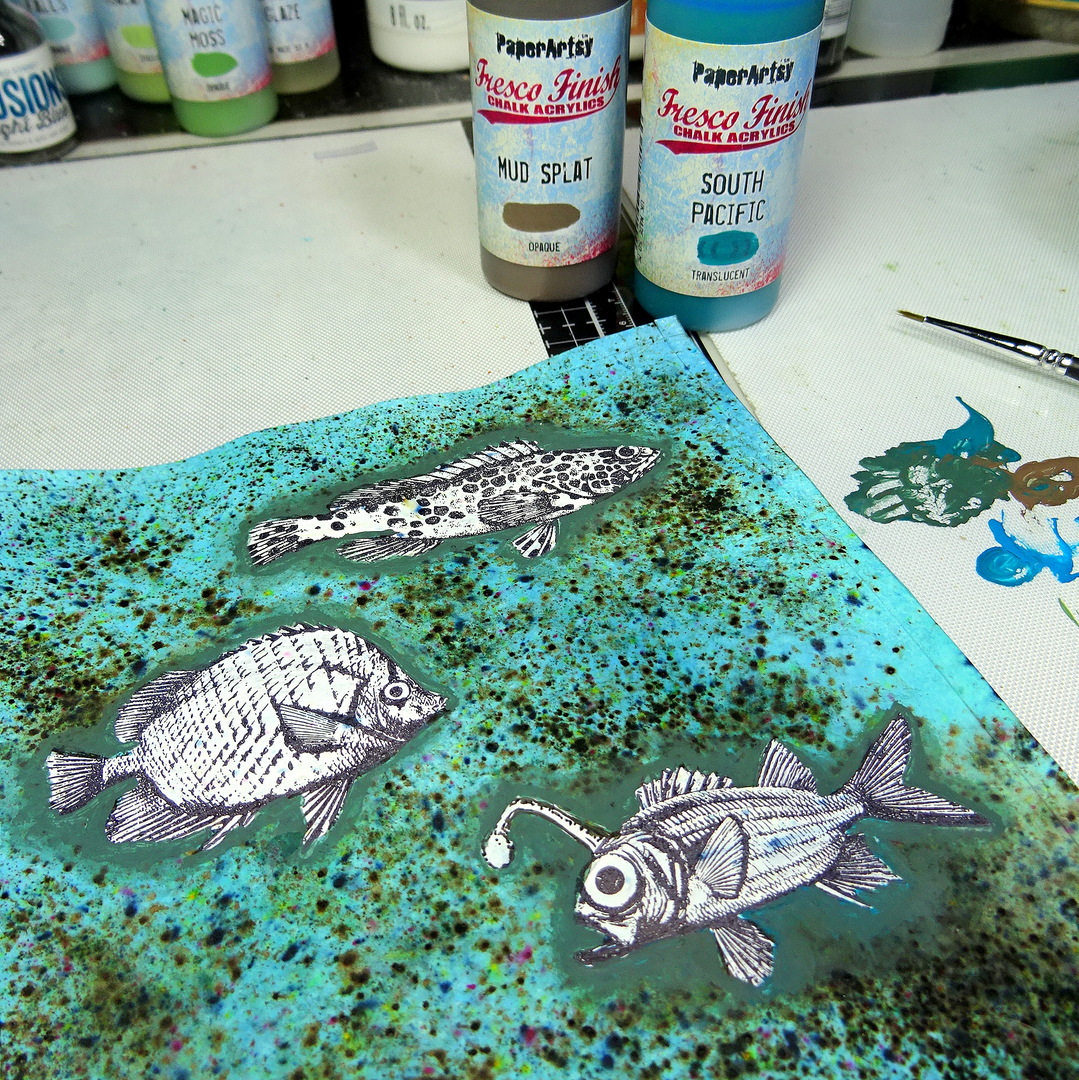
Next I stamped the three fish to their final spots using Ranger-Archival Ink (Jet Black) - only to cover them up right afterwards with some Titanium White acrylic paint! As you can see the Infusions have still bled through a little here and there - but that didn't matter.


I added the layer of white paint to get the paints I was going to use to shine - but first I needed my fish to get stamped back into place - on top of the white layer. I could have tried to mask the white cardboard sheet before adding the Infusions but I knew I was going to add loads of water and the Spray Stains and that would surely have seeped under the masks. I also didn't want to do a lot of fussy cutting to be honest - so this way of stamping-covering-re-stamping seems a lot safer and easier to me.


No need to worry about not stamping exactly back in the white spots - shading around the stamped images with a mix of Fresco Finish paints Mud Splat (FF61) and South Pacific (FF45) was going to cover any white edges AND add some cool shading around the outlines (which also creates a lot of depth).


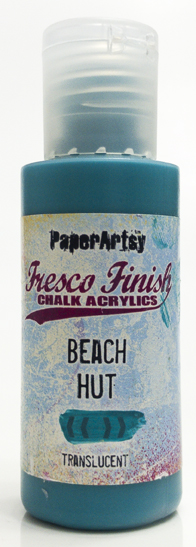
Time to paint the fish! I used Fresco Finish paints I already had on my palette and added Guacamole (FF05)Hyde Park (FF50)Beach Hut (FF43) and Niagara Falls (FF205) to the mix.


Finally, I fetched my cutting mat and a precision knife and cut out the eye and the lantern of my angler fish and some scales and spots from the other two fish. Behind these openings I glued some slightly tinted red, blue and yellow-greenish tissue paper scraps.

This is how my first test - by holding the sheet in front of my desk lamp - looked.


Time to add the lights and prepare everything for assembly! I still needed my top piece for the cabinet - so some more stamping, painting and a bit of fussy cutting was needed. I simply used up what I already had on my palette.


The cigar box got covered with adhesive Craft Sensations-Woodlook Sheets.
 

Next I drilled a hole (by hand) through the back of the cigar box and threaded the mini lights chain through to the inside. Only the switch and battery compartment stayed at the outer backside of the box. Then I eyeballed the positions for the lights to go to and fixed these to the inside of the box with some gaffer tape. I also inserted a frame of roughly cut to size foam board panels, so the picture with the painted fish would sit on it and keep its distance from the lights and the back of the box. 
 

As you can see I didn't invest a lot of time or labour with the back of the cigar box. The gaffer tape holds the lights switch and wire in place. The top piece image got glued to another piece of cut to size and shape foam board that I had covered with some more Woodlook sheets before I glued it to the top of the cabinet.


To finish up my cabinet I added some Dresden trim for a bit of bling. Then I toned that down with some smudged on DecoArt Metallic Lustre (Black Shimmer) for a worn and aged look. 


To fix the finished acetate pane to the cigar box I used small upholsterer's nails. This way the acetate and cardboard sheets can be removed if the lights need some repairing on the inside.


I am really happy that I managed to create a kind of Victorian era look with my little cabinet (I wasn't too sure if I would succeed at that to be honest - sometimes my projects just take their own lead and that changes the style I originally had in mind). In the end the acetate pane didn't fit too smoothly with the bottom as I moved it too much towards the top when nailing it down, but I covered that up with a glued on strip of a vintage designer paper scrap. Now we also know who donated this cabinet - "The R.P. Elmore Company" (I love it when things like that add some story telling to a make). The reverse acetate painting effect also looks cool on other projects like ATCs, tags or wherever you want to add that transparency effect with your mixed media projects! Just remember to reverse the order in which you paint - first the details layer, then work your way towards the middle and background layers (so for example add the red for the cheeks and lips on a stamped face before you paint the flesh tone and only then add the background with clouds and afterwards the blue sky). 

I haven't come up with any scientific names for my new luminescent fish species - but maybe I will add a little sign with these later at the side of the box - to have my cabinet look even more as if it was standing in a museum! For now I have added the French definition for luminescent, taken from an old dictionary, which also adds to the vintage feel of the make. This project was such great fun to create and the beautiful stamp designs really made it so easy and rewarding to do! I hope some of that joy shines through. 

Claudia xxx