Showing posts with label EM45. Show all posts

Tuesday, 21 January 2025

Circle Book with Seth Apter Products {by Ann Barnes}


Hi everyone, it's Ann (aksbarchitectCREATES) here with you today.

This year on the blog, we are being given free rein to do a deep dive into one of the PaperArtsy product ranges, and for this post I have been exploring Seth Apter products. I have always been drawn to the circles seen so often in the PaperArtsy stamp designs by Seth. I wanted to explore incorporating some of these stamps into a handmade book. I'm looking forward to sharing this fun circle book that I created.

I love making my own books. I know for some people, the book binding can be a daunting task, especially when it involves sewing multiple signatures together. This circle book is created in a way that removes all of the stress and also allows pages to be easily removed and worked on or even replaced!


A while back I was inspired by a technique that Laura Denison Designs used to create a "Twisted Pin-Bound Book". For the binding, Laura used a "pin" that the pages swing/rotate around. Extensions can be added to the "pin" to allow for multiple thicknesses. You can easily find her project if you search for her on YouTube.

Since I envisioned creating a book in the shape of a circle, I struggled with how I would bind it together, and then I remembered Laura's technique. For my book, I use a "Chigago Screw". These fasteners are used for a variety of purposes, from construction to leather and handmade crafts and are easily sourced.

While I was thrilled to be able to put the hinged technique to use in my circle book, I must admit that one of my favorite parts of working on this project was playing with some new-to-me PaperArtsy Fresco Chalk Acrylic paint colors by Seth Apter. Squid Ink (FF56) becoming a fast favorite; I have already added it to my to be replenished list!
   
I loved selecting a palette from Seth's PaperArtsy colors and getting busy with my gel plate.


I first gather all of my supplies, starting with an inventory of which Seth Apter circle stamp designs I have in my collection. Seth has many wonderful stamp sets, the themes may vary but his incredible underlying grungy style remains throughout. When I saw the Seth Apter stamp set 30 (ESA30), I knew I'd found the perfect focal image for my covers. I also grabbed a few of his mini stamp designs EM40EM45EM107EM112.

My original thoughts were to create my book in a monochromatic color scheme, focusing on Fresco Chalk Acrylic blues in the Seth Apter range. When I started selecting my colors I grabbed Squid Ink, imagining that it would be a dark inky blue color, but as I began to add colors to my gel plate, I quickly realized that it was so much more. I fell in love with this deep, dark eggplant color. It is gorgeous and looks amazing with Steel Grey (FF134), as well as Midnight (FF123), Double Denim (FF128), and Venice Blue (FF133). When I realized that Squid Ink (FF56) was a purple, I also added Spanish Mulberry (FF71) for a bit of pop.


Using a brayer I add the paint colors to my gel plate and make pulls on high strength tissue paper. I layer the prints with each pull from the gel plate. When I have a nice background, I also stamp into the wet paint on the plate with some of the rubber stamps. (Note: if you prefer to keep your stamps clean, be sure to keep a shallow tub of water nearby to wash the stamps after using them with paint.) I love seeing the faint designs among the layers.


I am really pleased with the combination of colors that I have chosen and am excited to work on the pages. I originally envisioned using these pages as collage material for the pages inside the book, but after seeing how wonderful they turned out, I am considering covering the entire page with the tissue and building upon it.


When I have a couple large master sheets of tissue that I am pleased with, I make the decision to create double sided pages. The master sheet layers of color are fairly dark. I decide that one face of each circle page will be layered using the same colors, but in a lighter palette. Effectively each page will be light on the front and dark on the back (or vice versa.)


For the lighter sides I print directly onto the page, using Fresco Finish Heavy Cream (FF203). I love the look of these lighter sides, they both complement and contrast the darker papers.


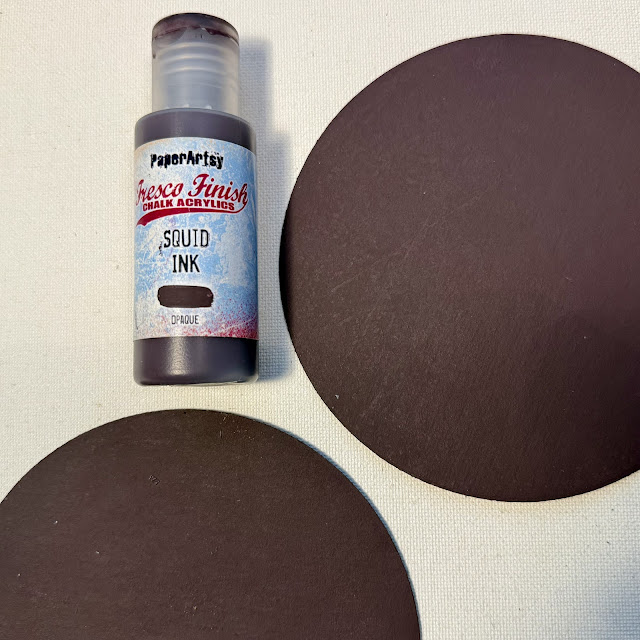
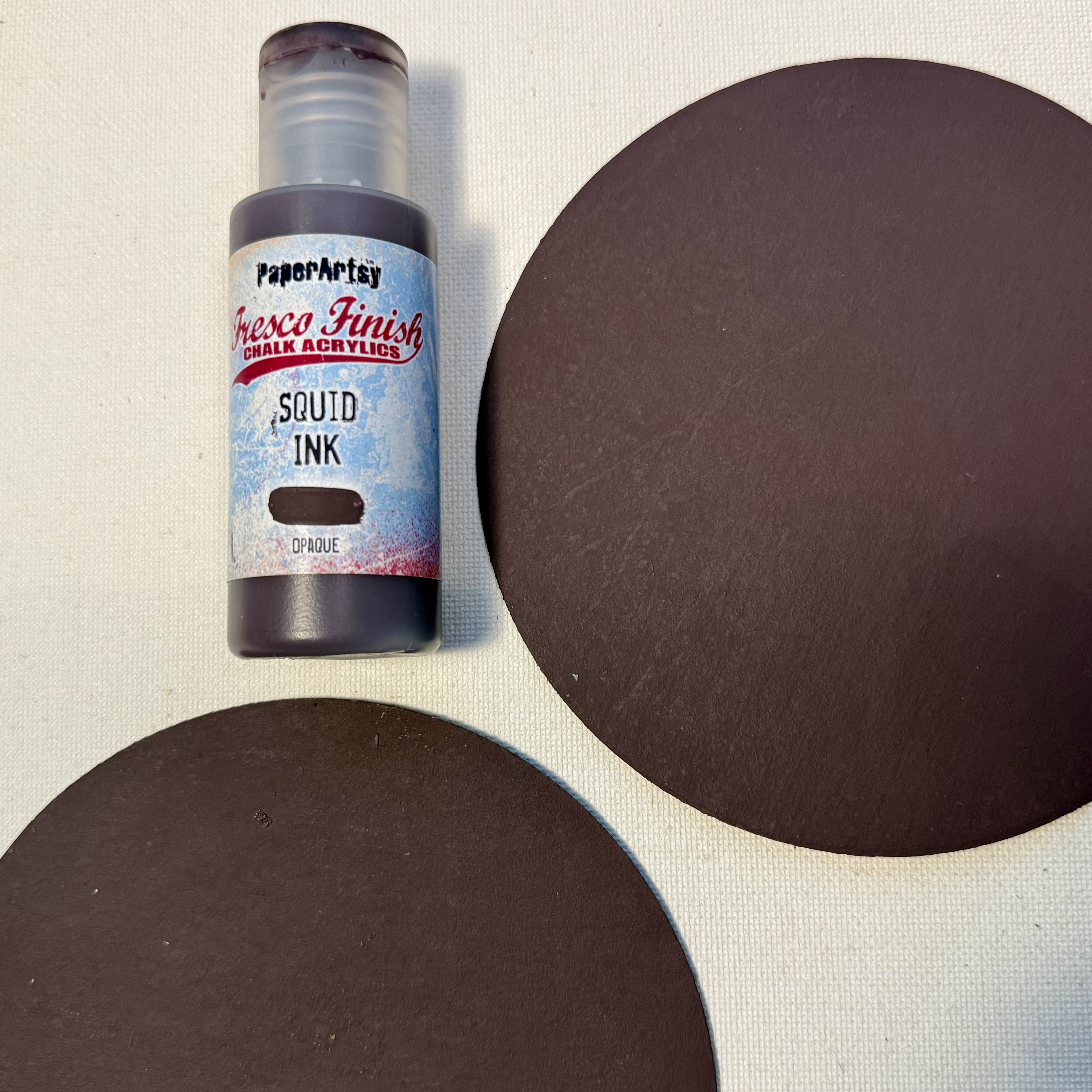
After letting everything dry while I clean up from the gel plate printing session, I am considering how it will all come together. This is when I decide to paint the covers in Squid Ink. The dark cover will be the perfect base for the stamped image and also highlight the color which is seen throughout the pages. I have a feeling that I will want to take the pages in and out to work on them, so I decide that it will be a good idea to reinforce the hinge point. I die cut chipboard circles and paint these with the Squid Ink color as well.

Using Ranger Distress Collage Matte Medium, I adhere the tissue to the unfinished sides of the pages. I weight down the pages to keep them flat while they are drying. After the glue is completely dry, I use a sanding block to create a clean edge. I have found this to be a simple way to ensure that the edges align.


I cut circles of various sizes out of the remaining painted tissue. These circles will be used as college elements within the book as well as on the cover.


Each page is then modified using the collection of stamps I have gathered. Stamping always brings to mind something I once heard Seth mention during one of his demos, "try to make the stamps your own..." One way to do this is by partial stamping, where you don't imprint the entire design, and another way is to modify the image once it is stamped. I love playing around with different ways of making Seth's designs more of my own, it makes it feel more like a collaborative effort.
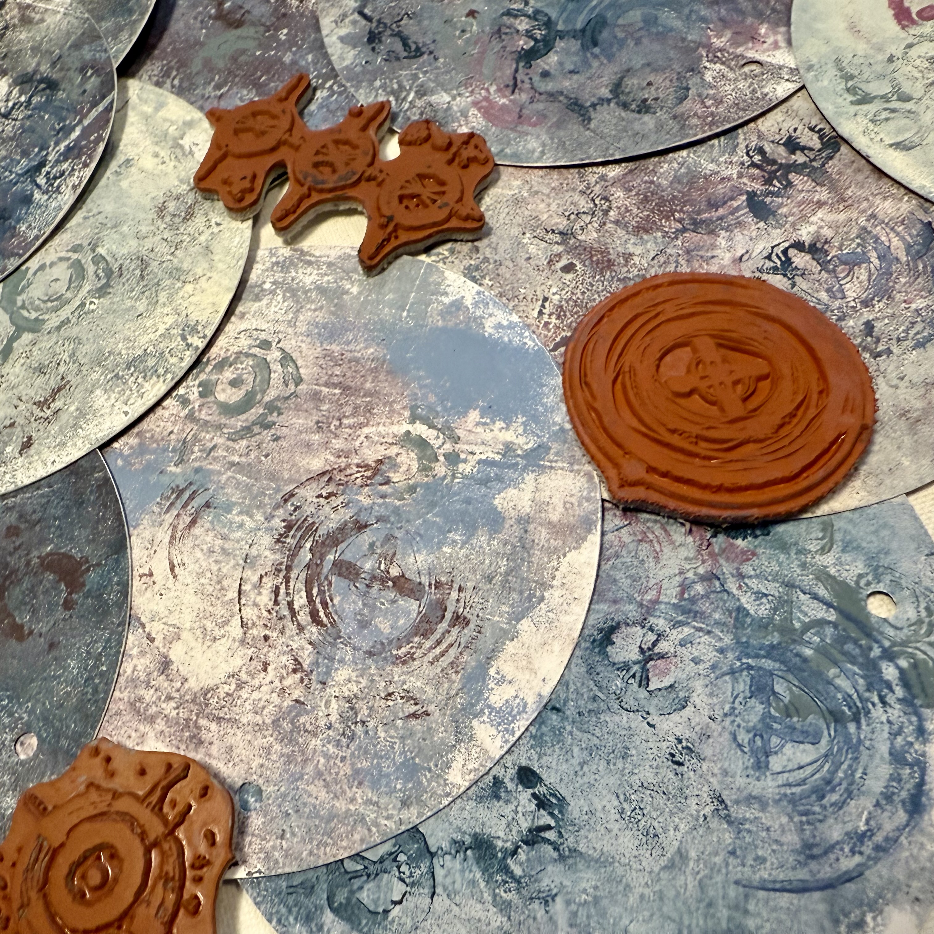

I select the location where the book will be hinged and then punch each of the covers and pages in the same location. I used a Crop-A-Dile to easily punch through the layered pages as well as the chipboard. You could use any suitable punch, just be sure that the hole size equals the diameter of the Chicago Screw post so that the pages will slip onto the cylinder. The book is almost complete.


The last step to completing the book is adding the title. Since the book is circular and double sided, I thought it would be fun to have one portion of the title on the front cover and the second half on the back cover. Essentially allowing you to flip the book over and browse the back sides as well. When I chose the "what comes around goes around stamp" I thought it would be fun to use the first portion of the saying on the front and the ending on the back cover. To do this it required a bit of simple masking.


I use a stamping platform and an embossing ink pad to stamp "what comes around" onto my cover. Simply mask the words "goes around" so that they do not transfer. Then I sprinkle some charred gold embossing powder over the impression and heat it. I do the same for the back cover but I mask the words "what comes around". I then add embossing ink along the outer edge of both covers, coat it with embossing powder, and heat it. I have always enjoyed watching the powder melt.


While I have the embossing ink pad and powder out on my desk, I also add a bit of stamping and embossing to each of my pages. I use different techniques to create interest, making sure to brush off areas of the stamped images prior to heating to make the images unique.
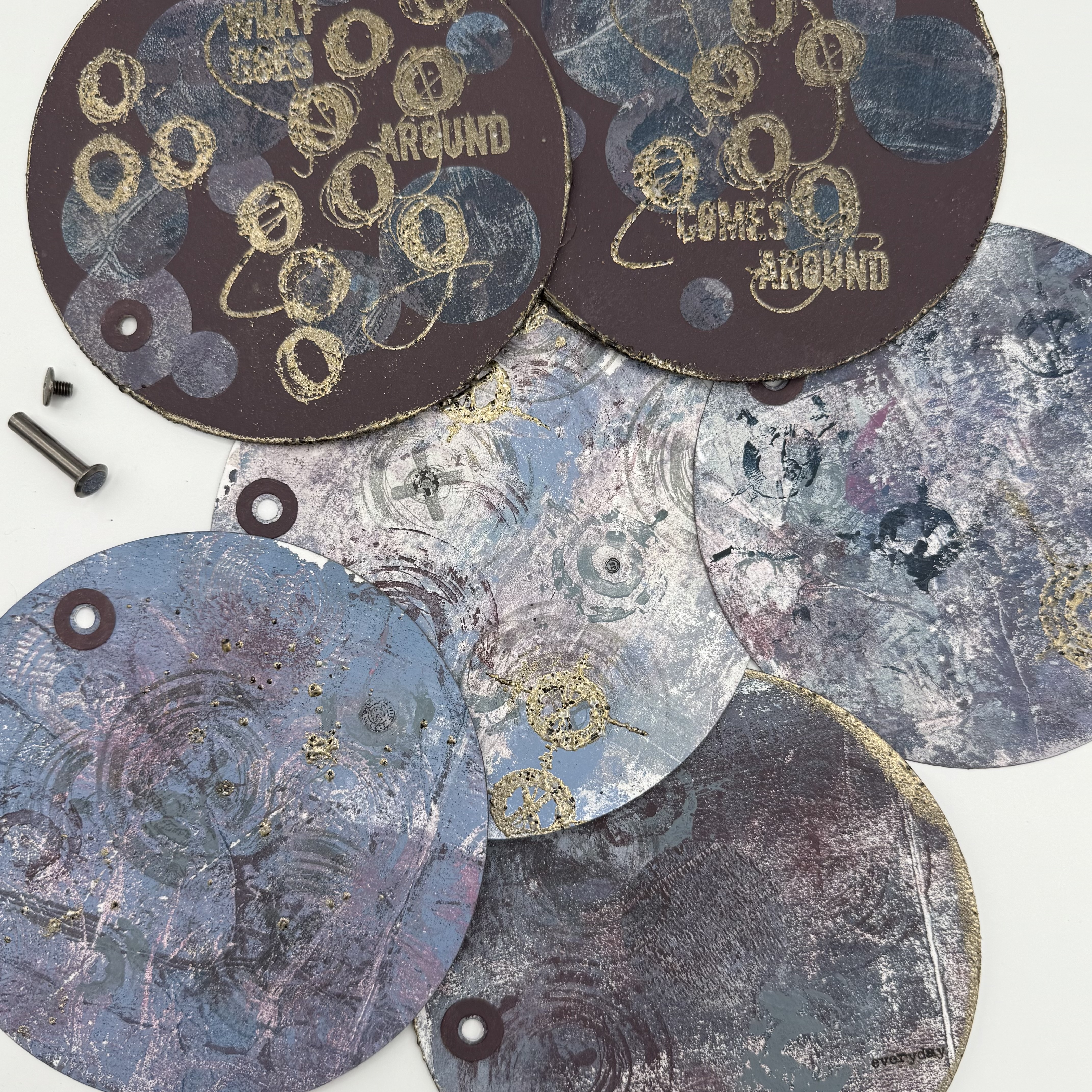

I added some rub-on words and images to a few of the pages as well. I have a feeling I will be adding more to each of these pages over time. I just love how it turned out.


Obviously, I was drawn to the idea of creating a circular piece, but I think this binding technique could be used in a lot of different formats. I think the best takeaway from my project is that trying out new techniques and blending new color combinations can yield amazing results!


I hope that I have inspired you to pull out your stamps and Fresco Finish paints and try to create something new! Wishing you a creative day ~Ann

Saturday, 14 March 2020

2020 #5 Mark Making: Infusions Tag Book with ESA {by Autumn Clark}

2020 Topic 5: Mark Making


Intro
Autumn is having a blast of late with the PaperArtsy Infusions. If you have not tried these, they are water activated pigment powders, but they have 2 unusual features: 1. they are permanent once dry and 2. they contain walnut crystals which activate more slowly than the colour powder (because a crystal is larger, and takes longer to dissolve in water). Result is that you get a colour pop with a vintage brown effect. 

Learning how to control the balance of colour to walnut makes for a lot of fun! That is why with just 2 infusions, Autumn still gets a range of colour and some super-interesting effects, and she makes plenty of marks with the fabulous stamps from Seth Apter's line. Take a look!
~ Leandra

Hi everyone, it's Autumn Clark from SewPaperPaint with you today, and I'd like to share with you a fun little tag book I made by marking up a sheet of Infusions dyed paper with loads of Seth Apter patterns.

I truly love playing with Infusions pigment powders and thought it would be fun to mix the two "blacks" in the collection together.  I was instantly amused by the combo of Black Knight and Blackcurrant.  One thing led to another and I ended up creating a little scrappy tag book with black and white photos of my darling girls...


More than anything I enjoyed I enjoyed the spontaneity of creating this project.  I let one color indicate the next and then the ink colors and even the shapes I used.  And there's nothing like a pop of black and white photos against pink!  My girls are mad about star motifs these days so I loved adding such elements to my design.  


I usually choose to apply my Infusions over very wet paper.  I love watch the magic as the colors bleed.  I dyed a full sheet of 12x12. 


I wasn't sure what I was going to do once I started, but this year I am adapting the principle of "striving for my flow state," where I take more time for creative abandon and pure play.  I cut the paper with a tag die and got eight pieces from the sheet.  I mounted them onto black cardstock one on the front, one on the back of four finished tags.  Since my water flowed to the center of my paper as the colors ran, it left me with sort of a striped effect, which I kept on the horizontal when I cut my tags.  It would be interesting to see how they would look with a more vertical swaying...


Now it was time to make some marks!  I pulled out some Distress Oxide colors that would coordinate with the magenta, grey/blue and blacks from my backgrounds and set to stamping my tags at random.  

I used PaperArtsy Eclectica³ {Seth Apter} Collection (EM35), (EM41), (EM45), (EM48) and (ESA09).  For the largest pattern from ESA09 I used Cloud 9 Fresco Chalk Acrylic Paint to bring in some contrast.


The concept of making one's mark made me think of my sweet girls and my hopes and dreams for their future, so I pulled out PaperArtsy Eclectica³ {Alison Bomber} Collection (EAB07), the "Dreams" stamp collection. 


I fussy cut portions of each quote to pair with my photos.  To create some dimension, I added some die cut elements with Seth Apter dies.  I embossed those in Ranger's "Punch" Mixed Media Powder.


Then the joy of building my layouts with my photos, pops of pink embellishments and these delightful sayings was found, all from the simple start of making a few marks...


I can't encourage you enough to have a play with Infusions.  There is something truly magical about the randomness of the colors.  I've shared a couple of video tutorials recently on my YouTube page HERE and HERE, so take a look and get to playing...  It's time to make your mark!

It's been a pleasure to share with you today.  Make sure to scroll through the PaperArtsy blog posts for more mark making inspiration.  Hugs, Autumn

Blog: SewPaperPaint
Facebook: Autumn Clark
YouTube: Autumn Clark - SewPaperPaint
Instagram: @sewpaperpaint
Pinterest: Autumn S Clark

Wednesday, 10 July 2019

NEW: Seth Apter Minis {by Christine Dark}

July 2019 New Products
Eclectica³ Collection {Seth Apter}


Chris has done a wonderful job of bringing so many products together in this post, stamps (of course) but also Frescos and infusions pair together along with numerous colours of ink. Its a veritable feast for our creative eyes! ~ Leandra


Hi everyone, it's Chris with you today to share my projects with Seth's new mini's EM41-48.  I very much admire Seth's art which is all about layering and his new mini's are perfect for making that easy and enjoyable as they all go together so well.

You can create depth and textural interest with the stamps by stamping in different colours and overlaying with black and further down the post you can see how I created my base layers with very quick and easy techniques. 


My first make is a large Birthday Tag. I stamped with all of the stamps over my base layer in various coloured inks and finally with black. 


Outlining some of the stamped images in white pen helps to bring them forward and add interest. Glossy dimensional glue has been added to the die cut letters and on the circles on the focal star from Seth's stamp set ESA03 for extra shine.


I used a couple of Seth's embossing powders to create yet more texture on the die cut scalloped frame and on the wood star embellishments. 


I cut a smaller tag from the same base layer outlined in white and also die cut some stars to add to the painted and glossed wood stars. I cut out the word 'create' from EM42 and used it for my sentiment.


I love the grunginess of some of the mini's in this collection. Stamp EM47 has those lovely grungy lines and will be hard to put down!


Similar to the tag above and using the text 'your story' from MA46.


For this tag, I used the stamps with a gel plate print and the bolder design mini's work particularly well with the gel plate. The words are taken from MA46.


I love the texture you get with mono prints, I used thin brayered layers of Fresco Finish Chalk Acrylics for this tag.


I like the more feminine colour scheme from the part of the mono print I used for this card, colours tend to get mixed on the gel plate so you can end up with quite a variety of colour schemes which is perfect for batches of tags or cards as they will all be slightly different to each other.


The die cut heart is covered in glossy dimensional glue which I used to highlight areas of most of the samples.


Another card from a mono print.


All the ribbons I added were dyed with Infusions; damp the seam binding ribbon, sprinkle with Infusions powders and dry off. 


I started off with a master board base layer adding various complimentary colours of Fresco Finish Chalk Acrylics with a large brush, a few sprinklings of Infusions and finish with a lighter colour or two on top to bring it all together. This is a nice base for stamping all over with all of the stamps in various colours of ink.


The final touches are stamping in black and some outlining in with fine liner pens.


My second substrate is an easy splatter and squish method! Spatter watered down Fresco Finish Chalk Acrylic Paints Blue Lagoon, Terracotta and Claret on to two sheets of Heavy Weight Smoothy cardstock, smoosh them together paint sides facing, pull apart then allow to dry.


Repeat the process using Infusions in Slime, Royal Blood, Violetta and Olive Tree diluted in water. I stamped in black over these pieces and used for some of my layers and die cuts.


I usually keep a few paints in this little wood crate on my desk, it's patiently been waiting for some colour and pattern and the Mini's are lovely for creating random abstract patterns


I didn't mount the stamps on a block just dabbed on Fresco Finish Chalk Acrylics and randomly stamped around the box, overlapping and not thinking about it too much.

As you can see, I enjoyed creating from my substrate pieces and decorating my paint crate which is the beauty of these mini's, they're going to be useful for so many projects and they work together perfectly due to the mix of solid and more delicate images, there are even words in there that can be accentuated or cut out.   

Thanks for joining me today, I hope you have a creative week.

Chris x

Blog: www.sketchingstamper.blogspot.co.uk
Facebook: https://www.facebook.com/christine.dark.7
Instgram: @chrisd999
Pinterest: https://uk.pinterest.com/cdark4163/