Showing posts with label Colour Study. Show all posts

Thursday, 9 February 2023

2023 Topic 02: Tetradic Colours {by Autumn Clark} with Zinski Art Stamps


Hi everyone it's Autumn Clark from SewPaperPaint here with you today.  I've had a lovely time playing with paints lately. This Tetrads topic was a new concept to me and I had to Google it, which led to some fascinating discoveries. I would urge you to do the same and take a second look at the Introduction Post HERE, which shares such a wealth of information.  I decided to break out my new collection of Zinis, Elena Zinski's darling house stamps, and I am looking forward to sharing with you how I combined the two.


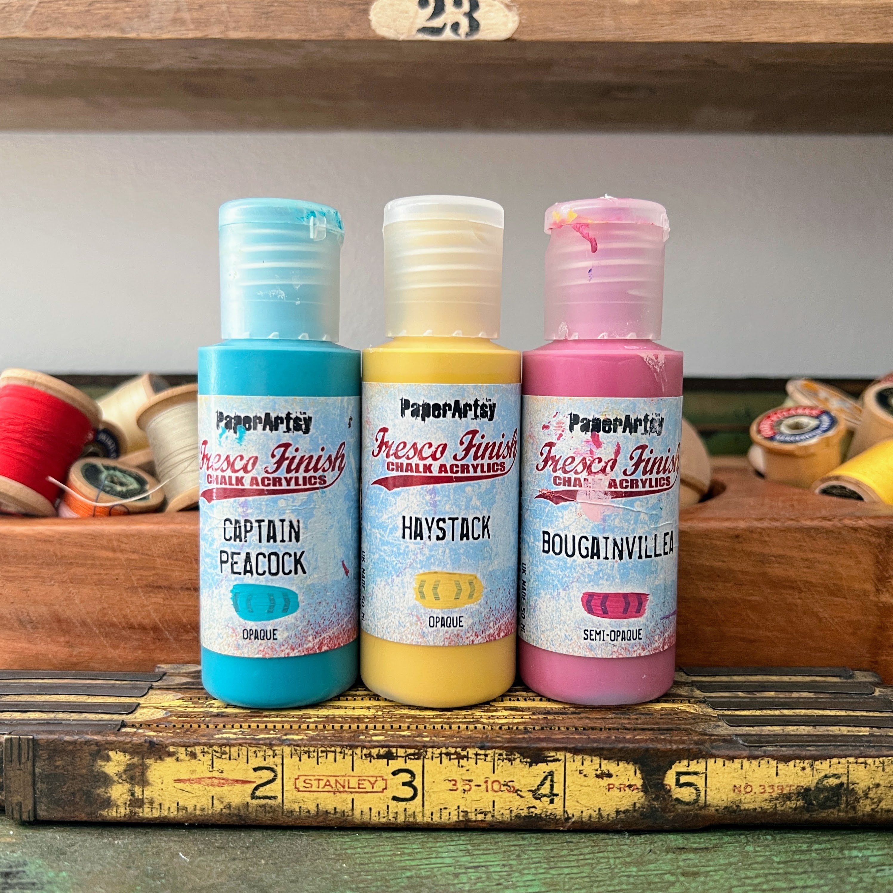
With each color wheel progression, the PaperArtsy bloggers have been encouraged to experiment with different primary shades. This was a real challenge for me! My very literal brain had trouble selecting non-pure primaries, but I switched up a little with PaperArtsy Fresco Finish Chalk Acrylic - Haystack (FF02), a warm and rustic yellow, PaperArtsy Fresco Finish Chalk Acrylic - Captain Peacock (FF110), a turquoisy blue and PaperArtsy Fresco Finish Chalk Acrylic - Bougainvillea (FF93), a deep pink. I was pleasantly surprised by how these colors still made for a somewhat traditional color wheel in the end, with all the classic colours identifiable.

I knew when I first saw the Elena Zinski release post HERE that I wanted to create an exploding card box. I was waiting on the perfect opportunity to create such a box. Originally, I designed a larger box, but had to scale it down to better fit the stamps. I cut a sheet of watercolor paper to 11x9" then scored on the 11" side at 4" and 7". I scored on the 9" side at 3" and 6", then cut the corners away and the longer sections into points as shown. I cut a roof for my box at 4.5 x 3.25" and scored along the 4.5" side at 2.5". 


Here are the latest Zinis from Elena Zinski's Art, ZN 49 to 56. It's hard not to fall in love with this selection of stamps with so many quirky house designs. I love that just one house could be colored a different way and look like a totally different stamp!


I purchased a new palette, as my smaller, older palette only had 10 sections and it's easier to work through the printable color mixing wheel (which you can find HERE, in the Files section of the PaperArtsy People Facebook Group) with a 12-section palette. Next time I think I'll stick to a paper plate because I found this larger palette to be cumbersome on my small work table.


I noticed my mixed colors lent to some pinky oranges, a "perfect" purple and really lively greens.

I chose a square tetradic palette as I felt like I could go in any direction with it. I painted the three possible square combos in columns and decided on the center one because I really liked how the pure PaperArtsy Fresco Finish Chalk Acrylic - Haystack (FF02) brightened up the palette. The finished colors are represented in blocks 1, 4, 7 and 10.


I was trying to decide on the best way to use my mixed colors to decorate the many houses, so I added them to my gel printing plate, as shown, and pulled a couple of prints.


One of my prints didn't pull very well, so I took a paint brush and blended some additional color onto the paper. I decided at this point to lighten things by adding in a touch of PaperArtsy Fresco Finish Chalk Acrylic - Cloud 9 (FF149). I always try to add a touch of black and white to most projects for balance.  This gave me a stampable, precolored surface for my houses.


I painted the front of my house box, intentionally omitting the blended Bougainvillea color so that that color would really pop when the box was opened. I added some water to lighten areas during blending.


And you can see the color does really pop inside!


l incorporated the Tracks theme into my project by creating a row of stones as a path around the garden inside of my box. I sponged Cloud 9 through PaperArtsy Stencil 102 by Sara Naumann (PS102).


I stamped the tiny flowers from (Elena Zinski) Zini mini stamp 54 (ZN54) along the edge of the grass and stones.  I also stamped and cut out the trees from Zini mini stamp 52 (ZN52). I cut a small strip from my gel printed paper and rolled it into a circle with some small flaps to adhere it to the center of the garden. I added stamped shrubs around the adhered trees.


I ran into an unexpected complication of needing larger flowers to fill in the garden. I chose PaperArtsy stamp set by Tracy Scott (TS069). You can see here the color variation from the gel prints.


Now it was time to get my houses arranged! I used my stamping platform to repeat stamp the images onto my gel prints, for a super vibrant black outline. I used Zini mini stamp 49 (ZN49), Zini mini stamp 50 (ZN50), Zini mini stamp 51 (ZN51) and Zini mini stamp 56 (ZN56).
 

I had glued some scallops to the edge of my roof to hold the box shut. I used plain black cardstock for this and wanted to add some additional detail in the background, so I stamped PaperArtsy Mini stamp 122 (MN122) in the coordinating ink color for each side panel and in embossed white. I chose this stamp because it mimicked tile or brick and flowed with the Tracks theme.

As a final touch, I painted the house windows white to tie in with the embossing and gave the roof a splash of watery Cloud 9.


I gave the inside of the box a splash of the same and a second splash of Haystack.


I don't always use bold colors in my creations and was challenged by the vibrant colors I had mixed. I think the addition of white and black helped balance the rich color. I've seen exploding card boxes and thought the house box idea would be a unique twist. It turned out to be very simple to work out. I would have liked to have some floating or pop up elements inside the box and think next time I could use acetate to make hidden hinges or floaters. Our goal as bloggers is to encourage you to try an idea and we hope that you will take it to the next level. Mine was an experiment and yours will be a triumph! I hope both this color wheel and project idea have inspired you today and your mental "Tracks" are kickstarted.

xx, Autumn


YouTube: SewPaperPaint
Facebook: Autumn Clark
Instagram: @sewpaperpaint
Pinterest: SewPaperPaint


Friday, 21 October 2022

2022 Topic 14 : Colour Study: Triads {by Autumn Clark} with Darcy stamps


Hi everyone, it's Autumn Clark from SewPaperPaint with you today, and I'm here to share with you a couple of circle canvases I created using a selection of stamps designed by Darcy.  


Because I am totally addicted to stamping, it will be no surprise to you to find out that I've experimented with just about every substrate known to man, ha ha!  I've spent a good amount of time pondering project types and trying to think of a new surface on which I could experiment and for today's project decided upon circular canvases.  These 6" canvases I thought would be something fun and new, which could easily be recreated as 6" circular cards if desired.  Because at the end of the day, let's face it, we often make more cards than anything!


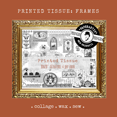
It so funny that almost every blog post I write here at PaperArtsy starts off with me saying how I adore starting any project by choosing my color palette, yet for a color topic I did not start with color!  Go figure!  I wanted to show how easily this type of project could relate to ANY colors you choose from the PaperArtsy Fresco Chalk Acrylic range or ANY that you mix from them.  I was also super excited to play with the brand new PaperArtsy Printed Tissue: Frames.  I adhered some torn strips to my canvases with Mod Podge so some of that yummy pattern would seep through the finished painted product.


At this point any colors imaginable would have made a beautiful canvas, but I decided to pick some primaries that would give my finished projects an earthy feel.  I chose PaperArtsy Fresco Chalk Acrylics in Space Cadet for my blue, London Bus for my red and Caramel for my yellow.  I did not have access to a printer to print Leandra's fabulous color wheel, which you can find in the PaperArtsy People Facebook group files HERE, so I had to draw my own with a sharpie marker.  I must say, my favorite portion of my color wheel was the analogous portion starting with the olive green, then Caramel, then pumpkin, then rust.  Mixing up random colors will always result in happy accidents.   


For the Triads color scheme, I first chose to play with the selection below, a dark plum, deep teal and the richest orange/rust.


With my palette mixed and my canvases dry, I was ready to get some color down!  I applied my orange to the top of the canvas and sprayed water to let it drip down, trying to focus the dripping around the stenciled stems.  When this was mostly dry, I turned upside down and repeated that process with my teal.  I blotted with a towel as needed to try to keep the colors from dripping too far down.  Once the base colors were dry, I gave a good splash of my third triadic color, plum.  I also continued to spritze my entire mixed palette with water so the paints didn't dry too quickly.


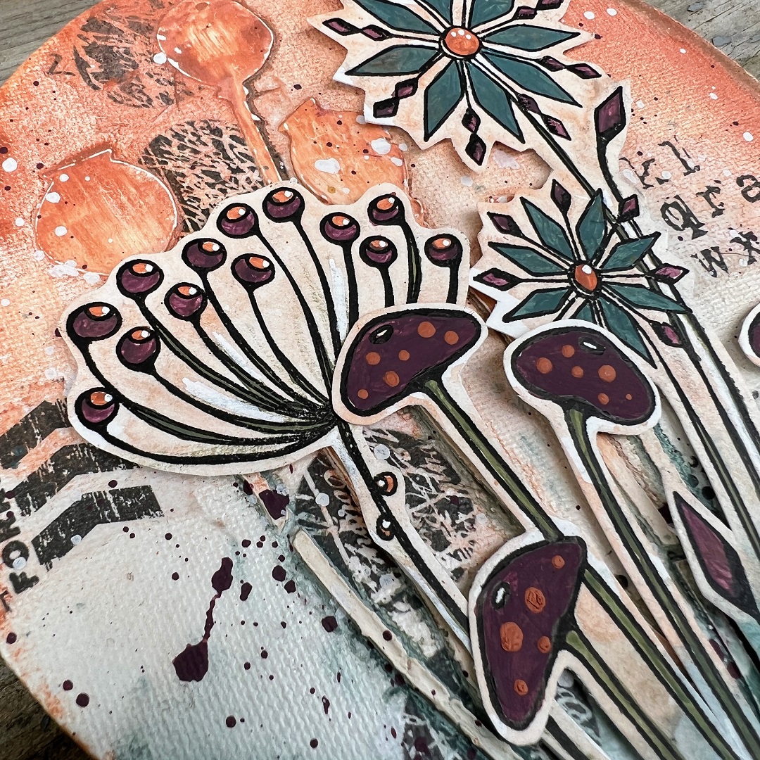
Once I was happy with my canvas background, I moved onto adding my focal elements.  I chose PaperArtsy stamp sets (by Darcy) EDY12 and EDY09.  I used my stamp positioner to stamp the flowers, then painted them with my chosen mixed Fresco Chalk Acrylics, then repositioned the stamps into my platform and restamped to get keep all of the detail.  After they were painted, I added a very light wash so I could cut them easily and the outlines would blend into my canvas background.  


I was so pleased with how well the images looked after they were mounted onto the canvas!  Because stamp set EDY09 is so open, I was afraid of how this would work, hence the background wash and excess in the cutting.  But it worked a charm.  


My favorite detail is the PaperArtsy Printed Tissue peeping through.  It adds just the right amount of grunge to these fun flowers in my opinion, but with the light Fresco wash over it, is toned down just enough.
 

I've said in plenty of my posts how I always choose floral images that have both an open and closed design, whenever possible, because it is the perfect balance.  The mushroom stems look so good paired with the open flowers because of this contrast.  
 

And with any color scheme, you can always pick main players.  For this panel I let plum be the sidekick and teal and rust be the stars, but plum still adds the perfect amount of contrast to complete the triadic scheme.  
 

With one more canvas ready and waiting, I decided to go with a second triadic color scheme and chose the lighter variation of the colors I used for my first piece. 


For this panel, I focused on the larger mushroom from set EDY12.  I completely switched up my background colors too, so you can see the difference it makes using the lighter orange as the sidekick color and the lighter teal and lighter plum as the focus.  


I did add a little more of the orange in this panel, with the additional leaves at the bottom.  


I even added some to the mushroom caps by dipping a skewer into my paint and making the dots with it.  The fun of these color challenges is to play and see what mix works best for you and just how much of each color to add to your finished creation.  


I hope these little canvases have inspired you today.  It may seem daunting to mix up your own palette, but trust me when I say it is a joy!  You will learn so much about color theory by mixing colors yourself and seeing first hand how one color affects another.  And by all means, I hope you will decide to paint some flowers and make some arrangements of your own.  I've shown just two options, but truly the possibilities are endless.  Just take some time for yourself and have a play.  One final thought, do make the most of your mixed up paints!  You can scape them onto your gel printing plate and pull a quick print, or you can use some to paint the reverse of your PaperArtsy Printed Tissue to use for future projects.  


I look forward to seeing what you come up with!
Autumn


YouTube: SewPaperPaint
Facebook: Autumn Clark
Instagram: @sewpaperpaint
Pinterest: SewPaperPaint