Showing posts with label Darcy Wilkinson. Show all posts

Friday, 21 October 2022

2022 Topic 14 : Colour Study: Triads {by Autumn Clark} with Darcy stamps


Hi everyone, it's Autumn Clark from SewPaperPaint with you today, and I'm here to share with you a couple of circle canvases I created using a selection of stamps designed by Darcy.  


Because I am totally addicted to stamping, it will be no surprise to you to find out that I've experimented with just about every substrate known to man, ha ha!  I've spent a good amount of time pondering project types and trying to think of a new surface on which I could experiment and for today's project decided upon circular canvases.  These 6" canvases I thought would be something fun and new, which could easily be recreated as 6" circular cards if desired.  Because at the end of the day, let's face it, we often make more cards than anything!


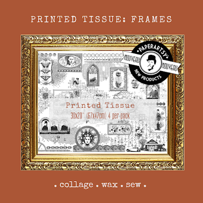
It so funny that almost every blog post I write here at PaperArtsy starts off with me saying how I adore starting any project by choosing my color palette, yet for a color topic I did not start with color!  Go figure!  I wanted to show how easily this type of project could relate to ANY colors you choose from the PaperArtsy Fresco Chalk Acrylic range or ANY that you mix from them.  I was also super excited to play with the brand new PaperArtsy Printed Tissue: Frames.  I adhered some torn strips to my canvases with Mod Podge so some of that yummy pattern would seep through the finished painted product.


At this point any colors imaginable would have made a beautiful canvas, but I decided to pick some primaries that would give my finished projects an earthy feel.  I chose PaperArtsy Fresco Chalk Acrylics in Space Cadet for my blue, London Bus for my red and Caramel for my yellow.  I did not have access to a printer to print Leandra's fabulous color wheel, which you can find in the PaperArtsy People Facebook group files HERE, so I had to draw my own with a sharpie marker.  I must say, my favorite portion of my color wheel was the analogous portion starting with the olive green, then Caramel, then pumpkin, then rust.  Mixing up random colors will always result in happy accidents.   


For the Triads color scheme, I first chose to play with the selection below, a dark plum, deep teal and the richest orange/rust.


With my palette mixed and my canvases dry, I was ready to get some color down!  I applied my orange to the top of the canvas and sprayed water to let it drip down, trying to focus the dripping around the stenciled stems.  When this was mostly dry, I turned upside down and repeated that process with my teal.  I blotted with a towel as needed to try to keep the colors from dripping too far down.  Once the base colors were dry, I gave a good splash of my third triadic color, plum.  I also continued to spritze my entire mixed palette with water so the paints didn't dry too quickly.


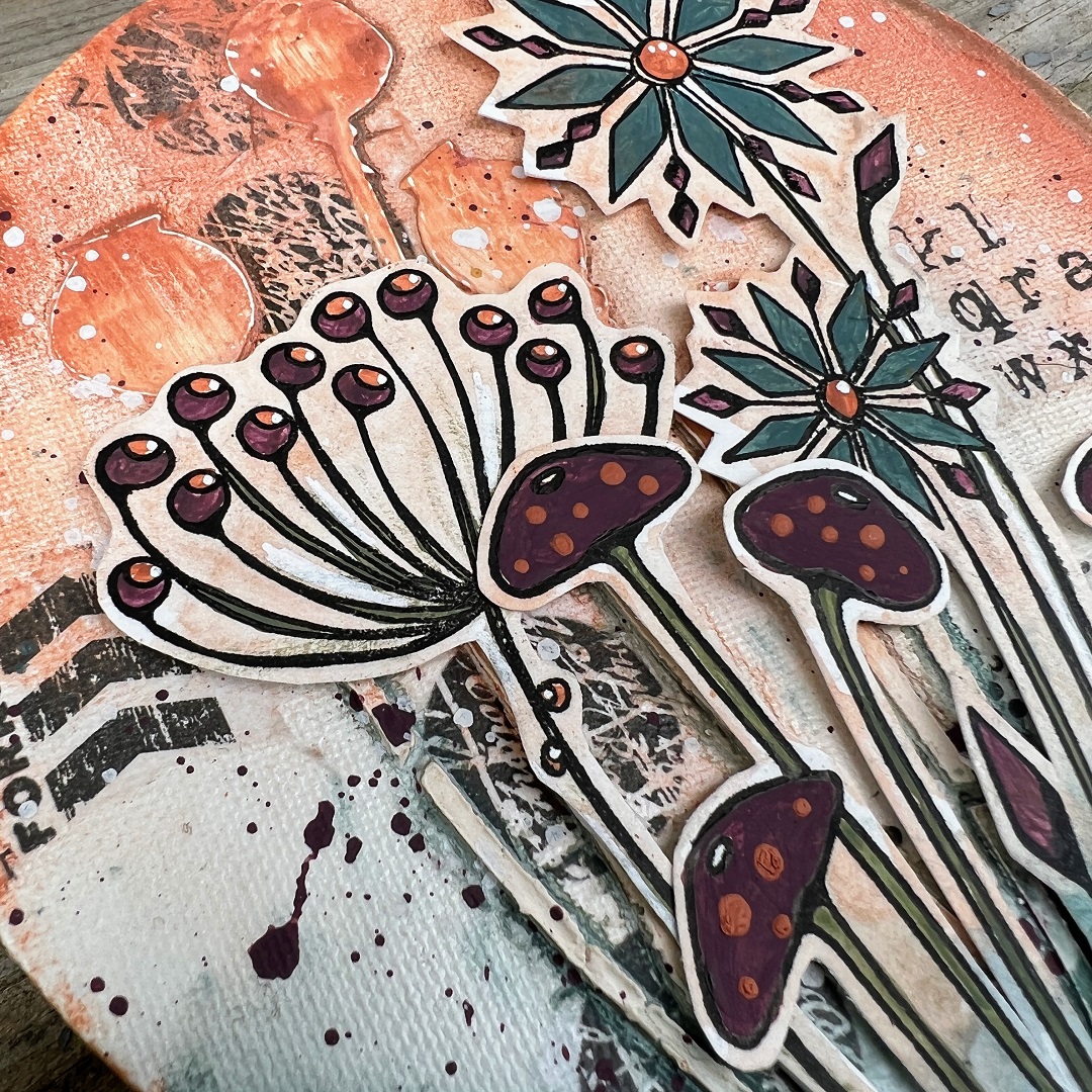
Once I was happy with my canvas background, I moved onto adding my focal elements.  I chose PaperArtsy stamp sets (by Darcy) EDY12 and EDY09.  I used my stamp positioner to stamp the flowers, then painted them with my chosen mixed Fresco Chalk Acrylics, then repositioned the stamps into my platform and restamped to get keep all of the detail.  After they were painted, I added a very light wash so I could cut them easily and the outlines would blend into my canvas background.  


I was so pleased with how well the images looked after they were mounted onto the canvas!  Because stamp set EDY09 is so open, I was afraid of how this would work, hence the background wash and excess in the cutting.  But it worked a charm.  


My favorite detail is the PaperArtsy Printed Tissue peeping through.  It adds just the right amount of grunge to these fun flowers in my opinion, but with the light Fresco wash over it, is toned down just enough.
 

I've said in plenty of my posts how I always choose floral images that have both an open and closed design, whenever possible, because it is the perfect balance.  The mushroom stems look so good paired with the open flowers because of this contrast.  
 

And with any color scheme, you can always pick main players.  For this panel I let plum be the sidekick and teal and rust be the stars, but plum still adds the perfect amount of contrast to complete the triadic scheme.  
 

With one more canvas ready and waiting, I decided to go with a second triadic color scheme and chose the lighter variation of the colors I used for my first piece. 


For this panel, I focused on the larger mushroom from set EDY12.  I completely switched up my background colors too, so you can see the difference it makes using the lighter orange as the sidekick color and the lighter teal and lighter plum as the focus.  


I did add a little more of the orange in this panel, with the additional leaves at the bottom.  


I even added some to the mushroom caps by dipping a skewer into my paint and making the dots with it.  The fun of these color challenges is to play and see what mix works best for you and just how much of each color to add to your finished creation.  


I hope these little canvases have inspired you today.  It may seem daunting to mix up your own palette, but trust me when I say it is a joy!  You will learn so much about color theory by mixing colors yourself and seeing first hand how one color affects another.  And by all means, I hope you will decide to paint some flowers and make some arrangements of your own.  I've shown just two options, but truly the possibilities are endless.  Just take some time for yourself and have a play.  One final thought, do make the most of your mixed up paints!  You can scape them onto your gel printing plate and pull a quick print, or you can use some to paint the reverse of your PaperArtsy Printed Tissue to use for future projects.  


I look forward to seeing what you come up with!
Autumn


YouTube: SewPaperPaint
Facebook: Autumn Clark
Instagram: @sewpaperpaint
Pinterest: SewPaperPaint

Saturday, 19 December 2020

2020 Topic 22 Xmas Cards with EDY (by Lynn Good)

  2020 Topic 22:Icy Christmas


With an intriguing heat gun technique and some delightfully quirky stamps, Lynn has gone to town with some fab and fun Christmas cards. With the perfect amounts of bling and fake snow, these are going to lift someone's spirits for sure!
~ Keren

Hi everyone, it's Lynn Good from Memories On The Page, with you today, and I'd like to share with you a set of cards that I have made for this weeks topic 'Icy Christmas'.

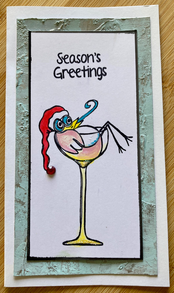
I chose to use images from the stamp sets EDY25 & EDY26 by Darcy as I just love their quirky nature.  I wanted to make simple but fun cards.


The top two cards have a background that I created. This was to be the beginning of my project but as usual it took a turn on its own and turned out completely differently!!

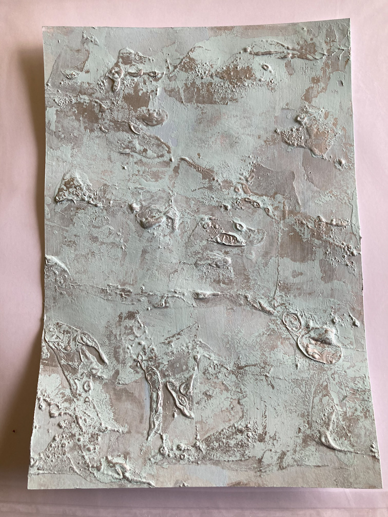
I made the background using Smoothy Heavyweight cardstock.  I started with a layer of Paper Artsy Fresco Finish Paint in Cloudy and a metallic paint in silver.  Before the paint dried completely I used a heat gun over the metallic paint to cause it to bubble and create this wonderful effect - I was thinking of snow and ice at the time.  (This only works with metallic based paints).


I painted over it with Paper Artsy Fresco Finish - Blue Moon and before it dried, wiping away the paint on the bubbled areas that I wanted to highlight.
I then covered the whole piece with Paper Artsy Fresco Finish Crackle Glaze for an extra effect.


I loved this effect and spent a couple of days deciding what I was going to do with it!! I decided to use it as a background for cards.

Using the same Smoothy cardstock I stamped out the images and added highlights of colour.  I have used the following colours: Smurf, Banana, Beanstalk, Limelight, Slimed, Candy Floss and London Bus.


I added some bling dots, liquid pearls and puff paint for snow. Here is each one:


I hope that you have found some inspiration to have a go at these quick and easy but great Christmas Cards.   They would also work well as tags for presents.

Thanks for stopping by, and I hope that everyone has a wonderful and safe Xmas and New Year.  2020 has certainly not been what we expected and fingers crossed 2021 will be kinder to us all.

Lynn 


Monday, 28 January 2019

2019 #1 Mustard: with Cerise and ESA {by Josefine Fouarge}

2019 Topic 1: Mustard


Josefine's project tonight is a brilliant example of how leftover paint and some clever outlining can transfom an art journal page using stencils and brayers. Stockist info for all the new 2019 products are available here

Hi everyone, Josefine here and today's art journal page is very colorful. I decided to pair the Fresco Finish paint Mustard with Cerise as well as with one of the latest Seth Apter stamps, a stencil by Darcy and some other Fresco Finish paints.

I'm really into bright colours lately and love all the variety of colours that the Fresco Finish paints come in. They just make everything 'happy'. So, I started with one of my clean up pages and ended with this magical wonderland.


This is what the page looked like at the beginning. It's a clean up from a mono printing project where I used Fresco Finish paints in Mustard Pickle (FF148), London Bus (FF37), Vintage Lace (FF18) and Mermaid (FF44) for a tag. As a first step, I added Cerise (FF136) and more Mustard Pickle using a brayer. Of course,that makes orange! Using primary colours to make others is always fun and easy with a brayer!


Then I stamped a variety of circles and postage stamps from Seth Apter's set ESA07 and Scrapcosy's set ESC16.


To pull everything together, I used Fresco Finish paint in Snowflake (FF15) and Vintage Lace and brayered those two colors all over the page.


Once I was done with the background I grabbed the PS104 stencil and added the mushrooms to the page. I used Mustard Pickle as the base and blended a little bit of Cerise to the heads of the mushrooms.


Then I added more Mermaid around the mushrooms and outlined them with a black fine liner.


After adding the birds from the same stencil and a short sentiment, I also added a few circles from Seth Apter's latest stamp set ESA12. They had to fit to the page, so I used again Mustard Pickle and Cerise, created an ombre effect on my craft mat and used that as the ink pad for the different circles from that set.


Finally, I added a few white outlines and some more scribbles to highlight a few of the areas.


At the end the page had something magical, even with the more mechanical looking images from Seth's set. Color can really change how we perceive certain things and it's so much fun to experiment with that.


What fairy tale project are you going to create next? 

Thanks so much for stopping by! Don't forget to come back often as there are so many great projects, sneak peeks and stamp reveals waiting for you.

Facebook: HolyLise
Instagram: @HolyLise
YouTube: HolyLise Designs

Stockist info can be found here from the recent Seth Apter new product announcement