Showing posts with label TS069. Show all posts

Thursday, 9 February 2023

2023 Topic 02: Tetradic Colours {by Autumn Clark} with Zinski Art Stamps


Hi everyone it's Autumn Clark from SewPaperPaint here with you today.  I've had a lovely time playing with paints lately. This Tetrads topic was a new concept to me and I had to Google it, which led to some fascinating discoveries. I would urge you to do the same and take a second look at the Introduction Post HERE, which shares such a wealth of information.  I decided to break out my new collection of Zinis, Elena Zinski's darling house stamps, and I am looking forward to sharing with you how I combined the two.


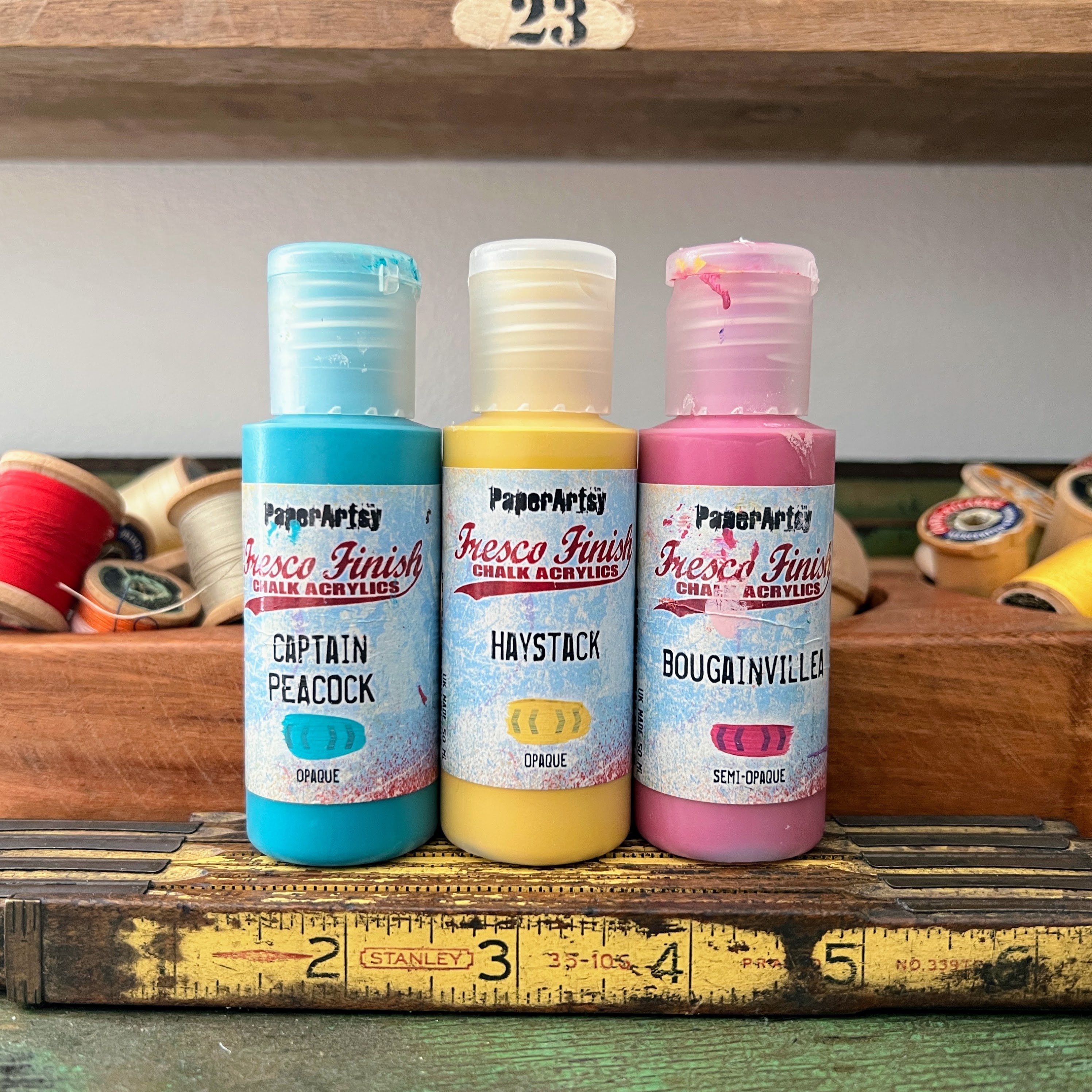
With each color wheel progression, the PaperArtsy bloggers have been encouraged to experiment with different primary shades. This was a real challenge for me! My very literal brain had trouble selecting non-pure primaries, but I switched up a little with PaperArtsy Fresco Finish Chalk Acrylic - Haystack (FF02), a warm and rustic yellow, PaperArtsy Fresco Finish Chalk Acrylic - Captain Peacock (FF110), a turquoisy blue and PaperArtsy Fresco Finish Chalk Acrylic - Bougainvillea (FF93), a deep pink. I was pleasantly surprised by how these colors still made for a somewhat traditional color wheel in the end, with all the classic colours identifiable.

I knew when I first saw the Elena Zinski release post HERE that I wanted to create an exploding card box. I was waiting on the perfect opportunity to create such a box. Originally, I designed a larger box, but had to scale it down to better fit the stamps. I cut a sheet of watercolor paper to 11x9" then scored on the 11" side at 4" and 7". I scored on the 9" side at 3" and 6", then cut the corners away and the longer sections into points as shown. I cut a roof for my box at 4.5 x 3.25" and scored along the 4.5" side at 2.5". 


Here are the latest Zinis from Elena Zinski's Art, ZN 49 to 56. It's hard not to fall in love with this selection of stamps with so many quirky house designs. I love that just one house could be colored a different way and look like a totally different stamp!


I purchased a new palette, as my smaller, older palette only had 10 sections and it's easier to work through the printable color mixing wheel (which you can find HERE, in the Files section of the PaperArtsy People Facebook Group) with a 12-section palette. Next time I think I'll stick to a paper plate because I found this larger palette to be cumbersome on my small work table.


I noticed my mixed colors lent to some pinky oranges, a "perfect" purple and really lively greens.

I chose a square tetradic palette as I felt like I could go in any direction with it. I painted the three possible square combos in columns and decided on the center one because I really liked how the pure PaperArtsy Fresco Finish Chalk Acrylic - Haystack (FF02) brightened up the palette. The finished colors are represented in blocks 1, 4, 7 and 10.


I was trying to decide on the best way to use my mixed colors to decorate the many houses, so I added them to my gel printing plate, as shown, and pulled a couple of prints.


One of my prints didn't pull very well, so I took a paint brush and blended some additional color onto the paper. I decided at this point to lighten things by adding in a touch of PaperArtsy Fresco Finish Chalk Acrylic - Cloud 9 (FF149). I always try to add a touch of black and white to most projects for balance.  This gave me a stampable, precolored surface for my houses.


I painted the front of my house box, intentionally omitting the blended Bougainvillea color so that that color would really pop when the box was opened. I added some water to lighten areas during blending.


And you can see the color does really pop inside!


l incorporated the Tracks theme into my project by creating a row of stones as a path around the garden inside of my box. I sponged Cloud 9 through PaperArtsy Stencil 102 by Sara Naumann (PS102).


I stamped the tiny flowers from (Elena Zinski) Zini mini stamp 54 (ZN54) along the edge of the grass and stones.  I also stamped and cut out the trees from Zini mini stamp 52 (ZN52). I cut a small strip from my gel printed paper and rolled it into a circle with some small flaps to adhere it to the center of the garden. I added stamped shrubs around the adhered trees.


I ran into an unexpected complication of needing larger flowers to fill in the garden. I chose PaperArtsy stamp set by Tracy Scott (TS069). You can see here the color variation from the gel prints.


Now it was time to get my houses arranged! I used my stamping platform to repeat stamp the images onto my gel prints, for a super vibrant black outline. I used Zini mini stamp 49 (ZN49), Zini mini stamp 50 (ZN50), Zini mini stamp 51 (ZN51) and Zini mini stamp 56 (ZN56).
 

I had glued some scallops to the edge of my roof to hold the box shut. I used plain black cardstock for this and wanted to add some additional detail in the background, so I stamped PaperArtsy Mini stamp 122 (MN122) in the coordinating ink color for each side panel and in embossed white. I chose this stamp because it mimicked tile or brick and flowed with the Tracks theme.

As a final touch, I painted the house windows white to tie in with the embossing and gave the roof a splash of watery Cloud 9.


I gave the inside of the box a splash of the same and a second splash of Haystack.


I don't always use bold colors in my creations and was challenged by the vibrant colors I had mixed. I think the addition of white and black helped balance the rich color. I've seen exploding card boxes and thought the house box idea would be a unique twist. It turned out to be very simple to work out. I would have liked to have some floating or pop up elements inside the box and think next time I could use acetate to make hidden hinges or floaters. Our goal as bloggers is to encourage you to try an idea and we hope that you will take it to the next level. Mine was an experiment and yours will be a triumph! I hope both this color wheel and project idea have inspired you today and your mental "Tracks" are kickstarted.

xx, Autumn


YouTube: SewPaperPaint
Facebook: Autumn Clark
Instagram: @sewpaperpaint
Pinterest: SewPaperPaint


Sunday, 8 May 2022

2022 Topic 07: Specimen Jar {by Keren Baker} with Tracy Scott stamps


Hi everyone, it's Keren Baker with you today, and I'm here to share with you a dimensional project exploring the relationship we have between feeling contained and how we contain ourselves by the choices we make in our lives.


With our topic being about specimen jars it was originally suggested I could look at creating an art doll from a jar. The idea of drilling into glass to connect little jars to create a doll had me scratching my head or the other option was how I could incorporate the jar without simply just placing the doll inside. I had the choice of Tracy Scott's lovely stamps and her newest ones with the wedge design had the potential for art doll clothing. 


To start off, I thought about how I would tell the story and grabbed a combination of different sized jars, all the colours I wanted and a couple of extra stamp sets to complete the project.


I thought creating the art doll would be easy. Just draw a sketch - I wanted her to be tall, willowy and slightly different. I cut her out, sewed using a smaller stitch (really important if you're tugging it around when stuffing) and then turned her out.

Right- don't do what I did. You really need to make a doll in pieces and then attach for ease. This was so tricky trying to turn her. Once done- she looked exactly like an American Footballer linebacker! She needed a face and I found one the perfect size in MN36 but she had a hat and hair so I needed to create a simple mask to stamp through.


Once partly stamped and partly stuffed I had to make her look a little more lifelike. I liked her legs and arms being unstuffed so left them that way. I had to pick some wool and sew the hair...which would you have chosen?


For adding colour to her face, I experimented a little and found that Prismacolor pencils work beautifully with mercerised cotton. Just add thin layers of colour just like you would for any other project. She needed a crown and a way of cinching in her neck a little. I searched for the tiniest stamps and found the perfect candidates in MN112. I coloured them with Copic markers, trimmed them out and added them to a hot pink crown made from wire.


Now I had my basics I had to make some decisions about how I was going to communicate my idea, so I went to the specimen jar next. It was designed for sweet treats but it was to become her (I named her Willow) self-made prison. I wanted her to feel trapped by her surroundings but actually she was freer than she'd imagined, she simply filled free parts of her life with things that cluttered her space and ironically those things that she chose were trapping her further.

I had wanted to use Frosting Glaze with the glass specimen jar and originally thought I'd stencil it but wanted to use the TS069 floral set to add a little texture to the look and get the viewer to look a little more closely. To add the Frosting Glaze I simply brayered it onto the stamps and pressed the stamps without using an acrylic block so the stamp hugged the curves of the glass.


You can add colour to the glaze, but I wanted a very subtle finish. It's hard to capture in a photograph, but this will give you an idea.


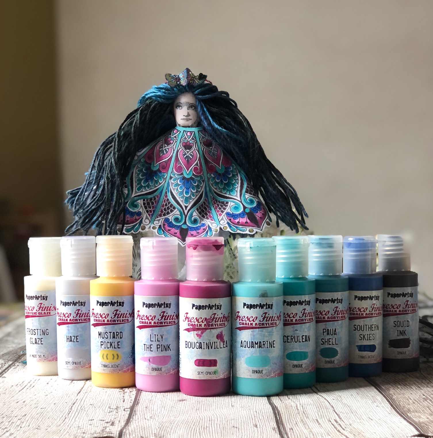
Willow was looking a little chilly so I grabbed some more white cotton and a bunch of paints. Here's the queen Willow with all of her colours. Aquamarine, Bougainvillea, Cerulean, Mustard Pickle, Paua Shell, Southern Skies, Squid Ink and two of Tracy's new colours Haze and Lily The Pink.


When painting onto fabric- it's helpful to lightly spray the fabric or add a little water to the paintbrush before painting. What is brilliant is the ease in which Fresco Finish Chalk Acrylics lay down on fabric and even better, how the fabric is still wonderfully pliable afterwards.
I tend to use Stazon ink with fabric (unless I was using alcohol markers) and then iron it to make sure the ink is properly set. I did use a stamping platform to make sure I got a blacker image as the fabric tends to suck the ink in initially.


Looking carefully at the photo above, you'll see that there's a little bleeding. It's an easy fix- just allow the area to dry and then add paint over the top to correct the 'damage'. I loved the scalloped edge and wanted to keep it. I was going to add this layer onto a circular piece of fabric so added some Bondaweb which meant I could cut it out without the edges fraying. In the end I simply stamped another 4 wedges and sewed both stamped panels together to create an almost circle. At this point I realised that her shape, the pointy toes and the fact I'd almost created a poncho reminded me of an Irish dancer, so that was vibe I continued with (forgive the pink ballet shoes- I know Irish dancers wouldn't wear those).


I needed to group the individual elements to make sense of what I was trying to do. Willow's complication is that she clutters her life with all the things that don't matter. She gathers 'stuff' and buys so many things that weigh her down rather than free her. The things that really matter aren't ever 'things'. So I wanted to use tiny jars filled with 'nothings' to crowd Willow inside the jar.

I wanted to use the beautiful labels set by Gwen Lafleur EGL17.


Stamping on glass is easy. Stazon is your friend again and the easiest way to transfer ink is to roll the mini jars along the stamps maintaining a downward pressure whilst you roll.


I wanted to add white Stazon inked images plus the new printed tissue paper from PaperArtsy, secured onto the jars using Matte Glaze- one layer under and one on top of the tissue paper. Allow to dry.
Here's how they all look together.


Here's Willow, crushed by the things she purchases and consumes.


The last thing I had to do was add a little tag to the somewhat bare specimen jar lid. I added an acetate tag using TS069 flowers and EGL17 tags. I'd used up the left over paint from the painted fabric onto some Smoothy Heavy weight cardstock and then stamped and added Prismacolor pencil details. I finished it off with a few beads.


I really love creating art that makes me think whilst I'm creating it. It is well worth reflecting on what we purchase, consume and what we hold onto in our lives that weighs us down. How would you artistically express the tension between what we buy to enjoy, what we overconsume and what holds us back from freedom?

Keren x