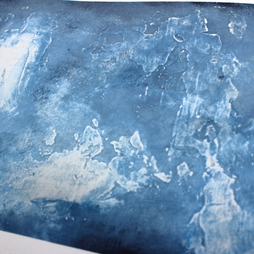
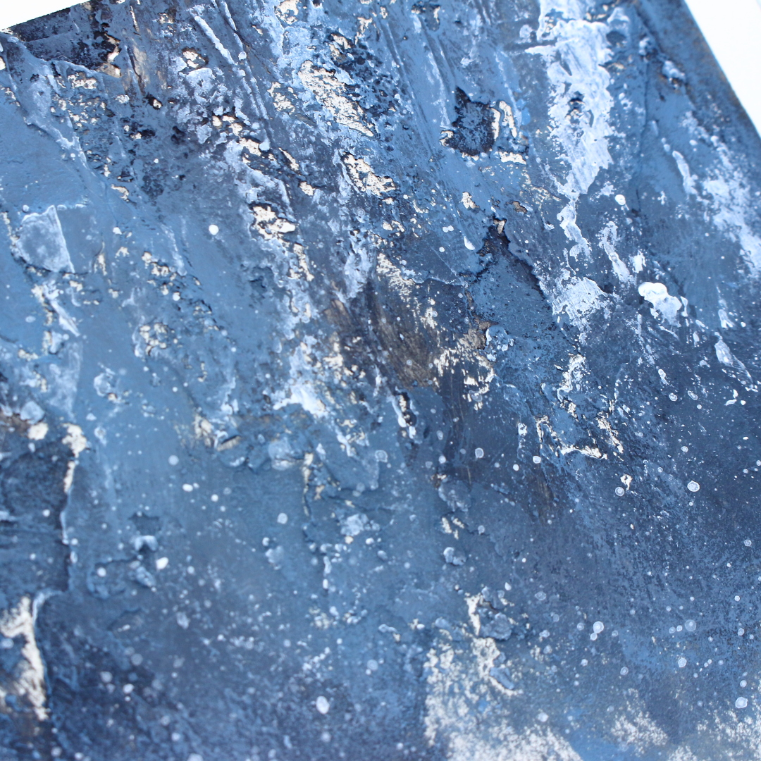
Hi everyone, Peley Renata with you today and I have prepared something really fun for this blog post. This won’t be the first time (nor probably the last) I tell you that I did something new, out of my usual style or comfort zone. I feel like blogging for PaperArtsy has been a great motivator for me to expand my knowledge and my skills. So, let me share my newfound knowledge with you.
Perhaps this project seems simple enough, but let me show you the ways I have explored the colors and textures of this month’s topic.
For this topic, I felt like my starting point should be some research.
As we are exploring variations of blue color, in particular PaperArtsy Fresco Finish Chalk Acrylic Paint Surf’s Up (FF146), I will talk about the shades of this color.
I think many of you, same as me have mixed up the terms 'shade', 'tint' and 'tone' so first let’s define what does a shade of a color mean.
Shade is a hue (pure colour) or mixture of pure colors to which only black is added.
Shade darkens the color, but the hue remains the same. When mixing a shade, we begin with the color itself then add black one drop at a time.
To better understand what I mean, take a look at the picture below.
Now that we understand what the shades of a color are, let’s start mixing PaperArtsy Surf’s Up. For making shades, I had to add pure black color which is PaperArtsy Fresco Finish Chalk Acrylic Little Black Dress (FF19).
On the image above, you can see the various 'shades' of Surf’s Up that I have achieved. This is a very basic and not too precise palette that I have made as I have eyeballed the amounts of the paint. For instance, I know for sure I could have achieved a few more brighter shades, and I encourage you to try it yourself.
Before I start focusing on my project, I wanted to do some experimenting first.
This quarters’ topic is ‘textures’ and I think that is a topic on which we all from the PaperArtsy team could write blogs all year long, but let’s start simple.
For creating texture, I chose only a few simple tools: PaperArtsy Grunge Paste (GP190), my chosen acrylic paints, a couple of brushes, paper napkins and a palette knife.
I made six experiments and I will tell you a couple of words about each of them. I have also prepared a video on which you can see my process for each of these backgrounds.
For each project, I used heavy weight (300gsm) smooth paper and some Grunge Paste. But I made sure to apply the paste and the paint in different ways. So, let’s start.
Example #1
Here I applied a thick layer of Grunge Paste in a vertical line and I made some deep marks on the paste with the side of my pallet knife.
I applied the paint with horizontal brush strokes, going from long brush strokes with lighter shades to shorter brush strokes with darker shades.
When the paint was dry, I added some splatters with the PaperArtsy Fresco Finish Chalk Acrylic Snowflake (FF15) and I have removed a thin layer of paint from my textured area with a sanding block for contrast.
Example
#2
In this case I have applied the Grunge Paste while trying to smooth the edges of the paste so that textures wouldn’t be too rough and bumpy. I did this dry, but if you mist water over GP, that is another way to create a very silky smooth surface with this product.
The paint was next applied with a dry brushing technique with a wide, flat brush going from brighter to darker shades. I tried to keep darker shades mostly towards the edges of my paper. When the paint was dry, I once again used sanding block to remove paint from the textured areas.
Example
#3
In contrast with the previous experiment, I
applied Grunge Paste while making sure that my textures would be as rough and bumpy as possible.
For this and the next experiment, I tried layering the paint a bit differently. I have first applied darker shades and then the brighter shades over them. To accentuate the textures, I have added a bit of white acrylic paint in the end.
Example
#4
Once
again, I have applied a very thick layer of Grunge Paste and made deep,
vertical impressions on it. While drying the Grunge Paste, I have noticed that
it doesn’t bubble up under the heat as some other texture pastes might. Some
people like this effect while others don’t, so it is just something to be aware
of.
(TIP from Leandra: Grunge Paste is very stable when dried with a heat tool because it is clay-based, not plastic! Generally it is plastic products that will bubble. However, if you want to create cracks and fissures in Grunge Paste, spritz the GP generously with water while it is wet, then use your heat tool to dry the GP fast. The underlayer will dry first because the water stops the very top section from drying. As you dry you will see cracks appear, and sometimes you might also get bubbles, this just depends on the heat tool intensity that you use, the thickness of the GP, and the amount of water you mist)
As I said, here too I was applying paint going from darker to brighter shades, but this time I used a pallet knife for painting. One fun way to create texture with your paint is to apply it in a thicker layer and lightly tap it with your pallet knife. I think it creates really pretty and fun textures. Since this kind of texture is not too noticeable, I used white acrylic paint to accentuate it.
Example
#5
Another cheap way to make interesting
textures is to use paper napkins or tissue paper. I have separated the layers
of my napkin and used only one layer. It is very thin and delicate. I used
matte medium to adhere it while making sure to wrinkle my napkin and make as
much texture as possible.
For applying the paint, I used the pallet knife. I really enjoyed how the paint gets stuck in all those texture nooks and crannies. Once again, I didn’t resist using white paint to accentuate the texture.
Example
#6
Now last but not least and perhaps even my favorite one. This time I have combined the texture made by adhering the paper napkin with Grunge Paste that I applied over it. This way I had two types of textures.
In this case, I was going a bit back and forth with adding darker and lighter shades. I also applied some white paint and a bit of white splatters. For applying the paint, I used dry brushing technique.
I came to the realization that I really enjoyed how the various shades of Surf’s Up can look with the dry brushing technique. As far as texture making goes, my favorite technique was the mix of paper napkin and Grunge Paste, so these are the things that I am going to try to replicate for my canvas.
You all know how important the size of your
focal image is compared to the substrate. And since I am very bad at eyeballing
the sizes, I decided to first make the focal image before choosing my canvas.
The whole inspiration for this project for me
came from the PaperArtsy Hot Picks stamp set HP2102. So, the first step was to
stamp this image. I decided to give it a more astral look by heat embossing the
circle around the girl on a vellum paper with gold embossing powder, then I
embossed the girl on simple white paper with black embossing powder.
Now of course I fussy cut both of the elements and adhered them to each other. This way my focal image was ready to help me with deciding on the canvas size. For this project, I chose to work with 20x25 cm (7.8x9.8 inch), but honestly it doesn’t matter much as you can see what size fits the best for your own imagination.
After choosing the canvas, I started preparing for the fun part – texture making.
As you can see, I prepared two pieces of paper napkins, matte medium and an old brush. When adhering the napkin, I really did my best to make a lot of wrinkles. Also, I didn’t have fully white napkins at home, just some children cartoon-themed ones so you can see a bit of the color on my canvas at this point (sometimes even the second and third layer of the napkin can have a bit of the color from the print), but that didn’t worry me as I will fix that with some white gesso.
In some other cases I would even leave the canvas as it is, with that napkin coloring and that might have been an effect of its own. But this time I really wanted to focus on achieving those beautiful shades and didn’t want those colors to be corrupted by the napkin print, so I have covered the canvas with white gesso, and on certain, more colored areas even added two or three layers of it as well.
And now let’s not forget about the PaperArtsy Grunge Paste. I have applied it mostly randomly and over areas where I felt that the paper napkin had created a bit too sharp lines. And I don’t know about you, but I am totally in love with how this project looks so far. In my mind, this kind of background gives a perfect opportunity to show all those lovely shades of Surf’s Up.
For applying the paint, I went with the dry brushing techniques as planned. I have placed a big blob of Surf’s up on the craft mat and a smaller one of The Little Black Dress. For the very first layer of paint, I placed pure Surf’s up, but for every next layer, I was adding more of the black color bit by bit. I covered the majority of my canvas with the first layer but with each darker shade, I was moving more towards the edges of the canvas. This way, all the various shades can be found over the surface of my canvas.
Sometimes it can be hard to take photos of every layer of shade, but I do have a full process video on my YouTube channel, where you can get a even more clear image of what I was doing.
When the paint was dry, I grabbed a sanding block and very gently sanded off a small amount of the paint on the more textured areas. It gave an effect of some highlights. I really liked these brighter areas so using a pallet knife, I applied very small amounts of PaperArtsy Fresco Finish Chalk Acrylic Paint Snowflake (FF15) on the textured areas but also in that brighter area on the left. Of course, I felt a couple of white splatters were necessary as well. 😊
To be honest, I was really enjoying my background as it was, but me wouldn’t be me if I didn’t have to add a couple more details.
As
you know, before starting to work on my canvas, I made my focal image. There I
did heat embossing with gold and black embossing powder. Now was the moment to
connect my focal image with my canvas and for that, I needed some gold details
on my background as well.
To
achieve that, I have used Windsor & Newton Ink in Gold color and PaperArtsy Hot Picks stamp sets HP2102 and HP2103. The idea was to copy that same golden pattern
around the girl’s head to the background.
And once again, I had to add those very irresistible splatters, this time in gold.
I
really don’t understand why it is that way for me, but very often I feel these
kinds of projects incomplete without a word or a sentiment. I could have
completed my project before placing the image, but as soon I added the picture,
I felt the text become necessary.
And
what has to be done, has to be done. For the text, I just chose the word
“imagine” which comes from the PaperArtsy Stencil PS100 designed by Sara
Naumann.
Well
guys first of all, this was a very long blog post so thanks to all of you who
stayed with me until the end. This was such a learning process for me, so I
really do hope I managed to pass some of this knowledge to you as well. And to
be honest, my head is still spinning. First, if you just look at those shades.
The beauty, the richness of color that we achieved… and then we have those
gorgeous textures which even more accentuate the colors… I mean, I know it is
silly to self-praise but I just love everything about this project. I enjoyed
experimenting, playing, learning and I enjoy the end result. The next level for
me is to try to replicate something like this on a bigger scale and make a
larger canvas (again in blue color as it is one of my favorites, just perhaps
experiment with making shades with a different blue color) and see how I deal
with texture making there.
Anyway, I hope you enjoyed my creative process and that I have managed to inspire you to try some experimenting with colors and textures as well.
Renata 💜
As I have previously mentioned, I have prepared two videos as well. In one of the videos you can see how I am learning and experimenting with colors and textures, while in the other one I am applying my newfound knowledge to make a beautiful canvas using some fun mixed media techniques combined with beautiful PaperArtsy stamps and stencil.
Hi everyone it's Autumn Clark from SewPaperPaint here with you today. I've had a lovely time playing with paints lately. This Tetrads topic was a new concept to me and I had to Google it, which led to some fascinating discoveries. I would urge you to do the same and take a second look at the Introduction Post HERE, which shares such a wealth of information. I decided to break out my new collection of Zinis, Elena Zinski's darling house stamps, and I am looking forward to sharing with you how I combined the two.
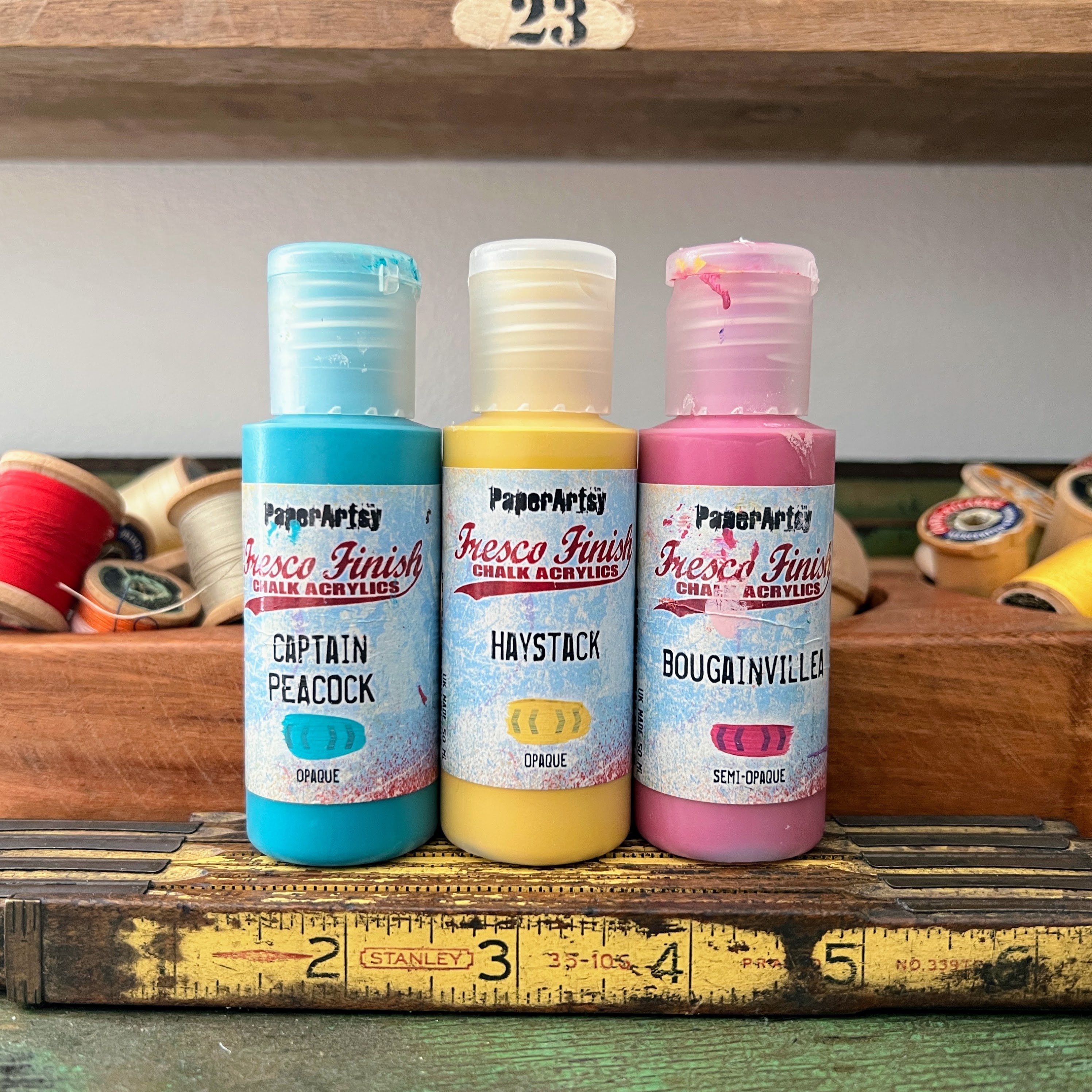
With each color wheel progression, the PaperArtsy bloggers have been encouraged to experiment with different primary shades. This was a real challenge for me! My very literal brain had trouble selecting non-pure primaries, but I switched up a little with PaperArtsy Fresco Finish Chalk Acrylic - Haystack (FF02), a warm and rustic yellow, PaperArtsy Fresco Finish Chalk Acrylic - Captain Peacock (FF110), a turquoisy blue and PaperArtsy Fresco Finish Chalk Acrylic - Bougainvillea (FF93), a deep pink. I was pleasantly surprised by how these colors still made for a somewhat traditional color wheel in the end, with all the classic colours identifiable.
I knew when I first saw the Elena Zinski release post HERE that I wanted to create an exploding card box. I was waiting on the perfect opportunity to create such a box. Originally, I designed a larger box, but had to scale it down to better fit the stamps. I cut a sheet of watercolor paper to 11x9" then scored on the 11" side at 4" and 7". I scored on the 9" side at 3" and 6", then cut the corners away and the longer sections into points as shown. I cut a roof for my box at 4.5 x 3.25" and scored along the 4.5" side at 2.5".
Here are the latest Zinis from Elena Zinski's Art, ZN 49 to 56. It's hard not to fall in love with this selection of stamps with so many quirky house designs. I love that just one house could be colored a different way and look like a totally different stamp!
I purchased a new palette, as my smaller, older palette only had 10 sections and it's easier to work through the printable color mixing wheel (which you can find HERE, in the Files section of the PaperArtsy People Facebook Group) with a 12-section palette. Next time I think I'll stick to a paper plate because I found this larger palette to be cumbersome on my small work table.
I noticed my mixed colors lent to some pinky oranges, a "perfect" purple and really lively greens.
I chose a square tetradic palette as I felt like I could go in any direction with it. I painted the three possible square combos in columns and decided on the center one because I really liked how the pure PaperArtsy Fresco Finish Chalk Acrylic - Haystack (FF02) brightened up the palette. The finished colors are represented in blocks 1, 4, 7 and 10.
I was trying to decide on the best way to use my mixed colors to decorate the many houses, so I added them to my gel printing plate, as shown, and pulled a couple of prints.
One of my prints didn't pull very well, so I took a paint brush and blended some additional color onto the paper. I decided at this point to lighten things by adding in a touch of PaperArtsy Fresco Finish Chalk Acrylic - Cloud 9 (FF149). I always try to add a touch of black and white to most projects for balance. This gave me a stampable, precolored surface for my houses.
I painted the front of my house box, intentionally omitting the blended Bougainvillea color so that that color would really pop when the box was opened. I added some water to lighten areas during blending.
And you can see the color does really pop inside!
l incorporated the Tracks theme into my project by creating a row of stones as a path around the garden inside of my box. I sponged Cloud 9 through PaperArtsy Stencil 102 by Sara Naumann (PS102).
I stamped the tiny flowers from (Elena Zinski) Zini mini stamp 54 (ZN54) along the edge of the grass and stones. I also stamped and cut out the trees from Zini mini stamp 52 (ZN52). I cut a small strip from my gel printed paper and rolled it into a circle with some small flaps to adhere it to the center of the garden. I added stamped shrubs around the adhered trees.
I ran into an unexpected complication of needing larger flowers to fill in the garden. I chose PaperArtsy stamp set by Tracy Scott (TS069). You can see here the color variation from the gel prints.
Now it was time to get my houses arranged! I used my stamping platform to repeat stamp the images onto my gel prints, for a super vibrant black outline. I used Zini mini stamp 49 (ZN49), Zini mini stamp 50 (ZN50), Zini mini stamp 51 (ZN51) and Zini mini stamp 56 (ZN56).
I had glued some scallops to the edge of my roof to hold the box shut. I used plain black cardstock for this and wanted to add some additional detail in the background, so I stamped PaperArtsy Mini stamp 122 (MN122) in the coordinating ink color for each side panel and in embossed white. I chose this stamp because it mimicked tile or brick and flowed with the Tracks theme.
As a final touch, I painted the house windows white to tie in with the embossing and gave the roof a splash of watery Cloud 9.
I gave the inside of the box a splash of the same and a second splash of Haystack.
I don't always use bold colors in my creations and was challenged by the vibrant colors I had mixed. I think the addition of white and black helped balance the rich color. I've seen exploding card boxes and thought the house box idea would be a unique twist. It turned out to be very simple to work out. I would have liked to have some floating or pop up elements inside the box and think next time I could use acetate to make hidden hinges or floaters. Our goal as bloggers is to encourage you to try an idea and we hope that you will take it to the next level. Mine was an experiment and yours will be a triumph! I hope both this color wheel and project idea have inspired you today and your mental "Tracks" are kickstarted.