Hi everyone, Dounia here with another colour topic. So far in 2022 and 2023, we have focused on mixing original and unique colour wheels and using them to select various colour schemes.
A little reminder:
Add some complexity and potentiality to your palette by picking a main colour and the two colours right next to its complementary opposite. More nuanced and still a lot of contrast!
Still choosing three colours, this time evenly spaced on the wheel. Choosing them 1 wedge, 2 or even 3 wedges apart creates lots of possible palettes, from balanced and contrasted to subtle and delicate.
Enter the (sometimes treacherous) realm of four-colour schemes, for more variations and playful options. Always composed of 2 pairs of complementary colours, 3 different configurations (square, rectangle and slim rectangle) create great colour contrast with more (or less) harmony. While the richest, tetradic schemes are not always the easiest to balance so be sure to check all our tips and tricks to it pull off!
This month, we are changing direction to focus on bringing complexity and nuance. We are exploring how by creating variations of one colour. Colours are crucial to crafting so we have being trying to make palette selection easier and fun, as well as pushing you toward mixing your own colours. Now we hope to inspire you to explore value and saturation. We will study the different effects obtained when adding another colour to your main one, ranging from black and white (and blue!), to greys, neutrals and more.
In your own colour adventures, we hope by now you have tried to create variations of all your favourite colours. For this topic, to be really effective and show off the the impact that a single colour can have, we decide to focus on a blue and how it might impact on other colours it is partnered with .... but which one !?
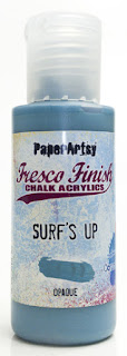
Our team of fabulous bloggers had to work with this colour and 2 others of their choosing. As you probably can guess from the title of this topic, we selected a blue, as it is one of the easier and most popular hues for most people to get to grips with. We wanted something not too bright, not too light (or dark) to get maximum variation. So welcome to the star of this topic, a friend that will pop up in each blog post .... a drum roll for... Surf's Up!
As we delve into this topic, let's help you understand the colour-language that might be new to you. There are words that will crop up a lot over the next few weeks and when used purely in relation to colour, their meaning might be new to you. If you can understand the intention better, it should also help you with your colour explorations.
These words are: value, tint, shade, saturation, tone, hue. How confident are you that you could explain each of these terms in relation to colour? Well, we are here to help!

Colour is generally defined by 3 qualities: hue, value and saturation (or chroma).
Hue describes the “root” or “source” colour. The hue is always one of the 12 key colour places on the basic colour wheel. It categorises the pure colour without any addition of white or black. These hues are the starting point - all other colours can be mixed from them.
If you are a bit confused, think of it as a way to distinguish one colour from an other. When looking at an object, hue is the first colour-words you choose to describe it: perhaps it's blue, yellow-green or purple? All other subtilities in colours then come from variations in value and saturation.
Value describes how light or dark a colour appears. It is based on the value scale between white and black.
If you were to remove the hue from your colour, what grey would you get? That's your value. White is the highest 'value' and Black has the lowest 'value'.
So to apply this logic to colours/hues ... any lighter colour is then said to have high value, while all the darker ones are low value (to remember it, replace 'value' by 'light', or perhaps the word 'highlight' is reminder enough).
One tricky thing to take in consideration is that all the basic hues (core colours) do not start with the same value (light to dark). This is pretty obvious: we already know a yellow is generally a lighter colour than a purple for example, look at the colours in the wheel below, and you can clearly see that yellow on the outer ring is much lighter than many of the other hues around the exterior of the wheel. Adding black to hue of the outer ring, creates darker shades as you move inwards.
Now compare the 'desaturated' colour wheel to the 'primary colours and shades' wheel and you get a better idea of how value can be seen differently from colour to colour:
You might also notice that the 3 primary colours of magenta, yellow and cyan blue (CMYK -colours are used for printing purposes) stand out as the lightest/ highest values on the desaturate wheel too.
Source: Fine Arts Tutorials
Incidentally, this is how tests for colour blindness work!
Colour blind people, while normally able to determine values but cannot perceive certain hues/colours. The well known dotty numbers below are made using colours of the same value, only differing by hue.
If you remove the hues, there is very little to distinguish the contrast between the focal numbers and the backgrounds; and the numbers pretty much disappear!
In art, values from light to dark are essential to create light contrast and depth. It is not always easy to divorce it from the colour contrast creates by hues, especially bright ones. This is why historically classic art studies first focused a lot on pencils and charcoal drawing, where the only contrast comes from values.
Nowadays, pretty much any basic image software can transform a full colour picture into a grayscale one. It can be a great tool for creatives to check their values without the distraction of hue/colour. For example in this study, Chris Carter could compare the model photograph above with his painting below. The spools in the photograph have more obvious shape and stand better against one another because the value range of the photo is greater than in the painting. By his own admission, Chris wanted to preserve the brightness of the oranges and reds and was a bit too cautious of lightning and darkening them, resulting in a mush flatter result, where most have similar value.
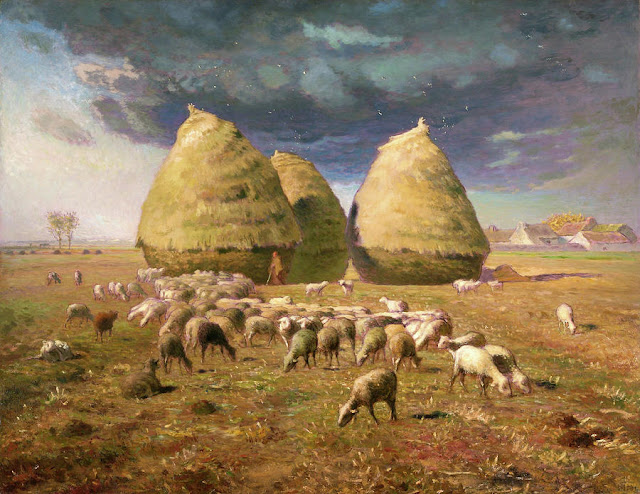
Values are key to creating volume and light effects in your art. In this beautiful pastoral scene by Jean-François Millet, value provides shadows on the hay, and the dramatic clouds in the sky. The middle of the painting, with the hazy sunny horizon and the white sheep, is lighter than the top and bottom. This pulls the eye toward the centre of the painting to discover the lonely silhouette of the shepherd.
Source: Ian Scott Massie
Now, how to play with 'values' in your own colour-world? The simplest method is to add white or black to your hue to change its value. See below for gradients within the 3 primaries of blue, yellow and magenta. If you understood the info explained above, you might be able to spot the starting hues within the white 'tints' and black 'shades' below!
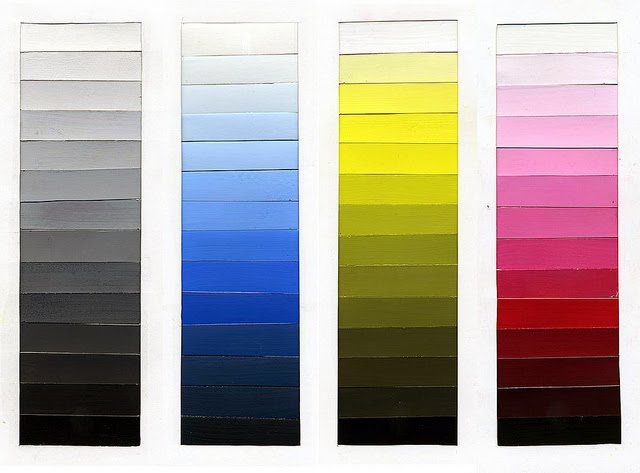
Adding white to your hue creates a tint, and as we shared earlier, adding black creates a shade.
The more elaborate colour wheels often present some of the possible (light to dark) value variations inside the circle of hues. Lets take a closer look...
If you add white to your hue, you will create lighter variations, or tints. Those are incredibly useful to represent catch lights, suggest volume or just create a lighter and calmer atmosphere. You can create a whole gradient with just one colour and white.
Here is an example with red. You can see that red tints (bottom row) are what we would call pink. If the hues are somewhat based on the visible colours found in white light and shown in the rainbow, the differentiation between two colours can be cultural and linked to language. For example, several antique languages did not have a word for blue and it was not considered a colour distinct from white. While English has a separate word for light red, 'pink', which is considered a separate colour, Italian for example also has a widely used separate word for light blue, 'azzurro', which is considered a separate colour to regular blue. All of this to say that, in colour theory, pink is a tint of the originating red hue, and culturally our core understanding of colours can be variable!
Source: Color Meanings
Now if we consider our bloggers' mission in this topic, how would they go about creating tints? Remember that they are playing with Surf's Up as their starting hue.
The
Fresco range actually has 3 different whites you can use to create tints.
Snowflake is a bright white, the whitest of them all, but not the most opaque!
Cloud 9 is a slightly warmer and creamier white, it is a warm white and a bit more opaque than Snowflake.
Chalk is a cooler version, moving a little bit toward the greys, and it is the most opaque of the 3 whites.
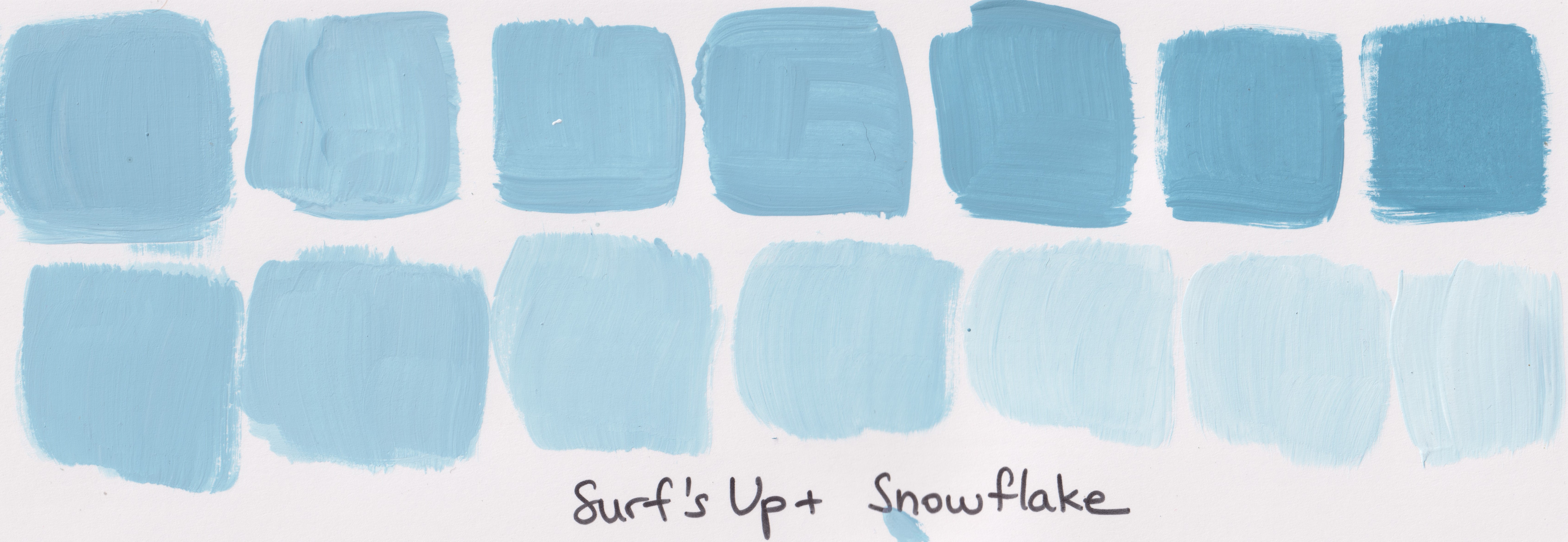
I used Snowflake to give you an idea of possible tints from Surf's Up but these tints can be slightly different depending on the warmth and opacity of the white you choose to use to tint the hue: bright, warm or cool.
On the flip side, adding black to your hue will darken it and create 'shades'. Shades are amazing for creating shadows or perhaps a mysterious and rich atmosphere.
In the Fresco world, this means playing with Little Black Dress.
Starting from the right, and working around to the black, you can see the various 'shades' that can be created.
While they are amazing in conjunction with other colours, shades and tints may be all you need to create a whole project with depth and definition so don't hesitate to play along and create your own colour values!
The third quality of a colour is its saturation (or chroma). Saturation describes how much of the original hue is in the mix, and therefore how 'bright' a colour is.
Think of it as dilution: when you add something to your original colour, it is diluted by the new product and therefore less saturated. A saturated colour will show the original hue a lot, while a desaturated one will be more muted.
Maybe you are wondering: when I add white to create a tint, I am diluting my hue. Am I then lowering its saturation? Well, yes!
Value and saturation are linked and you cannot have a colour that is both very light (or very dark) and very saturated. This is why in this graph of value (lightness) and saturation, you cannot fill all the squares with a sample; only the mid-values have high saturation levels.
As it not very easy for us to dissociate value and hue, here is the completely desaturated (no hue at all in the mix) version of this graph. You can see that each horizontal line is indeed the same value.
Of course, this works for other hues in addition to the red explained above. If all of the variations were represented on the same graph, that would create a 3D representation of the 3 colour factors. Because of the relationship between value and saturation, and the difference in value of base-hues, the resulting shape is not a nice square or sphere but a weird irregular blob...
Variations in saturation create another type of colour contrast, and are essential to make some colours 'pop'. In this harbour scene by Claude Monet, most colours are quite desaturated. The boat and its passengers stand out because they are much darker than the surrounding water, it is a value contrast. However the sun grabs the eye because it is much brighter than the muddy sky. The strong orange contrasts with the greyish colours of the rest of the painting because it is much more saturated.
Source: Claude Monet

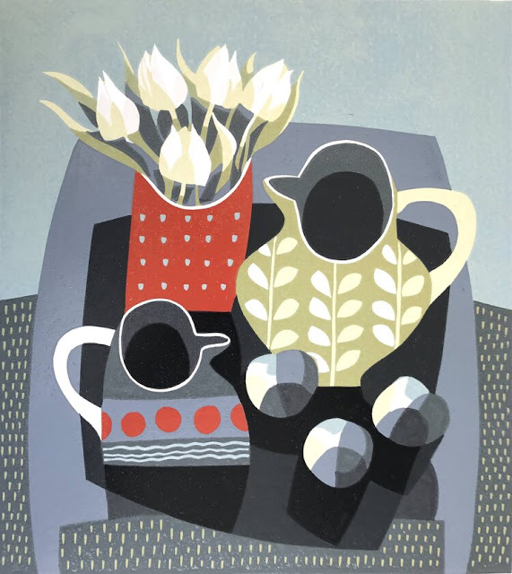
The definition of a tone is a colour created by adding grey to the starting hue.
If the grey you choose is of the same value as your starting colour, you will decrease the colour saturation without changing the overall value.
It just tones down the intensity of the colour, hence the name: tone. This is the most straightforward way to play with saturation.
To create tones with Fresco paint, in order to change the saturation of your colour, you first will want to consider its initial value.
Surf's Up is quite a mid-value, so from the greys available I have selected Elephant, a
medium grey, to limit the lightning/darkening of Surf's Up, and to really show the change in saturation alone (the value remains consistent).
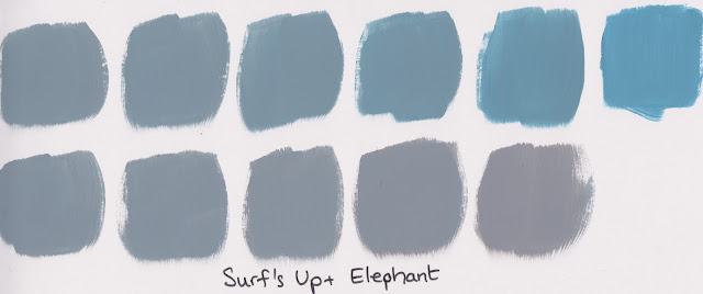
However we have a whole family of neutral greys to play with: Concrete and Koala are lighter and therefore would create new tones while also lightening Surf's Up. Slate, which is a much darker grey, would create darker tones and also lower the value of the resulting colour taking it to a moody place.
Now might be a good time to talk about neutral colours and rich grey colours.
Neutrals grey colours are created by mixing black and white in various amounts. They do not contain a hue and are pure values. Therefore adding them to a colour will change its saturation and possibly its value without changing the hue/colour. This is what I demonstrated earlier with Surf's Up and Elephant to create tones.
Rich greys are made by mixing different hues together (making intentional mud basically). They will generally have a hint of colour to them and will react differently depending on the hue they have in common with the starting colour. For example a slightly bluish (rich) grey will bring out the blue in a purple or a green but will quickly muddy a colour containing its complementary (opposite) colour, orange.
Creating a colour variation with a rich grey is a way to push the boundaries even further and create subtle and sometimes surprising variations. (NB Technically these are not strictly 'tones' because they are not a neutral grey. THey are a coloured grey, so we are 'colour mixing'.
Below you have an example using Haze, which is a little bit of a light-purple-grey, a little bit muddy. It creates a different, warmer effect with Surf's Up than a neutral grey, while extending the visible blue tinge even when Surf's Up is is very diluted.
Other rich greys in the Frescos range are Stardust (a bit greenish) and Steel Grey (a beautiful blue-grey). Again, these would create an interesting colour-mix variation with Surf's up.
Tones are generally pleasing to look at. The majority of colours you see everyday have a little bit of grey to them. It avoids colours looking aggressive and/or clashing but be careful because large areas of muted colours can also feel dull and boring.
So what is the impact of the rich coloured greys? How can you make them? Try mixing orange and blue then lighten with white. Try different blues with the same orange to find another grey. Lighten off to discover the variations. It's so interesting to discover by doing!
Coloured greys are amazing to produce a quiet and sophisticated atmosphere. They are often associated with comfort and luxury. Keep an eye out for them and you will notice them everywhere: interior design, clothing, packaging, even cars! Again, to avoid monotony, be sure to contrast them with a more saturated colour or a complementary hue.

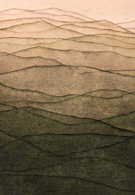
We are now going outside of the classic mixing schemes to explore the effect of adding a ‘neutral’ to your colour. What is a neutral, you might ask? Basically it is a subtle colour with very little hue. Think beige, cream, taupe, everything in that ball park. 'Neutral' does not have a specific, defined thing, there is still room for personal interpretation.
Neutral colours get that name because they are restful and therefore do not distract the viewer. That's why they why they are generally a big deal for interior design, creating comfortable and calming rooms that appeal to the majority, or at least do not rattle anyone the wrong way!
As neutrals are generally created by mixing all 3 primary colours togethers in varying ratios, they can easily be mixed with pretty much any colour to create a new colour.
You will get both some amplification of your main hue and some muddying/softening due to the presence of the complementary colour in the mix. For more info on neutral colours and their use, you can check this article by Color Meanings.
For true Neutrals when playing with Frescos, we recommend Family 16: Eggshell – Stone – Truffle – Taupe – French Roast.
With a lighter colour like Stone mixeed with Surf's Up, you get both a lightening and hazing effect.
With Taupe, a dark colour the results get muddier but lots of different variations are created.
Adding neutrals will create soft, complex colours great for subtle variations and gentle palettes. A 'coloured neutral' is easy to pair and build amazing backdrops to make more saturated colours pop.
In the same concept as 'coloured greys', instead of a true neutral you can start mixing with an already 'coloured neutral' for even more variation and complexity. For example, Buff, while still pretty much neutral, is slightly
warmer than Stone because of a yellow hint in the colour. Mixing it with Surf's Up logically
creates a green effect while still softening the colour.
The Fresco range offers a lot of coloured neutrals that would yield great variations with your favourite main colour.
A few colours softened with the same neutral colour will result in similar undertones, making them work beautifully together and contrast cleanly with black, white and bright hues. This is a great way to create new colours that will all 'play' with each other nicely, because that have that one neutral colour in common within the various colour mixes.
Here, we want to explore mixing with colours
that are slightly outside of the “neutral” range. This is the time for weird, hard
to classify colours. For two different examples, I have chosen Desert Bush (a
muddy, taupe-y green) and the really unusual/ unique Squid Ink (is it purple? Is it wine? Is it brown? How
much grey is in it?)
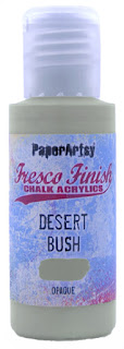
In both examples you can see a definite hue shift due to the green in Desert Bush and the rich Wine tones of Squid Ink, particularly in the second line of each swatch. The variations are unique and gorgeous and would be an incredible base for a sophisticated palette.
There are multiple other choices in the Fresco range that will result in some interesting colour variations: the very dark colours like Pea Coat or Winter Green, the very light colours like Vintage Lace, Hint of Mint or Ice Berg, so we have many options at hand for you to have fun exploring colour mixing beyond white tints, black shades and grey tones!
This is the best way to create mysterious and unique colours for a personal and original look.
To round up this intro, I have also created
an example of what we asked our blogging team not to do!
We were keen to restrict them to stay in the Surf's Up lane and explore “degrees of colour”. We don't often restrict our bloggers, but we hope over the course of this topic to share with you ways to mix variations of a colour
while staying within the same hue of blue. For this topic, colours too far outside of white/black/grey/neutral were not recommended.
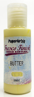
As an example going beyond that lane, here I have used Butter. While pale, it is very much a yellow. Consequently, I have in fact gone back to classic 'colour mixing' between a blue hue and a yellow hue to create green. This is not what we have in mind for this topic.
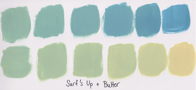
While a little bit of colour shift is expected, we plan to keep to 'degrees' of Surf’s Up as
the core focus.
Of course in your own practice, all types of colour mixing are fair game! We just hope you will want to find out how to create your own colour variations to develop and refine your personal palette, and we also hope that you now have a better grasp of what the outcomes can be when using white, black and grey with a hue.
We hope this topic sparks your imagination and inspires you to try mixing tints, shades and tones and other variations yourself! Be sure to check out the amazing projects our blog team have dreamed up using Surf's Up.
If you want to create along with us we would love to see what you get up to!
You could tag us on Facebook, Instagram @paperartsy , Twitter, or post in PaperArtsy People Group on Facebook. We really love to hear about how the blog topics have inspired you, so don't be shy!!