Hi everyone,
Ellie Knol from PAPER-STAMPS-COLOR here with you today.
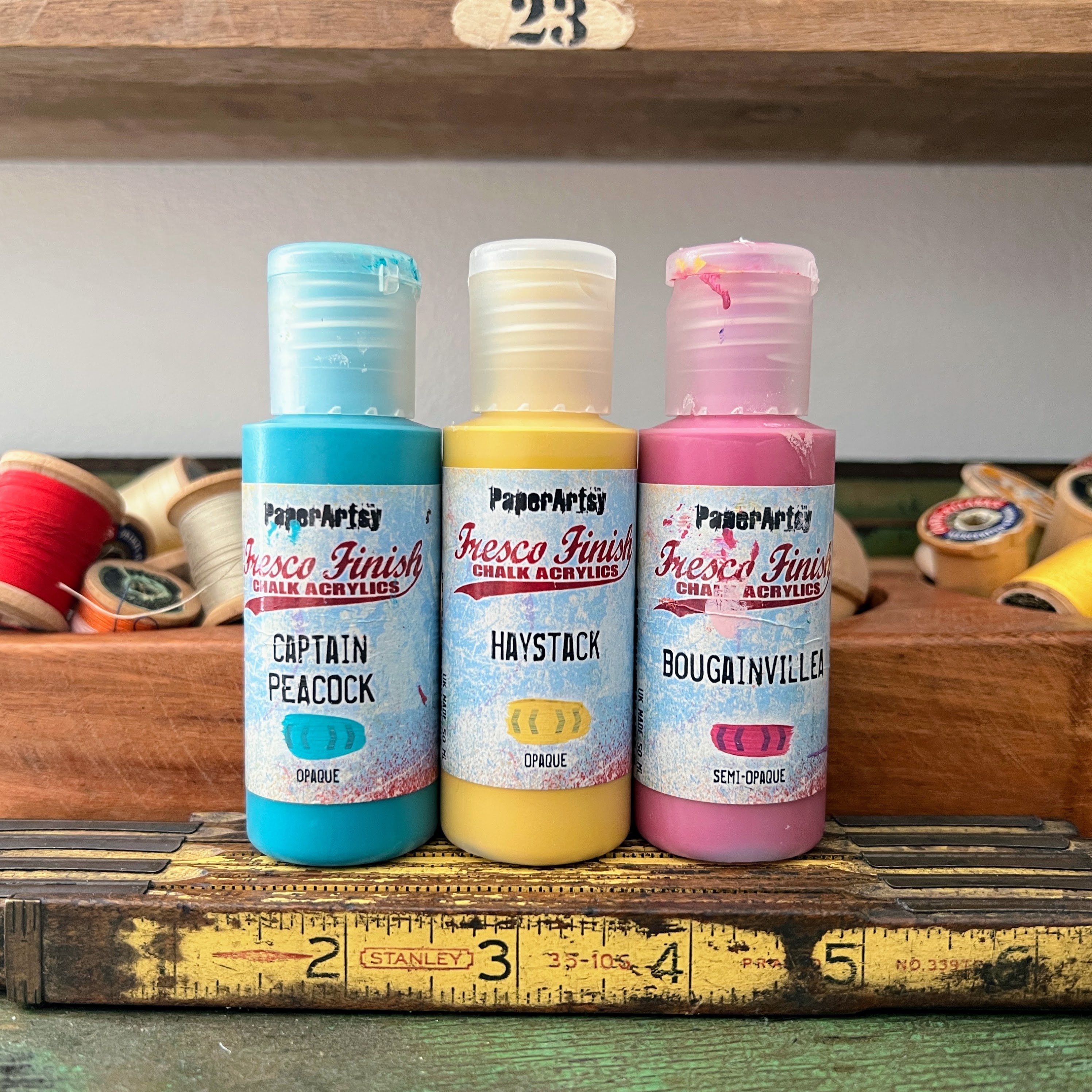
Of course I've been enjoying some creative time lately. This topic 'Tinged Blue' had me thinking about mixing PaperArtsy Fresco Finish Chalk Acrylic (Surf's Up, FF146) with a neutral color, PaperArtsy Fresco Finish Chalk Acrylic (Mud Splat, FF61)
So first things first: as I wanted to share the mixing of the colors to be the initial step, I stamped with these mixed colors and also created some prints on the gelliplate to get me started. By exploring the colors and products normally gets me into a creative flow.
Beware: I did change my mind all through the project (not a problem for me as now I have a lot of stamped fodder left for future projects!)
Beware: I did change my mind all through the project (not a problem for me as now I have a lot of stamped fodder left for future projects!)
Especially making the bottles a little see-through was sort of a challenge.

This home-decor piece turned out quite different to what I'd envisioned, but I enjoyed every step of creating it. I hope you will read through the post and enjoy the techniques and use them as inspiration.
I went with the flow: you'll see!
I went with the flow: you'll see!
How did I get the white-washed effect on the tiny bottles? What substrate did I use to make them, and how did I get them rounded like a real bottle? Read on...

I was not sure what type of project I was going to create, but I chose to play with the beautiful stamps from Gwen Lafleur; bottles and flowers - Gwen Lafleur stamp set 25 (EGL25) and stamp set 27 (EGL27).
I was sure this combination would tickle me into a project I would enjoy making. I also chose to use Gwen Lafleur Mini Stamp 122 (MN122) for some texture.
I was sure this combination would tickle me into a project I would enjoy making. I also chose to use Gwen Lafleur Mini Stamp 122 (MN122) for some texture.


Why did I choose these stamp sets for this theme? I guessed the blue would be nice for the bottles, and the brown for depth. Their mixes open other windows. For texture the mini stamp will do!

I ended up with 6 color mixes; eight colors to choose from now. I was tasked with using a 'neutral' color, so Mud Splat was the direction I went in.
I mixed PaperArtsy Fresco Finish Chalk Acrylic (Surf's Up, FF146) Up and PaperArtsy Fresco Finish Chalk Acrylic (Mud Splat, FF61) onto cardstock, and also painted it onto cardstock to be able to pick out the most suitable mix to stamp images with for the project at a later stage.


This is artsy happiness... (or PaperArtsy happiness).

I also created some prints on the gelliplate to get me started; maybe I will use them as a background?! Or for texture?! .
Having all the collage materials and prints ready, I took the plunge to decide on the type of project: an altered embroidery hoop to create a window (and frame) for a home decor piece.
Having all the collage materials and prints ready, I took the plunge to decide on the type of project: an altered embroidery hoop to create a window (and frame) for a home decor piece.

I ended up using the 50/50 mixes to stamp with; not brown, not blue.. it almost looks like a browny green.

What will the backdrop be? Will I use a background from the prints, or a picture from a magazine or calendar? I had a look through my stash... making them visual and taking a picture of it makes the decision easier.


Here we go.. the fun happens now: combining and assembling all the elements.

... stamping all the flower images with Memento Olive Grove ink...

.. tearing strips from the gelatine prints because I need some texture! Decoupaging strips of the gelatine prints to the inner circle of the frame gives a quite unpredictable and textured feel to it.

Then painting the outer frame of the hoop: I painted it with PaperArtsy Fresco Finish Chalk Acrylic Mud Splat. and then went on to create a window window grid, the bottles would sit on part of this.

What else do I have to create?

Remember: I stamped quite a lot of bottles on paper with the paint mixes, but bottles are transparent in real life.. how to achieve that?!
First step was to find some transparent sheet with a satin surface in my stash; that might be the solution. Stamping onto it was easy; the paint dried pretty quick!
BUT : The substrate is not visible on the background.. what now?
Follow the pictures and you''ll find out how what I've learned!
BUT : The substrate is not visible on the background.. what now?
Follow the pictures and you''ll find out how what I've learned!


I've got myself some fancy vases now:


I stamped the flower images onto a sturdy watercolor paper. The ones that I picked, were then colored and fussy cut. I colored these images with water diluted paints to get a watercolor effect. Arranging them into the 'vases' was a delight all on its own.

A few more pictures ...


Reflections of the sun?! While making pictures the sun decided to appear on part of it through a window...

Can you tell I LOVE the outcome of this home decor piece? It was a happy process!
Creating this project made me realize how even more paint colors can be derived by mixing them. The sky is the limit as to what is possible.
The bottles make me happy!
I LOVE colored glass! I collect green glass bottles: I have quite a few in my collection; so the stamps are right up my street. I just wish I had such an outstanding view through my front window, lol.
I'd love to hear what inspired you and of course I'd like to see what you create! Share with us in the PaperArtsy FB group!
Artists need to have their hands dirty! Have a good artsy day...
The light outside changes the colors to its full glory!!


Facebook: https://www.facebook.com/EllieKnolCrea/
Instagram: https://www.instagram.com/ellie.knol/
Pinterest: https://nl.pinterest.com/ellieknol/