Showing posts with label 2017 Topic 12. Show all posts

Wednesday, 27 December 2017

PA 2017: Blog Year in Review: Topics 9-12


Hello again from PaperArtsy HQ,

we are mid-way through our look back at some highlights on this blog over the past year. And boy have we had a year of fantastic inspiration for you all to enjoy. Throughout the year I get emails, from people telling us how fantastic our bloggers are, and how inspirational their posts are. I love that we have such a large team who represent lots of different approaches to being creative!

Tonight I'm sharing my picks from Topics 9-12. Read on to see what happened.

Leandra 

Topic 9: Aqua

I think Aqua has to be one of the most popular colours EVER! Blue matches every other colour; its bright, pretty, and soft versions are cool and soothing. It's perfection!

My first pick is this amazing beauty by Dounia Large. She always has a wonderful way of reinventing, well, anything!The ways he trapped her fairy under the sea was pure magic!


And I hope you didn't miss this excellent pocket book from Carol Fox!


I really liked how Miriam made this  into a masculine themed card, the contrast of browns with blues is always a great mix!


Alison used teabags as the basis for this canvas! Yes, really! She has been so out-of-the-box creative this year on the blog, she's brilliant! I love this canvas!


Topic 10: Dark to Light/ Contrasts

I think when you moved into the world of mixed media, the biggest lesson to learn, and the only lesson that really helps you come to grips with all the other elements of being creative, is contrast. If you can get 'contrast' right, then everything else falls into place so much more easily. When you have no clear contrast, that is when whatever you make can look like a muddled mess. So eve though it sounds like an odd topic, I think this is a great concept to understand, and the principles apply to interior decor, gardening, even how you present food!

My first pick is this amazing beauty; a beautifully decorated wooden box by Carol Fox. The colour contrasts are clever, and the tones fun and fabulous.


And I hope you saw this Seth Apter inspired panel  by Nikki Acton


I adored how Alison faded her colours from one into the next, very different by blending her contrast, and her stamps as the quote accent fitted the brief perfectly too.


Additionally we saw all sorts of contrasts with Chris's gelli printed flowers! She goes on to turn these into a stunning journal page, the whole piece is totally wonderful!


Topic 11 : Books

Summer is upon us at this point in the year looking back, and the topic was all about books. Never have so many ideas been so different, binding, page sizes...you name it they all had a blast with this topic!
Wendy Malls has a thing for books, and she executes them exquisitely! This Japanese stab binding was superb, and I loved the colour palette and the stamps she chose too.


My heart skipped a beat with Chris's wonderful JoFY book! The bright colours are totally what I adore, but she aslo found hidden birds in Jo's doodled flower heads!!


I fell in love with Kate's Japanese fabric book - stunning layers! Gorgeous colours. Serene Perfection!


Anneke chose a super-soft palette whihc reminded me of ice-cream and she layered up Emma Godfrey's stamps in the most wonderful manner! I love the pop of black in the binding of washi tape between all the pages! Do take a look, its a fun idea with all the pages differing sizes!


Topic 12 : Hybrid Inks

I knew this topic was going to be a pleaser! With Ranger's new Distress Oxide Inks causing a stir, and there are other brands of hybrids too that hit the market in 2017, so we figured it all needed some clarification! At shows this year I was constantly asked about the Ranger inks, and so we demoed a load of ideas and techniques all year long, ending up with some super cool re-inker techniques. Let me share with you how the bloggers got on with them!

My first pick is Etsuko. She shared several ideas with them within her post, all fascinating! Take a look for yourself! Here is just one below.


If you follow Sarah Anderson on Instagram, you will know how much of the year she spent using Oxide inks for her fabulous, minimal mini journal spreads. This card is a reflection of that, many more ink pad tests on her post too.


Helen tried the re-inkers onto all kinds of fabrics, with amazing results!! I adored how the colours looked so vibrant, and when you colour with them, it really is like using paint - except non permanent of course!


Additionally Wanda amazed with this embossing over the inks to create a vibrant pop! 


It is fun to look back on what our genius bloggers have shared with us over the course of a year. This year seems to have zapped by in a blink, but at least the blog remains as the perfect reference tool Don't forget to save the posts that float your boat on pinterest. No excuse now, you'll hit the New Year with a dozen ideas to crack on with!

Leandra 

Sunday, 3 September 2017

2017 #12 {Challenge Winner}

Well hello everyone, Darcy here,


Bit of a change to the scheduled programme for the next 2 weeks. We have a fortnight of new products starting shortly, but first, lets see who won the Hybrid Inks Challenge.

Topic 12: Hybrid Inks Challenge...

The winner is: Marina from My Perfect Life with a lovely mixed media piece, combining tissue, oxides and stamping. 


Email Darcy to claim your prize. Darcydotneedles@gmail.com


So we'll be back here again for some new products, so stay tuned for the next 2 weeks, we have 6 designers releasing Christmas, Halloween and wintery feeeling stamps!

Are you ready???

Friday, 1 September 2017

2017 #12 Hybrid Inks: Autumn Postcard {by Jennie Atkinson}


2017 Topic 12: Hybrid Inks


Jennie decides in this post to use her oxide inks onto a painted background - wathc what happens!

Hi everyone, it's Jennie (Live the Dream) with you today, and I'd like to share with you some experiments using the wonderful new Distress Oxides and PaperArtsy Fresco Acrylic Paint.

Many of you will know how much I love the Infusions and that I find I have a far greater control over the colour and saturation levels when I give the cardstock a coating of Fresco Acrylic Paint. So .... I decided to experiment in a similar way with the Distress Oxides and have been very pleased with the results, especially when combined with Scrapcosy's wonderful new Autumn stamp release.


I will start with the experiments so you can see what I am talking about! I love using PaperArtsy Smoothy Cardstock as it really does hold the ink and water well. Using some ATC sized pieces I splodged the following Distress Oxides on my craft mat and spritzed them with a little water.


This was how the ordinary cardstock picked up the colours - very nice and I like the effect but you know me, I always want to get something a little softer!


But look at the difference when the cardstock has been primed with Chalk Fresco Finish Acrylic Paint .... a much softer colour which sits on top of the paint instead of being absorbed into the cardstock.


Seeing the experimental pieces side by side it doesn't seem possible that I have used the same colours. But I have to admit to liking the softer version which sits better with my vintage style.

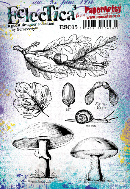
I wanted to create a soft vintage Autumnul postcard using Scrapcosy's Autumn stamp set ESC05 and stencil PS065 from her release back in June. The stamps are just so gorgeously detailed and there are so many lovely elements on the stencil.


For the postcard itself: before using any inks or stamps I primed my piece of 6" x 4" Smoothy Cardstock with Chalk Fresco Acrylic Paint again in order to maintain the same colours for my base. I picked up a minimal amount of colour from my craft mat this time, just enough to hint at a watery autumnul day. I blended some Vintage Photo Distress Oxide lightly through the stencil and stamped text here and there as a second generation inking. Just keeping everything as light as possible.


I went in a bit heavier with colour for the toadstools as I wanted some brighter colours. I managed to find the "best" bits stamping with Archival Black Ink. 


These were then cut out and layered onto the postcard - I just love those gorgeous random splotches of colour and watermarks!


From the pieces which were left over I stamped some acorns .....


..... and then used Grunge Paste through the stencil to create a small sentiment which hides the messy cutting at the feet of the toadstools!


I really love the softness of colour the Chalk Fresco gives the Distress Oxides. As much as I love the bright colours they are not for me, but by combining the two products the result is a beautifully smooth softer hue whist still maintaining the oxidised finish.

I do hope this gives you some ideas as to how you can lighten bright colours to give them a more muted vintage hue by priming the cardstock first. I have to admit to getting through a huge amount of Chalk Fresco Acrylic Paint - I use it as a base for so many projects as it really does give a very different finish to Gesso, but doesn't overpower the project with a base colour.

As always thank you for joining me and here's hoping that the Autumn doesn't arrive just yet! 

Jennie x

Live The Dream

I love how you figured out how to soften the oxides to suit your personal preferences Jennie! This has turned out fabulous, the stamp details really pop beautifully!!


We always hope that you  learn something interesting from our blog. 

Our creative team love to read your comments so much, so please take time to let them know you've been inspired!  

Why not join our 2-weekly challenge by blogging your create response to the current topic and link it here?

The current topic link Topic 12: Hybrid Inks will close 17:00 (London Time) Sunday, Sept 3rd 2017, and the winner will be announced 2 hours later at 19:00.

All links go in the draw to win a £50 voucher to spend on products of your choice from the PaperArtsy online store.

Wednesday, 30 August 2017

2017 #12 Hybrid Inks: Dragonfly Dreams {by Wanda Hentges}

2017 Topic 12: Hybrid Inks


This is a surprising technique. Do take time to watch the video, it is always interesting to see how people apply inks to get oxidised effects. But the resist! Oh my, it really does not work the way you expect, but it's magic! 

Hi everyone, it's Wanda (Art By Wanda) with you today, and I'd like to share with you a large card (5" x 7") using a technique I love with Distress Oxide Inks and Transparent Texture Paste. 

I've been doing this technique since shortly after the Oxides were released including, at first, figuring out why sometimes it worked well and other times not as much (it's important to get enough oxidation).  What I really love about the finished technique is the contrast between the oxidation and the glossy paste - it's fabulous!!!  


I've also embarked on a new journey... videos.  I've made my very first video for this post and it's helpful for understanding the technique fully.


I mentioned in the video that I would share a picture of the finished panel.  Here it is.  Beautiful, huh!!


With PS026, by Sara Naumann


Sara's wonderful new stamps were on the final sample I made (ESN21) 

and stencils (PS062, PS063) have been used for the card.


My plan was to stamp the dragonfly collage directly on the background  in black and then add the colored dragonfly on top.  I did this but did not get a good stamping because first my stamp slipped on the paste and then also the dimension didn't allow complete stamping.  I didn't want to start over but didn't really want the opaqueness of cardstock to hide the mess so instead stamped the image onto colored vellum and lined it up over the first stamping.  This kept things soft and allowed a hint of the background to show through.  The dragonfly (image and word) are stamped with Oxide ink onto Smoothy Card, cut out and layered over the stamped collage.  The wings of the colored dragonfly are brushed with Metallic Glaze Fresco Finish.


To continue the theme of the sequin waste in the stamped image I took some actual sequin waste and painted it with Bubble Gum Fresco Finish Chalk.


Stitching is a wonderful way to add detail to edges!!  I tend to make my stitching crooked on purpose because I'm not so good at keeping it nice and straight.  Going around twice gives it an arty look. 

The Distress Oxide Inks are fabulous whether you are making backgrounds, stamping, or water coloring with them.  Combining them with the Transparent Paste is a whole lot of fun!!!  I hope you will give it a try and that you will share your makes or plays.  I'd truly love to see what you create!!!

Thank you for following along.  Please let me know what you think of the post and the video.  Would you like to see me create more videos?  

Hugs, Wanda

Blog:  https://artbywanda.blogspot.com/
Facebook:  https://www.facebook.com/wanda.hentges
Twitter:  https://twitter.com/WandaHentges
Instagram:  https://www.instagram.com/wandahentges/
Pinterest:  https://www.pinterest.com/wandah/

In love with this technique! Very cool, and interesting that you say it requires a lot of oxidised layer too! I can see a lot of people trying this out! ~Leandra


We always hope that you  learn something interesting from our blog. 

Our creative team love to read your comments so much, so please take time to let them know you've been inspired!  

Why not join our 2-weekly challenge by blogging your create response to the current topic and link it here?

The current topic link Topic 12: Hybrid Inks will close 17:00 (London Time) Sunday, Sept 3rd 2017, and the winner will be announced 2 hours later at 19:00.

All links go in the draw to win a £50 voucher to spend on products of your choice from the PaperArtsy online store.

Monday, 28 August 2017

2017 #12 Hybrid Inks: Vintage-Brights {by Clare Messenger}

2017 Topic 12: Hybrid Inks


There's nothing we like more than a colour palette challenge. Using Vintage stamps with a bright palette is one of those awesome things we totally LOVE, and Clare has created some striking bright-brown contrasts in this piece!


Hi everyone, it's Clare Messenger here with you today, and I'd like to share with you what I discovered using Paperartsy pearl glaze as a resist, used along with Distress Oxides.

I loved that while using the pearl glaze as a resist it  kept the vibrant colours and stamping underneath, peeping through the distressed layer!  Using the glaze through stencils it enabled me to create my inky 'Dream Scene'


Using Wilted Violet, Cracked Pistachio & Broken China I splodged & stamped  using Vintage Ink and dog stamps & stencilled with various Paperartsy Stencils  


I found that after applying the Paperartsy Pearl glaze, through Emma Godfrey's mini masks, I was able to distress the whole piece using Walnut Stain, Distress Oxide. Don't panic! A quick wipe back with a baby wipe tidied up the oxides that were left behind on the glaze.
I really love the combination of textures, you have the earthy, rich matte feel from the oxides and the pearly sheen from the glaze.


I decided to experiment further using different colourways. The post card & poet was made with Broken China, Fosilized Amber & Spiced Marmalade.


Adding more layers of stamping using the oxides and then Versafine Onyx Black gave the project even more depth.


This is quite a dark piece for me so I'm really looking forward to experimenting with some brighter colours and trying out some different glazes to see what different effects I can come up with.  Initially I started off trying these out on index cards to see what colour comobos worked for me and what inks worked well over the top of the glaze.  So I now have a little collection of reference cards with what colours I used.  I think I will be adding to the collection as my experimentation continues! 

Thank you for stopping by today. 
Happy Crafting,

Clare.

Blog:http://craftyclarey.blogspot.co.uk/
Facebook:https://www.facebook.com/ClareMCraftyMoments/
Twitter:https://twitter.com/claremessenger
Instagram:https://www.instagram.com/clarecraftsalot/?hl=en
Pinterest:https://www.pinterest.co.uk/claremessenger/

This is such a great idea with the glaze! Love how that gave you some control over the brown too, and Emma's stencils with such fine detail are perfect! Great combos! ~Leandra


We always hope that you  learn something interesting from our blog. 

Our creative team love to read your comments so much, so please take time to let them know you've been inspired!  

Why not join our 2-weekly challenge by blogging your create response to the current topic and link it here?

The current topic link Topic 12: Hybrid Inks will close 17:00 (London Time) Sunday, Sept 3rd 2017, and the winner will be announced 2 hours later at 19:00.

All links go in the draw to win a £50 voucher to spend on products of your choice from the PaperArtsy online store.