Showing posts with label 2015 Topic 21. Show all posts

Saturday, 8 December 2018

2018 #21 Matchbox Art: Clips and charms with ETS {by Carol Fox}

 2018 Topic 21: Matchbox Art


We are rounding off this topic with a gorgeous sample from Carol using versatile stamps by Tracy Scott. I really hope you have enjoyed this topic as much as me! So many ideas! ~ Leandra

Hi everyone, it's Carol with you today, and I'd like to share with you a Matchbox full of Trinkets. I often add little dangley bits and sticking out elements to my journal pages, as I like the way it makes my overall journal look when it's closed, so my Matchbox contains a selection of these. I have actually made this as a little gift for a friend and I will also add a few collage elements to the finished box too, because as I used a larger sized box (the one that those longer matches come in) there is plenty of room for lot of bits and pieces. Even my Dragonfly is detachable on a long bit of curly wire so it can be used to wrap a small journal.


Closed box with the Dragonfly wire wrapped around the box.


Box Open showing all the little bits that can be added to journal pages and the Dragonfly at the back on his wire.


My background was done with a gelli plate using Deli paper. Here I have used  Fresco Paint in Bubble Gum, Haystack and added detail with  China and stencil  PS015


Stencil PS015 again and Cerise Fresco Paint added. 
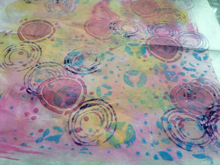

 Last Painty layer and this time I used a stamp from ETS09 and thinned  Eggplant Paint with Satin Glaze to make it a bit translucent.


I stamped with the smaller daisy from the same Stamp Set and then coloured it in with pencils, the pencils go over the fresco paint really smoothly.


I added stamping using ETS21, I then covered my box with the paper, and added stickles and splatters of Snowflake Fresco Paint.


I mainly used stamps from ETS21 to make all my little journal charms,but I could not resist the little House element from SIBM2 as I love the quirkiness of this image and it is one of my favourite houses.


These charms were stamped onto Acrylic shapes, painted with Fresco paints in the same colours as above and then glazed with Glossy accents.


This selection were stamped onto card , coloured with watercolour pens and then a paper clip was sandwiched between them.


My box looked quite flat and boring before I added the Dragonfly, and I do like that he can be removed to .

I found the combination of Fresco Paints and the Deli paper was really good, at the start my paper was quite thin and flimsy, but once it got the Fresco paint on it, it started to take on a thicker slightly leather feel and I felt there was no danger of it ripping as I coloured in my images, and given it I had to remove it from my matchbox once as I got in on very crooked on the first attempt, I felt there was no danger of it tearing so I will be using the combination again when printing paper to wrap things in.

I hope you enjoyed my post and get time to enter into the challenge.

Carol.


To join our challenge and win a £50 PaperArtsy voucher:

Simply make something arty relevant to the topic, and link your creation from any social URL (eg. Instagram, Pinterest, Blog Post etc) sharing your original make to this challenge page.

The current topic link Topic 21: Matchbox Art will close 17:00 (London Time) Sunday, December 9th 2018, and the winner will be announced 2 hours later at 19:00.

All links go in the draw to win a PaperArtsy voucher. Please make sure we can contact you as a prize winner - it helps if you share your contact info from the platform you opt to use.

Good Luck! If you have any questions, don't hesitate to ask!

NEWS FLASH
Annual Sale on now at PaperArtsy
on our new look website

Sale ends Dec 16th
Discount applied at checkout automatically
A good time to stock up, or make your Xmas requests from family.

Saturday, 5 November 2016

2016 #21 Typo Tags {by Jo Myhill}

2016 Topic 21: Typography, Fonts, Quotes

Hi everyone Jo Myhill here. Tonight I'd like to share with you this evening with a post about making master boards with layers to make gift tags.

I love using this technique to build up layers of colour and layers of stamping in different inks, it can be subtle like these or bright and contrast clashing colours if you are that way inclined! With some distressing and embellishments you can quickly make a whole range of tags - just in time for Christmas!


Step 1: I started with a piece of A5 card which I covered in Chutney that gave a nice dark colour. I then clear embossed the numbers stamp from ID09 so it could act as a resist when I added the Buff over the top in random places.

 ID09


Step 2: I removed the clear embossing with a hot iron, lots of scrap paper over the A5 masterboard, not all of it as I still wanted some resist.I then added Snowflake washes to start softening the base colour and meld it all together.


Step 3: I started stamping the typography stamp from ID01 over the A5 masterboard altering the direction and stamping off the page. I used Potting Soil for this stamp and Plum for the smaller script stamp from ID09

ID01

Step 4: For the final layer of stamping I used the stamp "stamp" from ID01 in Orange Blossom.  This gave a contrast to the browny / plum colour scheme, but was still a subtle tonal autumnal contrast. 


Step 5: I then cut out as many small tags as I could.  You could do any size but from my A5 card I got six.  I then distressed the edges and the front of the tags and Used Ripe Persimmon and Vintage Photo Distress Inks on three of the tags and left the others plain.  I mounted the tags on Kraft card.  


Step 6: and cut round them leaving a small edge so the distressing could be seen.  Cut a hole and added sisal string. I added a flower cut in half and a button to add some more texture and embellishment.


This really is a fun simple technique and you could very quickly make a whole bunch of gift tags and use up some of those embellishments you've had knocking around for ages.  You could add lace or ribbon between the Kraft card and the top layer, stitch round the top layer before gluing to the Kraft layer. So have fun and personalize your  gift tags!

All the best
Jo

Great tags Jo, these make fabulous use of the script stamps. Lots of layering with paint and ink adds great depth. Really lovely vintage tags that are suitable for every occasion. ~Darcy

All of our bloggers love to see your twist on their ideas,  particularly if you were inspired directly by their post; so please spare a moment to comment or make your own creative item. They all love to see your feedback and what you can do more than you realise!

We would love to see how you interpret this Typography,Fonts and Quotes topic by linking what you make to our 2016 Challenge #21: Typography,Fonts and Quotes, on this page HERE. The 'Typography, Fonts, Quotes' link will close 17:00 (London Time) Sunday, Nov 13th 2016. The winner will be announced 2  hours later at 19:00.

All links go in the draw to win a £50 voucher to spend on products of your choice from the PaperArtsy online store. 

Friday, 20 November 2015

2015 #21: Textured Canvas {by Ruth Mescall}

 2015 Topic 21: Abstract Art

Hi everyone, Ruth here from a love to create joining you this evening to share a textured canvas panel inspired by the large glass wall art of Jenn Meador. I love the idea of soft blended strokes of creamy paint separated by gold foiling and with no main image. I’m using the yummy new Limited Edition Fresco Chalk Acrylic Paints to create my painty piece of abstract art.


Step One: I took a 40cm x 15cm box canvas and drew a rough panel across for placement. I then started to paint lines on the bottom section with Fresco Chalk Acrylic Paints in Snowflake, Chalk, Stone, Concrete, Teresa Green, Granny Smith, and Professor Plum.   


Step Two: I used the PaperArtsy set of 10 paint brushes and found the layers building beautifully as the creamy paint went on so smoothly and dried so quickly. I went back to this part several times, blending and layering more each time.


Step Three: At this stage I added some texture to the darker green areas with Golden Glass Bead Gel.


Step Four: Next I covered the top and sides with Grunge Paste then stamped into it with one of the stamps from Eclectica (Ellen Vargo) Collection (EEV07).


EEV07

Once dry I dry brushed with the neutrals and Teresa Green and brushed the edges with Squid Ink. I then lightly sanded back the grunge paste to reveal some of the original colour.


Step Five: Next to add the central gilded panel. I used the Eclectica (Ellen Vargo) Collection (EEV08) and stamped with a Versamark inkpad across the join. I then used bonding powder which is a sticky embossing powder and after heating applied the foil and burnished whilst hot. I found a cloth wrapped around my finger worked well for this. You can repeat on any areas missed. Having used the gold, I felt it needed something else to tie it in and went back and added touches of pink foil. The effect can be a bit random as the sticky powder can transfer to other areas, and you’re not stamping on a smooth surface, however that’s the beauty of it as well. The scratchy stamps are of course perfect for this technique.


EEV08

Step Six: At this stage to finish it, I added some more glass bead gel to the plum areas and very, very lightly gilded the bead gel with Treasure Gold in White Fire and Aquamarine on the green areas.


Now the eagle eyed among you may have noticed that the panel kept changing directions and it was only when it was finished and I hung my abstract on the wall and decided it looked better upside down! When I looked at it I felt the colours were running down into the gold and being filtered out leaving the neutrals to flow out. I think that’s why I like abstract art so much, you can put your own spin on it. I hope you might be inspired to test out the paints in a different way or explore alternative ways of adding texture. Finally I just have to say I’m in love with the 2 new greens, may have to stock up on them!
Ruth x
Twitter @argeum1

This is stunning Ruth, I love the mystery of abstract. I love that you kept changing your mind about the direction. It looks almost like a waterfall of colour, i want to peer through and see what is beyond! ~Darcy

We would love you to join in with Challenge #21: Abstract Art

If you would like to join us in some abstract experimentation, then link what you make HERE.

All links go in the draw to win a voucher to spend on products of your choice from the PaperArtsy online store. The Abstract link will close 17:00 (London Time) Sunday, Nov 22nd winner will be announced 2 hours later at 19:00.

Wednesday, 18 November 2015

2015 #21 Abstract Journalling {by Marta Lapkowska}

Hi everyone,


It's Marta Lapkowska here. Firstly I wish to say thank you for having me here and giving me this wonderful opportunity to meet you all and create with fantastic PaperArtsy products.


A few words about me ?
From the bottom of my heart I am a creative mind. Since I remember I have loved art and crafts and had passion for innovative techniques. Spraying, painting, stamping and more! From cards and tags to layouts, mixed media canvases, journal pages and altered objects. I am mixed media girl that loves teaching people and share love for art.

Abstract art is one on my favourite themes. There are no rules, no restrictions... you are free. Journaling works in the same order, there is no set paths, we have complete freedom of creating.


I started my project by covering my page with four different colours of Fresco Finish paints Lilac, Spanish Mulberry, Mermaid and Beach Hut. I love using my fingers instead of brush, you have great colour control.


To create some texture I used stencil and modeling paste with Fresco Finish paint China and Concrete


After drying my page I started stamping. I used Emma Godfrey's stamp EEG07. Circles are always great fun. This is definitely a must have stamp set.


Lastly I played around with the circles by painting them with Fresco Finish paints to create some depth. I used white pen to doodle around the stamps. I also diluted paint with water and added some splashes to my page.


Colours of Fresco Finish paints are amazing, rich and vibrant. You will love how the colours blend in together. Abstract art, circles especially are perfect for journaling beginners. I hope this page inspired you to create your own journal spread. Journaling is fantastic way let go, to explore the techniques and experiment.


If you wish to meet me and attend my workshops in March in UK please follow my Social Media to stay tune for more details to come. Here is Art Workshops Facebook Page where you can find my classes.


Feel free to watch my VIDEO tutorials here on my YouTube channel. You can also get in touch with my by Facebook, Blog, Instagram and Pinterest.


Wishing you a great creative time, Marta x


We would love you to join in with Challenge #21: Abstract Art

If you would like to join us in some abstract experimentation, then link what you make HERE.

All links go in the draw to win a voucher to spend on products of your choice from the PaperArtsy online store. The Abstract link will close 17:00 (London Time) Sunday, Nov 22nd winner will be announced 2 hours later at 19:00.

Monday, 16 November 2015

2015 #21 Abstract Geometric Backgrounds {by Pavla Hozikova}

2015 Topic 21: Abstract Art

Hello everyone, Pavla here with a simple trick to make easy abstract backgrounds. Before I discovered mixed media, I used to do a lot of “geometric” paintings. Now, I like to return to this style every now and then. What I like about the technique I’m about to show you is that you pretty much don’t know what you are going to end up with until the last moment when the ugly duckling turns into a swan.


For this technique, I will be working on four backgrounds at once. Why four? I’ll explain later - this technique requires a bit of pre-planning but for now, just trust me. I started by stamping four sheets of white cardstock with four different stamps. I used stamps from: JOFY32, EDY09, and Gentleman Plate 4. It doesn’t have to be perfect – it will be covered, so it doesn’t really matter. Instead of stamping, you can use some book paper or washi tapes. I like to start in black and white, if you use colour in this step, you’d better have your colour scheme thought out at this moment.

JOFY32

EDY09

Gentleman Plate 4


Next, I applied some paints to the paper. I used a Gelli Plate – but only because it was sitting on my table. Feel free to use a brayer, a paint brush or your fingers. You can even use sprays. I worked with Yellow Submarine and BloodOrange Fresco Paints and their combinations because I wanted my final layout to be in yellow/orange/red tones. I also added a bit of Gesso to the top to bring the vibrant colours a bit down. You may notice that the stamped images are still visible, because the paints I used are translucent.


My backgrounds wouldn’t be complete without stencilling. You might want to choose smaller detailed patterns. I applied the Yellow Submarine and Blood Orange paints (and their orange combinations) through some of my homemade stencils. The paints are quite thin for stencilling – but I’m going for a messy look. You can go on adding layers but I’m happy right now with what I have.


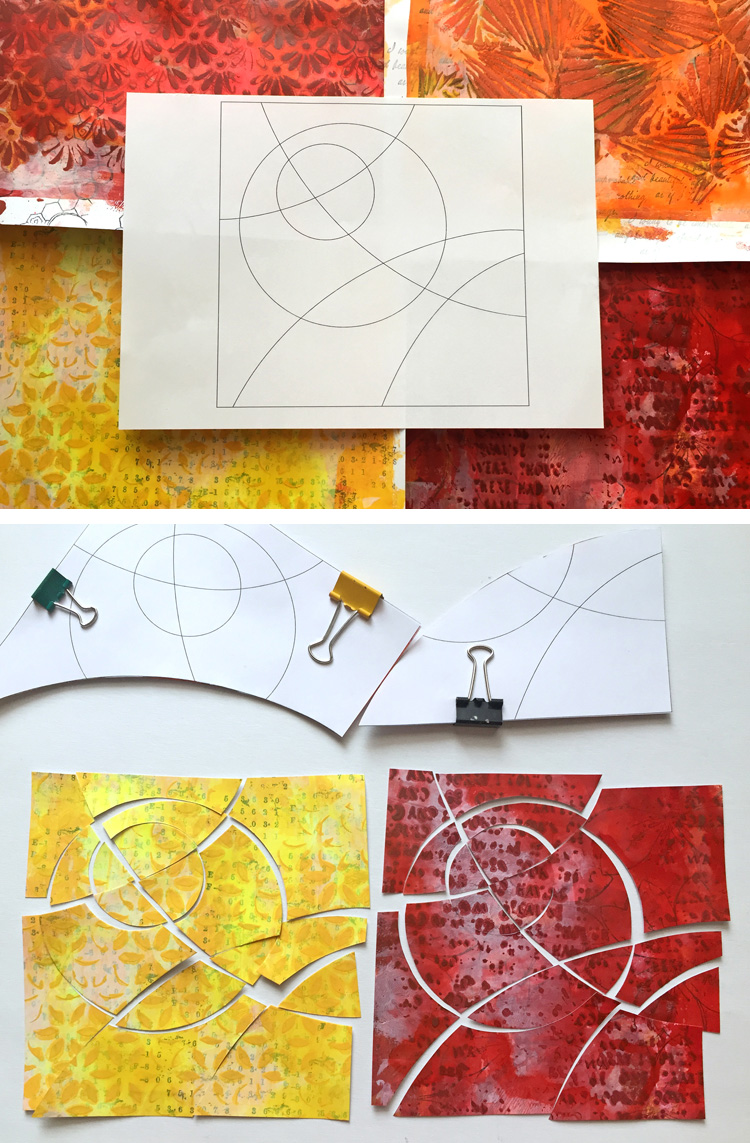
Now, the fun part. You need to cut the backgrounds into smaller pieces. It brings us back to the pre-planning. I drew a pattern – couple of lines and circles – and coloured it in so I knew I wanted to use four colours and therefore need four backgrounds. I made 4 identical templates for the cutting and I cut the four backgrounds along the lines of my template.


Once you have the pieces, you need to rearrange them so you end up with four multi-coloured patchwork-like assemblies. Before gluing down the pieces on a sheet of cardstock, I went along the edges with ink.


Finally, you have to decide what you want to do with your reassembled backgrounds. Sometimes, I just make a bunch of them, keep them in my drawer and when I need a card, I only add a sentiment and/or a flower. My backgrounds always end up a bit too colourful, so they require only some bold and simple embellishments. Here I used stamps from the JOFY32 set. I white-embossed them on a black cardstock and added a bit of shimmer using the Wink of Stella glitter pen.


This technique is very versatile. You don’t really need to create new backgrounds to cut them apart. You can use your old scraps and/or discarded artwork to make something entirely new. There is no limit. I’m looking forward to seeing what you create.

I hope you got inspired. See you some other time!

Pavla

Blog: pavlart.blogspot.com
Twitter: @pavlah
Instagram: pavla_art

Fantastic Abstract Art Pavla, love how you still allowed the vibrant colours to show through, and also the added dimensional layer from the stencilling. The composition is simple yet very effective. The finishing detail from the black and white touches is perfect. ~Gillian

We would love you to join in with Challenge #21: Abstract Art

If you would like to join us in some abstract experimentation, then link what you make HERE.

All links go in the draw to win a voucher to spend on products of your choice from the PaperArtsy online store. The Abstract link will close 17:00 (London Time) Sunday, Nov 22nd winner will be announced 2 hours later at 19:00.