Hi
everyone, Keren here with some great news; it's a NEW..s topic! Ok,
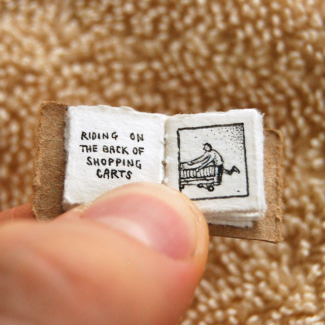
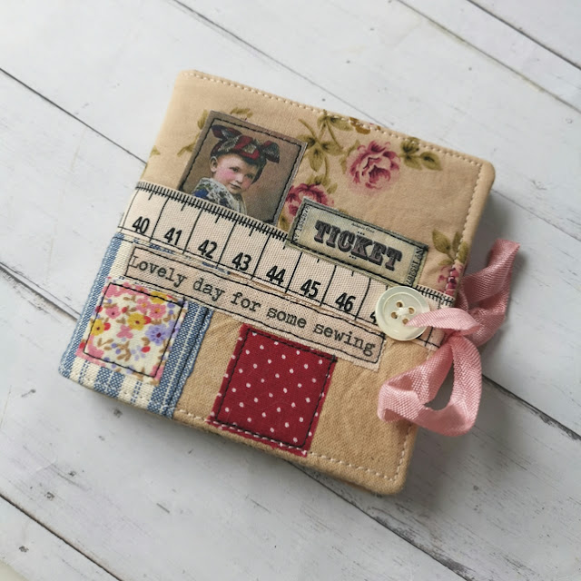
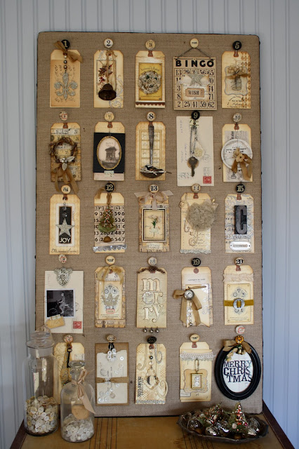
it's not really news but I love anything miniature and 'type' so I am
really excited to see what our blogger team come up with.
I
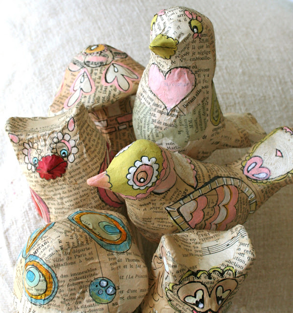
have visions of miniature newspapers used to cover doll forms and the
tiny font trimmed out and used to highlight or title some art work.
Could the project be large and the type small or will we see tiny art
pieces with tinier words?
Starting
with alphabet beginnings, there were some wordy wonders in the
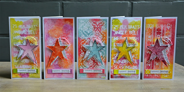
PaperArtsy blog. Anneke de Clerck will often rustle up something modern
and vibrant and this set of Christmas greetings is no exception.
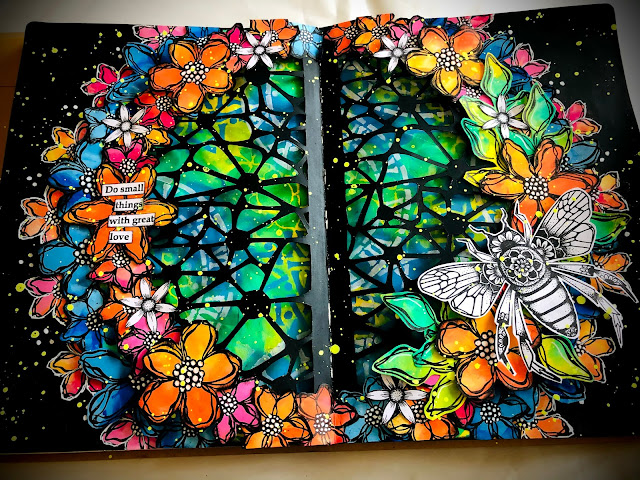
Sneaking
this one in to the PaperArtsy section; whilst Alison didn't create this
for the blog, as she's practically our chief 'word' designer, I
couldn't resist this splattered beauty.
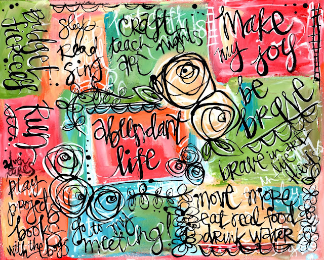
Some
of you will be very familiar with the concept of 'One Word'; a popular
way of considering how you will focus your attention on the year ahead.
This artist, Erin Lee decided to write points springing from her (two!)
One Word for that year. Adding those white shadows really lifts the tiny
text.
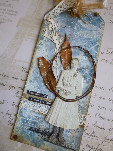
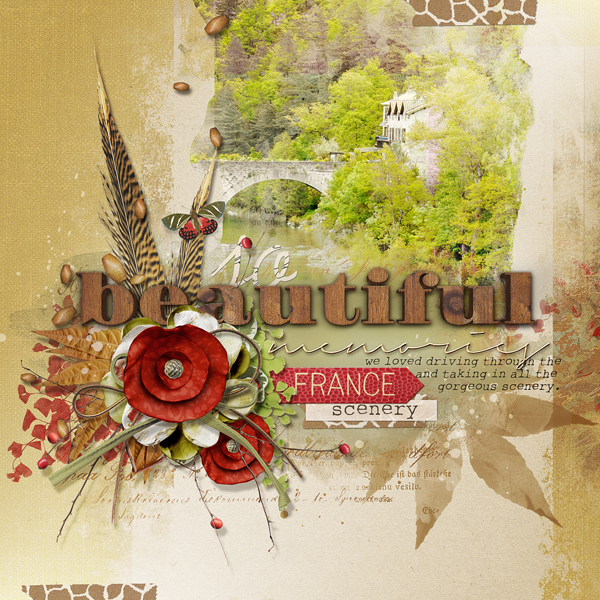
Using
a myriad of fonts, in different sizes can be a challenge, but this is a
wonderful example of using bold and soft type in both the title and
background.
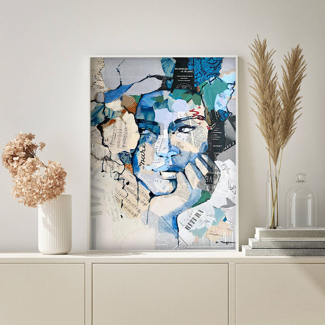
Carme
Magem is known for creating famous women of note in a collage style and
you can spy different tiny words dotted around the beautiful faces. How
beautiful.
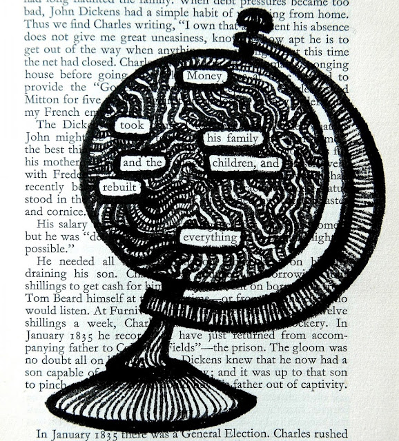
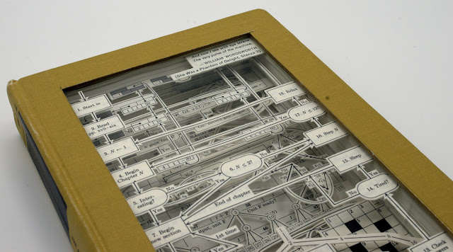
Julia
Strand produces amazing book engravings and her work is really varied
but often uses texts in the pieces. This almost technical looking piece
is a real contrast of black and white layers.
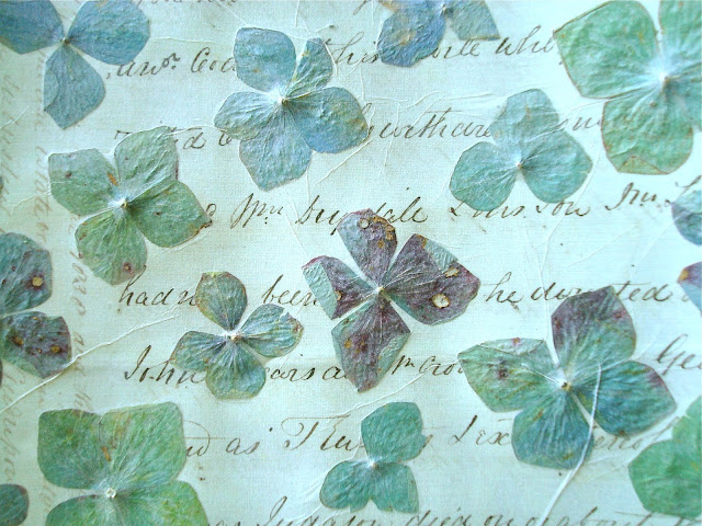
Using
hydrangea petals and glueing them under tissue paper over some
beautiful tiny handwritten words on paper produces a unique product that
the artist cut into little hearts.
Tiny
words given the spotlight to create texture and form in a journal style
page is a clever way of using text. the undulating watery effect has a
magical quality and the artist has used white space to great effect too.
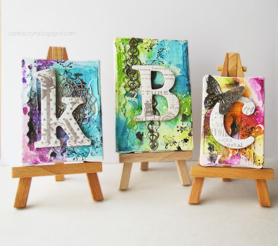
Whilst
you can use tiny font on a larger art piece, why not go the whole hog
and get creating on small canvases like these miniature examples from
Kasia Avery.
Hope
you've enjoyed some initial exploration into the topic. I'm sure we're
going to see some miniature masterpieces and tiny font focused pieces
over the next two weeks.
If you
want to create along with us while we explore this topic, please share
your makes on our social feeds so we can follow along. Instagram @paperartsy or why not join us and post in the PaperArtsy People Group on Facebook. Make sure you tag us in your contributions, we love to see what you get up to in your creative world!
Blog Summary: Grids, Alcohol Inks, Bleach, Mail Art.
Well here we are, the final day of the year, and the final summary post what our bloggers did for us all in2016 here on the PaperArtsy Blog.
One of the biggest blog challenges this year was to 'spot the word' within Gabby's creation above. See this blog post for more
2016 seems to have been a year of international tragedy, unrest, and confusion, we have experiened a year of unexpected turmoil and change. We also seem to have observed an unprecedented level of celebrity deaths, many way too soon. In among thechaos that was 2016, I feel our little blog has hopefully offered ahaven of positivity and encouragement.
The year ahead will no doubt hold as many surprises at that which has just passed. We may not be able to control the outside world, but we do have some significant choices we can make about our own lives, how we choose to use our time, who we choose to spend quality time with, and what we do for our own pleasure. Crafting is often a welcome escape from the realities of the rest of the world, but it is also a wonderful way to express deeply-felt emotions on any scale or topic.
I
hereby challenge us all to make more art, find our happy place, take
time for yourself, absorb, marinate and pickle yourself in the process
of learning or doing something new. Somehow it always seems to give you some perspective, and joy. Here's to the year ahead! Happy New Year!
So it's me again today (Leandra), remembering with you the final days of our blogging year.And boy has it flown by! Today we look at the final topics of 2016, and the great ideas expressed within! Let's take a look!
Topic 20: Squares and Grids
One of the first stamping techniques I learned was the 'grid technique' ...using Post it notes to mask off a grid line, then apply colourdirect to paper with Adirondack Inks by Ranger... and that whole method of working with structure has always continued to appeal to me. I like the structure a grid offers, and working with squares is such a great way to isolate focal points too.
My first pick is This flower 'grid' by Helen Chilton. Helen always seems to turn an idea on its head with ease! Her bright colurs and pops of white really make this grid so cheerful.
Jennie Atkinsonseems to have morphed into an infusions guru this year. Her natural Vintagecrafting style is perfectly suited to Infusions. I love how our first ever stamp collection released in 2004 (Ink and the Dog), works perfectly with ournewest 2016 product release: Infusions! (something old, something new). See here for more.
...into this. Framed it looks amazing! I love how Emma seems to strip back and make things look simple, when actually there is a lot more to it than meets the eye!
And finally, Ingrid stamped into texture to highlight patterns for this topic perfectly. Lovely rusty layers and textures within!
Topic 21 : Typography, Fonts, Quotes
I do find that words and numbers are such useful elements when building up backgrounds. For example, a script stamp is utterly indispensible, but so are number and alphabets stamps, no matter what font or size, they are very handy to have in your stash! In fact I'll let you into a little secret... one of our first releases of 2017 fits this category PERFECTLY... I wish I could share more!!! Guess what!? You will find out more tomorrow! I promise!
Claire Snowdon created this dreamy background using words and quotes with gesso to soften. The layers of paints and inks in pinks and blues is highlighted by infusions on top. I loved this, so simple and effective!
In a similar vein, Tricia started with Newsprint under her typographical imagery, and made her Tracy Scott stamps pop in the process!
Sanda showed us the entire process of her journal page with words and numbers in her background, it is always amazing to see other people's method of creating up close like this!
One to remember for next year! Keren's Christmas wreathmade from a numbers mini stamp!
Topic 22: Alcohol Inks and Pens
I might behandy when it comes to gin recommendations, (here is my latest find, Nordes). I'm certainly not as competent when it come to alcohol INKS! Particularly pens. So I am fascinated by the posts for this topic! Very useful info! No I won't be tinting my gin!
My first pick isKay Carley showing her wonderful skill withAlcohol ink markers. Just the daintiest touch of colour hits the spot!
Lauren shared the mind-blowing blending solution on a flannel for texture tip in this post! (I did not know that) She's another closet copic guru. See here for more...
Jenniedid a simple technique here, but oh my how cool does it look!!
Topic 23: Bleach
The
end results from some bleach techniques, can be very similar to alcohol
inks (resists in particular), but as ever, the bloggers come out with a
load more crazy-good ideas with a household available (craft) ingredient!!
For example, Corrie bleached out denim with a bold flower stamp so effectively! Details here.
Hazel had a blast using infusions with bleach! Oh and she got some numbers in there too!. bold stamps seem to be the stamps of choice here!
Our final topic of the year, Mail Art, which was appropriate considering the postal service was somewhat overloaded at the time! Sadly we could only fit in 1 week of this topic, but we still saw a lot of loveliness! As Christmas was imminentI expect many of you missed out seeing these posts.
Roxanne (by Bun) enjoyed exploring her new love for Fresco Paints! Lots of awesome tips within her post too!
One of the HUGE reasons we put so much effort into our blog content year after year, is so that you are inspired to play along. Even though the mail art challenge came at the worst time of year as far as people's busy lives go, I was blown away with the challenge entries. This is what is is all about, sharing with us what you create in response to the blog. We LOVE to see that. Let me share a few with you...
Helen who is one of our most ardent blog followers, and she really should be called the most senior on high PAtwit (haha), killed 2 birds with one stone, and made some Christmas gift envelopes for her niece and nephew! I think she must have entered every challenge this year!
Well there you have it people the final 4 topics of the year and only a smattering of the gorgeous posts highlighted. It's been an utter pleasure!
We hope you continue to follow us in 2017, and be aware, we have sneaky peeks starting TOMORROW of our imminent new releases. Our sale ends today too, so be quick for that!
All the best for a safe and happy New year Celebrations
Hi everyone Keren Baker here. I'd like to share with you this evening with a post about focussing on fonts, with a festive flavour!
Using mini stamps sometimes leads you to creating with them in small areas or as adding texture or interest to a project. I absolutely love modern fonts and wanted to use some of the minis in a way that majored on them rather than them being just a part of the process. I've used them in several ways and have created two projects utilising some repeat stamping to create patterned cardstock.
Step 1: To create the wreath, I wanted to create the leaves using part of the stamp containing '25'. So simply stamp some (make that a LOT!) parts of the stamp over and over! I've used the Ink and The Dog Mini 19
Stamp in several colours and cut out then attach to the base card and arrange onto the frame. Add the little extras and you have a simple frame for giving or decorating your home.
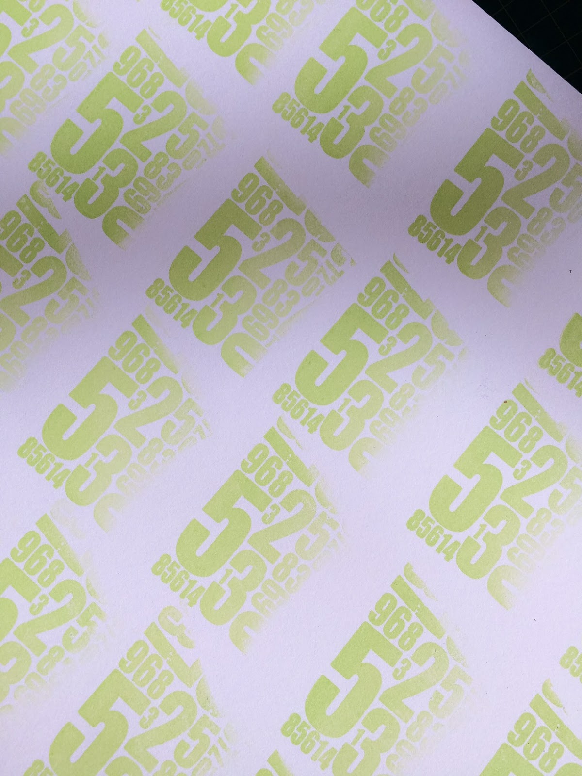
I wanted to use some of the other minis to make some patterned cardstock to create a gift box with. First off, pick out some lovely minis; Mini 24 and Mini 39
Do lots of repeat stamping and make a sheet of patterned cardstock. I simply lined up by eye although you could do it with a stamping positioner. Then stamp again 3 times in blue and trim out some lengths to create a 3D bow and stamp the '25' in red. Then just score and make a lid with the stamped sheet and a base in white cardstock.
Then, attach all together adding in a few bells for a little extra fun. Simple!
Using repeated stamping, whether using it for individual elements like the leaves or the patterned cardstock makes a small image into a really useful larger one. Fonts create a really contemporary lift to your projects. I'd love to explore other ways of creating with fonts. My next project with them will be stamping these into clay and creating handmade ornaments for Christmas or Fimo and using for unique gift tags.
I hope this is getting you into an early festive spirit (haha!) See you soon, Keren xx Twitter: Craftsatampink
Instagram: Craftstampink Pinterest: Craftstampink Thanks for sharing these with us Keren, both fantastic uses of typography. The frame is subtle and classy and would be perfect for display. The box lid is bold and will make any gift really special, that is the kind of packaging that people will want to keep. ~Darcy
All of our bloggers love to see your twist on their ideas, particularly if you were inspired directly by their post; so please spare a moment to comment or make your own creative item. They all love to see your feedback and what you can do more than you realise!
We would love to see how you interpret this Typography,Fonts and Quotes topic by linking what you make to our 2016 Challenge #21: Typography,Fonts and Quotes, on this page HERE. The 'Typography, Fonts, Quotes' link will close 17:00 (London Time) Sunday, Nov 13th 2016. The winner will be announced 2 hours later at 19:00.
All links go in the draw to win a £50 voucher to spend on products of your choice from the PaperArtsy online store.
Hi everyone Sanda Artfulflight here, joining you today with a post about art typography. I love to art journal so, when I was invited to post another tutorial here this was the first thing that sprang to my mind. I use my art journals to freely express my feelings through colour and texture, or just to collect ideas for future bigger artworks. You can watch the video tutorial I prepared for you on my Youtube Channel.
Step One: I started by applying a coat of white gesso to both pages, dried this layer with a heating gun and then applied a second layer, this time using a heavier gesso and a spatula. When this was dry I started adding colour using PaperArtsy Fresco Acrylic Paints (Haystack,Cherry Red and Chartreuse), blending the paint with my fingers and a bit of water. While the paint was still wet I removed some of the paint through a stencil using a baby wipe. Then I added more paint (Caribbean Sea) and then I stencilled some numbers through a stencil with black gesso and made some marks with PaperArtsy white paint (Chalk).
Step Two: While the paint was drying, I made a small stencil using PaperArtsy Eclectica {Sara Naumann ESN11} . I stamped the linked hearts on a piece of heavy weight watercolour paper using a black inkpad and then cut the stencil with a craft knife. I mixed PaperArtsy Grunge Paste with marble dust and spread this mixture through the handmade stencil and then through another heart stencil.
Step Three: I added more visual texture and interest to my pages with some background stamping.
Step four: I spread with a palette knife the leftover Grunge Paste – marble dust mixture all around my page creating a border. Dried it thoroughly with my heating tool, applied a coat of graphite paste on top and dried again. I painted the graphite paste with a dry brush and PaperArtsy acrylic paints (Toffee, Haystack and just a bit of Chalk), trying to achieve a rusty look. When the paint was dry I accentuated the texture with another colour (Caribbean Sea).
Step five: I painted the hearts using Cherry Red, Haystack and Chalk and to give them a little more oomph I applied White Fire metallic paint. The effect was gorgeous! I created a focal point using one of the cut out hearts, painted it in the same manner and stamped “My heart” from the stamp set. Added two metal wings to my heart as well. Separately I stamped a quote from the same set on a piece of white tissue paper and collaged it with soft gel medium. I cut out a few letters from some stickers to spell the word “Promise” and glued them down on the big heart.
Step six: As a final touch I added some gold mica powder to the wings using the PaperArtsy Crackle Glaze as a glue.
If you would like to see this page come to life step by step then please do check out my video.
Hope you have enjoyed the tutorial, you’ve got inspired by my project and you will try these fun and easy techniques and create your own fabulous art journal pages. These high quality PaperArtsy acrylic paints and stamps are just wonderful and so much fun to work with!!!
Wow, thanks Sanda, what a gorgeous page. The border is stunning and really adds a luscious frame to the layers of typography. Excellent choice of stamps, they really do make for a beautiful page. ~Darcy
All of our bloggers love to see your twist on their ideas, particularly if you were inspired directly by their post; so please spare a moment to comment or make your own creative item. They all love to see your feedback and what you can do more than you realise!
We would love to see how you interpret this Typography,Fonts and Quotes topic by linking what you make to our 2016 Challenge #21: Typography,Fonts and Quotes, on this page HERE. The 'Typography, Fonts, Quotes' link will close 17:00 (London Time) Sunday, Nov 13th 2016. The winner will be announced 2 hours later at 19:00.
All links go in the draw to win a £50 voucher to spend on products of your choice from the PaperArtsy online store.