Showing posts with label 2015 Topic 10. Show all posts

Friday, 5 June 2015

2015 #10 Stars Luminary {by Lauren Hatwell}

2015 Theme 10: Bottles

Hi everyone Lauren here, joining you this evening with a post about faux glass painting and embossing on glass. We have all seen how Fresco Paints can be used to create a gorgeous opaque finish on glass with amazing results and I wanted to show you that you can easily achieve a beautiful translucent finish too. I love this technique; it's much easier than it looks and it's a great way to re-purpose items for the home or make a special gift for someone.  With summer just around the corner, this project seemed just perfect.
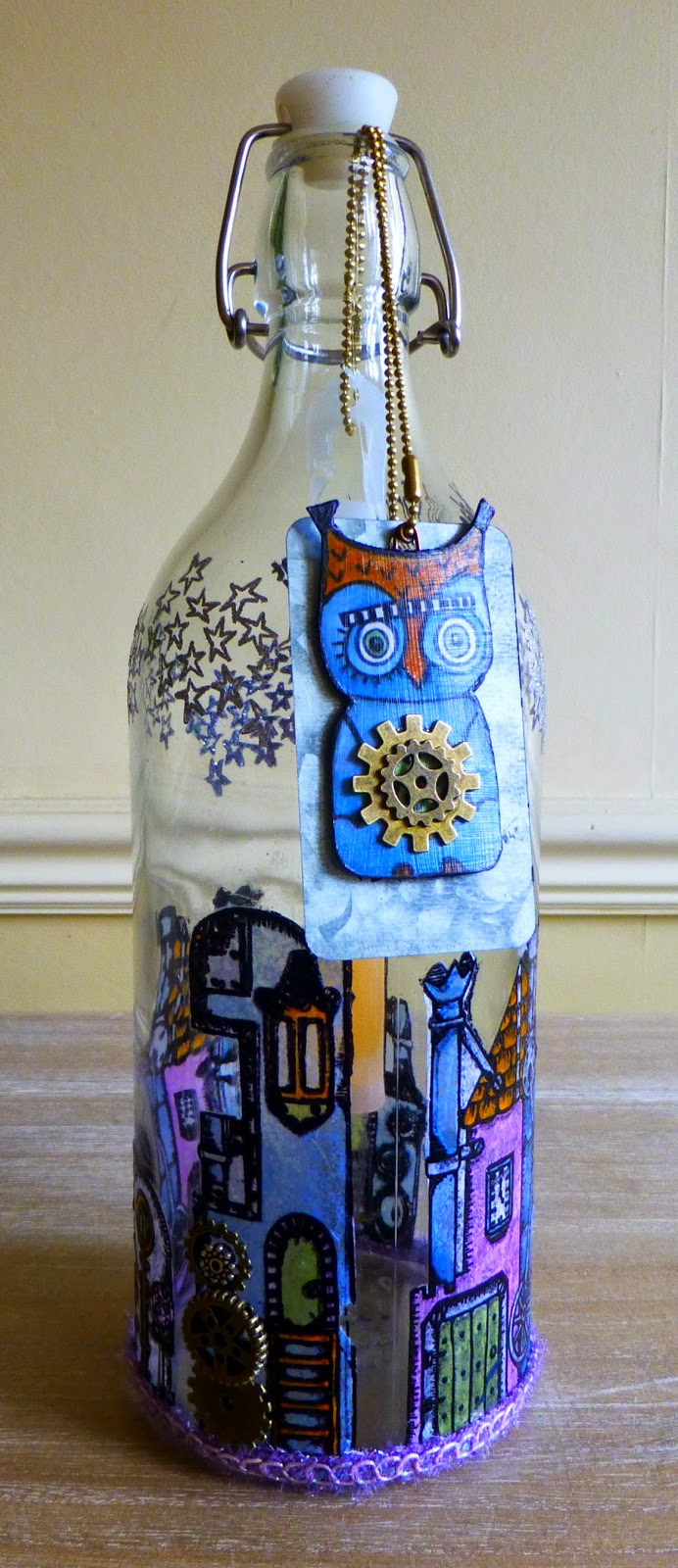

I wanted to use Darcy's fabulous EDY08 plate of stamps 


and her recently released Owl Mini for my luminary. They stamp beautifully and are an absolute joy to colour. I love them.


The owl chipboard will act as an anchor for the light stick. This will help the light stick to hang midway in the bottle rather than just lie in the bottom and makes it much easier to retrieve it when you want to replace it.  

I stamped and coloured the owl using Fresco paints in Inky Pool, Autumn Fire and Tinned Peas before sticking him to a couple of layers of heavyweight card. Once dry, I cut out the "owl sandwich" and coated everything with a layer of Outdoor Mod Podge being careful to seal the edges. I've added a metal tag and some cogs for extra weight.


Just a quick word about light sticks if you've never come across them. You can get them in all kinds of shapes, sizes and colours. I buy mine in bulk from Amazon or ebay, whichever works out the most cost effective at the time. They last all night and will still be glowing faintly in the morning.  To light them, you just bend them in the middle until the little capsule inside snaps and the chemicals mix. Give them a shake and they will glow fairly strongly for about eight to twelve hours. They don't get hot and they don't blow out so they're perfect for the garden PLUS it means people can handle your makes without burning themselves.  The one I've shown here will fit inside a standard wine bottle.


Now for the fun bit!  There's no need to worry about embossing on glass. Your only MUST HAVE item is an anti-static pad which you want to pounce on the bottle rather than swiping it so you've got a liberal dusting. If you skip this stage all your embossing powder will stick to the glass and you'll be brushing it off for hours. I like to steady the bottle between two acrylic blocks to stop it moving about while I'm stamping. {Tip: if you don't have an anti-static bag, you can use talc as an alternative to the chalk-filled anti static bag}


As it's a curved surface you'll need to hold the stamps in your hand rather than mounting them on an acrylic block but you can see they stamp nice and cleanly.


It's a good idea to stamp and emboss as you go as you're less likely to smudge anything,  but do remember that the glass gets pretty HOT. I thoroughly recommend you use goggles and something heatproof like leather gardening gloves if you have them, just to be on the safe side (just call me Mrs Health and Safety :oD). You can see on the picture below that the stars have embossed beautifully. Wait a little while before you polish the bottle as the embossing will smudge if you do it while it's still warm.


I embossed the writing and the stars directly onto the bottle as they will not be coloured in. I used a black Archival ink with black embossing powder for the writing and a sparkly silver embossing powder for the stars. I tend to use WOW embossing powder but any brand will do the job.


For the coloured images I stamped the outline onto tissue paper, embossed with clear or black embossing powder and then coloured the tissue paper using Fresco Finish Chalk Acrylics in Inky Pool, Autumn Fire, Tinned Peas and Orchid, watering them down to a slightly thinner consistency. I dried the tissue with my heat gun after each new addition of colour just to keep the tissue as dry as possible. You can use whichever colouring medium you like as long as you don't get the tissue paper too wet.


When you've coloured your images and cut them out (keeping as close to the embossed line as you can) you need to glue them to the bottle. Again, I used Outdoor Mod Podge. It's much easier if you paint the sealant onto the bottle and then apply the the dry tissue paper over the top, smoothing gently as you go. Clean carefully around the outside of the images with a damp cloth to remove any remaining sealant and then leave to dry thoroughly.


Here is how the bottle looks with all the embossing and colouring done. All you need to do then is seal the images to keep them weatherproof. Once again, I used Outdoor Mod Podge for a good weatherproof seal. You get a nice glazed finish which makes the images look like they're painted directly on the bottle. If you compare this picture with the one below, the images are wet where I've just sealed them but you can see that once they were dry the colour has gone translucent and is nice and strong, just like glass painting.


And finally, here is a picture of the lit bottle hanging in my olive tree in the garden. I think I need to  make more...


So, there you have it, a quick and easy way to transform a plain glass bottle into a pretty lantern for your house or garden without any fuss.  These are a lovely way to light a pathway for a party, barbecue or wedding and a great way to decorate storage bottles as you can still see what's inside. When you want to change it (or, heaven forfend, IF you should make a mistake!?) you just scrub it all off with plenty of washing up liquid and a scouring pad and you're good to go again. Why stop at bottles? You can decorate vases, jars, windows, picture frames. The possibilities are endless. Easy and, pretty much stress free fun. Just enjoy.

Lauren Hatwell

Blog: Marvellous Mechanical Mouse Organ

Wow, Lauren! Thankyou for such a brilliant project. I have never used these light sticks before so seeing them used like this is so inspiring. You have totally transformed this bottle, it truly does look like glass painting. (something I always loved the look of but could never so well) Your embossing of the text and stars is brilliant, the whole thing is such a stunning effect, but I do love the stars best. 

We would love you to join in with challenge #10: Bottles If you are inspired by any of our guests who blog with us over the fortnight, then please join in and link up your creativity HERE

All links go in the draw to win a voucher to spend on products of your choice from the PaperArtsy online store. The Bottles link will close 17:00 (London Time) Sunday, June 7th, winner will be announced 2 hours later at 19:00.
  

Wednesday, 3 June 2015

2015 #10 Bluebell Fairy jar {by Julie Ann Lee}

2015 Theme 10: Bottles

Hi everyone! Julie Ann from Magpieheaven very happy to be with you on the PaperArtsy blog this evening!

I'm sharing a post about up-cycling a mustard jar, an old glass saucer and a piece of crackle tile off-cut! I love the effect of painting on glass with Frescos, and these items that might have found their way into the recycling bin were calling to me to be given a magical new life as the Bluebell Fairy-House Jar. 

I had not tried combining rusting and the new PaperArtsy blues on glass before, so I was eager to see if I could create something whimsical with the sense of a story behind it out of these unwanted bits and bobs and a little PaperArtsy 'fairy dust'! 


Step One: I began with this tacky little pink saucer, which was headed either for the charity shop or the glass recycling bin! It had a thin layer of metallic paint over the centre, which was already flaking off. I removed this with some white spirit and a abrasive pad and then rinsed it. When it was clean and dry, I painted it carefully with PaperArtsy Blue Glass Fresco; allowed this to dry and then applied a thin coat of Ranger Glue N' Seal matte to that vaguely star-shaped area.


Step Two: Before the Glue N' Seal was dry, I sprinkled the upside down saucer with Rusting Powder and then spritzed with a spray of water containing a few drops of vinegar. I was careful to ensure that I kept that rusty sludge nice and moist!


Step 3: Now it was the turn of the mustard jar to be painted, Glue N' sealed and rusted and spritzed. Everything was looking incredibly grungy and messy!


Step 4: I grabbed my little off-cut tile, which happened to be the same size as the square sides of the mustard jar and sprayed it with washes of Smurf, Blue Oyster and Wisteria Frescos.


Step 5: The tile already had a crackle effect so the washes of colour ran into the little cracks. When I was satisfied with the effect of the washes, and it was dry, I stamped it with the key from LPC 031. It is difficult to convey in a photo, but the different shades of blue and the rust reacted just as I wanted, trickling into the cracks and the rough edges of the tile off-cut.


Step 6: Now it was time to combine the elements to create the Bluebell Fairy-House Jar! I painted the jar with a little Golden Heavy Gel Medium (although there is a gel medium for use specifically with small no-hole beads in it already) in places and adhered blue, green and amber glass beads, applying Treasure Gold in Sapphire, Green Amber and Florentine when everything was good and dry. Shrink Plastic houses from ELB 14 and 19  stamped in Black Archival dangle from hemp around the neck of the jar. I also stamped Lin's 'Home Sweet Home' sentiment from ELB19 onto the shrink plastic painted with a wash of Smurf in Wendy Vecchi Forget-me-not Archival.


Heavy Gel Medium bonded the tile really well to the glass, which amazed me! I'm beginning to think there's nothing this gel won't stick! I finished off my up-turned saucer lid with a smattering of some more glass beads and a painted resin flower.


I liked the effect of combining the Treasure Gold and Rust on the lid, as it looked a little like Titanium to me!

Now I have to decide what the jar will contain: maybe I could keep broken jewellery in it for future projects or create a miniature fairy occupant from papier mache? I hope this little jar fantasy has inspired you to create something from glass 'throwaway' items around the house. Frescos work so well on glass and I was really pleased with combining the rust, Treasure Gold and paint for an aged look. I can't wait to see what you come up with on this theme because there is something so magical about painting glass.

Julie Ann from http://magpieheaven.blogspot.co.uk/ wishing you a magical and creative week.

This is an absolute delight Julie Ann. You are so right, the golden gels are miraculous as adhesives, and because they are a fine art product (not PVA based), they will not get brittle or yellow with age, due to their UV resistance, so they are ideal for this kind of thing indeed!

I adore the colours, and the Rusting Powder works so well with the blues! It is amazing how it does its own thing , you just need to keep it damp until you like the effect. It's a very cool product! Thanks again for another brilliant make! ~Leandra

We would love you to join in with challenge #10: Bottles If you are inspired by any of our guests who blog with us over the fortnight, then please join in and link up your creativity HERE

All links go in the draw to win a voucher to spend on products of your choice from the PaperArtsy online store. The Bottles link will close 17:00 (London Time) Sunday, June 7th, winner will be announced 2 hours later at 19:00.

Monday, 1 June 2015

2015 #10 Blossoming Bottles {by Pavla Hozíková}

Topic 10: Bottles


Hello, my name is Pavla and I come from the Czech Republic. I’ve recently discovered the joys of art journaling. I don’t label myself as an “art journaler”. A journal is a tool for me, rather than a goal. I don’t do the art journaling for the sake of journaling but I just create my art IN art journals - I simply consider my journals as a collection of individual pieces of art bound together. I was really thrilled when Darcy asked me to do a guest blog post for you tonight with a project based on the topic of Bottles. 


I’m working in a journal I specifically dedicated to this year’s PaperArtsy challenges. I like to work in square sized journals, so I make my own. This one has canvas paper – it can be a pain sometimes because it curls when it’s wet, but I love the texture. First, I gelli printed the background using Smurf and South Pacific Fresco paints with a little bit of glazing medium. I’ll be using just these two colours because I’m going for a bit of a tone-in-tone look. 


I’ve always loved texture and my favourite supplies to work with are stencils (I usually cut my own designs) and texture pastes. For this project, I had a wonderful image in my mind – of stencilled bottles, layered one over another, different texture pastes… I even cut a set of bottle stencils. But you know, when I tested this idea in theory, Plan A was abandoned very quickly – and nobody needs to know, right? 

So I cut the bottles from a piece of cardstock instead. I covered the shapes with crumpled deli paper (similar to Waxed Tissue). I lightly sponged the Smurf paint over the shapes, just a bit, only to get a bluish tint. Then I used the South Pacific paint around the edges on one side to create a shade on the side of the bottle. 


Then I stamped some flowers from the EDY09 set.

I decided to fussy cut them rather than stamp them directly on the layout. It was an afternoon well spent… I coloured the flowers with orange and red markers. Because the layout is a bit monochromatic, the flowers will stand out. Notice that each flower stem is bended slightly differently – I took advantage of the stamp’s flexibility. {Well, I don’t have such a long stamping block, so I had to bend it anyway. LOL}


Now it’s time to assemble the page. First, I glued down the bottles. Notice that I went around the edge of them on the background with gesso to make them pop up a bit. Then, I added the flowers.


Finally, I glued down a quote. I cut the focal word on my Silhouette machine. I also added a bit of shading around the bottles. 


I really enjoyed making this layout even though it wasn’t in my usual bold and bright colours.

I hope you got inspired. See you some other time!


Pavla


Twitter: @pavlah

Instagram: pavla_art

Wow Pavla, not your usual bold colours true! But we can't call these dull colours either! The orange really pops against the blue, and the bottles stand out beautifully with their gorgeous texture and shading! Love how this makes a wonderful page in your PaperArtsy Challenge journal! Thanks for sharing with us! ~Leandra

We would love you to join in with challenge #10: Bottles If you are inspired by any of our guests who blog with us over the fortnight, then please join in and link up your creativity HERE

All links go in the draw to win a voucher to spend on products of your choice from the PaperArtsy online store. The Bottles link will close 17:00 (London Time) Sunday, June 7th, winner will be announced 2 hours later at 19:00.

Sunday, 31 May 2015

2015 #10: Bottles {by Leandra Franich}

2015 Topic 10: Bottles

Hi everyone Leandra here, actually doing a blog post for a change! 


If you have been following me on twitter, FB or Pinterest lately you will know that I have been playing with Craft stuff quite a bit of late, just trying to catch up with you all!!

Over the last few weeks I have gone back to a journal I started a few years ago.... well.... I did the cover, and that was about it! Sound familiar??!! For me journalling is like doing altered books, except flatter. About 15 years ago my creative life evolved around altered books. However, now the main difference is rather than a dimensional page I really want to master my control over drawing faces, so I've been adding those to my pages of late. Quite a few years ago I did a Suzi-blu class, and that got me started on faces, but I have not spent any time practising, so that time has now come.


To be perfectly frank, I am no expert at this! There are many of you out there who are far more adept at this process than I. For those of you who are still at the thinking-about-it-but-don't-know-how-to-start stage, then maybe my simplicity might help you jump in too. I just follow my instinct, and have no idea how to 'do' it, I just take it slowly trying to think about proportion, shape and shadows. I often use Pinterest images as a reference, there are many fabulous journal entries there, and having a guide to refer to certainly helps a lot.


I'm sure there are numerous methods, but at some point you need to just jump in. I know I need to improve my shading skills, but it's one step at a time, and perhaps if I share a little of how I get started, you might be brave enough to try too, and we can get better together!

Step One: Outline
So first up I started with an outline...Now DON'T LAUGH....but she was certainly going to end up as an alien if I kept going with this option!! Maybe I have a talent for alien faces! LOL


OK so you can see what's wrong can't you?
- The eyes are too high
- The face is too long

There's probably a lot more that is wrong, but I'm not aiming for perfect! Just a recognisable face would be good! So to fix it, rather than move the eyes, I rubbed out the pencil and shortened the face! Yes its OK to do that, you can't always get it right the first time!! So don't expect to! And pencil easily rubs off Fresco paint. Yay! You can also see the grid thing. I like to do this as it helps me get the lips and nose in the right place, and that is even more important if the head is tilted...so for me that helps.

As far as the shape of the eyes goes, the lower lid tends to be flatter, and the upper a curve. The more you platy around with this, the more expression you can add, or you can move from whimsy to realistic in style. But I'm not bothered too much with that, for now its all about 2 eyes that match, so I'm going with basic!


Yes, I know...dodgy eyebrows right??!! Very Brooke Shields circa 1980...I ended up ditching them and covering that issue with a fringe!! 

Then I went over all the lines with a Black Pigma Fineliner micron pen (#4). This is the first time I have done that, usually I just paint over the pencil. Not sure it makes much difference, but the pencil is easier to adjust moving forward, so stick with your pencil if you wish! Once heat set the Pigma Pigment pens are permanent (nice alliteration there), and the set of 3 gives you fine .02, thick .08 and medium .04, so I like them a lot. Always make sure the paint is totally dry before you use them or they will stop working!


Step Two: Shadows 
So from the basic sketch, add colour. And that's it!

My go to paints for the initial face-tones are all the pale white-skin tone Frescos eg Snowflake (white), Chalk (white-cream), Nougat (off white/cream), Buff (very rich beige-cream), Vintage Lace (hint of pink), Mushroom (pinky-beige), Blush (skin pink), Rose (very pink), Taupe (like it says on the tin).

The concept is:
1. Put a dark shade in the shadows, then 
2. Come over the top with a 'blender' or lighter shade
3. ...and repeat...
4. ...and repeat...
5. ...and repeat...until you like it!

So I used mushroom down the sides of the nose and I will then take it up into the eye socket cavity. Blush (under left eye) and Blush then Rose on the right cheek/ under eye. On the whole, I added Blush in all the shadow areas, above/under lip. Then the white/ highlight areas are done in Chalk/ Snowflake or Nougat (nose, above eye). For the rest I then move into the mid tones (Nougat, Vintage Lace, dash of Buff) to blend from the shady areas to the highlight areas.


I always work with a damp (not sopping) flat small brush, and only the tiniest bit of paint on the brush. Apply the paint, wipe the brush onto the paper towel, then blend the applied paint into the nearby area. Leave it to dry before you decide what is needed next, bearing in mind, the pale paint will often dry a tad darker. So I move to a different part of the face, then come back. I don't use the heat gun because if you dry the paint too fast, you can get those tide marks, so it's better to just move around and work on a different bit.

Brushes. I use mainly the small flat one on the left, and the 2 on the right. Far right is great for the eye detail, finelining the eye etc. You can find them online here, less than £1 per brush, so cheap as chips.


Step Three: Warmth 
So you just keep working it until you like it. So how did I warm her up?? Once I had a base over the entire paper-face of various shades, I like to add some Pumpkin Soup. It's a translucent, so she immediately goes from vampire to the living when you add Pumpkin Soup! Again, go over the top with Nougat, chalk, and your shader-tones to soften it back, then it will look more natural and blended.

Step Four: Eyes
Again, it helps to find a template on Pinterest, and do the eyeball style/ expression you like. I am not good enough yet to do eyes from a blank page/ mind, so I find a guide to refer to eliminates anxiety. This also helps with the shading discussed earlier!


Eye Tips:
1. Draw 'brackets' ( ) in the eye socket.
2. Draw a pupil, but leave a hole in it to 'catch' the light. I find the pupil looks better if it is semi obscured by wither the upper or lower eyelid. Then she looks like she is looking up or down, in fact I always do them looking up or down and to one side, for me I find the eye ends up much softer, and less goggly.
3. Add more white to the white of the eye.
4. Add colour to the coloured bit (I used Limelight and Hey Pesto, and I even mixed South Pacific into the Hey Pesto to create a deeper green-blue for the very lower-right bit)
5. Colour the pupils. I used French Roast (a brown-black), 2 layers. Then Little Black Dress around the outer pupil edge. Then I Stippled nougat for the catch-lights.
6. Fine liner brush with French Roast on the bracket bits (  ) of the eyeball, and both lids.
7. Repeat 5 with LBD if necessary

...so you see you don't need to use a pen at all! Oh hang on....I did...

8. Used  the fine .02 Pigma Pen for the eye lashes once it was all dry.

Hair Tips:
Again, look online for ideas. I had to cover the dodgy eyebrows, so I used Pumpkin Soup, Brown Shed, French Roast, then Little Black Dress using the fineliner paintbrush to draw squiggles. That was way easier than I thought curly hair might be! I finished with the .08 thick Pigma Pen to do a few more black defined squiggles.

Step Five: Page Background
Once you have the 'face' its easier to make a background to suit the tones. I decided I would go dusky.


The entire Spread was painted direct to the paper (no gesso!) with Buff, then I added patches of Lake Wanaka and Rose with a wide flat brush working fast. I wanted it to look scruffy, so I added the paint, then wiped the brush clean, and literally scruffy- scrubby style blended the colour into the Buff as fast as I could. (total paintbrush disrespect!) I then came back over again with nougat to soften and blend all the patches, and finally I added some chalk patches which I finger painted/ rubbed in.


I tinted Grunge Paste with the left over Rose and Lake Wanaka, and randomly applied it through the new Numbers Stencil (PS021) that Mark has been hiding from us all!

Step Six: Facing 'Bottles' Page
I had some brayered 12x12" HeavyWeight Smoothy paper 


made with EEG07 which was left over from yesterday's project...


.... Yesterday I made a 6x8" canvas with Clare Lloyd's face stamp ECL03 ...


...so I used the stamped face instead of drawing one myself.... See if all else fails you can still make it look like you've drawn a face!!!


While we are here, here is the face close up... 


See how she has a nose ! Clare didn't define the eyeball or nose...so it was kind of tricky for a newbie like me to go from white eyeball to mushroom shadow of the eye socket...but I tried to subtly give it a go!


Where were we???...oh yes...bottles...I wanted to use the green paper that I used for the coat above for the bottles, the green colour would mimic the eye colour of the face.. So I stamped HP1109 row of bottles onto the brayered BG. And then made square flowers...as you do! Actually looking at it now...they could be balloons!!


The final step was journalling, and as I started with Buff paper, I drew circles on a bit of Buff painted book page, cut them out, cut them in halves, and journalled on them the story of how Barbara Streisand ....she does look like her I think.... wanted square flowers!

Might be a tenuous link to 'bottles' for the current topic, but we got there in the end!!! Finally I added a shadow with my Scribe All Pencil

It writes on glass etc, and comes in a set of 2 (Black and White and with a pencil sharpener) and it's water soluble. So you apply it, then blend with water to get the soft shadow around the things on the page. This technique makes things pop off the background too.

Lastly I scrawled some journalling about the process in a white sharpie paint pen, and talked about how its not that scary after all to draw and colour a face!


So, I hope you have had a lovely weekend, and perhaps this week you might be able to combine the bottles Topic with faces too! And share your work in the challenge that closes on Sunday Night?

Don't forget, if you are up North, this coming Sunday we are at the Doncaster Dome Stamp Magic Craft Show. Darcy will be there demoing with me, and mark and our eldest Courtney will be running the stand. We very much look forward to seeing you there!


We would love you to join in with challenge #10: Bottles If you are inspired by any of our guests who blog with us over the fortnight, then please join in and link up your creativity HERE

All links go in the draw to win a voucher to spend on products of your choice from the PaperArtsy online store. The Bottles link will close 17:00 (London Time) Sunday, June 7th, winner will be announced 2 hours later at 19:00.