2020 Topic 8: Popping Pink
Hi
everyone, Keren here introducing the colour PINK! This is not a colour
that I wear nor choose to craft with, but whether neon, bold or
beautifully pastel, it's certainly a colour that makes a statement. As
to whether it can be described as 'popping', I've chosen lots of
different shades and added in examples where the contrast can make it
pop as well as the colour itself.
Debuting
this theme are a PaperArtsy duo. Corrie Herriman is pushing the pink
envelope with pinky- purples and uses the impactful stamp designs from
Kim Dellow.
Serendipitously,
Amanda Pink had also created something textural using colder pinks.
Layer upon layer of paint plus some Seth Apter images produces this
wonderful result. She simply had to be here because of her name ;-) .
Think
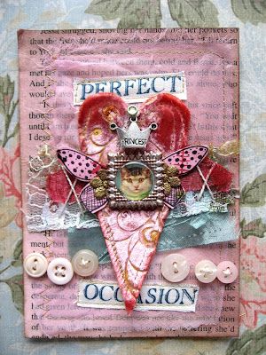
for a moment about famous pinks, and this next one has to be up there.
Lots of little girls have grown up with these bold pinks.
Like
every colour, the look can change depending on its neighbours. Add
bright red and gold and it looks modern and contemporary.
Now
take softer hues, a pillarbox red and some vintage images, and you end
up with a pink that would be perfectly at home in a Victorian drawing
room.
Shift to the animal world and pink is inextricably linked with those 'show-off' fashionista birds!
For
a romantic interjection into proceedings, how about a beautiful sunset?
Pinks in many different hues can be found and partner so stunningly
with blues, purples, yellows and oranges.
Pink
is not a colour I'd have automatically associated with Christmas
greeting cards, but this lovely knitted textured layer seems a
sympathetic choice with the foliage and pine cones.
If
you're not a lover of sugary pinks, maybe you'll appreciate the
vibrancy of neons. This print is bold, and would brighten up any dull
space.
Pink and orange are cheerful companions. This simple card could be sketched and watercoloured in a similar style.
Dina
Wakeley is known for her love of colour and bold designs. This piece
shows how well the colours turquoise and orange make the bright pink
really 'pop'.
Resin
art has a certain magic; the softly blended colours and brilliant
shine. Pinks blend with oranges, purples and nestle cosily next to
white.
Tree-like
plants erupt out of this forest. The green is a great contrast and the
pinks sliding into purple burst out of the centres.
Bold
graphic prints don't get much better than this. Notice all the
different shades of pink interspersed with black and neutrals plus other
contrasting colours.
Pink brings out its delicate side when paired with yellow. This bouquet would bring a smile on even the dreariest of days.
Teaming
pink with navy and grey makes pink seem sophisticated and grown-up
even. Love the triptych of prints, proving that more can be more! Not
sure I could manage to keep a pink sofa pristine, but would like to try!
Pink wouldn't be my go-to colour for figures, but I love this artist's journal page. She explains the process with a video.
I
admire anyone who can paint, and this piece has my full admiration. Not
only is it a wonderful portrait but the way they've added the paint
gives such an amazing textural quality.
Staying
with art, but in a more abstract form, this artist pairs pastel and
bright pinks with the neutrals that help tie the two hues together.
It
always impresses me how different colours appear dependent on the
background colour. This almost kraft background gives this piece a
warmth and notice the 'unfinished' element that allows your mind to
colour in the rest.
We
close out this intro with the bold art marks of Rae Missigman. She's a
'new-to-me' artist but I'll be visiting her more often. Her playful
pieces use lots of mark making and her colours are punchy and arresting.
Not afraid of pinks, I should take a leaf out of her book.
We've
seen sugary pinks through red based vintage shades, up to fuschia bold
pinks and even neon! Pink is a wonderful colour that you're sure to have
fun with. Do have a look through your paints and inks and see where
'pink' takes you.
If you want to create along with us, please share on our social feeds so we can see what you get up to. The best places are Instagram @paperartsy or post in PaperArtsy People Group on Facebook. Make sure you tag us in your contributions, we love to see what you get up to in your creative world!


2 comments:
Oooh great topic... And one that is definitely out of my comfort zone!
Thanks you so much Keren for the mention and featuring my art .😄 A lovely appreciated surprise! Humbled!!
Love the variety and range of all the other inspiring works of art you have sourced and shared narrated as always with excellence .
Thanks for sharing
Amanda x
Post a Comment