Showing posts with label ferro. Show all posts

Friday, 1 February 2013

Inspired By Guest Designers And Fresco Paints ....

Hi everyone, Gillian here with a project inspired by some of our featured Guest Designers projects this month and of course Mrs PaperArtsy herself doing a totes amazeballs job over on the PaperArtsy You Tube Channel. Where did January go ??? 
The PaperArtsy blog has been a hub of activity with amazing but completely different styled projects from all our designers .... Huge thanks to our Guest Designers! I hope you have enjoyed what has been shown so far! 


I have used this wooden shadow box and wooden block also from PaperArtsy which is perfect for altering with Fresco Paints
 

 I started out by applying some Ferro through a stencil using a Palette Knife to create texture.


Any excess paste can simply be scrapped off at this stage prior to heat setting.
I then added some book text as inspired by Michelle's 1st project HERE using Fresco Satin Glaze as my adhesive.

 
Next came my paint colour choices .... Mermaid and Guacamole

Start applying thin layers of Fresco Paints to build up your layers.

Before applying the really dark shades of paint to accentuate the shadows, Leandra recommends applying translucent colours in medium tones, as this builds depth on the lighter base coat, and ultimately helps makes your textured areas "pop", so at this stage I applied some Limelight.


Again continue to build up your layers. Next came South Pacific ... its a deep blue-green, can I just say I LOVE this colour and need to use it more.

Don't be scared at this point as you can always "knock" back your colour with Snowflake.
I have some of my fave colours watered down to use in these little Spray Bottles which gives a much softer look to your projects.  
{see Leandra's footnote at the end of this post for more info on opaque sprays}

You need to dry with a heat gun before going any further, and they will take longer to dry than paint on its own as there is more water in the mix.

Next I used more watered down Fresco colours sprayed on ... Limelight, Beach Hut and Zesty Zing. Continuing to build up the layers.

Dry well, and then I've stamped Mini 44 in Nougat.


To add some definition around the edges of the frame I have applied some Treasure Gold (Sapphire)


Then of course, once you start....you want even more Treasure Gold  so (Sapphire and Rennaissance) was also applied over the textured areas.


and I finished with Mini 44 again, this time stamping in South Pacific.

So for the inside of the frame, it's all about the wooden block which was inspired by elements of Linda's post HERE .... 
{I did at this point forget to take step by step pics duh!}
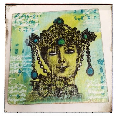
Basically I have used the same colours as above this time applied with Cut N Dry Foam, stamped Mini 44 and Mini 23 again in Nougat and South Pacific

The image is from LPC013 which has been stamped using Archival Ink (Jet Black). I've then added the white detail using Snowflake to accent area's of the image. I love how she appears to be "rolling her eye"s ... not going to tell you what at Mrs PaperArtsy said LOL!!


To brighten up the image and colours I applied Fresco Gloss Glaze.  
Gloss glaze reflects light back to your eyes, so a matte colour, that looks soft, and a bit dull, suddenly looks much brighter, because that is how our eyes perceive it to be. 
So, if you want your Frescos to look brighter, then just add gloss glaze!

I've then adhered the wooden block into the centre of the wooden shadow box .... genius combination Leandra and Mark!

{Leandra says: errrr, I think you are the genius there Gillian, I had no idea the block fitted in the frame! .... must order more blocks!....}

I applied South Pacific to an Idea-ology word band highlighting the text "Embrace Imperfection" with Treasure Gold.


I hope you have enjoyed this project and remember you still have time to be inspired by Suzz projects this week to be in with a chance of winning some PaperArtsy rubber! Click HERE to link up!

Leandra comments: When we first released Fresco paints just over 2 years ago, you may distantly recall at that time, under the ArtsyCrafts banner, we also hosted Tim Holtz here in the UK for a massive 2 day consumer event. 

Almost 300 ladies went through classes with Tim or Lin Brown and I. Lin and I create a new technique using watered down Fresco snowflake as an opaque spray over the awesome Ranger Colour Wash Dye Sprays. Oh wow did the ladies make some really cool opaque stains with the vibrant dye sprays use on metal card. Of course, the colourfast dye mixes and mingles with the paint to create stunning effects, pastel shades with a matte finish. And, once dry, you have an awesome matte surface to stamp on! We also mixed the stains into the paint, added water, and tinted our papers to match in with the colour combinations.

So, along with Gillian, making paint sprays is also one of my favourite things too, and Frescos are perfect for the task! But why stop at snowflake....OMG the combinations are ENDLESS.

You can so easily make your own:
  1. 2/3 fill your bottle with water
  2. add the paint on top of the water (this stops the paint sticking in the base of the bottle and helps it to mix with the water more easily)
  3. Shake well, and test your spray on paper towel
  4. Decide if you need more water, or more paint, or the addition of another colour! (eeek - such fun)
You can make these really thick or really thin, depending on your need and the project.
You can make opaque ones with the opaque paints, or more translucent if you want some warmth but not opacity.
Add an opaque to a translucent to make a more opaque version (snowflake and limelight for example!)
You can custom-mix colours of paint together to create new colours! (hint: try 50/50 Guacamole and Sky with a hint of South Pacific for a gorgeous duck egg blue)
So a big thanks to Gillian for this fantastic end of the month round up post. I can't believe we are starting February already. So much coming up this month, starting with another video from me tomorrow. A whole bunch of new PaperArtsy products are released this month as we head to the UK's largest Craft Trade show in a couple of weeks time, and of course a new round of stunning projects from our inspirational Guest Designers. Michelle is back to kick it all off on Sunday evening. 

Wednesday, 5 December 2012

Puff Paint, Liquid Leaf and Treasure Gold

Today's videos are still starting off with the textured surface (ferro or puff paint). On top of those backgrounds are 2 options

Firstly Liquid Leaf. This comes in 8 colours, that are literally like those Krylon pens we used to use back in the day .....the most metallic thing ever. You can see for yourself in the video below. The Xylol that suspends the metallic powders evaporates, leaving the powders bonded to the surface of whatever you are working on: wood, paper products, metal, plastic, fabric etc. It smells really strong, but the effect is amazing! Happy Crafting!! ...well you will be after a session with Liquid Leaf!
The next video uses puff paint as an easy base. I love this effect, so easy, but of course could equally be done onto fabric, wood etc, so check out the items here and here online. Loads of new products have been added in recent weeks to our online shop, and there are some amazing bargains hidden in the Sale area too!.

We are shipping orders out on a daily basis, so there is still plenty of time to order in time for Christmas.

Don't forget to subscribe to the PaperArtsy You Tube Channel so you get immediate notifications. Still more videos to follow this week! On a roll....


Tuesday, 4 December 2012

Texture with Treasure Gold

This week PaperArtsy HQ has become filming central! Not quite Hollywood...errrr PA-llywood??? LOL 
Mr PaperArtsy is the very capable director and editor, for the most part I try to do as I'm told.  I think he is now know as Hatman Productions....maybe he's found a new vocation... certainly his skills and talents seem to know no bounds. Yay!
We are filming a series of You Tube videos showing all the techniques I was demonstrating at shows throughout the autumn. This will give you some great ideas to get stuck into over the Christmas holiday period. It gives you the perfect excuse to get you friends, family and partners to go shopping online now for all the bits and bobs (or get you a gift certificate), and then after the fuss of Christmas has died down, you can watch the videos, and sit down and have lots of fun with these ideas!
The first two videos that went online today are using Ferro texture paste to get a really nice raised texture, like that in the pictures above of finished samples. This is done with a stencil, Ferro and a bit of heat directly onto a wooden gift box.Then you can add other gorgeous things like Treasure Gold, Fresco Acrylic paint or why not both!
The second video is the same technique onto a tag with Ferro, and then Treasure Gold applied directly to the tag to give a stunning metallic background.
This December we dare you to take the bull by the horns and have a go. Get stuck in. Try it, twist the ideas or colours to suit your preference, but just give something new a try. It's fun, and gets new ideas sparking once you've made a start. 

We are adding more videos almost daily in the next few weeks, so make sure to subscribe to the PaperArtsy Channel on You Tube so you get notifications as soon as the videos are online.

I'll chat to you again tomorrow no doubt!
Leandra

Thursday, 17 December 2009

Weeks whizzing by

Yesterday we had snow, and this afternoon and tonight it's going to snow heavily down here in Essex, and the East of England, so I think this morning is my last chance before school ends to get those last few presents sorted out. You  think you have it all done, and then you think of another 6 things you forgot about. So just thought I'd get a note out to you all before I hit the panic button.

My mother is here from New Zealand this year, she has just spent the last couple of weeks up in Lancashire for a family wedding, and catching up with some old school friends, then on Monday she will come down to us. We have lots of evening parties planned next week, so I think by the time Christmas eve arrives we will enjoy a day on the couches watching the tele!!

We launched a PaperArtsy Youtube channel last week and I have put a couple of videos up relevant to recent blog posts. 

Firstly stamping into texture. In this video I used Terra and Ferro, but you don't have to use both on the same project, you could use one or the other. I put a couple of dark colours into the dips, but you can put light in the dips, or leave as is and put darker colours on top. It really is a lot of fun, and great for onto wooden frames or surfaces as well as papier mache or chipboard.

I am expecting a delivery of Terra and Ferro today, so there will be plenty of choice in the shop, plus we have a whole lot of new wooden items to put online too, so get your orders in now ready for that wonderful week between Christmas and New year whihc is a great art-play time!


The second video is the technique of 'puffing' metal. For this you can stamp an image and puff out sections of it. The image might be a bird cage, the castle turrets, birds on a wire, or in the case of the video, a simple flower which makes a beautiful card or scrapbook embellishment. But I also added a simple frame to it.
We will continue to add more videos to the PaperArtsy channel so you can see first hand how to use products that we stock. If you have any specific request, then let us know.

Wishing you all a totally fabulous Christmas and a wonderful New Year.

Leandra & Mark.

Monday, 12 October 2009

Part 4 - Viva Decor Paint Effects

The backgrounds I used on lots of the samples I have been showing you over the last few posts are all using Viva Decor Products. 

 This silver metal sample is done with a base coat of Graphite Ferro into which I stamped with a really fine script stamp from Clocks Plate 1 . I quite like the graphite colour because when you paint over it you can see the nice black texture being accented by the Metallic Paints (precious Metal Colour) over the top.


People often ask me how to choose which colours to work with. 
First you want to identify what colours you most often use and are drawn to, are they soft muted tones, or bright and vibrant? When you shop for clothes, are there particular shades you are drawn to all the time? Generally the colours that automatically come to mind for you are your starting point. 


Lets say you pick Pink as you fave colour, next look at the range of colours in Viva, and pick another colour either lighter or darker...so perhaps Blackberry. Now you want to choose something contrasting, green is often partnered with plum shades (so check out Olive, Golden Green or Emerald Green). In this sampleI used Olive
I often finish with the tiniest touch of another contrsting colour on top, in this sample I went lighter to Mother of Pearl. But the colour I opt for most for this job is gold because it goes with everything beautifully, one of those 'must have' colours. Below is the same colour combo, but this time with Gold on the top..see how it warms it up, and add another striking contrast.

Nearly always when working with these combinations I will also use what I call a standard metallic: gold, copper, silver etc.. on the very top layer, it just adds a bit of sparkle.

 Now this sample above is interesting. On top of the graphite Ferro I started with a Turquoise Kaisercolour acrylic paint. Using Cut and Dry foam, this beautiful paint was pushed right down into the recesses of the stamped ferro , particularly on the right hand side of the background, the left side was left with the black peeking through. On top of that I brought the contrasting colour of Olive kaiser colour. I found if you add 2 thins coats you get a deeper version of the same colour highlighted. When applying the Olive, just drag it across the Turquoise, and the stamped texture pops. The last step here was to add the Gold Viva Precious Metal Colour. It really lifts a piece in a way that a picture just can't capture.
Here is another close up. This one is in really pale shades. Pistachio, Silver gold, and Ice blue on top of a black background make a nice modern metallic palette.

Remember to spray your rubber stamp with water before you press it into the Ferro. The water acts as a release agent.You can really see what a great result such a fine detail stamp gives.
Yes the effects are awesome, but now that you can see them close up like this you get a better idea of how beautiful they really are!

All these productds are available online in our shop www.paperartsy.co.uk 

The countdown is on to ArtsyCrafts.  Only 5 sleeps to go!!! Lin and I are putting the final touches to kits, notes, table products and my Mark is pressing rubber for everyone to use!

Tomorrow Lynne and Jo come to me for our fianl day of prep together. It's going to be a great couple of weekends to come and I am very excited to see what you all think of the several classes we have planned.

Leandra

Monday, 7 September 2009

Day 5: PaperArtsy 12 Days of Christmas

Day 5: Featuring Jo Firth-Young 
using Nut and Meg plate 5 

Yes we do have an abundance of Joanne's on our Design Team, but this is the last one you will meet. This, our 3rd lovely and very talented Jo Firt-Young also writes fabulous articles for Craft Stamper. Yes we do move in high circles here at PaperArtsy.


Jo F-Y has graced the cover, no less, of a Stampington Wedding Publication, and has all kinds of official “crafting and teaching” qualifications. I have known her for over 8 years – she was a regular attendee of the monthly PaperArtsy classes we taught here in Essex way back before we made Rubber Stamps. And back then I was instantly wowed by Jo's amazing way with colour, she would create the most sunning altered books, and I really thought she should be teaching us, not the other way around! 


Jo is also one of our co-teachers at ArtsyCrafts retreats. She has a great sense of humour, and is one of the few on our Design Team who live near PaperArtsy World HQ. I adore her attention to detail and the huge variety of things she produces. She has a really unusual way of bringing her ideas to fruition, far more well thought out, tried , tested, sketched and planned than most of us splodging peeps, so we probably should call her a “proper” artist! (and then she would blush) Jo is a non-tooting crafter, and we need to recognise her talent with a huge booming fog horn. You can check her out on her blog here.

Birds are in the House 
by Jo Firth-Young

Jo was here at PA HQ just as the new Rum & Raisin papers came off the press, so she managed to create this sample and incorporate the new papers into her project. She used the following rom the pack of 28 papers: Blue damask, Green text, Stripe, Red. 

The birdhouse panel:
Cut a white piece of card 8x23cm.  Stamp birdhouse (SINM5) at the top in black ink.  Colour

On a separate piece of card stamp the parcels from the Christmas tree image (Nut and Meg plate 3) 3 times. Colour in and cut out.

Arrange the parcels at the bottom of the white piece of card under the birdhouse (don’t stick down yet) because you need to draw a long post connecting the birdhouse and the parcels. Take the parcels away and around the base of post draw ground grass and tall stalks – run some of them up the post. Colour in.

Rearrange the presents around the base of the post and attach.

The tag:
Cut a piece of chipboard 12.5x26cm. Shape the top to look like a tag.

Cut a piece of the blue damask paper 21cm tall, and a piece of the green script with text 8cm tall. Do not trim the width of the paper at this point, keep it the A5 width , as it comes in the Rum and Raisin pack.


Border punch the bottom edge of the blue panel. Run both of the patterned sheets through a glue machine, or use you preferred adhesive on the back to secure to the chipboard. Position the green sheet at the bottom of the chipboard tag, trim the sides to fit. Centre (widthways) the pattern of the blue sheet onto the tag, and attach to the tag so it lies over the green paper. Trim.

Tie a piece of ribbon around the tag a third of the way up positioning knot to one side.
Punch hole at the top of the tag, add eyelet.
Attach the stamped panel.

  
Stamp the ‘do not open…’  image (Noel Plate 4) onto a piece of the red "Rum & Raisin" paper and cut out. Embellish with a gold pen around the edges. Attach to the card over the top of the birdhouse panel.
Thread ribbons through the holes at the top of the tag.

The reverse of the tag: 
Cover with a piece of white card/heavyweight paper.

Stamp flourishes (Noel plate 4) in gold over the bottom third over the tag.

Cut a piece of striped paper 5cm high and attach to the tag – overlapping the stamped images.

Draw around the edges of the entire tag with a gold Krylon pen.

And here's the finished project ! A huge tag!
A big thanks to Jo for this sample, she will be back on another Xmas day, so keep checking back!

Just time for one more sample with Nut and Meg plate 5.
Copper Birdhouse
by Leandra Franich
Create a background of stamped ferro highlighted with copper precious metal colour accents. Make a chipboard panel with painted terra-texture. Make a tape-metal sandwich of the copper metal pieces, and use a teflon pointed tool to highlight the stamped design. Use a herringbone wheel on the stars to add interest. Secure copper pieces to the background with Claudine Hellmuth multi-medium (Matte). Stamp the lights (SINM1) onto appletini green metal, make a tape sandwich for extra strength, cut out and drape around the frame. 
 
PaperArtsy Blog Giveaway: Please leave a comment and we'll randomly draw a name to win Nut and Meg Plates 5 and Noel Plate 4 on EZ Mount PLUS a Rum and Raisin Paper Pack, making a prize worth £23.40. This offer ends midnight GMT the day of this posting, 8 Sept, 2009, and is open to all players worldwide.

Thursday, 18 June 2009

Viva Paint Ideas

I had a lot of fun demoing at the Craft Barn for their June demo weekend, so thought I'd show you a few pics of some of the samples I made before I send them off to Sandy for her to put up in the shop.
I got to demo so many supplies that my desk was a treasure trove of all kinds of goodies. One of the most popular techniques people enjoyed was using the viva decor ferro texture paste. You can use a splodger (spatula/ credit card) to spread it and then stamp into the paste with a damp script or pattern stamp. I used MN44 (french text), and SM08 (squiggly scroll). Leave that to dry (15 mins) and then you can apply Precious Metal Colour paints all over to highlight the texture.

Ferro is available in several rusty colours, so if you want the colour to show, then choose contrasting shades to use on top. I like Gold Iron which is a rusty chocolate colour. Golden orange and Silver Ferro are lighter shades that contrast nicely with pinks and blues. If you opt for a shade like Golden green, it works well with greeny blues like the sample shown here to the left, it's a forest floor type effect.


In this swirly sample you can see more clearly the texture and how I used a few different shades of precious metal colour paints: blue lagoon, green gold, bronze and a touch of violet.

To apply, make sure the paint is well shaken up, place a piece of 'cut and dry' foam over the top of the bottle, then tip the bottle up and back down. Now you will have a spot of colour on the foam and you can easily drag it across the ferro texture lightly. It dries really fast, so you are not waiting around for this at all, it's very instant! I just used a heavy piece of card as the substrate, but you could use grungeboard, chipboard, wood or canvas. The texture is quite flexible, so it won't crack.

This pink sample is on a chipboard base, and then coloured with pink, gold, rose-pink and lilac precious metal paints.

To embellish these samples, I prefer to stamp images from Squiggly Ink Crowns and Castles collection onto copper metal. It's nice to outline the stamped image from the front with a teflon-tipped tool (from the Basic tool set or teflon tool set), then you can flip it over onto a soft mat, and puff out the image with a paper stump. Once you are happy with the depth, fill the metal recess with glossy accents, press onto card stock, and once dry you can cut out the metal image and secure with glossy accents, foam pads or gel medium onto the chipboard as an embellishment.

On this dragonfly sample you can see how the ferro was spread over 3 sections of the card, stamped with the scroll SM08, then painted with precious metal paints in pinks, and highlighted with bronze.

The dragonfly SITT3, and small flowers SITT6 were stamped onto periwinkle and copper metal, layered to card and humungo tape, and then embossed with the pointy teflon tool, and sprayed with glimmer mist. Note how the patterns on the petals catch the glimmer mist. I love how working with metal allows you to give shape to wings and petals. It makes the embellishments so interesting!
On the mini castle sample you can also see the texture of the flowers. The copper was also lightly sprayed with a glimmer.

TIP: If the ferro is too thick when you stamp into it you will get a peaky-frosting effect when the stamp is lifted off. To avoid this, clean your stamp (an old wet toothbrush helps!) thin and smooth the level of the ferro with your spatula and try again. I think it also helps to stamp while the rubber is damp, but the great thing about ferro is you can stamp and smooth until you have the effect you prefer. You do need to clean up that stamp quickly!

This green/brown sample also uses periwinkle metal for the stamped bellies, but they were more heavily sprayed with glimmer, so the colour is less purple and more green/blue. You can also see that I used the croco crackle (gorgeous colours!) around the edges....and I love how once 'cracked' you can see through to the metallic paint underneath beautifully.

Well I am sure you have enough information to give this technique a go! All the paints, stamps, metal and tools are easily found in the shop by following the links in this post.....now all you ahve to do is choose which colours to buy!! My advice, start with 3 shades: a light, medium and dark, and 2 of those should contrast...oh and don't forget to get a metallic accent shade for the peaks.... like gold, silver-gold or bronze.

I still have some other techniques I want to show you with metal and the paints, so I'll post those over the coming few weeks.

Have fun and remember...its more fun to get messy than clean the house!

Leandra

PS. You can now follow me daily on twitter @paperartsy . I promise to tweet interesting facts ... not boring drivvle! LOL .....