Showing posts with label Pam Thorburn. Show all posts

Saturday, 7 May 2016

2016 #9 Printed Collage {by Pam Thorburn}


 2016 Topic 9: Mono Printing

Hi everyone, It's Pam Thorburn here. 

Tonight I'd like to share with you this evening with a post about using your mono prints to make a collage. Anyone who owns a gelli plate knows how addictive mono printing is. It is such fun applying paint, experimenting with different colour combinations, stencils and stamps, that in  no time at all we end up with a stack of prints and wonder what to to do with them all.

So it was with in mind that I decided that my project for the mono printing theme would focus not so much on the printmaking but instead on something to do with your stack of prints. I have used a stack of blue prints to make a portrait collage.


Step One: The first step to making this collage was to make sure I had a stack of prints. Since I wanted to make my collage monochromatic I used only shades of blue. The great thing about making a collage is that prints do not need to be perfect, since they are going to be torn up. This suits me as I tend to be quite slap dash when I create! 

All my prints were made the same way: brayer on paint, stamp onto the gelliplate, picking up the paint and stamping it off onto another sheet of paper. (You can use this paper to print on later.) Continue stamping until your gelliplate is covered with pattern, then take a print.

  I used Emma Godfrey's EEG15 stamps for this project and a range of blue Fresco paints: Smurf, Mermaid, China, Blue Glass and Southern Sky. To lighten the colour I used Snowflake and to darken I added Little Black Dress. You need a selection of darks, lights and mid tones for this collage. I used ordinary printer paper. I like this paper because it takes the colour well and is nice and thin for tearing into strips for the collage and it adheres well with gel medium. 


EEG15
Fresco paints are very fast drying, and while this is generally a good thing, for printing it helps if you slow down the drying time. You can use the Paperartsy Drying Retarder for this, but it's still necessary to work quickly. Just as well you don't need to be too precious with your prints! This is what my plate looked like before one of my pulls. As you can see my stamping is slap dash, but that's OK!


Step Two: To start the collage I drew the face and used some coloured pencils to colour in the dark shadows,  and the mid tones, and left the highlights white. When that was done I started building some background colour. I brayered  some light blues onto the gelliplate and then placed my page upside down on the plate to pick up the colour. I used the gelliplate as a stamp pad and stamped onto my background for some subtle pattern. I wasn't too worried about paint getting onto the face or hair, as this would all be covered by the collage pieces eventually.


Step 3: When I had some background colour I started my collage. I started with my dark blue prints and tore them into long strips. These were adhered using gel medium on the darkest part of my drawing. It looked very freaky at this stage!


Step 4: I continued building up my collage working from darks to lights. I tore the pieces rather than cutting as I think this gives a more subtle change of tone, and the torn edges blend into each other better when glued.


Step 5: When all the collage pieces were stuck down I began to use pen to add detail. It's the pen work that pulls the collage together and gives the face its expression. I've outlined the lips, and added some shading with fresco paint. I've draw in the eyes and added some definition to the nose. The rose in her hair is a spiral rose, again using one of the gelliprints.


Step 6: I used a Uniball Signo white gel pen to add some lines to her hair to give some sense of movement. And finally I added some more stamping. I really love some of the little mark making stamps in the EEG15 set-the scribbles lines and squares, but especially the little spiral dot groups. (I've used this set a lot in my art journals!) I used Snowflake and Blue Glass Fresco paint for the stamping.


I was really happy with my collage, and I love how using monoprints has given the collage some lovely texture and pattern.

I want you to know you don't need a gelli plate to make mono prints like the ones I used in my collage. The beauty of a project like this one is that your prints can be messy or imperfect-it doesn't matter! Years ago I taught monoprinting to a class of 8 years old and had them paint directly onto the laminate table tops and pull prints that way. You can also paint your craft sheet and use stencils, stamps, or junk to add pattern to your surface before taking a print. I chose to use a blue monochromatic palette for my face, but you could used a selection of  bright colours for a different take. And don't think you have to stick to a human face. You could make a collage of your dog, or your favourite teddy bear!!
I hope you enjoyed my collage and do hope you will have a go yourself!

Pam 
You can find me at Waltzing Through Life

Wow Pam, this is fabulous. I love all the shades and tones and subtle patterns that have all merged into this portrait, so very clever. As you say the humble pen brings it all to life. Torn strips of pattering look totally differnt to a full sheet, opens up so many posibilities for using them.~Darcy

We would love to see how you interpret this Mono Printing topic by linking what you make to our 2016 Challenge #9: Mono Printing, on this page HERE.

All of our bloggers love to see your twist on their ideas,  particularly if you were inspired directly by their post. All links go in the draw to win a £50 voucher to spend on products of your choice from the PaperArtsy online store. The Mono Printing link will close 17:00 (London Time) Sunday, May 15th 2016. The winner will be announced 2 hours later at 19:00.

Monday, 29 February 2016

2016 #4 Through The Window {by Pam Thorburn}

2016 Topic 4: Image Transfers 

Hi everyone, It's Pam Thorburn from Waltzing Through Life here. 

I'd like to share with you this evening  a post about Tape Transfers. 

I love using image transfers in my work. My favourite technique is a gel medium transfer, but for this project I thought I'd try a tape transfer for two reasons: Firstly they are easy, but more importantly a tape transfer suited my vision for a still life with window. A tape transfer has a shiny glass-like finish, so I thought it would be perfect for making a window view.


Lately I have found myself very attracted to indoor still life scenes, particularly those done in a naive style. If you check out my pinterest board you will see what I'm attracted to, and where my inspiration for this piece of wall art comes from. 

So this is my finished piece:


Step One: The first thing I did was my tape transfer. To make a tape transfer you can use clear cellotape, the wider the better, or you can use sticky back clear plastic, which is what I used. Select the image you want to use. Mine came from a Marks and Spencer catalogue and is quite a large picture. Using sticky back plastic rather than cellotape for my transfer allowed me to use a large picture. If you want to use a large picture, but only have cellotape, that's fine. You will need to cover your picture with overlapping pieces of cellotape. Your transfer will have fine lines where the tape is overlapping, but that can add some interest to your transfer.

All you do is to cover the front of your image with tape or clear plastic, turn it over, and burnish hard on the rear, ensuring that every part of your image is firmly adhered to the tape. I used an old plastic card to burnish, but you can use the back of a spoon. Then place the tape into water and let it soak. After a few minutes your image will be wet through and you simply start rubbing the back part of the paper away, leaving the image adhered to the tape. If you rub too hard you will rub the actual image away, so proceed with caution. If you look at mine you can see white spaces where I rubbed too hard. However I was quite happy with that as I didn't need a really clear image, since it is a view through a window. I adhered the tape to the substrate with some matt medium.

If you are wondering about my substrate, it is heavy duty watercolour paper. When I am painting with acrylics I always have a spare piece of paper onto which I clean my brushes and wipe excess paint. I then use those papers to paint on later.


Step Two: Having applied my transfer I worked on the basic composition of the picture. The walls are painted in Mermaid  I used stamps from EEV03 and for the piece. The wallpaper is her diagonal line stamp using Sage The floor was painted with China and then given a wash of Nougat to knock back the colour a bit. While the paint was still wet I dragged a comb through to create a wood grain effect. The lower half of the wall was painted in Tinned Peas and Hey Pesto and for the tableI used Nougat.

EEV03


Step Three: Next I needed to make some collage elements. I stamped onto scrapbook paper using EEV03 and 04. The curtains were made from paper stamped with the triangle lined stamps.

EEV04

 
My favourite collage piece is the table mat. This is a simple Gelli print Smurf paint rolled onto the plate, then paint removed with the thick circle stamp from the EEV03 set. I just love it!

Notice here I have painted over the green on the wall behind the table the lighter Antarctic The darker green just wasn't doing it for me!


The other collage elements were the flowers. I stamped a range of flowers and leaves onto scrapbook paper. The flowers and leaves are all made from EEV04 with the flower centres coming from EEV03.


Step Four: The kraft coloured vase was stencilled with a Tim Holtz line stencil in Nougat, then over stamped with Ellen Vargo's lined diamond stamp from EEV03 using black ink. The fruit bowl is scrapbook paper stamped with the line stamp from the same set. I arranged (and rearranged) the collage pieces until I was happy with the composition and adhered them with gel medium. I thought at that stage I was finished, but when I stepped back to assess my work it all seemed a bit bland.


Step Five:  I decided that the piece needed some pencil detail to make the various elements stand out more. So using water-colour pencils I outlined parts to add some shadow detail and add a little dimension.


Here's a close up of the outlining and the shadows.


If you like still life art in a naive style and you're not confident with drawing and painting, then why not give collage a go? There are lots of PaperArtsy flower stamps which would be perfect for creating a vase of flowers. The other parts of the collage are basically just simple cut out shapes. And a tape transfer makes a great window in the background!

Pam x
Blog: Waltzing Through Life

Thank you Pam for allowing us to revisit this image transfer technique ... there are so many out there and it's not always the easiest technique to perfect. I love how the white spaces from the over rubbing add an interest to this beautiful image. The whole composition lends itself to the still life scene. Great use of the EEV stamps to create all the other fab elements ... so creative. ~Gillian

We would love to see how you interpret this Image Transfers  topic by linking what you make to our 2016 Challenge #4: Image Transfers, on this page HERE.
All of our bloggers love to see your twist on their ideas,  particularly if you were inspired directly by their post. 
All links go in the draw to win a £50 voucher to spend on products of your choice from the PaperArtsy online store. The Image Transfers link will close 17:00 (London Time) Sunday, March 6th. The winner will be announced 2 hours later at 19:00.

Monday, 19 October 2015

2015 #19 Angel Face Painting {by Pam Thorburn}

 2015 Topic 19: Faces

Hi everyone Pam Thorburn here, joining you this evening with a post on the theme of faces. I jumped at the chance to do a project on this theme as I have been experimenting with how to paint faces for sometime now, and I know that Fresco chalk paints are beautiful for painting lovely smooth skin. I have chosen to paint an angel for my project, since Christmas is approaching, and also I fell in love with Sarah Naumann's new stamp collection, ESN18. This set has a winter/Christmas theme.

So here is my Angel painting:


Step One: I began by sponging on and blending in some Fresco paint for some background colour and roughly sketching in some guidelines for my face. The paint colours I used were Haystack, Sherbert, Candy Floss, Orchid, Spanish Mulberry and Snowflake.


Step Two: This is the ugly part of the painting, adding some shadows and highlights, and some hair colour. The colours used in this step are not that important as they will be covered up. You just need a mid tone for most of the skin, a dark tone for shadows,  and a light tone for highlights.


Step Three: I began layering paint onto the Angel's face. The skin is built up with lots of layers of thinned paint, ensuring each layer is dry before adding the next. The main colours used were Blush and Stone. I also worked on the hair and the facial features. The hair is a painted with a number of Fresco colours to create the streaked effect. I used Snowflake, Haystack, Toffee and Claret. The line detail is added with some watercolour pencils. I also used watercolour pencils for the eyes and the lips, (as well as some fine black marker pen). The halo effect is done with a dry brush technique, brushing Snowflake, and some Zesty Zing away from her head.


Step Four: Now for the wings. I wanted some lovely textured wings so I decided to use Grunge Paste through  stencils. First I used  the Mini Peacock stencil, but I only wanted a semicircle of this design, so I masked off where I wanted the first application of Grunge Paste to go. I finished the wings with a Mini Onion skin stencil.


Step Five: I began adding some stencilling background detail. I used interlocking flowers in Spanish Mulberry, and Mini Roman Letters in Haystack. I also began my stamping by embossing the twig from ESN18 using gold embossing powder.


Step Six: I continued stamping: The dress is collage tissue paper onto which I had stamped the music score image. The necklace is a chipboard star, painted and stamped, and the chain is dots of gold Stickles.


Stamping has been added to the background. The sentiments from the stamp set are stamped using Fresco Paint. The bird stamp has been added to the angel's 'halo'. 


Finally, the wings were painted  first with Snowflake paint, and then with Metallic Glaze as I wanted the wings to simmer and shine. And they do! here is a close up, and I think you can see a little of how they glimmer.


I really hope you like my painting. I have to confess that she really hasn't emerged the way I had envisaged. My original idea was to take my inspiration from the 'Winter Chill' stamp in the set. My background was going to be in cool blues, and my Angel was to be pale and white, with a silver halo. I'm not sure what happened. When I went to collect my paints the opposite colours seemed to jump into my hands instead. Has that ever happened to you?

I'm really looking forward to seeing everyone's faces. You can see  more of my work over on my blog Waltzing Through Life.

Pam, your Angel face is absolutely delightful from the choice of colour palette you opted for to the built up stamped/stencilled layers. The Angel wings are exquisite as is the use of the gold embossed twig halo. Thank you for sharing your step by step creativity with this theme. ~Gillian

We would love you to join in with challenge #19: Faces If you are inspired by any of our guests who blog with us over the fortnight, then please join in and link up your creativity HERE

All links go in the draw to win a voucher to spend on products of your choice from the PaperArtsy online store. The Faces link will close 17:00 (London Time) Sunday, 
Oct 25th winner will be announced 2 hours later at 19:00.

Wednesday, 23 September 2015

2015 #17 Stamped and Collaged Art {by Pam Thorburn}

 2015 Topic 17: Pigment Powders

Hi everyone, It's Pam Thorburn here, joining you this evening with a post about Brushos. Brushos are so much fun to play with. What I really love about them is the surprise element. These little puffs of powdered pigment can be used in all sorts of ways, and sometimes have a mind of their own. That's what make them fun!

Tonight I have two art projects to show you. The first is the project I had originally conceived, and the second came about because I had lots of Brusho experiments that I felt I should do something with.


The inspiration for my first  project came from the gorgeous Poppy stamp set HP1505 ...


...which lends itself to commemorating those soldiers who fought for their country.

Step One: To create the background I sponged some card stock with some Fresco paint in Stone and Nougat, then used a spot stencil with Toffee Fresco paint. Then I used the seed pod and script stamps from HP1505 and stamped them with Chocolate Pudding paint. Finally I knocked back the colour a bit by sponging some diluted Nougat paint over the whole page.


Step Two: Now for the Brusho. I was after a water colour effect here. I spritzed some water onto the stamp and sprinkled some red Brusho onto the flower and some light green onto the stalks and leaves, and spread it around the stamp with a paintbrush before stamping. I actually stamped the flower part 3 times, overlapping slightly each time as I didn't want a crisp flower image. One of the great things about this stamp is that it is easy to bend the stem as it adheres to the acrylic stamp block. That's why one poppy has a straight stem and one has a curved stem.


Step Three: I over stamped the  image using Stazon ink, then sponged some Toffee paint around the edge of the piece. The 'REMEMBER' stamp is stamped onto Crunchy waxed paper and the soldier image from the HP1505 is stamped onto tissue paper. The frame is made from a die cut oval which I embossed in a script embossing folder, then painted with Chocolate Pudding fresco paint and highlighted the script embossing with Spanish Topaz treasure gold.


So that's my Remembrance piece. I hope it's a fitting memorial to this young ANZAC soldier. 

As a result of playing around with Brushos while coming up with the above piece I ended up with lots of different backgrounds, so I decided to put them to good use and create a collage:


First I'll show you how I did the background, then I'll talk about the some of the techniques used for the collaged frame pieces.

Step one: I mixed three colours of Brusho powder with water making three little puddles of Lemon, Yellow and Light Green on my palette. Then I used a brush to paint blobs of the colours, overlapping and dripping the colours as I went.


Step two: I mixed some Emerald Brusho powder and water into a small spray bottle and spritzed it through a Stencil Girl leaf stencil.


Step three: The collaged frame pieces were made from a cutting up a number of my experiments including spritzing card stock with water, then shaking on Brusho powder, and also doing the opposite, ie. dropping on powder, then spritzing with water. 

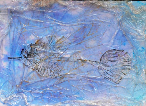
A third technique is this one below. First saturate card stock or glossy paper with water, then sprinkle the Brusho powder into the water. Move the colour around with scrunched up cling film and leave the cling film in place while the card stock dries-overnight is best. (The piece below is one of my rejected experiments).


Step One: Create and assemble the focal image. First the jug. The jug is using the cling film method from above. Draw a jug on the back of the card and cut out. Cut around the front rim of the jug and adhere the small back section, then the flower stems, then adhere the from large part of the jug over the flower stems.


Step Two: The flowers: I found it easier to stamp the flower heads and the stems separately, and reassemble them into the vase later. The flowers were done by first stamping with a mixture of China  and Blue Glass Fresco paint onto  smooth white card. When the paint was dry I went in with some Ultramarine Brusho and filled in the white spaces. The stems were stamped with Tinned Peas.


At this stage the collage looked a bit flat:


Step Three: Finishing details. Using London Bus paint, I stamped the red poppy onto tissue paper and adhered it to the jug. I outlined the jug with a fine black marker and put some in shadows around the jug and flowers using a black watercolour pencil. I added some white highlights and some dark centres to the poppies using acrylic marker pens, and used the same pens to add some dots to the frame.


I really enjoyed using this stamp set and playing with Brushos. I think I have succeeded in making two pieces of art that are quite different in feel even though they both use Brushos and the same stamp set. If you've never used Brushos before I really do urge you to have a go. They are not expensive, as a little goes a long way, and there are so many different techniques for using them. They are just pain fun!!

Thanks for looking.

Pam

Ohhhhh Pam, what a fabulous use of brushos. You have used them in such a controlled fashion, they look wonderful, and I LOVE your Anzac card!.Thanks Pam for showing 2 very different ideas!!

We would love you to join in with challenge #17: Brushos. If you are inspired by any of our guests who have blogged on this topic over the fortnight, then please join in and link up your creativity HERE.

All links go in the draw to win a voucher to spend on products of your choice from the PaperArtsy online store. This link will close 19:00 (London Time) Jan 17th 2015.

Wednesday, 13 May 2015

2015 #9 Words of the Wise {by Pam Thorburn}

2015 Theme 9: Words

Hi everyone, Pam Thorburn from Waltzing Through Life here, joining you this evening with a post about on the theme of Words. When I was thinking about what project to do for this theme it occurred to me that since books were full of words, that I should alter an old book in some way. In the end I decided to make a portfolio of quotations. What mixed media enthusiast doesn't love to collect quotations? I liked the idea of a portfolio, rather than a journal, as it meant I could work on loose sheets of card stock. Working on loose sheets, can be easier than working on fixed pages. When my art pages are completed I can just use the bulldog clips to keep them in the portfolio. My techniques are simple: stamping, painting, collage and hand lettering. 

So here's my very simple quotation portfolio using an old book cover:


Front Cover:


Inside:


Step 1: The book is a cloth covered book, and I really liked the cloth texture, so I decided to give it a paint finish which would allow the cloth texture to show through. After removing the pages from the book with a craft knife, I painted on gesso inside and out. I followed this by sponging on three shades of blue: Mermaid, China and Blue Glass. I was quite random with my paint application, and not at all concerned if the finish was blotchy. When that was dry I used gesso and  two stamps: JOYF 32 and Background Plate 6 to add some pattern.

Step 2: The images were first stamped on thin card and then painted with Fresco Acrylics. I then cut out the images and collaged them on using heavy gel medium. The stamps are from JOYF 32 and   E Lin Brown 17. The inside also uses JOYF 14. The colours are Yellow Submarine, Tango and London Bus.

Inside cover:


Front and back outside cover:


Step 3: For I my first quotation page I kept it simple, just stamping onto the smoothy card stock which makes stamping so easy. I stamped with stazon ink and painted the images with Fresco paint. The transparent paints are perfect for painting stamped images as the fine detailed lines show through the paint. I used the same clouds as before: Yellow Submarine, Tango, and London Bus. 

Like a lot of people I am not particularly fond of my own handwriting, but I have discovered that by exaggerating parts of your writing, for example sprawling the letters out, or making the ascenders and descenders extra long you can give your writing a bit more personality. As you can see I use a pencil to lightly write before using a pen. I then erase the pencil marks, and add some thickness to my letters.


The large scallops are the 'wings' from the E Lin 17 stamp plate, and the smaller scallops are from the JOYF 13 plate.


Step Four: For my next quotation page I started by painting a background of a sky and sponging on some green grass. I found a quick way of making the flowers. Rather than stamp, then paint, I painted the cardstock and when dry I stamped on top. This is much quicker as it doesn't require the same amount of care to paint within the lines! The flowers were then cut out and collaged on. I've sued some additional colours for the flowers here: Candy Floss and Pansy.


Step Five: When everything was dry I took my black pen and wrote my quote. 

WORD OF WARNING: Make sure you choose the right pen!

I didn't and as a result of grabbing a pen that was not quick drying I accidentally smudged my writing.  I thought I would try to fix it by painting over the smudges with acrylic paint. That's when I realised my pen was slow drying because it wasn't waterproof! So I actually made it worse. 


As another attempt to repair the mess I outlined the writing with white pen. It's not perfect but I think it probably minimises the mess a bit! 


I think I will really enjoy making small art works inspired by my favourite quotes, and having the freedom of working on loose card within this portfolio. 

Do you do handwriting on your projects? What are your favourite quotes? Do you ever use them in your art work? I'd love to see you use your own hand writing on your art work and see how quotes inspire your art!

Pam Thorburn, Waltzing Through Life

Wow Pam, this is such a striking project, and you have a cazillion brilliant ideas going on! I did have a giggle at the bird, a very knowing expression on his face suits the quote of the page perfectly. Thank you so much for sharing with us so many great uses for 'words' in a creative sense!  ~Leandra

We would love you to join in with challenge #9: Words If you are inspired by any of our guests who blog with us over the fortnight, then please join in and link up your creativity HERE. 

All links go in the draw to win a voucher to spend on products of your choice from the PaperArtsy online store. The Words link will close 17:00 (London Time) Sunday, May 24th, winner will be announced 2 hours later at 19:00.