Showing posts with label Magenta. Show all posts

Wednesday, 11 February 2026

Altered Floral Notebooks with EAB {by Autumn Clark}


Hi friends!  It's Autumn Clark from SewPaperPaint with you today and with Valentine's Day right around the corner, I thought I would be fun to create some handmade gifts for my loved ones.  What's better than a bouquet of flowers for Valentines?!  So I've created a couple of handmade journals, bursting with bouquets and filled with love...  


I created the notebooks in two colorways to inspire you all year as you craft your own handmade gifts.  First I'm showing the products used for the pink journal, including the focal florals from PaperArtsy stamp set EAB48 by Alison Bomber and the supporting berry stamp set EABF.  I also used two bottles of Infusions, Sunset Beach and Magenta and a coordinating ink pad.  
 

Next we have the products used for the blue-green journal, including the same florals, but different focal stamp from PaperArtsy stamp set EAB48 by Alison Bomber and the supporting dandelion stamp set EAB52.  Again, I used two bottles of Infusions, A Bit Jaded and Olive Tree and a couple of coordinating ink pads.


I purchased a stash of these unlined journals from Amazon HERE to create personalized gifts.  I measured the cover to include a bit of the black cover as a border and cut watercolor panels for each journal.  I knew I wanted some white contrast, so I embossed the text from EABF in white on panel one, knocking off some of the powder here and there to avoid harsh lines and give a more organic look.  I spritzed the paper heavily with water then sprinkled Infusions powder in Magenta mostly in the corners, spraying with water and dabbing with a "flouncy" watercolor wash brush to blend the colors as desired.  I wanted to leave the center a bit lighter. I let this dry thoroughly. 


I then stamped my berries and used Infusions in Sunset beach to color them.  Then I spritzed the panel again with water and the coloring diffused, so I took the paint brush and moved this pigment around where needed to achieve the right asthetic.  I spritzed the entire panel with water and added more of the Sunset Beach along the edges, as described above with Magenta to give a depth of color.  I finished by stamping  some of the collage stamps from the sets in a darker color.  


For notebook no. 2 I opted for dandelions from stamp set EAB52 in place of the berries and the alphabet in place of the Thoreau quote, embossing both in white.  I repeated the process above first with Infusions in Olive Tree, as you see below.  Then to add depth of color I layered with Infusions in A Bit Jaded.


With both backgrounds tucked under stacks of books to dry flat, I worked on the focal florals.  I stamped the flowers onto watercolor paper and used the same Infusions to watercolor them, trying to leave the flowers as white as possible, yet with shading for depth.  I really wanted the flower stems to fan out in opposing directions, so for one of the flowers I bent the rubber stamp stem as far as possible in the opposite direction, using tape to secure in place for stamping.  I drew with a waterproof pen the lengthened stems.  


I love to use foam tape to mount my stamping layers in most all of my projects.  I love the dimension it creates!  Since I was making notebooks, which would be handled more, I wanted to strengthen the dimensional stamping for endurance with use.  Often I do this by adding packing tape to the backs of my stamping before fussy cutting, but this time I used black bookbinding tape because I thought it would be nice to have black on the backs of the flowers if it were to show any, and thus coordinate with the black notebooks.


My stamped flowers looked beautiful over the supporting berries and foliage!  I loved the dimension of the flowers popping up, but I glued the stems flat for extra protection and to allow me to layer the absolutely beautiful sentiment "here's flowers for you" over top.
 

Here you can see how that tape trick worked out and I achieved two different looking flowers from the same stamp.  Yay!


I added a tied sari ribbon to each notebook, which can also be flipped inward as a bookmark.  


The pink makes my heart sing this February, but I am a green lover and can see myself using the other journal more so on a daily basis.  How about you?  Or maybe there are a couple of other colors you could combine with your own Infusions powders for a different colorway all together?


I hope these gift recipients will feel warmed by their flower bouquets much longer than a week!  Mostly, I hope you are inspired today to get out your infusions and PaperArtsy flower stamps and make some gifts of your own.  


I particularly loved adding the word Valentine twice at the bottom of this piece and think it would make a great greeting card design too!  Happy Valentine's Day!  xx, Autumn


YouTube: SewPaperPaint
Facebook: Autumn Clark
Instagram: @sewpaperpaint
Pinterest: SewPaperPaint

Thursday, 16 November 2023

2023 Topic 11: Monochrome {by Keren Baker} with Magenta & Scrapcosy stamps


Hi everyone, Keren Baker with you today.

What scares you, artistically speaking? Some of us find putting colour combinations together challenging. Others get freaked out by white space. Yet others (myself included) find a limited colour palette a little scary...but using just one colour? That's playing hardball!
So joining in with this Monochrome topic was a good way to push myself in a new direction. Resisting adding a tiny dot of extra complementary colour nearly finished me off!! I ended up with two finished projects- and here's one of them.


I don't ever really do art journalling and you'd be forgiven for arguing that this isn't either. But I wanted to use it as a piece of wall art, so didn't add it into my journal (even though I currently have a very bare one!!). I absolutely loved creating this A4 piece; not my usual pared back style- definitely a little too much product on one page for my level of arty calmness!


The pieces began with a pack of giant playing cards that I'd bought a while back and had been wanting to use. They measure 12cm x 17cm so are definitely super-sized. Nothing else was purchased for this creative session, I made do with what I already had.


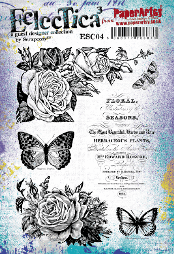
My selection of products revolved around the colour pink; Cerise to be precise and then adding Little Black Dress and Snowflake both as contrasts and also to change the Cerise into shades (adding black) and tints (adding white). I had the beautiful nature-themed set ESC04 from Scrapcosy as my hero stamp set to act as my starting point.


I'll show you a pre-project photo. My original plan was to add in a neutral or two plus some Glaze but I decided against that. Let's go cold-turkey. Simply stick to one colour and black and white.


Breaking the 'plainness' of Smoothy Cardstock is always hard. I knew I needed some different tints and shades so started mixing colours and adding them lazily to my cardstock, diluting them down so I had more interest in depth of colour too.


Don't be afraid of 'letting go'. Let the paintbrush dance and allow it to move in random unexpected directions. Don't overthink (I'm definitely guilty of this one!).


I also needed to lay some colour down on the playing card. It is a plastic coated cardstock and I wasn't sure how the PaperArtsy Fresco Finish Chalk Acrylics would do on that. I know that these lovely paints will go onto anything - but as I was diluting with water, I was interested to see what effect that would have. Added to that, Cerise is Semi-Opaque, so wouldn't give as solid and opaque a colour as I might have wanted.

My concerns were unfounded. Everything went down onto the cards justfine. If you need more coverage - add more paint, or, add in a little of the Snowflake / Little Black Dress which are useful fully-opaque paints.


Hold your nerve at this point. It's not looking too promising right now- but once we start to add layers, the piece will start to develop.
 

The next step was to use Grunge Paste onto both the playing card and the painted A4 cardstock sheet. My Grunge Paste didn't have much left in it and it also needed 'reactivating'. If you find that your paste has gone a little harder (but not rock hard 'set'), you can get it back by adding a little warm water and mixing (or chopping into it with a plastic knife) until it reaches the original consistency. You can always add more, so be sparing when adding water.

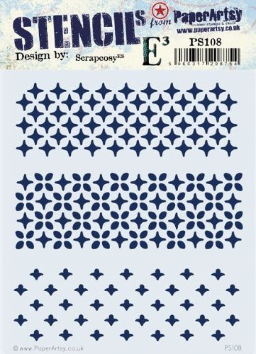
It's hard to know which stencil design to use. I like to 'audition' my stencils to see which one seems right. The Scrapcosy PS108 worked well.


After I let the Grunge Paste dry (doesn't take very long) I started to add more paint. This will colour the paste, and as I preferred a contrast, I simply sanded off the top with a nail file.


To add more texture to the 'flat' cardstock, I enlisted the aid of Infusions, which if you've never tried them- they're like unexpected magic!


I wanted the strength of the initial colour, not the secondary brown walnut stain that comes through more strongly as more water is added, so I dried them off fairly quickly with a heat gun. You can see here the other stencil that I used (my all-time favourite) PS021.


It was definitely time to stamp, and I grabbed the beautiful ESC04 set from Scrapcosy


You might be bothered that you've got to stamp over an uneven surface after using Grunge Paste- so 2 easy tips. Firstly- a stamp positioner is a really handy tool for situations like this. Secondly- I'd used the lighter-weight Smoothy cardstock (rookie error) and had thrown quite a bit of water and paint at it, so it was a little warped. One easy fix is to run it through your die-cutting machine, or leave it sandwiched in there over night. The added bonus of this is that it will flatten your Grunge Paste relief thus making it easier to stamp on!!


I wanted to focus all my detail into one area of the piece so as not to make it feel cluttered (design-wise). I trimmed some thin strips from some of the painted cardstock and created a small woven section.


To help 'ground' the focal point, I thought to add some of the stamps from the EC04 set but in a very delicate way. Using Matte Duralar, stamped and white heat embossed was a good solution, and helped that you could see a little of the underneath colours showing through.


It was heading towards the home-straight now, just a few little flourishes to add.

I love to add a quote - I do like CS Lewis and this quote fitted perfectly with the stamping I was about to do.


I rarely create projects without some sort of fibre or fabric and felt that this needed a few French knots. I was sorely tempted to add some turquoise knots at this point but managed to resist!! I also added a few pieces of washi tape and little tiny pieces of text that were under the butterflies in the Scrapcosy set.


I was looking for a mid-sized alphabet and the Ink and The Dog Words 2 (W2) is perfect stamped onto the larger Scrapcosy butterfly.


You can see the other finished playing-card project here. It's almost grungy!!


I did love the restricted monotone challenge and also how you can achieve interesting results just using a few simple techniques. I would definitely use the Metallic Glaze if I was doing something similar again and I'm looking forward to making more art with the giant playing cards. Wouldn't they look great bound as a book or with hinges on? So many possibilities. 

What could you create by editing your starting supplies? What could you add to increase the texture and interest on your journaling pages? Could you get a friend to challenge you - or hunt down one of the previously popular 'tic-tac-toe' challenges online.

I hope that you'll try a limited colour palette and see how freeing it can be...no more guessing which colours go with each other!! Thanks for being with me tonight,

Keren x