


Hi everyone! It's Liesbeth here with you today.
I was looking forward for this Monochrome topic for a long time! And to show you how nice it can be if you have only one colour as your starting point! So I chose a beautiful blue, wonderful stamps, took my A4 art journal and made this spread.

For most of the things I make I don't have a plan, I just start. But not this time :-) . I new some things in advance: Japanese, blue, and the small mosaic tiles. (Something I did before, loved it!) I decided the rest and the process while I created this journal spread and after much deliberation, and lots of fun, it turned out to this. I am happy with the result, hope it inspires you too!

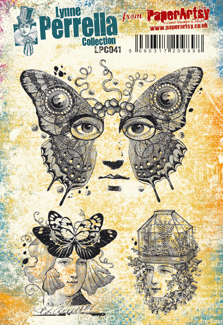
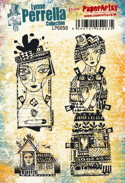
Inspired by Japanese porcelain and our own Dutch Delft Blue I chose two of the wonderful Japanese stamp sets by Lynne Perrella: PaperArtsy LPC023 and LPC024. Oh how I love them! Some of them have that beautiful Japanese characters, that will work perfect for our quarter theme: Typography!
For creating the tiny tiles I needed some PaperArtsy Grunge Paste. It's chalky and creamy, the perfect one for my tiles!

My favourite PaperArtsy Fresco Paint is Glass Blue, so that choice was easy, I use it a lot! I love the blue colour and its transparency so much!
Besides the blue I also used black and white: PaperArtsy Fresco paints Little Black Dress and Snowflake. I always like to make a color study in advance so that I know what to expect. So I mixed the colours onto the colour wheel, except between black and white because I knew I didn`t want to use any grey. I was surprised about the mix Glass Blue and black! Amazing ,indigo' blue!


I took my art journal, protected the other pages with some paper under my spread, and started! The paper in my journal is a nice watercolour paper, very good for the background I had in mind. But it's very bumpy, so hard to stamp on.
I tried to make a cloudy background: I used a drop of PaperArtsy Fresco paint Glass Blue and a lot of water, it looked like watercolour paint, great! I just painted the entire journal spread with a soft brush, worked very wet.

Here and there I splashed some paint drops and dabbed dark areas with a paper towel to make it cloudy.

After drying I was temperate satisfied about the result, it was beautiful, but a bit to soft...boring. So I thought: It needs some more interest, why shouldn't I start with some ,tiles'?
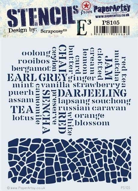
Using the Glass Blue paint, the crackle part of PaperArtsy Stencil PS105 and a small sponge I sponged the crackle. Dark at the edges (a few layers) and softer in the middle of the spread. Nice effect! This is what it needed!


Time for the focal points of the pages! I stamped all of the stamps from the PaperArtsy stamp sets LPC023 and LPC024 onto an A4 piece of smooth white cardstock with a waterproof black ink. (I used Tsukineko StazOn-Jet Black) Then I used the blue PaperArtsy Fresco paint Glass Blue as a water coulor paint again. Using lots of water and a bit of paint I painted the stamped images. I tried to vary light and dark.

When everything was painted, I cut them out and made a composition. The idea was to create a ,group' of stamped images on each page, which I was going to connect with mosaic. Here you see the left page. I was satisfied about it and I glued it onto the page

There was a little problem with the right page. The stamp with the face and flagpole with the fishes was to hard to cut uit, so I needed to stamp the flagpole directly onto the page as you see here, and add the cut out face and fishes later on. Because the paper is very bumpy, the stamped image was not very neat, so I drew over it with a black fineliner.

And this was the result of the right page after gluing the stamped images down. I also sponged the edges of the pages with some black ink.

I was happy with the way my pages looked at this stage, now I just wanted to connect them!

First I spread out a very thin layer (1 à 2 mm) of PaperArtsy Grunge Paste onto a craft sheet. I always use a rubber spatula for this. I let this slice dry for one or two days. A long drying time is good to let it harden well.

Then I broke the dried Grunge Paste into small pieces, different in shape.

I painted the biggest part of my mosaic tiles with PaperArtsy Fresco Paint Glass Blue, my main colour. The reason why I break into pieces first and then paint is I want to colour the sides as well! Because the paint is translucent, it needs two layers of paint.

I also painted a few tiles white (PaperArtsy Fresco paint Snowflake). The 3rd colour I painted some tiles with was a beautiful indigo blue, I mixed it with Glass Bue and black (PaperArtsy Fresco paint Little Black Dress) I think on my colour wheel it was something between 3 and 4 :-) I let the small pieces dry very well. Overnight works best.

Now we're going to create a nice tiled connection!

Starting in the bottom left corner, I glued the tiles onto the pages one by one, around the stamped images. Most of them Glass Blue, here and there white or the mixed dark blue. Here you can see what I mean.... hopefully it makes sense;-)

And so on for the middle part... I tried to make a track, a kind of path in one flowing movement.

The finished right page

And here you see the finished spread again.


This was so much fun to do! I think the journal spread has turned out mostly the way I had in mind before! I learned that working with monochrome colours, which I almost never do, isn't boring at all! It was an adventure and I love the way the colours turned out. Perfect together with black and white! The combination of the three used PaperArtsy Fresco paints Little Black Dress, Snowfake and a main role for Glass Blue was great. Making and glueing the mosaic tiles was hours of work, but worth it! They work so good in combination with the stunning Lynne Perrella stamp sets LPC023 and LPC024 !! I hope I inspired you to choose only one colour of Fresco paint (ok...and black&white :-) ) and give it a try! Have fun!
Liesbeth XX


Facebook: Liesbeth Fidder
Instagram: liesbeth_fidder
Pinterest: liesbethfidder


.png)
