


Hi everyone it's Floss from flossworkshopart with you today.
I whooped out loud with joy when this latest PaperArtsy mail art topic opportunity landed in my email box! It instantly got me thinking about the amount I used to use 'snail' mail and how I loved to decorate envelopes, or parcels and the crazy things I used to send through the post, (more of that later...) and so because of this I decided to go straight for the obvious for this blog and decorate some envelopes. I wanted to keep things fairly straight forward but keeping my use of gesso, a few layers, a little stitching and some embossing...as that wouldn't be me without those things...and they all tie in nicely with this quarter's theme: textures.

I hope that at least one of these envelopes will inspire you to join in with this topic and consider sending an art envelope to brighten someone's day...I think art should be shared with all, so why not also bring some joy to the posties whilst your 'snail' mail is on the way to its destination?! Decorating envelopes is something I've totally enjoyed doing for many many years...maybe I should tell you about one of the funniest things I sent through the post...

I wanted to make the art mail envelopes more individual and I knew that by using PaperArtsy infusions on a good cartridge paper, it would give me interesting results that would be totally uncontrolled and random to start with. I did a colour swatch for Sunset Beach and Olive Tree because I think they suited the stamps I was going to use.

Here you can see, not only did I colour swatch the infusions but I started to look at how different colour inks would work over them instead of just going straight for black.. I think that using different coloured ink pads can enhance the overall appearance of an art piece and it can compliment the different tones within the infusion dye stains as they are rarely a solid colour. You will also see that I have labelled bleach on the swatch too.

Some people like to sprinkle infusions on wet paper, some prefer to sprinkle infusions onto dry paper and then spray them to activate. I personally like to dry sprinkle then spray, I then use a large flat brush to swirl the colours and liquid into some very pleasing designs. It really does depend on how much you like to leave or dissolve the little specks within the infusions, and how much water you use to hydrate the powders. I mostly like to dissolve mine or leave heavy areas that almost create a crust when left.


Using a hairdryer or heat gun can speed up the drying process and give some interesting outcomes too depending on the length of time you hold it in the same spot. Here you can see how very different each page was...

I wanted the envelopes to be 220 x 110 mm (standard DL size) and so I needed the paper to be 251mm x 251mm to start with. I used my trusty paper cutter and made sure that each page was square.

Some dyed pages were not big enough so I sewed some together to make the correct size required. The stitching which would add further interest and texture to the envelope.
I found an amazing website that was extremely helpful with envelope making sizes. www.imjustlovinit.co.uk This link will allow you to choose metric/imperial and put in your own envelope measurements...it's fabulous if you make bespoke cards etc which need something different from standard sizes given.

I scored the first line at 164mm, then rotated the paper CLOCKWISE and lined the score line I had just made with the horizontal cream plastic triangle inline with the 1cm marking measurement. I kept rotating right and scoring until I'd done all 4 lines.

I punched the little triangles out where the score lines crossed...you can also use scissors to do this. I then folded them into envelopes ready to have some creative fun with...

The folded envelope on the left shows an example of what I mentioned earlier about the 'crust' texture where the infusions remain less activated but heat set onto the surface.

Having tested how bleach works on infusions, I knew that my first 'texture' layer was going to be stamping bleach. THIS IS AN ADULT ONLY part of the project. Please wear gloves and open your windows if you are going to try this element of the project or get an adult to help you if you are a young artist. It is safe to use bleach with the rubber stamps, as long as you wipe the stamp straight after with a damp cloth or a wet wipe and then use running water to thoroughly clean them after you've finished this stage. I used thin bleach poured onto 4 layers of folded kitchen towel to make a stamp pad. you don't want the paper towel to be soggy...but I found just enough to make a slight sound when releasing the stamp. Do try test pieces first.
In my testing I found that the more closed the image was the less defined it would be using bleach. I liked the results using the background (BG3EZ) stamp best.

Having done a fair amount of testing the process I went ahead with adding bleached layers to the envelopes. I used BG2EZ with bleach and then stamped MN23 using Ranger Archival Ink ground espresso in small areas without using a stamping block so I could limit the area stamped. I stamped the top and bottom flaps upside down to accommodate the folding upwards leaving the numbers to be the right way up when it was assembled and glued together.

I then spread gesso onto some fine calico using an old store card...notice that it was spread uneven to enhance the feel of the texture. Once it had dried I used another stamp from the same BG2EZ set onto this using Ranger Archival Hickory Smoke Ink pad. i did not refesh the ink each time so that it would give me more 'broken' tones.

I did not measure the fabric as it was just a random piece that I pulled out of my stash but did feel a bit jammy with how I snipped the edge and ripped it into three strips, then folded those strips into three to snip the edges allowing me to rip again making 9 labels. I prefer to rip rather than cut fabric as it leaves a lovely frayed edge which adds to the natural textural quality. The fabric piece was approximately 330mm x 180mm making the labels approx 110mm x 60mm.

I then punched some circles out of left over pieces of dyed paper, cut oblongs of scrap chiffon fabric, which I folded into three, assembled, punched and secured with an eyelet. I added a string for decoration purposes. I did worry about the string maybe getting caught up or ripped off so I made sure that part would be stitched or heavily glued in place.

I did edge finish the coloured circle using the ground espresso to allow it to 'pop'.


I started assembling which stamps I thought would work well with which envelope...and which tissue paper textures would enhance each one. The different envelopes really allowed for so much choice and fun.

The tin lid on the left is what I used to contain my 'bleach ink pad'. If you are going to use text for your envelope textures then remember that the top and bottom flaps will fold over so remember to do those the opposite way (upside down) to the fronts and sides of the envelope.

I thought the little dolls were just so cute popping out of the inside of the envelopes.

I glued the labels on and sewed extra chiffon along the edges or slightly tucked chiffon under the labels and stitched them into place.


I painted PaperArtsy Fresco Finish Snowflake Chalk acrylic on the reverse of the torn tissue paper car and stamps so it would be more defined and embossed the measurements from the G3EZ stamp using Wow opaque vanilla embossing powder.

I then used double sided tape to secure the sides under the bottom folded over flap. I will use double sided tape or a glue stick to secure the envelope closed once I am ready to enclose something inside and post it on its merry little way into the world...


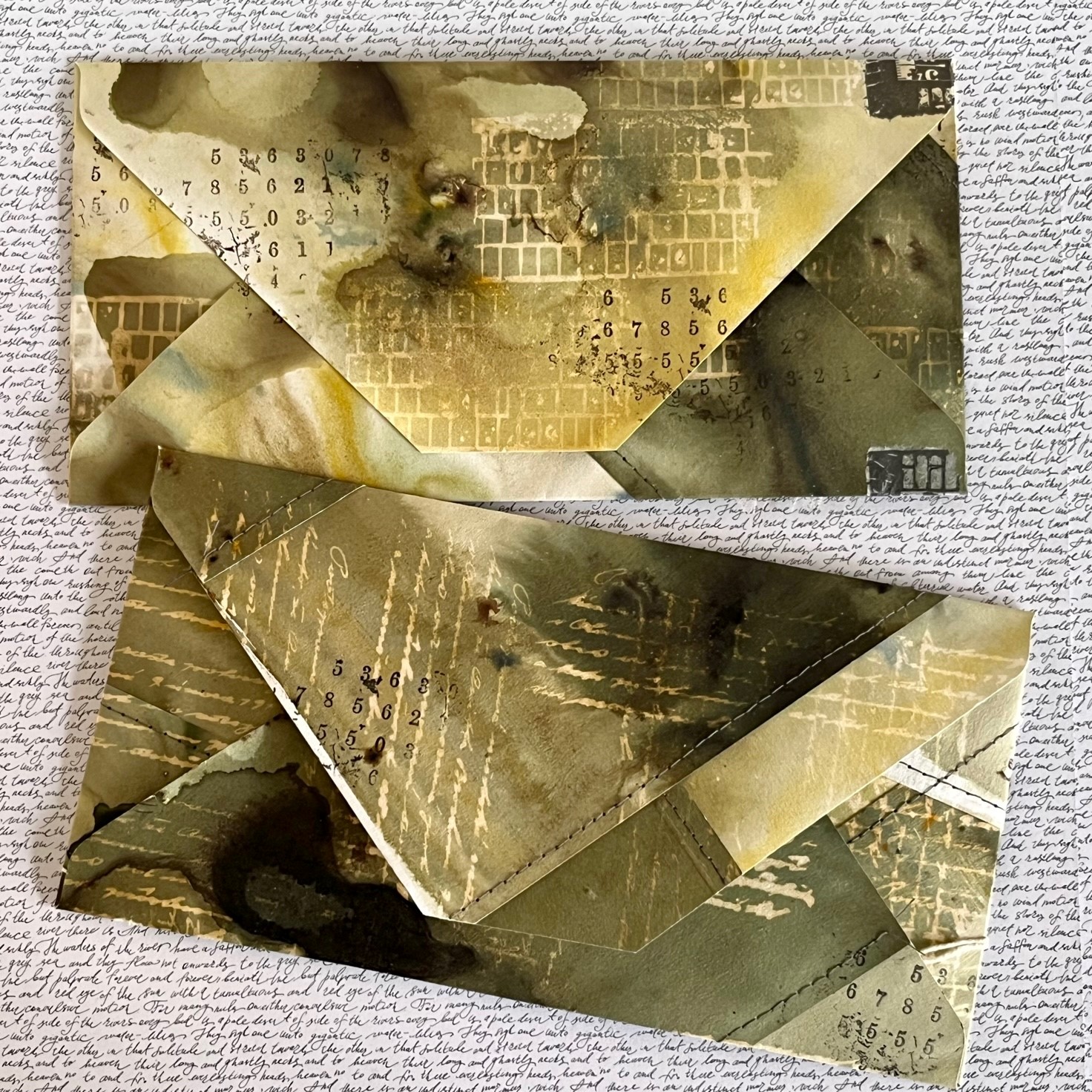
I particularly liked adding the script stamp both horizontally and vertically creating a grid pattern with the bleach.


Is there one you'd love to have fall through your letter box?

I found stamping and embossing onto tissue paper easier to place over cloth and glue into place using matte medium rather than embossing straight onto the fabric. It may be because the fabric had quite an open weave. The embossing ink pad soaked through into the cloth making the embossing powders difficult to show/stay on top of the cloth. I found that when I was embossing onto tissue, I had to keep the heat gun moving and not hold it down too long as the embossing powder tried to stick it to the paper beneath it as the tissue paper was very thin.
I enjoyed how the whole thing came together at the end and because I used the stamp sets across all envelopes they automatically became connected to one another. Maybe I should've only used one type of infusion powder, but I wanted to give myself choices.
I'd love to hear your comments especially if you give this project a whirl and which stamps you chose to use on yours.
Enjoy your creative time,
Floss x

I have made my first YouTube video...it's a quick tutorial of how to measure, score and make envelopes using the score board and notch punch...I hope it is useful to those of you who have not made envelopes before...or for those who need reminding how to make envelopes.

Facebook: floss.workshop.art
Instagram: floss_workshop.art
website: www.flossworkshopart.com
I have the following classes coming up at the end of April in Hellingly, East Sussex UK
Mixed media for beginners 24.01.23 10am - 12.30pm


