Showing posts with label ESN59. Show all posts

Monday, 16 March 2026

Flip Flop Book with ESN {by Keren Baker}


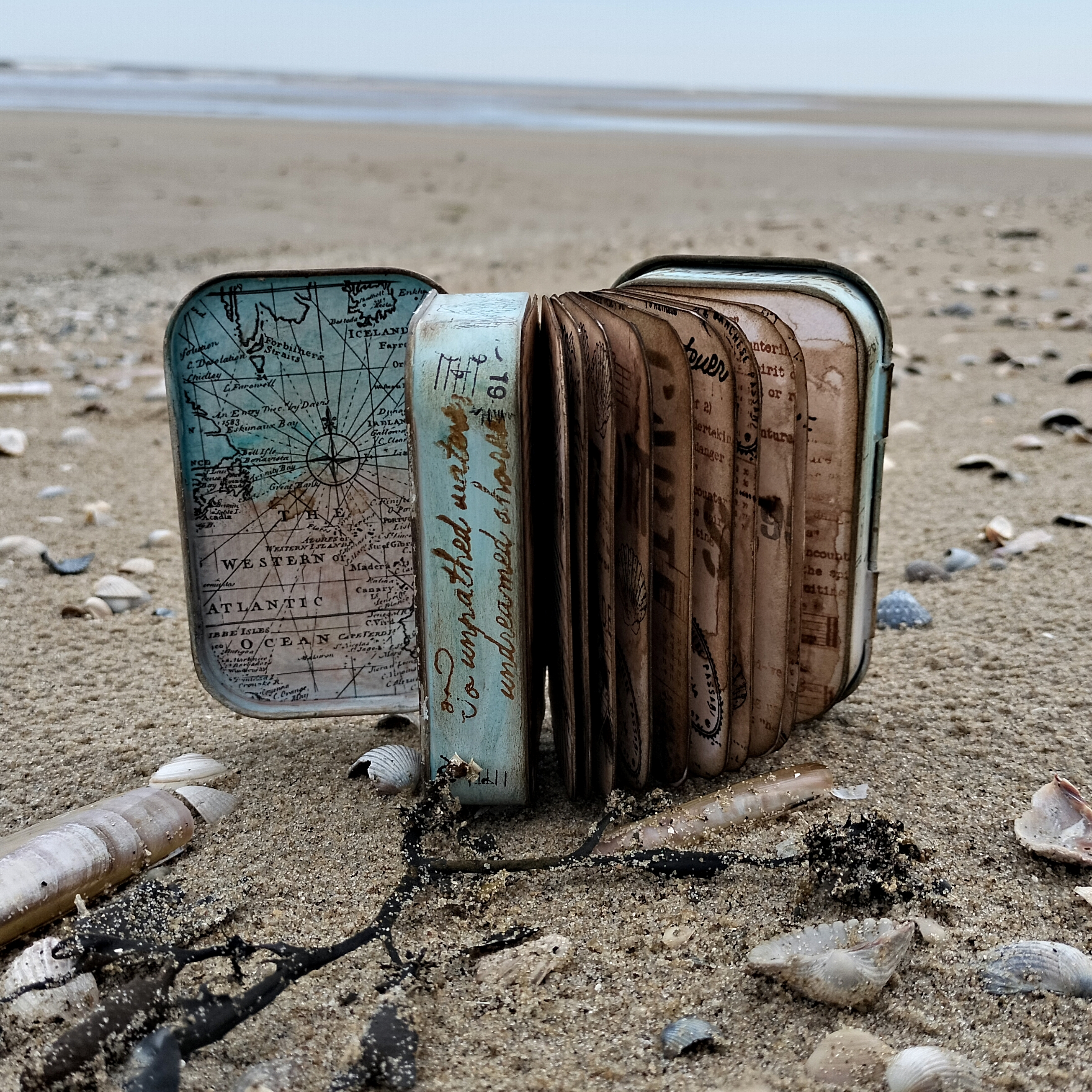
I recently learned about the explorer, inventor and conservationist Jacques Cousteau and when I sat down to create this project, his inspiration teamed just perfectly with Sara Naumann's stamps and I created a somewhat unusual front cover to my Flip Flop book.


I would normally pick two main colours and add a pop of colour with one that's directly opposite on the colour wheel, but I wanted a tranquil marine theme and decided to leave the more bold colours alone.


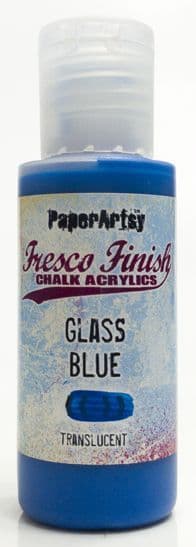
I had lots of 'backgrounds' to complete, but I began with the final page, and this was just on a piece of White Board with lots of dry brushing and using PaperArtsy Fresco Finish Chalk Acrylics in Baltic Blue, China, Heavy Cream, Green Patina, Lawn & Duck Egg Blue.


I stamped out multiple images from the Mini 118 set with different coloured inks. I had this idea of making a focal point in a wreath using cut out images, but I really wished that I'd just left it like this and used this whole sheet as a background !


I wanted to use Grunge Paste in a couple of ways. I haven't stamped on it for quite some time. It's an easy technique that delivers high impact. You'll need a substantial substrate to add the Grunge Paste onto.


I used White board, (PaperArtsy have great packs of it). Spread the Grunge Paste in an even layer. The temptation will be to add a spray of water onto the stamp to help ease it out of the Grunge Paste but don't, as it'll make it more liquid-y and not show the stamp details up as well.


Just make sure that you clean your stamps straight after stamping with the Grunge Paste so you don't get it drying in the stamp crevices.


I also created a small piece that looked like the ridges on the sand when the tide has gone out. Leave them both to dry.


Sprinkle on your Infusions over the dried stamped piece; I used In The Navy and A Bit Jaded. As the Infusions have two different crystals that react with water at different rates, if you want more colour and less brown walnut crystal, you need to dry the piece once the desired colour has been achieved. I just used a heat gun to dry it off quickly.


I wanted to use multiple layers to open out for the book. Using translucent and clear surfaces would encourage people to look through and discover the other layers, so I dug out some acetate and Grafix Duralar. It's easy to stamp on one side using a permanent ink like Stazon and then use colour on the reverse.


For layering using acetate, add the colour that you want to be in the foreground first (on the reverse) and then add the other colours. This was supposed to be echoing waves as I wanted to add it over the Grunge Paste 'sand' layer.


Using the main image from Sara's Eclectica 59, I added the paint on the reverse. The Duralar has partial translucency and enough to be able to see a soft colour showing through from the back.
 

Having thought about Jacques Cousteau and his work in the oceans gave me the idea to have the front as an underwater mask.


I added another layer, putting one of the stamp set's quotes and adhering another stamped shell underneath.


You can see the soft effect that painting on the reverse gives.


Each layer opens upwards or outwards.


I used circles as much as possible, so there was a consistent theme. I echoed the 'bubbles' by using brads and eyelets.


I also used some metal tape to attach several of the elements to the book. If you closely at the photo, you can see some of the metallic shimmer spray that I sprayed over the top.


This was placed on the back; my failed focal element. It brightened up the back at least !
 
It would be easy to add in a few more flip/flop layers and have them left blank in order to add notes or photos. As Scrapbooking seems to be having a resurgence, maybe we should be printing off our photos once more!
I'd have liked to do more with the idea of looking through the layers, perhaps using a porthole styled frame and lots of layers.

It's a great way to add in texture and layers easily without having to plan too far ahead. Do give it a go !

Thanks for being here today,

Keren x


Monday, 3 June 2024

2024 Topic 4: Books & Journals {by Liesbeth Fidder-de Vos} on the PaperArtsy Blog


Hi everyone!

Liesbeth here with you today. I´m a book lover! I love to read a lot, and I also love how books look, feel and even smell! And of course I love making them! 

I am always looking for nice, curious things to make the covers for a small book from. It might be during a walk in the forest, spotting leaves, husks, bark, pieces of wood etc. Also a paradise for finding books is the thrift store. I always see possibilities for book covers everywhere. That´s where I found these two altoid tins, my perfect book covers.

Our quarterly theme is ,HIDDEN´, and there is lots of space in the tins to hide something in! 


After I finished this project, we went for a short vacation to one of the Dutch islands: Texel. Completely the atmosphere of the wonderful stamps I used for the book, so I made some pictures there on the beach! I was happy with the result, and it was so much fun to create the book and the tiny beach inside the front tin!


First I hasitated for a moment between some nice wooden coasters I bought as well and the tins. The tins won!

At this stage I didn`t know exactly what materials I should use, but I was sure about the wonderful PaperArtsy Sara Naumann stamps, I chose ESN55 and ESN59. They are really perfect for this project, so natural and vintage looking. And I was also thinking about a nice stencil, some Fresco paint and maybe some Infusions...?!


First I had to prepare the tins, so I sanded them with sanding paper so the paints will hold better. After that I added a layer of gesso, in- and outside.


I painted the lids of the tins with some PaperArtsy Fresco paint Glass Blue, let it dry and covered some areas with PaperArtsy Crackle Glaze. After it dried, I painted the entire tins with two colours of PaperArtsy paint: Blue Oyster and Eggshell, together on the paintbrush, not mixed to much. Wonderful crackles appeared on the lids.


To make the backgrounds inside the tins I used the beautiful PaperArtsy Scrapcosy Printed Tissue Paper. I glued nice parts of it into the tins with gel medium, as shown here, but not before I stamped some shells on the paper here and there with a waterproof ink. (I used Tsukineko StazOn-Jet Black). 


The best way to paint the inside tissue paper, to add some colour and a vintage look, was using PaperArtsy Mattints, they are so multifunctional! So here I used the Mattints Dragonfly and Nutty just as a paint. Being transparent, the black printed tissue imagery is not compromised.


To decorate the front and back of the book I stamped the beautiful big shells from the two stamp sets onto a blank piece of tissue paper, tore it out and glued it down with gel medium.


Here I made a little mistake... i didn't realize the tins needed to be in opposite direction. the front one should open at the right, the back one should open at the left. Mine are the same, oops! But I decided to use them the way they were, and it didn't turn out to bad!

Now it's time to create the book itself. I cut some double pages, the size is exactly as big as the bottom of the tins. I used some PaperArtsy Infusions (Just Walnut) directly on the paper with water, and also in a spray bottle. This way I created a very old and vintage look for the pages. 

After drying I sponged with Ranger Distress Ink (Walnut Stain) through the PaperArtsy stencil (PS325), and stamped the several stamps of the two stamp sets with brown and black inks, I used them all! I used a little bit of bleach to highlight some stamped images.


As soon as I was satisfied about the pages I cut the corners nice and round and sponged the edges with brown Distress ink. Then I made a nice composition and glued the backsides of the pages together.


I covered the spine of the book with a piece of fabric. Using my Infusions Just Walnut spray I made the tins very old looking. I also sponged and stamped the edges and sides of the tins with black and brown waterproof ink. I used Ranger Archival-Sepia.


It was time to finish the book by gluing the back sides of the tins onto the front and back of the book. Here you can see the spine, I hung a crystal Swarovski star onto it.


I decided to create a hidden tiny beach into the front tin. I didn't want loose sand so I bound the sand with PaperArtsy Gloss Glaze. This way I created ,sand  paste' and it worked perfectly as I hoped. I just mixed a bit of sand with some Gloss Glaze.


With the ,paste' I made a beach at the bottom of the front tin and let it dry overnight.


After one night it had hardened enough and I decorated the beach with some shells, rope and driftwood. I glued everything on it's place.


The book is closed and decorated with a piece of twine and I added the text ,to the sea, to the sea' to the front. The text is stamped on a seperate piece of paper and cut out.

And here it is, a sea shell book with altoid tin covers and a hidden beach.

Some of the pages inside the book


Making book covers out of strange things is so much fun, so many possibilities! Just look around and search, hope you give it a try! I am very happy with the result of this beach book. The PaperArtsy stamp sets ESN55 and ESN95 are so perfect for this project! The size, backgrounds, focal points and style...it seems like they were made for it!

Hope I could inspire you. Have a wonderful day and see you next time.

Liesbeth XX


More Posts to Enjoy