Showing posts with label ESA01. Show all posts

Tuesday, 13 October 2020

2020 Topic 18 Rule Of Thirds With ESA (by Nikki Acton)

  2020 Topic 18: Geometric


Whilst it's true that art can be completely random, many artists do employ design principles in their work. If you find a piece of art pleasing, you can often trace some elements of design on it and Nikki has given us a great look at one of those rules today. The contrast of the black border and beautifully executed design starts our Geometric topic off perfectly ~ Keren.

Hi everyone, Nikki here today (Addicted to Art) with you today, sharing my geometric journal page.

One of the simplest 'rules' of composition is the rule of thirds which I have adopted here. By dividing the canvas/photo/page into thirds, you don't need to actually draw the lines like I have Frequently the most pleasing composition is where the points of interest are at the cross section of these lines.


I did start by lightly drawing in pencil lines at one third from the left and the bottom. I wanted to create a light to dark with my paints so needed a guide! I started around the cross over of the lines with the yellows and worked my way out to the darker reds. As Fresco acrylics dry quickly I added a little Satin Glaze to add time for blending.  I used Banana, Haystack, Terracotta, Tango and Claret Fresco Acrylic Paints.


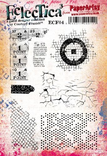
The blending doesn't need to be perfect as I added some stamping and stencilling. The stencil is the brickwork from PS016 (Emma Godfrey) and background stamps include the square grid stamp from ESA01 (Seth Apter) and dots from ECF04 (Courtney Franich).


The focal point is from one of Seth Apter's earliest PaperArtsy sets - ESA03. I stamped on some extra card that I painted with the same colours. This card was also used for the strips  that I have used.


I mounted my 6inch square onto black card (well in my black journal) adding a few extra bits of card to the edges of the page to balance the composition.


I added the lines back in at my one third from left and base using a Stabilo All pencil and smudged it lightly. I always like to think about composition in my artwork, although I don't always get it right! The rules of thirds is so simple; it doesn't need to be quite as strict and constructed as I have done here, but try it - it works!

Nikki x

Instagram: @Nikki_Act
Pinterest: nikacton

Wednesday, 20 November 2019

2019 #18 Shaving Foam: Making it Grungy with ESA and EAB {by Nikki Acton}

2019 Topic 18: Shaving Foam


The way Nikki has created a background panel using sections from different coloured shaving foam backgrounds is super eye catching! Seth's stamps fit in perfectly too! ~Leandra

Hi everyone, it's Nikki with you today from Addicted to Art to share my shaving foam inspired project. I used the shaving foam with PaperArtsy Fresco Acrylic paints, but kept my colours minimal using black as a main colour to keep a slightly more grungy feel to my piece.


As you can see I combined elements of different prints to create this panelled 4 x 4 inch canvas.


I used a combination of blues - Blue Lagoon, Glass Blue and Midnight along with Little Black Dress and also Chalk - which I used on black card stock.


Having created the swirly, gorgeous paint / foam combination I took the print for the lovely swirls. With any foam that had relatively fresh paint left I spooned it onto some card and then swiped it to cover. I found this gave me some interesting (if inconsistent) effects - see the piece on the RHS above.


Once my panels were cut to size I edged with Black Archival ink before adhering to the canvas board.


The focal point is the star from Seth Apter ESA03 along with an Alison Bomber quote from the Happiness Edition - EAB14.


I added additional stamping using ESA01 (circle and star) and two of Seth's mini stamps EM33 and EM40.


An idea stolen from Seth Apter - I used the little tail on EM40, to add detail to some of the edges. The lines on EM33 were also used at the edge and embossed with white embossing powder.


This is a fun, if a little messy, technique. A bit like gelli printing I find it's worth doing loads in one go to create lots of backgrounds that are then ready for other projects. The PaperArtsy paints work wonderfully in the foam - I also did some with magenta / pink tones (Bougainvillea and Byzantium) which might make an appearance soon!

Thanks for joining me today, I hope you have a creative week.

Nikki x

Instagram: @Nikki_Act
Pinterest: nikacton