
2021 Topic 7: Stamp Mash Up

With
some intriguing watercolour techniques using a glass, and real standout
texture thanks to texture paste, this is a bold art journal cover. It's
easy to pigeonhole watercolours as not having as much impact as other
paints, but as Ellie cleverly upped the levels of white on the page, the
subdued colours still take centre stage.
~ Keren
~ Keren
Hi everyone, it's Ellie Knol with
you today, and I'm here to share with you the making of a cover for an
art journal, of course with product from four designers! I chose to use
at least one stamp set from each and also a stencil.
In
order to mash up stamps and stencils from four designers, I chose to
use most of them in the background, and only one for the focal point;
the easy way I suppose.

I started creating a colorful background; it's basically watercolor added around three glasses onto watercolor paper. This way creates circles onto the background. The water will carry the color pigment around the edge of the glasses. After it had dried I chose to wet the white areas and let the color run into it a little. This is a technique I learned from a live from Ilse Hoekstra.

I
LOVE how this creates color blooms, and also color mixing on the paper.
By adding more, or less, water it will create beautiful unsuspected
backgrounds, with basically room for three focal points.Having
a colorful background as the start of a project gives a lot of
possibilities, as it's not a blank page anymore; which can sometimes be a
bit scary.

Using stencils in the background will add a useful layer. Choosing white is always a good choice, as far as I am concerned, because it will add a basic layer to which you can still add anything. Choosing structure paste adds so much interest.

The PaperArtsy stencil PS218
designed by Sara Naumann has been used as the main stencil. I applied
structure paste through it, except for the bottom left section.

I also added structure paste through parts of PaperArtsy stencil PS140 designed by Jo Firth-Young to fill the background even more.

While the structure paste was still wet I stamped into the structure paste of both the above stencils with the circles from EM60. LOVE this mini by Tracy Scott..

Next stencil I added structure paste through is the PaperArtsy stencil PS015 designed by Emma Godfrey....

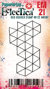
... and, yes, you might have guessed it, I stamped into it while wet also, with the stamp EM21 also from Emma Godfrey.
Last,
but not least (as this is such a beautiful and versatile stencil) I
filled the last gaps on the background with PaperArtsy stencil PS204 designed by Sarah Naumann.

NOW, for the focal image...
I had some decisions to make: what ink color to stamp it with? On what substrate?
I stamped and fussy cut quite a few of these butterflies, lol...
These are the three that made the short-list, one in a dark brown, the other two with StazOn ink (Rusty Brown) on vellum, and on white cardstock.

The butterfly and sentiment stamps are from PaperArtsy stamp set JOFY79 from Jo Firth-Young.

For the final steps I chose to stamp (with StazOn ink (Rusty Brown)) with quite a few stamps from various designers onto the background, also the ones I mentioned above. The scripts and postal images from Sara Nauman's stamp set ESN05 are so useful on any background.

The alphabet from MN18 is like the cherry on the cake here.

I
assembled it to the cover of an art journal... one that has to be
filled yet. It's one of four inserts from the lovely art journal set
from Julia Woning.

Enjoy looking at the pictures of the finished project...


I
mentioned that I had to fill the journal, still.. I did some cleanups
of the stencils on three of the pages... a happy start..


As you can see it's quite fun to mash up stamps from different designers.


Remember
when creating: there should be a balance in any project as far as light
and darks, white space and colored space is concerned. The focal point
is always the most important part of it.
That is my goal,
always, in whatever I create. It can be quite challenging sometimes, but
the key word is to just try... and get experience.
Take some time to be creative today, every day... happy playing..


