Hi everyone, it's Leandra here with you today as we start a new topic for 2022.
If you are a member of the PaperArtsy People Facebook group, you may have caught my live yesterday as I shared a relaxing play-along session on colour-mixing fresco paints. We also dropped a PDF document in the group for you to print off and work alongside me. It's available on replay in the group, I hope you find it useful!
The information I shared in the 'live' relates to the topic we are embarking on today: 'Opposites Attract', so if you would like to learn more about mixing frescos to make your own bespoke colours, then that video is a good place to start.
For my post today, I was tasked with using these opposites: Yellow and Purple. Eeeeewwww! Haha! I feel like the naughty kid in the back of class who got the icko choice! Anyhow....challenge accepted, but suffice to say purple is not my strong suit! I decided that I would need a light and dark or both the yellow and the purple for a bit more oomph. I created a yellow by mixing PaperArtsy Fresco Finish - Haystack (FF03) with Vanilla (FF65) which was intended to pair nicely with Tracy Scott's Ochre (FF195). The Purples were to be blue swaying ever so slightly towards pinky-blue...
I chose PaperArtsy Fresco Finish
Aquamarine (FF153) and
Candy Floss (FF70) to make the blueish purple I was after. As you will see in subsequent photos, I also used
Claret (FF31) and
Inky Pool (FF46) which gives a nice deep purple that is quite rustic to contrast beautifully with the rustic ochre yellow....I say beautifullly.....in theory...haha, trying ever so hard here to embrace my inner purple creative goddess! (just keep swimming.....just keep swimming...in purple)

I decided that when working with complementary colours (those that are opposite each other on the colour wheel) I was going to have to work with contrasting layers, so that was probably going to mean working off the page and sticking stuff in. This gave me a chance to play with my paint combos. If you mix any 2 opposing colour wheel colours together you are going to generally get a brown or a grey, so my usual trick of working on one layer was probably not going to work in this case. I decided to embrace the contrast and create separate layers to warm up! A bit of brayering and a bit of baby-wipe dabbing...
I was coming to the conclusion that a journal page was the way forward with ochre as the base, and purple pops on top. These backgrounds were going to come in handy later. Although I did tone down the pinky -purple above to make it more bluey-purple.
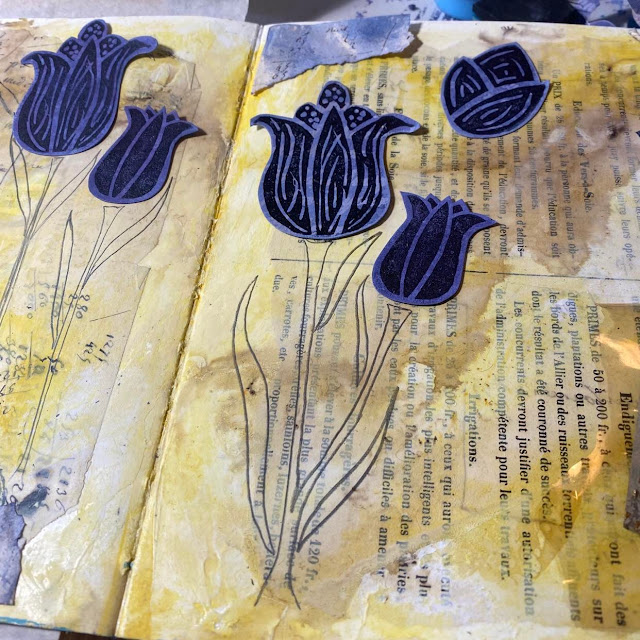
I decided purple flowers on an ochre background might be OK so I started off with that in mind. I also liked the idea of using Lin Brown's carved stamps as the heavy black might also be a good contrast...or maybe I thought the black would knock back the purple....haha...I'm already trying to eliminate the purple! I think you are getting the idea that this was a struggle for me for sure! Anyhow this is what I had in mind...

So lets back up a bit. To add a bit more interest to the plain page, I started by putting down some old vintage papers with gel medium.
Onto that I scraped on some Golden Absorbent Ground (because I had an inkling I might also go down the infusions road), and I hoped that might give a nice toothy surface for those infusions to hang onto.
Next up was some Ochre Fresco Finish Paint, with Vanilla to knock it back a little. I quite liked the papers showing through, so I used a baby-wipe to soften back the paint and that also softens the edges and opacity too. Makes it all look a bit more randomly applied too.
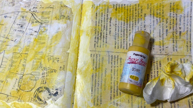
Out with the PaperArtsy Infusions Golden Sands (CS05) for some depth and more warmth.
Only a few grains gently tapped onto the page in a few places and lots of water. I did have some exposed paper, so that stain sank down into it wonderfully giving a good contrast. The brown walnut component is always going to add some depth with ease.
The next bit of preparation was to make some purple things that I thought might end up as embellishments. Strips of paper I tore from the edges of the vintage paper, a tag, a window from an envelope. Back to the colour wheels for reference, I was focussed on the secondary colour directly between the 2 Primary colours.....deep breath...here we go.....
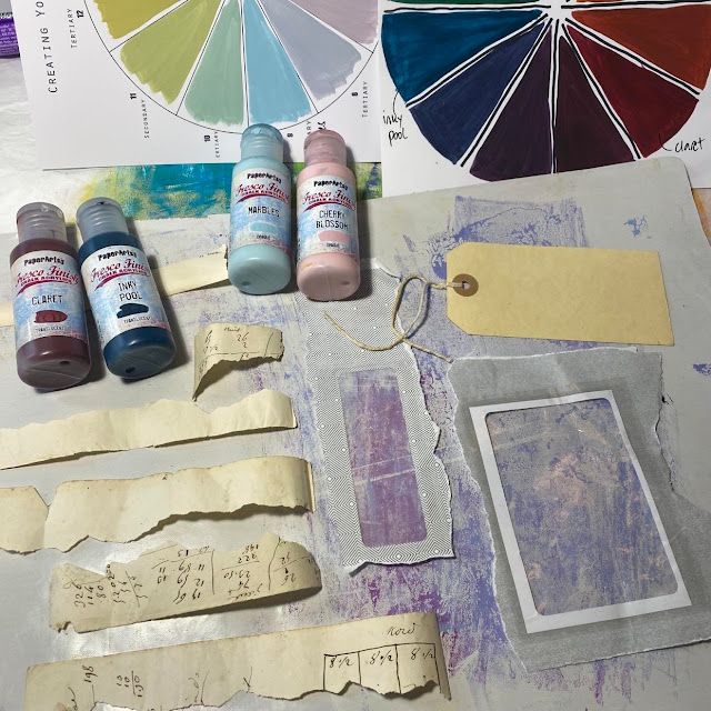
They all got layers of paint in the dark and light purple mixes. A bit of Finger painting, tapping, dabbing, wiping, wetting etc
And the tag ended up quite likeable, and I did go on to stamp script (from ELB05) in pale purple paint, and emboss in gold on it too....
TIme to commit! I boldly stamped out the flowers and decided to draw stalks for each of them so I could vary the height of the flowers. Was quite glad these pencil marks happily rubbed off the background.
I found my signo uniball pen in black was a wonderful juicy and black pen for filling in the leaves/stalks, and doodled some random thoughts and musings along the stems about the joy flowers can give to people.
I also did some journalling in white pen too on the right hand page, the pen is about to run out, so it was a bit scratchier than I expected, but I quite liked that effect as it allowed me to scribble knowing it was going to be totally illegible! (although yes I am aware my handwriting is impossible to read at the best of time)

I thought I was going to add a purple frame around the entire exterior...but whoa.... that was just too much purple for me! Perhaps if I had stuck with all pastel shades that would have worked out OK. I settled for a few embellishments in addition to the base purple strips, and put some brown-ochre thread under each flower for a bit of texture. Even the camera is making this look brighter than it does in real life, the yellow is really not that bright!
This is the right hand page, I prefer it to the other side. Perhaps it's because I found some yellowing plastic that I could tuck my tag behind. This is actually part of the cover of my 'Good Housekeeping' cookbook that I was given at the age of 18 for my birthday when I left home to go to uni. It is fondly referred to as the 'cooking bible' in our house! The cover is disintegrating after being dragged all around the world and referred to often. I knew the yellowing acetate would find a home as some kind of window one day!
Look, if I am perfectly honest, I am really not overly happy with this spread. I think it all needs toning down! I am extremely tempted to whitewash over the whole thing to knock it back, but I'm going to hold off and leave it to one side. I'll come back with fresh eyes in a week or so and see if it is still too bold.
I think I am on a bit of a soft-muted kick at the moment, so maybe that is why I'm struggling with this combo, perhaps I should have done this in more pastel tones. But I must say, doing the colour wheels really helped me to feel good about which yellow and which purple I wanted to use, and I loved creating with confidence the different tonal values of both the bolder and the paler version of each red-blue pairing. Normally I would just pick up a paint, but this was so much more satisfying to actually create the colours from scratch myself. And to be able to do that on more than one occasion too! Victory! (even if it is purple)
Thank you for joining me today, even if I was the grumpy purple person!
I've peeked ahead at the upcoming posts ... and I can see there are some fabulous ideas coming up using colour wheel 'opposites'! If you would like to play along with us, please come and share your makes in PaperArtsy People FB group! We are ever so nosey over there! And if you can show me your purple tricks I'm all eyes!!!
Take care and happy crafting to you all
Leandra