Showing posts with label Crunchy. Show all posts

Friday, 30 August 2024

With 3 Things: You're all invited! {by Tracy Hickman }


Hi friends, it's Tracy Hickman from @anonymous.palette with you, super excited to be a guest blogger for this 'With 3 Things' blog post.

This feature on the PaperArtsy Blog is where 3 bloggers are sent 3 items in the post. We have no clue what PaperArtsy HQ is going to send us, there are slight variations (for example on this round we each were sent slightly different stamp sets) but generally 2 of the 3 things will be identical.


I received a wonderful surprise in the mail from PaperArtsy with a Hot Picks Stamp Set (HP1011), a PaperArtsy Stencil (PS106) and 2 PaperArtsy Fresco Finish Chalk Acrylic paints, in Taupe and Marbles. I also added vintage book boards for my substrate. The theme this part of year on the blog is 'Nature' and we are launching a new Topic about 'Printing' so I wanted to include both in my project.

The idea for this project came together very quickly: Ann Barnes (@aksbarchitect, part of the regular PaperArtsy blogging team) and I are friends and she has an amazing garden. When I saw the arched door stamp I imagined her garden so I created an imaginary “invitation” to all the PaperArtsy folk as if I was hosting a party in her garden and all were invited (but an imaginary one ;). I made it with formal event invitations in mind to go with the 'Printing' Topic.


My starting point was the stamp set HP1011 with its amazing floral arched doorway that immediately gave me tunnel book vibes. Have I ever created a tunnel book? You may wonder and the answer is definitely no! ... but I was up for the challenge! Ellen Knutson from UFlibraries has a tutorial on YouTube that I watched to get the basic gist of the construction.


I experimented stamping on several types of paper in both black and brown archival inks and ultimately ended up using vellum for the crispest images.


The conundrum I had was the size of the stamp: it needed to be larger and scaled up further for the scenes to create a tunnel. I finally had eureka moment of using a printer to scale up the stamped image. This had me very excited! I enlarged the arched doorway image to 110%, 130%, and 150% and printed on to Canson Mixed Media Paper, a thinner weight that would go through the printer.


The size of the tunnel book and frame 7 1/2 “ wide x 9” tall ended up deciding the size of the cardboard book structure, 9” wide by 10 1/2” tall.  I spent a ton of time on mock ups using duplicate images and sighed with relief when the actual tunnel construction happened and worked out…


I also used the owl stamp in that set and reduced it to 75% and 50% to add to the tunnel. To bring some colour and variety, I had some vintage floral illustration books that were calling out to be fussy-cut. I added them to the floral arches using the larger flowers in the foreground and smaller flowers in the background to further enhance the sense of depth.


Now, onto the background! I’m an oil painter and currently taking a cloud workshop which inspired the background.  A coat of white Gesso covered the book boards and then the fun began!

The back and forth dance of a brush quickly blended three paints, Marble and Nougat with hints of Taupe to make a misty summer sky, perfect for a picnic garden party!


PaperArtsy Stencil PS106 by Scrapcosy followed and was placed strategically on the front cover and both inside pages. I used a few drops of Fresco Finish Chalk Acrylic Paint in Taupe to tint a paste to spread through the stencil for some pattern and depth. I did have one area on the front cover that smudged but the other areas turned out beautifully. I ended up sticking a butterfly on the smudge in order to conceal the mistake ;) Butterflies fix everything, right?


My tunnel needed a frame! I almost attempted a plaid pattern on it but really wanted some grungy texture to contrast with the “prettiness” of the other elements and a weathered crackled wood look came to mind. 

PaperArtsy Crackle Glaze came to the rescue and I revisited a PaperArtsy YouTube tutorial by Leandra that was super helpful. The first layer of Taupe went down on the front and when the cardboard started to curl a bit, I ended up applying paint it to the back as well and it flattened right out. Once dry, I used a wide plastic pallet knife to apply the crackle paste very thinly and evenly and prepared my 2 top coat colors of PaperArtsy Fresco Paints in Nougat (tying in the clouds) and Chantilly.  The key to the crackle is to apply your top coat generously and fast, so I did so with a wide flat brush, being careful not to go over existing areas of paint. 

Those glorious cracks you can see on the frame started forming immediately and using a heat gun, I was happy to see both large and small cracks come together. I added a bit of Ranger Industries Distress Ink in Vintage Photo around some of the edges and using a brayer (a Mags Woodcock tip) applied some hits of Marble to pull in the sky themed book background onto the frame also.


As further embellishments, the flower stamp in PaperArtsy Hot Picks set HP1011 were also stamped on vellum and printed out in 3 sizes. I even mirrored the image as I wanted the swing of the flower and stem to be very specific on the front cover. Another Eureka moment and now all stamps will be looked at with new orientation and sizes…  

I cut out a whole field of flowers onto mixed media paper, used three colors of Ranger Industries Distress Oxide Inks (Antique Linen, Lost Shadow, and Vintage Photo) along with PaperArtsy Fresco Finish Chalk Acrylic in Chantilly to create a vintage daisy. I cut off some of the petals of several and used them to stack on top for a 3-D effect on key flowers.


For extra interest, the center of the flowers was embossed with WOW Embossing Winter Ice and Lindys gang Toadstool Taupe which I dotted with an embossing pen.

Now I needed an actual invitation!


PaperArtsy Crunchy Paper (waxed kraft paper) was the perfect accompaniment for a picnic! The blackthorns from PaperArtsy Eclectica Set EAB31 by Alison Bomber seemed perfect to adorn deckled paper with WOW Clear Ink and embossed with a fine Taupe embossing Powder from Lindysgang as a base for a delicate vellum text. I also used the postcard stamp on the “r.s.v.p.” slide die cut and added some of my customs flowers. 


With the inside now all decorated, it was time to work on the covers. 

I wanted to make them interesting but just a tease for what was inside. For the front, I printed out 2 more enlarged doors, cut out the awning and door panels of one and layered them to make the door feel more 3D. 

I added even more dimension with a bit of Oxide Ink in Lost Shadow for shadowing. A vintage flea market escutcheon was the perfect addition to anchor the assemblage and some ephemera from AB Studio and Tim Holtz Ideology were nice add ons!  Note the “for you” stamp from set HP1011 that leads you to the knob to open the Cover….


When I saw the 'Wise Owl Quality' stamp from Hot Picks stamp set HP1011, I knew this would go on the back cover like a signature. To go with this, I included another owl from that set along with a stamped flower quote from Ralph Waldo Emerson from Alison Bomber.  The larger owl is from the PaperArtsy Scrapcosy PT05 Tissue Paper for scale. A feather and a few other tiny labels finished off the back cover.


Thank you PaperArtsy for the challenge and coming on this imaginary picnic with me :)!


Tracy Hickman

Instagram: @anonymous.palette
Pinterest: Tracy Hickman


Friday, 26 May 2023

2023 Topic 6 : Tracy Scott {by Mags Woodcock} with Tracy Scott stamps


Hi everyone
Mags here with you today.

I've been having fun lately exploring the theme and topics of this quarter's blog posts. I couldn't decide which topic to concentrate on, so in the end I incorporated them all: Mail Art, Tones of colours, Tracy stamps and texture of course!

Tracy Scott designs the most amazing stamps and stencils and I couldn't wait to combine those with my own grungy distressed style. Exploring the tinged topic was also on my list of things to try ... I love to mix tints, tones and shades of a colour in projects so quite often work in a fairly limited colour palette. Cerulean was the obvious colour choice to combine with my rusty textures and colours. 

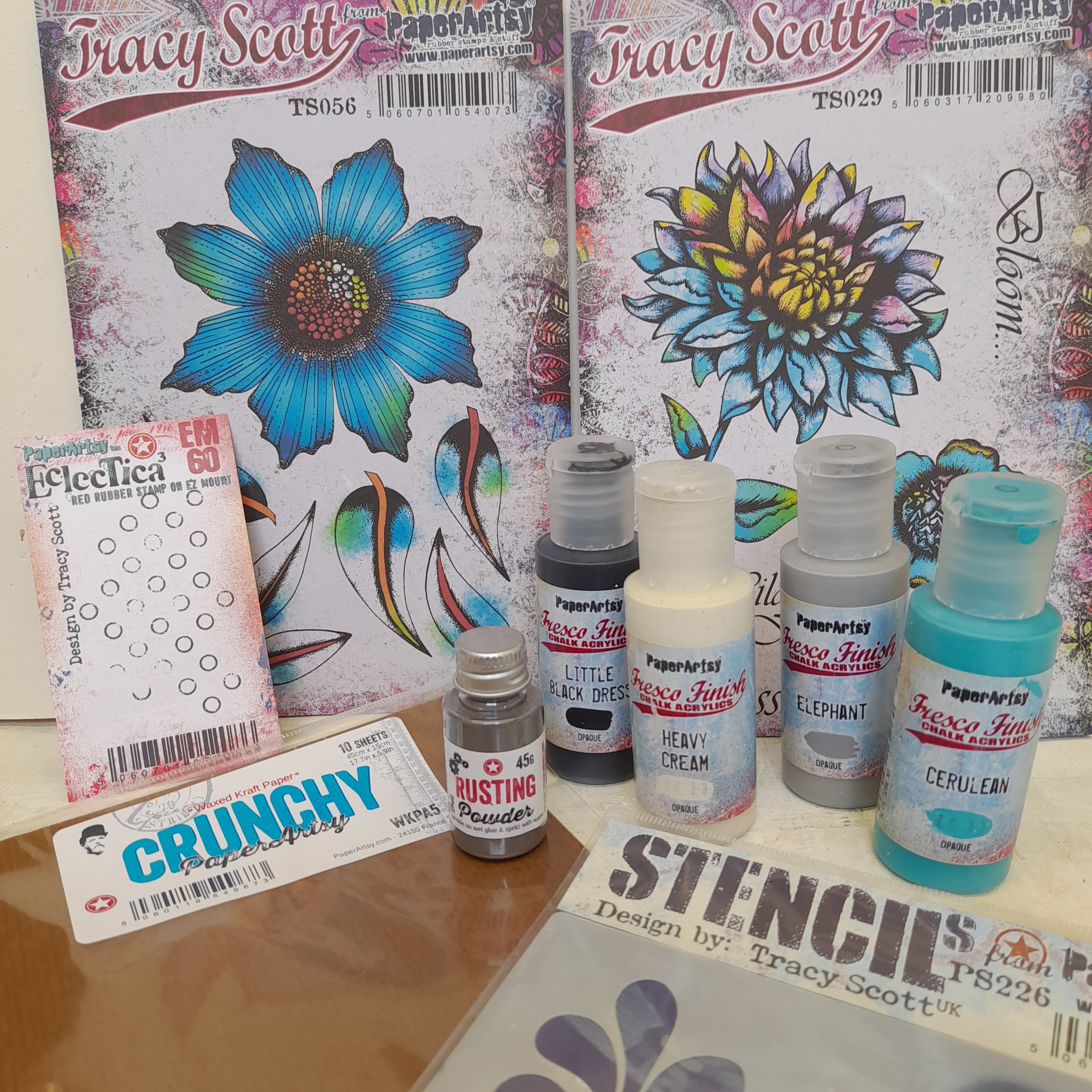
The next decision was what type of project. As I enjoy sending and receiving art in the mail I decided to create a set of notecards with matching envelopes. The theme for this part of the year is texture. Well what can I say ! I am a texture junky/freak and just love adding it in my work. As I gathered my supplies to start work, I was very excited to combine lots of texture into the project: Rusting powder, Crunchy Waxed Kraft Paper, Fresco Finish Paints, along with the stamps and stencils by Tracy were going to be so fun.


I really enjoyed adding machine stitching to the waxed paper envelopes and using a centuries old technique to add texture. I love how the set of notecards have so much texture and many tiny details to explore, including adding colour to the stamped images with rust.


When I first started thinking about this project I had several ideas in mind. As it progressed some of these were abandoned and some developed further. I knew for certain that I wanted to use Rusting Powder on cotton rag paper. When combined with vinegar to activate it, the depth of rust is fabulously intense in some areas and subtle in others. 

Tracy's Fresco Finish Cerulean is a great contrast to the rust and also adds a pop of colour to the project. I chose to create the envelopes for the notecards from Crunchy Waxed Kraft paper as I know how easy it is to add texture to this in many ways.

.

As I mentioned, I wanted to create the first layer of the notecards using cotton rag paper. It's easy to achieve a lovely textured rusty background by sprinkling Rusting Powder (RP45) onto the paper. I laid my paper panels in a deep plastic tray, dipped a fan brush into the Rusting powder and then tapped the brush over the paper to release the fine powder. I sprinkled on vinegar to activate the Rusting Powder and set aside, overnight in a well ventilated room.


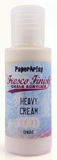
While the rust on my cotton rag papers was developing I started creating the coloured papers onto which I would stamp my flowers and leaves. I wanted a variety of tints tones and shades and also some visual texture. With this in mind, I chose Heavy Cream (FF203), Elephant (FF64) and Little Black Dress (FF19) Fresco Finish Chalk Acrylics to mix with my Cerulean (FF200) paint. I must admit I loved all the variations I achieved and got slightly carried away. 

I mixed varying amounts of the neutrals separately with the cerulean and applied them to heavy weight copy paper (160gsm). Once I had started the painting process I realised I could add more visual texture by dry brushing a lighter tint over a  shade for example. This then developed into painting rough circles with a variety of the colours I had created. I loved how the brush strokes added interest, so kept as many as possible showing.


Once all the paint was dry it was time to stamp the flowers and leaves. I decided to use a stamping platform and Ranger Archival ink (Jet Black) The circular paint layers lent themselves well to the flowers and the more linear dry brushing was a good fit for the leaves and smaller flowers. I chose Tracy's stamp sets TS029 and TS056, both of which had some large flowers and lots of leaves for creating a strong focal image on the notecards.


As I said earlier I may have got a little carried away ! I needed only a few stamped images, but I know there will be many occasions when these flowers and leaves will be perfect addition to a project. So the extras will always come in handy.


It was now time to return to the sheets of cotton rag paper which had turned our beautifully. I removed them from the plastic tray, brushed any loose rust powder back into the tray and set the papers aside for later. I wanted to harvest the rusty goodness in the plastic tray, so added a small amount of clean water. Using an old brush I loosened any dried on rust from the base and sides of the tray, this took a while but was worth the effort. I transferred the resulting rusty water to a small jar with a close fitting lid.


Using rusty water to add colour to stamped images is one of my favourite techniques. I started by using a palette and swatching the rust water onto plain paper, adding a little water to each section along with some of the rust. The more water, the paler the colour. Again I stamped the flowers and leaves from the stamp sets onto heavy copy paper, once dry I used the rust water to add colour and interest.


I think you will agree that once all the stamped and coloured images were fussy cut out they look lovely and a feast for the eyes. I was very pleased with my results and couldn't wait to move on to creating the envelope.


Now that I had the main elements for the notecards created and ready to go, I moved on to the envelopes. I had already decided I wanted to add lots of texture to these. The Crunchy Waxed Kraft Paper (WKPA5) looks fabulous when pressure embossed, but I also wanted to add stitching in some way. I created a prototype envelope and learnt quite a few things along the way.


Using a ball tool to add pressure embossing to the Crunchy Waxed Kraft paper was easy. I found the best results came from embossing on the reverse of the paper with a stencil for the template. I laid the paper on a soft stamping mat (a sheet of foam would be a good alternative) placed the stencil (PS226) on the top and used this as a guide to add the embossing and details to the leaves.


The next technique I wanted to try was something my mum has used on her handmade cards for years; Victorian pinwork. It is similar to Pergamano, but just slightly different. I pared the technique down slightly to a simpler version as it is normally quite ornate looking. I started by using the pricker on my craft tool, but found this wasn't very easy. I had some push pins on my desk and gave one of those a try, it was ideal, the right size hole and very easy to handle. Again this technique is best applied on the reverse of the paper to get the best effect. A tip to make things easier is, rest your hand on a wad of kitchen roll when embossing and pricking the paper, that way any jewellery and rings don't scratch the paper and leave a Mark.


I was happy with how the Waxed paper was looking but I also wanted a pop of colour to tie in with the notecard flowers. The Waxed paper takes Fresco Finish Chalk Acrylics really well so I painted one half of the leaves with Tracy's Cerulean. A couple of thin coats gave a nice solid block of colour.


I wanted to add some details to the blank areas of the envelope, so I chose to stamp some mini circles using one of Tracy's mini stamps (TSM04) and Cerulean paint.


To add more texture still I decided to pressure emboss the centres of the circles I had stamped. There was just one problem, I couldn't see them from the reverse of the paper. So the solution was to emboss from the front, flip the paper over and then repeat from the back. Strangely enough that seemed to enhance the embossing even more and gave the raised dots an almost metallic gold look. Quite an unexpected bonus !


As I mentioned before, I wanted to add some stitching to the project, in particular the envelope. To contrast with the Cerulean paint I chose black sewing thread and stitched across the leaves. The pricked holes were great to sew into and made life so much easier. I tied the thread off at the back and added a tiny blob of PVA to stop it coming undone.


It was now time to stitch the envelopes around three sides. I had learnt that stitching with the back of the envelope facing me on the sewing machine gave a more textured look, a little similar to the Victorian pinwork idea. I had also learnt from my prototype that I needed to add another sheet of waxed Kraft paper behind the hand stitched sheet, otherwise the notecard flowers and leaves caught on the inside stitching. So I added the extra sheet and used a large zig zag stitch to seal the edges of the envelope. It helps to stop ruching of the paper if you stitch from the bottom of the paper to the top.


All that remained to do now was to punch a semi circle from the top of the envelope to make it easier to remove the notecard . I also glued the extra sheet of waxed paper to the front sheet with a tiny amount of strong PVA just at the top.


Now my envelope was finished I could go back to creating my notecards and adding more details.


Once I started to work on the notecard layers again I realised I wanted to incorporate some of the elements from  the envelopes, so creating a cohesive look to the two parts.
The mini circle stamp was the obvious choice, it added extra visual texture and another pop of the pure cerulean.


One of the techniques I use quite often with circular stamped images is to add a little shading to one side of the circle. This gives a slightly more dimensional look. It is very easy to do and gives great results. Using a soft pencil (5B) I drew a small line at one side of the circle and used a cotton bud to smudge out the graphite slightly.


Before assembling the notecards I wanted to add some details to the darker coloured flowers, this was easy using a Signo Uniball white gel pen. It just added a lighter pop to some of the flowers.


It was now time to bring everything together on the notecards. I spent quite a while deciding on combinations of colour and flowers. Eventually I created 3 completely different looking cards, but all combining the rusty goodness and cerulean. I mounted the cotton rag panels onto panels of kraft cardstock. PVA was a good choice for attaching all the leaves and flowers.


I love all the texture on the notecards and all the tiny details which make them so special. Hopefully the recipients will feel the same.


To finish the project off with a bit of bling I added some sequins in coordinating colours and black. I glued these onto the rusty backgrounds with gel medium.


Some of the rust coloured flowers needed a touch of the cerulean paint to lift them a little, as you can see here.


Once the stitching was completed on the cards I tied the loose threads off, leaving some short ends and tying others in a loose bow.


I loved creating these cards and envelopes, it was great getting to grips with stitching on a project, as this is something relatively new to me. I also learnt quite a bit about using the Crunchy Waxed Kraft Paper and how fabulous it is when embossed. 

I must say my mum was very pleased I had embraced one of her favourite techniques. The paint mixing was a joy and I have lots of leftover flowers and leaves to play with later. I must admit I love the rusty painted flowers and leaves and will definitely be combining those in art journal pages in the future. I have an idea for a project inside a shadow box frame using a combination of the flowers and possibly an Ombre type background. I hope you give the techniques a try and have some creative fun too.

Happy crafting! ......Mags 


Facebook:https: //www.facebook.com/mags.woodcock