

Hi everyone,
Tracy Hickman @anonymous.palette and @tracyhickman_artist here with you today highlighting 3 fabulous new Eclectica stamp sets designed by Seth Apter for PaperArtsy.

I created an 8 page Concertina Artist Book to fit inside a CD case as an upcoming birthday gift to my father who’s is turning 83 years young this year along side a disc filled with all his favorite tunes. (My Dad has a vintage car with a CD player ;)
The Passage Of Time circle stamp in PaperArtsy Eclectica by Seth Apter (ESA45) kicked off the idea of a project with a visual theme of time and its progression. Seth in jest dared me to use all the stamps so this hatched the multiple page concertina format and the stamps slowly building on the pages to help force the sense of time and marks growing over the years.
I experimented with creating alcohol inks with Infusions to color stamped transparencies on the front and back pages and loved the stained glass effect created, (more on this later ;) Also loved incorporating some vintage elements and a hidden slide pull of the word 'Fearless' in PaperArtsy Eclectica (ESA43), not to mention having fun with all the glorious stamping.


The vintage photo of my Dad as a kid set the tone for the palette and I wanted to convey celebration with these mid value hues: PaperArtsy Fresco Finish Chalk Acrylics - Caramel, Agave and Spanish Mulberry. I used 3 lighter value paints in each color and 3 darker value paints for stamping noted below…


Creating the Concertina: Using a paper trimmer, I grabbed 2 pieces of 300 gm Watercolor paper to cut these down to 4 pieces. These measured 4.5” tall by 4.75” wide when folded in half to fit inside of the CD case. 1” wide white Artist Tape was run vertically between the 4 folds to connect. I love this tape as it can be stamped on or painted over and wonderful in journals.
I did create a simple mock up using copy paper to flush out the idea and sizing that was very helpful, measure twice and cut once! The size of the 1 3/4’ square corresponds to the dimensions of the amazing grid frame in PaperArtsy Eclectica Set by Seth Apter (ESA43). I centered and cut out the first square with a blade then would pencil through the cutout onto the next page and cut to make sure all the squares lined up perfectly. The openings are cut slightly bigger than the stamp.

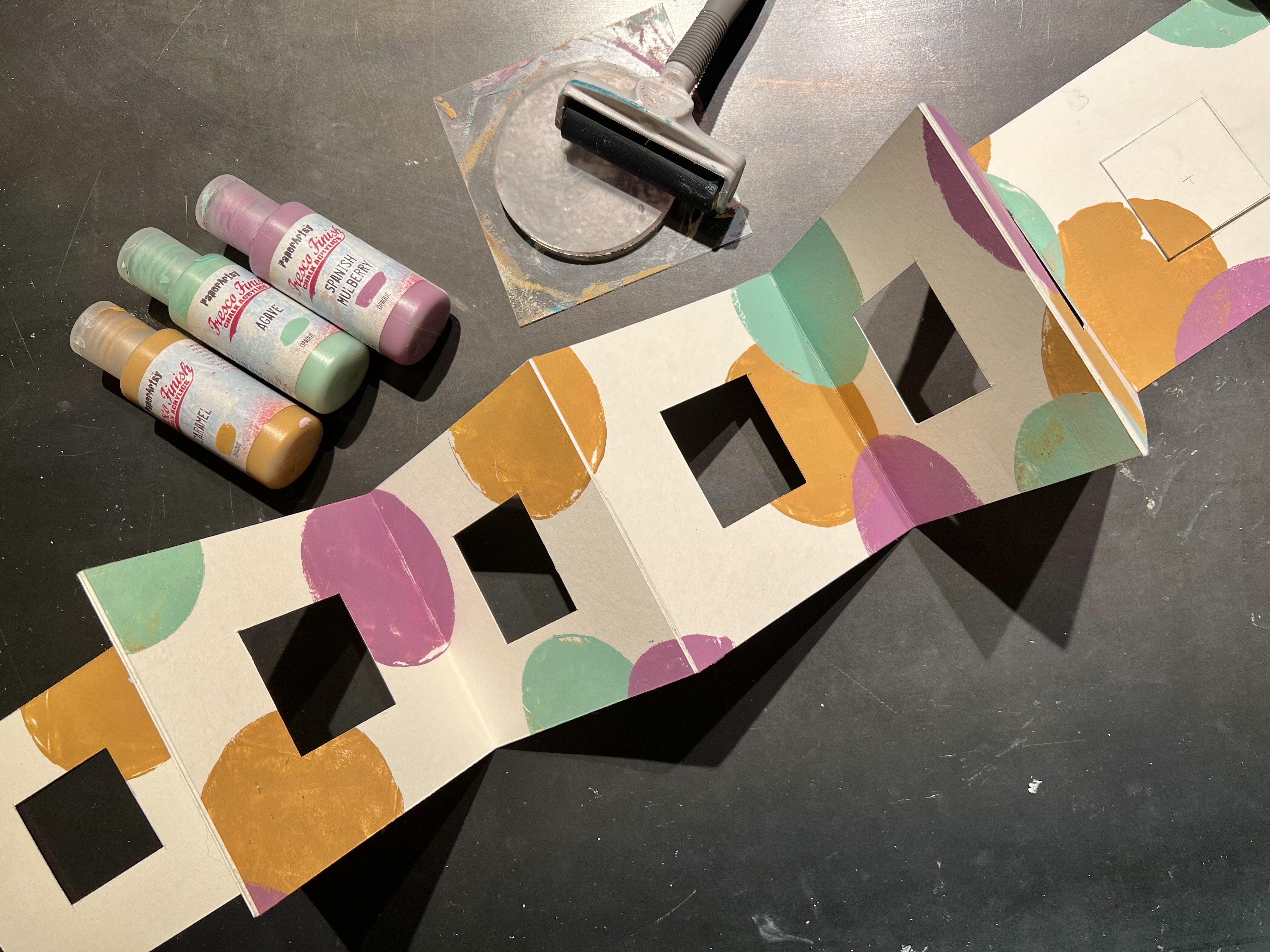
This is where the fun really started! Using a small circle gel plate, I stamped the 3 PaperArtsy Fresco Finish Chalk Acrylics - Caramel, Agave, and Spanish Mulberry, starting them spread out farther at the beginning and increasing the amount of circles as they progressed, playing up the progression of time. The PaperArtsy Fresco Finish Chalk Acrylics are necessary for a project like this so the book pages don’t stick together inside the case.

Let the stamping begin! After laying out the stamps in order of use, I got to work with the 3 lightest values of my selected hues: PaperArtsy Fresco Finish Acrylics - Sand, Fuzzy Cactus, and Haze (a fave). Adding white to the background colors would have been easy butt I was in a time crunch. The stamping also started out more sparse and gained momentum toward the end further enhancing a sense of time My first job.
Below, I chose the remaining stamps with the darkest of the hues, PaperArtsy Fresco Finish Chalk Acrylics - Toffee, Jade, and Plum, accelerating the amount of stamping again as the pages progressed. I probably added just a smidge too much on page 3 but sometimes the project wants what the project wants!
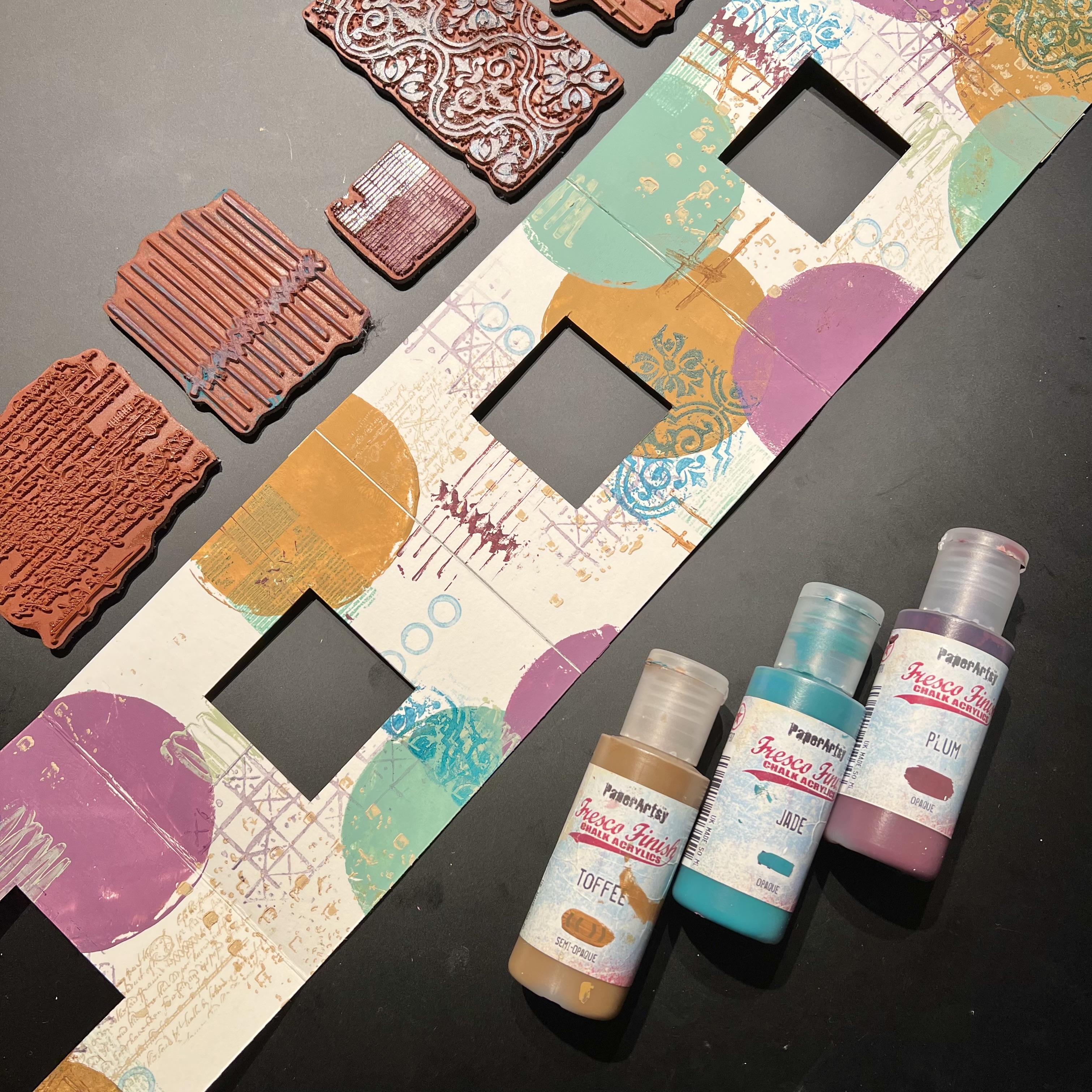
Add some stamping with Embossing Powder for some sheen and added dimension. I chose 2 stamps from PaperArtsy Eclectica by Seth Apter (ESA44) to direct the eye and add some additional contrast. WOW! Embossing Powder Inspired by Seth Apter - Space Dust (WW06X) and Emerald Creek Baked Texture Powder - Well Rustic Indigo was used on two of the stamps. See below.

Now for some embellishing… I used transparency film to stamp the grid frame stamp in PaperArtsy Eclectica by Seth Apter (ESA43), one of the major focal points in this project. The back of the film has a texture to it, and that is the side where you want to stamp. When turned over you have a beautiful smooth crisp image through the shiny front of the transparency. HIV I stamped a bunch (as not a great stamper) knowing I needed 2 full stamped grid frames for the front and back and 12 additional frames with the center grids cut out for the 6 internal pages.

Now for the alcohol ink experiment using PaperArtsy Infusions 😍. I selected Golden Sands, The Sage, and Raspberry and sprinkled them into 70% Isopropyl Alcohol, available at any pharmacy. Using about as much alcohol as I would add to watercolors, I painted the colors onto the textured side to the transparency film for a beautiful stained glass effect.

The six circle stamps spread across all three stamp sets were die cut and embossed with Lindysgang - Boogie Down Black Embossing Powder. Waxed book twine was sandwiched between 2 circles to be glued between the black frames from the back and later trimmed. The word stamp ‘Be Fearless’ from PaperArtsy Eclectica by Seth Apter (ESA43) was embossed with Emerald Creek Baked Texture Powder - Rustic Indigo and the words cut in two for the back cover.


A vintage paper target from my stash of ephemera happened to be the perfect size and came out to play to frame the transparency for the front cover along with a rusted key glued and sewn with that same waxed book twine to add to the hidden word “Fearless”.

There were quite a few steps, and some missteps along the way, (I accidentally glued the transparency upside down on the back cover and had to redo the front stained glass piece to match so it lined up. Also, I “misplaced” the plus stamp in PaperArtsy Eclectica by Seth Apter (ESA43) somewhere in my disaster of a studio but, I know right where it goes and will add when found, I’m not gonna let Seth down! But, overall so much fun to make! Check out the finished pages and concertina.


Love love love this stained glass effect using PaperArtsy Infusions with alcohol ink!

The stamps start out more sparsely…

The stamping gaining momentum and center circles building in contrast as well, and yes they spin!

The heaviest amount of stamping with all colors and added embossing powder for the finale.


And who doesn’t love an interactive pullout!

My Dad’s favorite quote is “Fear Not The Risk” and “Be Fearless” seemed the perfect punctuation to this CD Concertina Artist Book showcasing these new PaperArtsy Eclectica Stamp Sets by Seth Apter (ESA43), (ESA44) and (ESA45).
So loved working with these stamps, all three will be future go to’s for sure. I’m also looking forward to using these CD cases (they are really affordable and come in multi packs) for future concertinas. How awesome would these CD cases look on a shelf or coffee table filled with art? And, my husband while admiring, informed me that they also make cardboard box covers for these that would be fun to adorn as well.
Stay creative Peeps! 🎨
Tracy

Instagram: @anonymous.palette
Instagram: @tracyhickman_artist


