
2019 Topic 2: Brayers

Hi all, This is a fun project that Lauren created for us last year, and I recently taught it at the Stitches trade show to retailers because its such a fun make! Lots of photos, so grab a cuppa. ~ Leandra
Hi everyone, Leandra here and nice to be sharing a project with you on the blog.
In this post (that is very picture heavy) you'll get a step by step brayered background tutorial, hopefully useful if you need help choosing how to use colours (opaque and translucent) and the order in which to use them - you will not believe the number of layers. Plus some stamping and stencilling details too. Followed by the basic construction of this project. We laser cut the base this end (because we can! - a bit lucky there) and used a tube, but a ribbon reel will suffice, I know how resourceful you all can be! So what is it? A efilump spinning carousel!
In this post (that is very picture heavy) you'll get a step by step brayered background tutorial, hopefully useful if you need help choosing how to use colours (opaque and translucent) and the order in which to use them - you will not believe the number of layers. Plus some stamping and stencilling details too. Followed by the basic construction of this project. We laser cut the base this end (because we can! - a bit lucky there) and used a tube, but a ribbon reel will suffice, I know how resourceful you all can be! So what is it? A efilump spinning carousel!

We start with a small (LOL) selection of Fresco chalk paints! Our brand new brayer, which only today was called 'chubby' by a customer - PERFECT description! It is soft, and the silicone nature of it means paint seems to release from the surface quite happily - particularly multiple long-term dried layers!

The first trick is not to use too much paint, and not to apply the paint to the whole brayer...


With a very light action (not too much pressure) flick the brayer toward you starting top right and coming down the page toward yourself. Always start off the edge of the page. I'm using heavy smoothy, an 8x8" size (that we ordered by accident). I find it takes 2 brayer loads to use up that small dot of paint. Load 1 on the left below, then load 2 pictured on the right.


Next, I move to another colour. I started with a mid tone opaque (above), so i'm going to get darker with more opaques over the next few steps. Note the paint is put in the same pace on my craft sheet palette, and the blue is already dry on my craft sheet after doing the above brayering. Again, just a very small dot. Dark colours can take over so dispensing the smallest amount possible is important.


Followed Wisteria with Blue Lagoon, a yummy Seth Apter colour. It's much brighter than the picture infers.


Now that the background is looking significantly darker, it's time to make it lighter: Mermaid will easily soften it back (because like it says on the label, it IS opaque) This makes it easier to decide where to go next with colour choices.
If I want to use, say orange, then I would make it easier by putting down patches of snowflake first to 'block out' the blue...or...here's a short cut/ cunning plan... use an opaque yellow. This will make some green tones (Blue = yellow= green) In my book that is a bonus while also blocking out the blue, and in the next step also allowing orange to sit on top of the yellow. One stone, 2 birds.
If I want to use, say orange, then I would make it easier by putting down patches of snowflake first to 'block out' the blue...or...here's a short cut/ cunning plan... use an opaque yellow. This will make some green tones (Blue = yellow= green) In my book that is a bonus while also blocking out the blue, and in the next step also allowing orange to sit on top of the yellow. One stone, 2 birds.


See how the Lemon Meringue (opaque - a yellow opaque is always super useful) warms up the entire sheet of card? IMO, as soon as you add a contrasting colour, until now was all shades of blue, then BANG, you get something slightly more interesting. Yes, we could stop here...but yaknow....let's NOT!


As promised, the orange. Kapow! Bolder contrast. BUT, I do carefully try to sit it on top of the yellow patches, if I get it too much orange on the blue, I will get a brown effect. BORING, and not the goal of this layering exercise today!


Also, we are now in translucent territory! As the orange is a see-through paint, you need it to sit on top of the yellow for the colour to look 'true'. Let's go to another translucent that looks good on top of both blues and oranges - that would be Bougainvillea (a firm fave of Fresco fans!) Still a small spot, and note how the result is getting darker again, the Bougainvillea is a magenta pink, so now over the shades of blue we have shades of purples and plum...so...you guessed it....


... time to knock back with an opaque. let's try Candy Floss, an opaque pink. Opaques as you now realise, block out the layers underneath, so that light-handed touch with the brayer allows you to carefully flick colour in soft patches.

So here is where we are at. Look closely, and you should be able to see every colour used so far - that is the aim, to add layers, but not obliterate them. Even the candy-floss creates shades of orange, pinks, periwinkle and plum.
Learning about colours and blending with a brayer is a really good way to get your head around colour theory by DOING.

Now I think we are ready to move to the next type of layer - stamping! I look for textures, and, you know it, always stamp vertically and horizontally. Angles just make it look too messy and unstructured (IMO) So, small, detail stamps you can use with a dark paint such as Inky Pool, a beautiful rich green-blue. A great colour for colour mixing BTW!

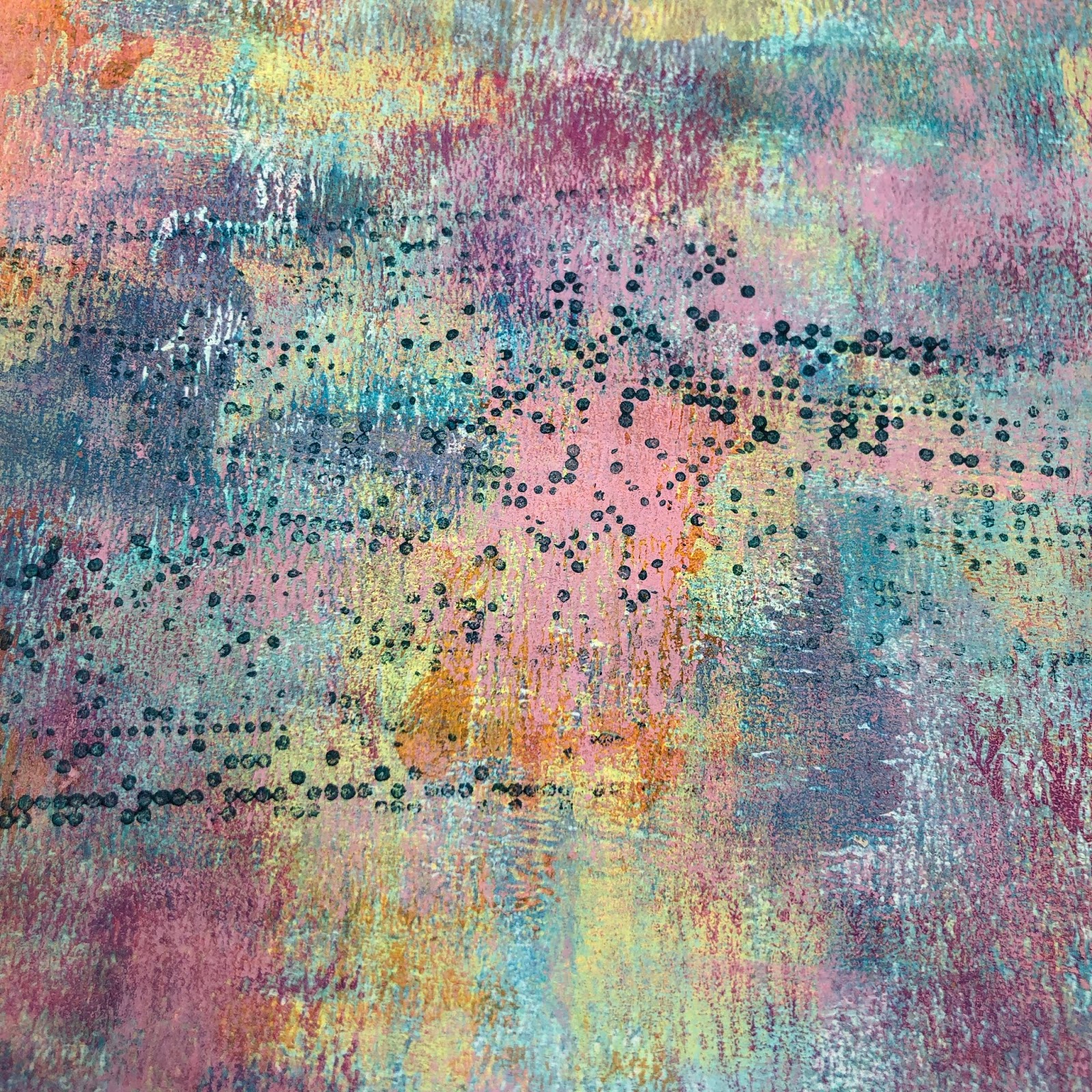
Next up a Courtney crackle stamp in Prawn.


More Spots, this time a little bigger, in Blue Oyster


I love how it is starting to look now. Lots of still-visible layers and interest.
Finally, I often finish up with an Alison Bomber stamp in script, this time using Butter, the stamp is from her new Friendship set. And some Courtney script in Snowflake. Stamping script in white all over a background is a common final thing I do, to make it easier, I use a fine script, ideally a huge one!
Finally, I often finish up with an Alison Bomber stamp in script, this time using Butter, the stamp is from her new Friendship set. And some Courtney script in Snowflake. Stamping script in white all over a background is a common final thing I do, to make it easier, I use a fine script, ideally a huge one!


OK final step that is also a bit more detailed than usual to help you take your stencils the next level! Adding depth to you colouring is a worthwhile exercise, thin layers are the key.
With a Tracy Scott stencil, taped in position, I used Cheesecake, Smoked Paprika (which became a bit opaque - same piece of foam), then more Smoked Paprika for the brightness to pop, and finally Bougainvillea for the true depth. Again, translucent paints are key here on top of each other with the opaques underneath to block. How heavily you apply the paint also can give control over the opacity.


Next I followed the same process in the opposite corner with the blues onto a new JoFY stencil, again, light to dark: Seaglass, Blue Oyster, Mermaid, then pow with the Blue Lagoon, and finally a light tapping of the lighter colour on top to give that soft contrast. I also stamped over this with the fine Courtney dots and Bougainvillea, which ends up looking plum over the blues.


Enjoy some close ups of these details. The stencilling looks so sophisticated with the shades changing colour softly....


Final stage, flicked white spots - of course!

See the details! All the layers really pay off!

Here are the card and chipboard bits I used to make the base for the carousel. A piece of tube with 4 holes punched in for ribbon, chipboard top and a bottom for that. A skewer, a bead and a round chipboard base. I painted them, then stamped them. Tied the ribbon into the tube making sure the knots were on the inside, and glued on the lid.


Close up of the base with the skewer.

So let's get out the new Zinski Efilumps!

This last part is quite a fast process; stamp the efilumps, and a quote onto the background we made earlier. I used the new StazOn PIGMENT ink. Game changer. Dries fast on paint, but is OPAQUE! Love this on frescos, no heat tool required, super dark, easy to stamp. It is such a new product, many distributors are still waiting for their shipment to arrive from Tsukineko in Japan, so keep your eyes peeled for this! 12 colours, and the teal is gorgeous!

One thing I didn't mention, is as I was stamping the script, spots etc, I often had left over paint in my brayered patch. So rather than clean it up, I flipped over the card, and brayered the excess onto the back of the card. When I cut out the efilumps, the reverse was already coloured! A white paint pen (Signo Uniball) pops the features, especially the eyes, and I like to add dots!

Red line tape onto the side of the tube, and bend the efilump to the curve, the quote and the 'glasses' efi are skinny, so I applied those opposite each other, and the 2 wider one opposite each other too!

Then add the bead adjust the height, knot and apply to the tip of the skewer!
Here is a video of how I finished off a slightly different sample of the same project with flowers at the top to hide the bead
If you want to see the carousel in action, go to @PaperArtsy Insta stories, and I've saved it as a highlight under the zinski link.
Hope you get a chance to play with some of the ideas in the post soon!
Leandra.
Blog: PaperArtsy Blog
Facebook: PaperArtsy People
Twitter: @PaperArtsy
Instagram: @PaperArtsy
Pinterest: Leandra Franich or PaperArtsyHQ


11 comments:
that's amazing! I just love all the colours you've used, Leandra!
Stunning. Wonderful. Project Leandra. I need to give this a go!
I love what you did with it! Such fun! The Efilumps are perfick for a carousel! Lx
This is really an adorable project using our brayers and paints!!!
Thank you Leandra. xx
Wow! Great step by step! Perfect to have all those pictures, it's really helpful! Looking forward to start brayering soon! And to create a carrousel as well!! :) Thanks for sharing Leandra!!xxx
What a fun project with Zinski Efilumps Leandra!! I really love woking with brayer and various colours. You not only made the beautiful carousel but it is amazing that it turns round. xxx
What an awesome project! So, so cute!
What a fab project ! Can see this work for a lot more Zinskis !
Corrie xx
Thank you so much I love your brayering technique always a pleasure to read or see your tutorials to help my customers going further with frescos ������.
Noëlle -toutencolle
That's absolutely brilliant, so, so clever!
Lucy x
Post a Comment