


Moikka moi everyone! It's Riikka from Paperiliitin here with my first PaperArtsy blogging team project of 2024! I'm so happy to have the honor to continue creating for PaperArtsy! I also found it rather delightful that I've done a full circle and start the year with an altered tin again. Maybe you recall my very first project for PaperArtsy last year? It was an altered tin (link) as well!
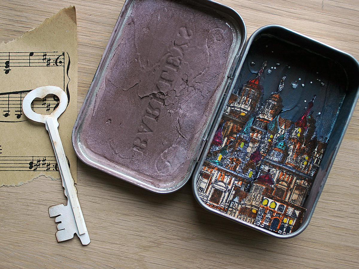
I remembered the tin well and it popped to my head immediately when I read the theme of miniature. What captivates me about this substrate is the illusion and the portability. Let me explain. I love to keep the outside of the tin unaltered so it looks just like an ordinary mint tin. But when you open it, it's something totally different! I also find the idea of carrying a little world of your own in your pocket alluring.
There's a couple of ways I included the quarterly theme in my make. When I pitched the idea, I was thinking of including a Lynne Perrella lady inside and I was going to use a dimensional glaze to highlight the rhinestones in her headdress. As you can see in the process photos underneath, I stamped, colored and glazed her, but then decided against adding her into the tin. Luckily I had used the same dimensional medium to the key and even before that, made a translucent glaze of my own for the starry sky! There's also some of that dimensional glaze on the stars, so I have the glaze part covered nonetheless.

I really like how the project turned out and how the process captured my imagination. It was also alluring to build the little city! I haven't read the story about the huge moving cities, "Mortal Engines", but I've seen glimpses of the movie. Somehow the city depicted inside the tin started to remind me of London in the series. And if I recall correctly, they were trying to find a key of sorts in the story...
I think the beauty of this kind of a project is that you can spin your own story about it and make a little world of your own!

I knew some of the elements for my project early on and added some along the way. That's a usual thing for me, letting the project decide where it really wants to go. I have an idea about the start, or a concept, but I'm open to change the route and follow different paths along the making process. I love the intuition of it!

What I knew from the start was the substrate, the mint tin, and also the stamp set (LPC013). I picked this set for two reasons. First of all the buildings on it and their scale but I also loved the lady with the elaborate head decor! I saw her in Baroque shades of deep jewel tones, with chiaroscuro and Rembrandt styled.

I also thought to use a dimensional glaze as I mentioned in the beginning. I wanted to highlight those gorgeous gemstones on the crown and make them really pop! At this stage I also thought to use Fresco Finish paints to color the stamped images, so I picked Vintage Lace (FF18) to be used as a skin tone. I also was aiming for a vintage, old look, so the new Infusions Just Walnut (CS25) seemed perfect for the job! To be honest, Just Walnut seems perfect for a number of jobs in my mind, I'm so thrilled about this product! But here I got to use it the very first time.

First things first - I needed to stamp the images for my little world in a tin! I stamped one key and several of the buildings to have layering elements. I used a black water resistant ink.
What I realized when stamping, was that I should use another method of coloring than Fresco Finish acrylics. This is for two reasons. Firstly, I forgot to use a stamping tool in the beginning so aligning the image would have been difficult. I have done it freehand before and usually it's not a big problem, but in this project it wasn't what I was after. More over, to get the images vibrant and filled with jewel tones would have meant at least three colors of paints, preferably minimum of five - a yellow, a red, a blue, a white and a black. That seemed a bit overwhelming to just color the image! So, instead I just stamped a bunch of elements and planned to use a translucent coloring method, so I didn't have to think about the aligning either!

I wanted the Baroque air to come across somehow, so instead of brushing the color to the tin, I decided to use a sponge to get a different kind of surface texture. I was hoping to convey an idea of leather. But what I learned, when I started to use the sponge on the metal, was that it was lifting the color off and almost nothing was sticking to the sleek surface! Luckily that was an easy fix - I painted a layer of clear gesso to the tin and let that dry before starting a new with the sponge!

I used two colors to create a leathery effect inside the tin. I used a dark brown - Chocolate Pudding (FF42) together with Vintage Lace (FF18) to get a varying surface. I used the lighter tone near the edges to get a weathered, worn and a bit dusty look.
I really like how the sponge made the surface texture look totally different than if I'd painted it! If you have always used a brush with Frescos, I encourage you to try another tool and see how the appearance changes, it can spark a whole new idea and approach!


As a final preparing step I added some vintage tones to the stamped images. I was after an uneven look, like the images would have had some water damage or just layers of gathered dirt. I used Just Walnut (CS25) for this. I wasn't a hundred percent sure what coloring medium I would use later on, when I started this stage, but I knew Infusions would work with anything!
I first sprinkled some crystals onto the paper, added a lot of water on top and used a flat brush to move the colorant around. I also sprinkled a few crystals then on top to get little darker specks here and there. Remember, I was trying to get an uneven, interesting look!


I was happy how the project was coming along at this stage! I had the elements done, so it was then time to start putting everything together and to add some color to the mix!

I had a strong vision where the composition was concerned. I wanted to add the key to the lid part of the tin, to the left side and then build a more dimensional structure for the right side, where the city would be. Even though I liked the leather effect I had created, the city scape needed another kind of background. I wanted to have the leather a bit showing, so I decided to add a blue glaze on top. Like it would be painted on the leather. I chose Baltic Blue (FF07) as the blue, but made it a glaze using Sating Glaze (FF23) as the color itself is opaque. To make the glaze I simply mixed the two together - maybe a bit more glaze than the paint as I wanted quite a translucent color.
As you can see, I painted half of the right side of the tin with the glaze and after it had dried added some stars to the night sky with a paint marker. I highlighted a couple of the bigger ones with the dimensional glaze also, adding a bit of shine to them.


Then it was time for the coloring of the stamped images! I was going back and forth with three coloring options: watercolors, colored pencils and brush tip markers. As you can see, I chose the last as my coloring method. Why? Well, to be honest, I'm terrible with watercolors! I mean I can create a lovely splodgy background with them, but coloring and with such an intricate design, not a chance! With the colored pencils I was afraid that the 'oomph' wouldn't be there, that the images would look too pale and not jewel colored and Baroque-like enough. So, brush tip markers it was!
The ones I used for the coloring are water based, so it was easy to mix them and even let them bleed a little, like in the cheeks of the lady. I tried to pick vibrant jewel tones and really create a pop of color for the buildings and the lady! For the key, however, I went with rusty tones.
After coloring I added a dollop of the dimensional glaze on top of the rhinestones in her crown. I also covered the key with the glaze, trying to make it appear more dimensional. However, I didn't add any to the buildings, even though I first thought so. I wanted there to be contrast between the shiny jewels and the old buildings.

Then it was inking time! When I cut the elements loose from the backgrounds, of course there was the striking white of the paper visible on the edge. That didn't seem to go in my "hunt for chiaroscuro". To hide the white, I went around all the elements with an ink. I chose a blue one for the buildings as I wanted to highlight the evening look. Like the nigh was enfolding around the city, caressing their corners and sliding to the shadows.
For the lady and the key I used a brown ink. For the key quite obvious reasons as it wasn't connected to the right side and was going to be rusty. For the lady I had a more personal reason. Even though I was thinking at this stage still to put her to the right side, like she would be on the foreground and the city in the background, I have had a bad experience with human figures and blue ink. Back in the day I was doing a Christmas card and inked around this ethereal lady with blue. Otherwise quite fine, but as the figure was in profile, her nose was quite protruding and the end result was a lady with a striking blue nose!

The next step was the most fun in the whole process! I mean, I enjoyed stamping and coloring, too, but now I got to build a city! It was kind of using building blocks or Legos but just with stamped images and foam tape. I started from the "back" and built onwards and upwards. I was aiming to create a perspective. I used just one layer of foam tape in the first buildings I added about a third down from the top and by the time I reached the bottom I had gone up to six layers of the tape! Not that I needed to add six tape layers together, most of the elements are adhered on top of the previous one so if your replicating this make, ensure the bottom layers are adhered sturdy enough!
As you may notice, I used the same buildings several times in the city scape. I tried to color them a bit differently and also altered them a little when cutting them. Some of them have the chimneys, for example, but from others I cut them loose. This was just to trick the viewer a little, to give the buildings a bit of individual character.

Then came the twist and turn of this project. The whole time I had been thinking of creating the city view as a background and to add the lady in the front. Like a ruler overseeing her land. But she was way too big for the tin! Or rather, she was covering too much of the city I had just created and started to love already.
I pondered a bit if I should change the design and add her to the left side, but then I wouldn't have had space for the key. I also thought about some kind of hinge, but that didn't seem right, either. Then the big reveal would be lost as she would be covering the city and what about her background then... So, I decided that she should be used on another project and I would just go with the key and the tiny city in this project! I hope you agree with me that it was the right decision!

I then had the right side of the project finished and could fully concentrate on the left. The plain key seemed a bit too little on the lid, compared to the bustling city of the right side, so some backing elements were needed. I was thinking of adding a piece of old musical note paper, but then remembered my stamped papers where I had created a pool of Just Walnut (CS25) so I'd have a piece of "old paper" should I need it. How clever I was to do that! ...of course I could have just made a new piece at this stage, too, but you probably know how it is when you are in the creative zone? You just want to go forward and not backwards!
I also added a couple thin strips of heavy cardstock to the back of the key to make it further dimensional and to strengthen it, as I had had an idea.
The idea with the key was to add some wire around it! This was to make it look maybe older and more worn but also to disguise the flatness, to make it appear like a round object.
To make tiny backing pieces for the key I added some stamping to the Just Walnut (CS25) colored pieces of cardstock using the same Lynne Perrella set (LPC013). You can see the script design on the postcard in the set. I then crumbled the paper pieces and highlighted the texture using the same brown ink I used to ink the edges of the key. I also inked the torn edges of the pieces. As an additional bit of stamping, I added a hint of the text to the lid as well.

After that, it was just adding the two background pieces together with a stapler and then using foam tape to mount the pieces to the lid. For the key coming on top I used a heavy body gel medium as the surface was so textured I was afraid that the craft glue wouldn't hold.

And here it is! The ready little tin! I found the whole project really enjoyable but the most fun was to build that little cityscape! Don't get me wrong, I do love the grungy and rusty key, too, right up to my alley, but the city started to feed my imagination immediately and stories started to appear. First of all that connection to "Mortal Engines" and the traction city of London. I do love a good story and enjoy conjuring those when I create!

Like I say in the beginning, I also love the reveal element, which offers another story line altogether. Like you'd offer a mint to someone but instead of candies there was a miniature city inside together with a puzzling key. The scene is set to another story! Would the city be real or just a model or an art work of a real city? Is this a quest for a hidden treasure or a way to a Narnia type of other reality?
That idea of worlds within worlds then brings me back to a movie I saw as a youth - M.I.B. I still think that the end scene of the camera pulling back lightyear after lightyear is the best in the whole thing. Really thought-provoking!

Have I captured your imagination enough with the possibilities of a little assemblage in a tin? Have I tempted you enough to give that a go?

Of course the world doesn't have to be in a tin! These mint tins, for example, are hard to come by nowadays in Helsinki, but luckily I have a stash. In stead of a tin, you could use a book as a base, just hollowing out the inside to make it more like a little box. Or use repurposing of other sort and make the base out of a tea package, a cookie carton or a candy box. If you use a bigger substrate you might even be able to fit the ruler of the city into the make!
Needless to say, it doesn't have to be a city, either! Just look at the variety of stamps you might already have and conjure a world from that. Teacups and playing cards for an homage to Alice in Wonderland or lamppost and snowy trees for Narnia. Or maybe just a peaceful meadow (link) to be carried around in a buzzling city?
Xoxo Riikka


4 comments:
I absolutely love this ! I too love to build stories into my art, so it resonated with me. I adore the rusty key, just fabulous
Super Riikka! Love how you cut up all the little bits to piece them together to make something new, and love the walnut and that key!
Absolutely stunning - a glorious tiny cityscape full of stories and imagination. I love it.
Alison x
Lovely project, especially the wonderful city you´ve built from all those little architectural pieces. And I loved following your thoughts while making this!
Post a Comment