Showing posts with label Shark. Show all posts

Saturday, 1 June 2024

With 3 Things: Blues Book {by Mags Woodcock}

Hello, Mags here with you today for another post in the three things challenge. 

You'll have  seen the previous two projects by Autumn and Floss, weren't they fabulous ! I love seeing how different artists use similar supplies to create a project in their own style. As many of you may know, I favour a vintage vibe with my art. This project is no exception. The book and journal Topic is a firm favourite and adding in a hidden element was great fun.


So lets have a look at the supplies I received from PaperArtsy HQ. There is a fabulous stamp set by Lynne Perrella (LPC006), a small stencil (PM015) and a bottle of Shark Mattint (MT04). If you haven't already discovered the Mattints, think coloured Matte Medium, just so incredibly versatile. As soon as I opened the parcel I was a very happy girl, a lovely surprise and right up my street.


My mind started to bubble over with ideas, so many choices and decisions. I've recently started revisiting my love of board books, you know the sort of thing that very small children start with, chunky and sturdy cardboard pages for little hands to hold. I love to repurpose those into art projects. I also adore miniature things, so a mini board book was the planned starting point for this project.

Firstly I wanted to get a feel for the stamps, the size, amount of open space etc. I was hoping to stamp onto vintage book pages, but I needed to find out which ink and papers were the best to combine. Some vintage book pages are fairly rough textured and the ink bleeds. I like Versafine Claire ink pads, as they give great detail to stamped images. You'll see that most of my papers took the ink well without any or too much bleeding. Playing with the stamps beforehand also gave me a stash to work with, and to try things on.


I sorted through my collection of saved board books, but couldn't find one small enough to work with my ideas. So I decided to create my own, in fact I created a prototype using music papers and then another using the end papers from some old books. Both were created using grey board as the base. I have a video on my YouTube channel showing the method I came up with, but you could just use a ready made board book. I decided to leave the binding until the pages were completed.


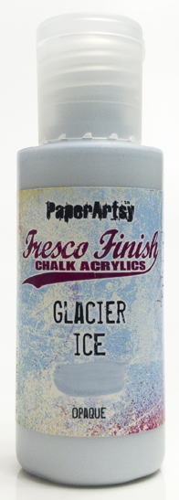
Once my board book pages were ready, I started creating the grungy papers for the backgrounds. Recently whilst playing with the Mattints, I discovered that they are fabulous for lifting multiple dried on layers of paint from a gel plate. So with this in mind I chose some vintage piano roll paper as my base, I love all the punched holes and random printed dots. I started by using just the Shark Mattint (MT04). I then needed more colours to build up the layers on the plate, so Fresco Finish Chalk Acrylic Blue Bayou (FF206) Glacier Ice (FF132) and Midnight (FF123) came out to play. I didn't over think the process and added very small amounts of paint to the plate before using my brayer to spread it thinly. Picking up a random grungy layer is easy this way. 

Once I had some layers built up on the plate, I added a layer of the Shark Mattint and pressed my vintage paper onto the plate. It's important at this stage to let the Mattint dry fairly well. Test a corner to see if it's picked up the paint, and them peel away. Any remaining prints that were too bright were given a coat of Mattint with my brayer. Even the most striking colours can be given a vintage look by adding a coat of Shark Mattint over the top.


When I had a collection of grungy vintage looking gel prints I picked out my favourites and started to add details. The first print I used the stencil (PM015) and a Micron pen to add the archway, following up with a light inking using a Ranger archival Ink pad (Jet Black) applied with a sponge.The centre of the arch was easy to cut away using a craft knife, leaving an aperture to act as a frame for a stamped image.


For the first hidden part of the project I decided to have the main character from the stamp set hiding in the building. This was fairly easy to achieve. I had stamped her onto vintage book pages, and cut her out. I folded her up and concealed her behind the bottom panel of the stamp. That way when the viewer opens the book at that page she is hidden, but moving the panel downwards reveals her. Again I used a grungy gel print as a background on the page.
I also decided to add folded index cards to the left hand pages, making for a second hidden element for secret journaling. These cards were given a coat of Shark Mattint with a brayer and then dipped into a weak solution of Just Walnut Infusions (CS25)


I continued to work with the gel prints and stamped images, cutting and combining some of the images made interesting pages.


Adding torn strips of gel prints and book papers along with small details from the stamps added interest to the rest of the pages. You'll notice I also coloured parts of the images with the Shark Mattint for a cohesive look.


When all the pages and the cover were completed I used a strip of heavy cotton rag paper to create the binding, adding Shark Matting with my fingers until I got the depth of colour I wanted. I glued the binding in place with PVA glue and clamped everything together until it was dry. With hindsight I think I should have used a lighter weight paper which would have been more pliable and adhered to the signatures better. As they say, we learn something new everyday.


I had great fun creating this little book and may add some wording to the journaling panels. Possibly something along the lines of Where did we go? Who did we meet? What did we do? . I'll let you make up your own mind about the story behind the adventures these ladies had. 
I'll leave you with a couple more photos of the project and say goodbye for now. 


Happy crafting
Mags x

https://www.youtube.com/channel/UCuhrZcsU0x6GlDK2M8Rf5HQ
https://www.facebook.com/mags.woodcock
https://www.instagram.com/mags.woodcock/


Friday, 31 May 2024

With 3 Things: Storage Book of Pockets {by Floss Nicholls}


Hello lovely creatives...It's Floss here with you today with the 3 things challenge. 

I was excited when I opened the box with the three surprise supplies in and found; stamp set Lynne Perella LPC006, The Hot Picks stencil PM018 and Shark Mattint (available from stockists). 

I knew in that moment that I wanted to do something with fussy cutting.  I'd incorporate my free motion stitching as a feature based on the Panacea Pizpireta image I'd seen a few weeks before that I found inspirational by Lisa Kokins and that I would hide stamped images in folds to incorporate the hidden element for this quarters PaperArtsy theme.

I was itching to get started and so went to find a fairly thin hard back book. 

I folded eleven pages roughly in the centre of the book using the deep margin as my measurement...and glued those folds down.  I then folded the remaining pages in half lengthways but did not need to glue these.  The idea behind this was to use the book as storage for my fussy cuts.  The front half of the folds to store the rough cuts, the back half for those that had been fussy cut and the middle pockets for anything in between.

With a thicker book, if I'd have folded all the pages in half it would have given me an open rolodex book holder, but I wanted to be able to close this one and potentially be able to flip through the pockets and tuck spots so I took a few pages out too...Being able to close the book would hold all the fussy cuts securely in place and this was important so I could have it with me wherever I went. My reel shows me shaking it about and nothing falls out :)


Using my gel plate, PaperArtsy stencil PM018, and their slimed and desert bush fresco paints I created some papers which I would use for the concertina edging which would hold the centre pockets together and bring some colour to the project. 

I measured the depth of the page for the length of each segment and made each segment wide enough to allow the pages to open enough to access the pocket area and also enough space to stamp the hidden feature within the folds.  I chose to stamp some images using Ranger Archival Plum Ink as I thought it suited the greens beautifully. 


I used my stamping platform to create a whole stash of prints to fussy cut...again I used Ranger Archival Inks in black and plum for this.  I used the Shark Mattint to bring a little interest to some of the prints using a small brush.


I really liked the idea of the hidden images in the folds...with two segments between each page it gave me an opportunity to mix the images up by stamping directly on to some of the concertina folded sections and fussy cut and glue black and white stamps on to others making this hidden detail more visually stimulating.


I wanted to explore using the shark Mattint further and wondered what it would look like on mulberry paper...It looked/reacted as I hoped it might and was definitely a YESSSS moment!

I squirted the Mattint straight onto the mulberry paper and spread it to cover the surface using and old store card. It absorbed deeper into the areas where the mattint was squirted than where it was spread and so it left some 'streaks' which was, for me, a bonus.  But it was the way the mattint worked with the little fibres inside the paper that was what I wanted to test...The fibres remained white giving me another visible texture. You really must try this technique if you like mulberry paper.


I glued tissue paper, fabric and paper 'Lynne Perrella' flowers made with stamp set LPC006 for a further variety of texture and surfaces onto the mulberry paper. I enjoyed using different parts of the stamps to give me colour density variation too. My free motion stitching around the flower using plum and cream coloured threads gave me a little more attention to detail and interest with another on the reverse. I then glued this onto the book creating the cover.


I used a lace ribbon to secure the tuck folder book together keeping all the fussy cuts safely stored away ready to be used on other projects.


I now have somewhere safe to keep my fussy cuts; it's organised sections means I can take my tuck folder book anywhere with me and I can trim to my hearts content at any given moment!

I really enjoyed making this project and I shall be putting a class together for this soon so do give me a shout if you are interested in doing this in person or online.

I must say one of the things I really like about doing the 'with 3 things' blog posts for PaperArtsy is that I have absolutely no idea what same (or very similar) three products/supplies the three blog artists will receive and then how we all make something so very different. You'll already have seen one fabulous post by Autumn yesterday and so make sure you look out for the third with 3 things using the same supplies by Mags tomorrow.

Until next time 
Sending lots of creative love
Floss x x x


Thursday, 30 May 2024

With 3 Things: Altered Book {by Autumn Clark}


Hi friends, it's Autumn Clark from SewPaperPaint with you for another With 3 Things post. I was so happy the current Topic, Books & Journals, was announced in conjunction with these particular 3 things.

I had previously started a shabby Lynne Perrella altered book and was thrilled to incorporate these 3 things into its pages.  Find more details on the altered book HERE.

Our allotment of treasures included the new PaperArtsy Mattint in Shark, along with a beautiful stamp set by Lynne Perrella (LPC006) and a favorite Hot Picks Mini Mask (PM017).

I had previously torn the pages between a spread to make room for the added artwork and decided it would be a fun place to start these journal pages.  I used the glue properties of the Mattints to adhere the layers of torn pages together.  The finished result was a sturdy, tinted page on which I could journal, with loads of texture as a bonus!

I mixed up a bit of Sleight Blue Infusions with water to make some "ink" for journaling.  I used a brush to scribe some thoughts in large script onto the tinted pages, adding some splatter for extra detail.  I tried to do some stencil monoprinting with PaperArtsy Fresco Chalk Acrylics over the backgrounds, but it didn't show up very much, so I tried to come up with an alternate idea for using the Mini Mask.  


I grabbed some tea dyed paper and did a stencil monoprint with Infusions  on the paper.  I wet the stencil thoroughly so it bled through to the backside of the thin paper.  I decided I would use this two-sided paper to make flaps for some "hidden" journaling to tie in with our quarterly theme.  


I sewed some random lace and blank pages along with some wrinkled strips of paper I had dyed with the leftover on my kraft mat from the monoprinting.  I liked how this wrinkled paper tied into the torn paper book page base.


I used the remainder of my Infusions "ink" mix with a glass dip pen to do some journaling on the blank pages.  I had never tried using a glass dip pen and was surprised at the way my faux ink flowed so evenly!  I used two of the stamps from the Lynne Perrella set as my focal images on either side of the spread.  The book closes very well because the thin papers don't add much bulk, but looks incredibly textural nonetheless.  I hope this project has inspired you today!  Perhaps you can use your Mattints to adhere some book pages together in your own altered book.  

Have fun!  xx, Autumn


YouTube: SewPaperPaint
Facebook: Autumn Clark
Instagram: @sewpaperpaint
Pinterest: SewPaperPaint

Monday, 20 May 2024

2024 Topic 3 : Vintage PaperArtsy Stamps {by Riikka Kovasin} on the PaperArtsy Blog


Hi there! It's Riikka from Paperiliitin blog here today to share my home decor project with a nautical touch with you. 

When pondering, what to pitch for, what kind of project to do, I was looking through the different vintage stamp collections by PaperArtsy. When I saw these sea inspired sets from the Hot Pick series, I immediately saw them as table decor pieces. I imagined the bigger elements perched on top of a metal wire with a spool as the base. Maybe it was the closing summer and sailing season that got me thinking that. I don't sail, but living in a coastal city with a glimpse of the sea from the windows, you start to notice sails emerging after hibernation when the coastal ice melts. These could also serve as a table numbers in a party either by changing the composition a little, leaving room for a number on the top, or then by adding a number to the top creature.

I covered the "vintage" part by simply choosing a stamp set, but tried to add a bit weathered, vintage feel to the project otherwise as well. When pitching this idea, I thought to incorporate the the quarterly theme of "Glace" by using a Mattint on the creatures but I ended up topping that by making a colored glace to age the spools and also for the "sand" I then added on top of them.


When I set to work, I started to hope I had drift wood to be used as the bases. There were two obstacles there - I had pitched for the spools and more importantly I didn't have any drift wood at hand! What the thought of that greyish weathered wood then caused was to turn those spools into the tones of drift wood and I like that even better! 


I chose two aquatic Hot Pick stamp sets for these decorations, HP1112 and HP1201. Combined they had enough big animals to make the focal points. I guess I could have gotten away by just using the latter, HP1201, but I really liked the crab on the second set. My star sign is cancer, so that also weighed in to pick two sets.


As you can see from the materials photo above, I took it after finishing the project. To be honest, when I started the only thing I knew for certain was the stamp sets! I was also relatively certain that I would use Mattint Shark (MT04), but otherwise I hadn't a specific Fresco Finish paints in my mind. In the end I chose to use just one color, Chalk (FF83) and color the creatures using brush tip markers. There's two reasons for this. For one, I had already stamped the images and should then have either chosen translucent colors or turn them into translucent by mixing them with a matte medium or equivalent in order not to cover the stamped details and lines. Secondly, I would have needed at least three colors, maybe even more and I didn't want to have an extensive list of materials. By using markers instead I was able to use several colors, hopefully give an idea and inspire how to combine different materials. Sometimes a simple kid's marker is all you need!


The first thing I needed to tackle, was to learn how to make mirrored images of the stamps. The other option was to make the decorations one sided but I didn't want the back to look unfinished. Especially as I thought these to be table decorations, to be viewed from all sides, I wanted them to look good from all angles. After a quick google, I thought to try a gel printing plate to get the image reversed. And it worked beautifully! The images weren't quite as crisp as the "real deal", but they were absolutely fine enough to be used to cover the back. 

What I did was to ink the stamp and then carefully stamp to the gel printing plate. While the ink was still wet I delicately placed a paper on top and pulled the print. The result was a mirror image of the original stamp! I learned that especially the pressure when pulling the print was key. If I pressed too hard, the image smudged. I used black, oil-based ink here but feel free to experiment with other inks as well! I assume that water-based inks might bead on top of the plate, though.


After tackling the mirror issue, I could then stamp the images the right way around. I also stamped a bunch of texts and three anchors. At this stage I thought to include them to the spools as decorations, not to the stems, so I only needed one side. I used the same black ink as in the mirror stamping.

Spoiler alert! If you want to re-create the decorations, stamp the anchors straight away as mirrored, too. 


The last preparation step was to turn the spools more weathered. For that I mixed Fresco Finish acrylic Chalk (FF83) with Mattint Shark (MT04). This created a lovely greyish glace, I then painted to my spools. In the picture underneath you can see one of the spools untreated and two treated with the glace. 

I used more Mattint Shark (MT04in the mix than the acrylic paint to keep the medium quite translucent. I also added a touch of white here and there undiluted when the surface was still wet and mixed it in on top of the surface of the spool. This created a beautiful uneven look.


The idea about the silvery wood came from the drift wood desire. Instead of going rummaging the (at the time frozen) shores, I turned something I had to resemble the thing I wanted. I found it quite remarkable how easy it was to change the mood of the spools with a touch of color. The impact of color keeps surprising me constantly! 

After letting the color medium dry, I wrapped some natural twine around each spool. I secured the start underneath a couple of loops of the twine and when I then had the whole spool covered with the twine, I glued the end as hidden as possible.


Now that I had all the elements started, it was time to go back to the stamped images and color them. The first thing I did was to add a layer of Mattint Shark (MT04) on top. This had two purposes. One, to create a wash to match each creature, make them a part of the series, but also to seal the surface. That then enabled me to play with the color without it getting absorbed into the paper straight away. I also remembered hearing or reading that the Mattints, even though acrylic, worked nicely as a ground for even water-based markers and pens, so I gave it a go.

I used a small paint brush to apply the medium, then let it dry and added the brush-tip marker on top. Subsequently I used the same brush to move the marker color around, give it more gradient transition. As you can see from the ready project or step photos further along, I didn't color the whole fish blue nor crab red, but instead added color to the edges and then pulled it towards the middle with a wet brush. I think this creates a lovely dimensional feel to the creature but also lets some of the Shark color to show.


Then it was time to cut! I carefully cut the crab, the fish and the seashell out of the sheet. I mainly used just scissors as I prefer those over a craft knife. The seashell was the easiest to cut, but both the crab and the fish had these teeny tiny details that took a while to cut. You can be a bit more rough around the edges, if you wish, but to me the beauty of the finished items is partly the delicate details.

I also inked the edges of each item twice. "Twice, what you mean?" you might ask. I first inked the stamped side with a delicate touch, my intention just masking the white edge of the paper after cutting. But to the flip side, the back side I added a bigger amount of color. This was to ensure that no white was peeking when I layered the two images back to back. As the other images, the mirrored ones, were a bit more smudged than the others, the measurements could have been a tad off but more importantly I cut the images loose by hand, so there was bound to be some differences. By using the same brown ink throughout, I hoped to hide the seam as well as I could. Naturally, you could use also an array of inks and follow the color scheme of the item with the ink. Blue for blue, red for red and so forth. I just thought the brown added a nice vintage touch to the elements.


Next I then mounted the focal points in place on top of wires. I used some foam tape in the middle of the element to make it a bit curved and dimensional, while the outlines were adhered together back to back. 

I mentioned earlier, that if you wanted to re-create these exact decorations, also mirror stamp the anchors. I hadn't done that, as I was thinking of adding the anchor to decorate the spool, but it was just way too big for that. My options then were either to leave the anchors off completely or add them to the stems as well. I wanted the decorations to have something more than just the spool and the focal elements, so I opted for the latter. That then meant I needed to mirror stamp the anchors as I couldn't leave those without a backing now that I had the creatures nicely done! Luckily I now knew how to proceed.


After stamping and coloring the additional anchors, I then adhered them to the wires as well. I then cut the wires to correct lengths and added several rounds of cotton tape to the ends to have them bulkier and thus easier to be adhered inside the spools. 

My mind was set to add some kind of embellishment to the spool, too. I could have done that many ways, but I craved for something grungy, yet nautical. I decided to make a bunch of tiny barnacles to be added to the spools. I used air-drying clay for those. I made a little sphere, pushed it down to a cone shape and then added the hole and some texture to the rim using a pencil as my sculpting tool.


While the barnacles were drying, I made some sandy touches to accompany them. I had these lightweight little pebbles in a couple of sizes, but they were white. While I know there's white sandy beaches in the world, I wanted a bit more contrast between the white barnacles and the sand. Luckily, there was an easy solution to my problem and that was to create a colored glace. This then allowed me not only to add color but to adhere the tiny texture pebbles in place. For the colored gel I used a matte medium and colored it using Infusions Just Walnut (CS25). I made a couple of batches of the sandy stuff with a varying amount of Infusion crystals added, so I could add a touch of variation in the color.


The last thing left then was to add the little barnacles in place. They took a surprisingly long time to dry even being so small! I like how the clay feels and looks "right" for these creatures, but I guess you could use drops of hot glue to make the shape as well, if you are in a hurry. Just use a non-stick surface, so you can re-melt the glue, should the end result not be what you wanted and paint the shapes using white acrylic after cooling.

I used regular craft glue to adhere the little details in place. As I wanted there to be contrast between the sand and the barnacles, I didn't color them anyway. In another project they could use a tad of darker paint added and wiped off to heighten the texture. 


After the glue dried, the decorations were done! I hope they echo my goal of a nautical, yet vintage feel.

Here they are! Three home decor pieces or table decorations for parties. I chose to go with a nautical combo of red, blue and white with added brown for the vintage feel, but you could adjust the palette to fit your preferences! 

Now thinking back, I could have added a wooden bead or two to each decoration. Those all could have been white, echoing the barnacles, but I could have gone with the nautical combo of blue, red, white as well.


I did this project a bit differently than I usually craft. Usually I finish a project in one sitting. This time, however, partly because of the short days of Finnish spring, I was forced to leave the project for a while and continue next day. While I was able to pick up where I left off, it made me realize once again that I really prefer a fast, stream-lined creating process! But, that being said, I think it's important to try to break the patterns at times, to try new things. It's the only way you can learn and improve! 


I'm mostly a paper crafter so my go to material is paper. I like how it behaved in this project, but you could do similar table decorations using air-drying clay in a more prominent role. Instead of stamping the characters on top of paper, you could stamp them to a circle of air-drying clay and thus have a completely different feel to the whole piece. Or you could use paper for the main creature, but use metal foil for the anchor, giving the decoration also a totally different look. 

To be honest, I even thought about using shrink plastic with the anchors at first, turning them into little charms for the spools. It was the vintage drive that changed my mind as I couldn't see a shiny piece of plastic as a part of the project. But maybe with a different color scheme that would be just the thing? Or coloring the piece with a metal color, turning the whole embellishment into a piece of jewelry would be the solution? 


What I really like about these decorations, is their vintage feel! That's mainly because of the vintage vibe of the stamps, but I also believe the fact how the color is applied, enhances the feel. I also loved working with Mattint and creating those tiny barnacles. They are such a tiny thing, but still have a lot of impact!  


Thank you for stopping by today! I hope you enjoyed the project!


Instagram: Paperiliitin
Facebook: Paperiliitin