I
was really interested to see how Autumn managed this cool ombre effect
with her gel plate and 2 contrasting colours such as soft blue and
coral. It's such a pretty effect and super-striking! Sara's bold stamps
sit perfectly on top of the gorgeously arranged layers! ~Leandra
Hi everyone, it's Autumn Clark from SewPaperPaintwith
you, and I am thrilled to be sharing here on the PaperArtsy blog again
today. I was so excited to get a chance to play along with the Coral
topic and two of the yummy new Fresco Chalk Acrylic Paints (Coral) and (Peach Nectar), which I mixed with a little (Blue Oyster)
and (Aquamarine). To me this palette is very bright and cheery and
sets the perfect stage for our beautiful PaperArtsy Eclectica {Sara
Naumann} Collection (ESN33) and (ESN34).
I
chose a simple ombre effect with my gel plate, achieved by brayering
each color towards the middle of the plate. My substrate was a variety
of old book pages and scrapbook paper. I was interested to see how I
could create a large variety of stamping surfaces with very little
supplies.
I
have always been drawn to bold imagery for stamp art and Sara's designs
are just that! I picked out the best portions of my gelli printed
papers for my stamping, then tore each and every leftover scrap into
just the right sized bits to add contrast and layers where needed in my
four card designs.
I
used a ColorBox Chalkz ink pad in Charcoal for my stamping. I love how
this ink works with Fresco Chalk Acrylics. Splashes of Nougat bring in more contrast.
I
used upcycled packaging to build height with my layers, tucking in bits
of doilies and scraps of lace along the way. The cardboard is easily
stapled and I made marks with the staples here and there for interest.
When
working on collage style cards like this, I often make the entire set
simultaneously. This helps me spread out my elements evenly and make
the most of my creative time, which we all know is more and more
precious...
I
hope these cards have encouraged you to have a little printing party
with two or three of your favorite paints. It has been such fun to see
what colors each contributing artist has paired with Coral these two
weeks. We hope it helps you see the color in a whole new light.
Some infusions magic for you in this post, but in true Raquel-style, she also has paints, inks, and many techniques for you to contemplate. This is a bright spread for her, and it seems many of these colours are outside her usual comfort zone, so what about you, will you turn your hand to a new shade of coral ?? you know you want to!!! ~ Leandra
Hi everyone, it's Raquel (scrapcosy) with you today, and I'd like to share with you this art journal spread inspired by my tea set collection and the coral colour. I used very simple techniques, not many steps, but the result is a vintage tea garden full of details achieved with minimal art supplies (in terms of colour), but lots of stamps... I couldn't help but use my entire tea stamp set collection!
As you may know, I love to add colour with infusions, so these will be the main supplies I used, but not the only ones. I wanted to add a touch of paint as well, so I couldn't resist to use one of the new colours recently released which perfectly matches with my colour palette. Can you find out which one it is? Let's see first the result and then I'll give you more details and a video with all the steps as well.
Since the topic was coral, it was only natural that I would explore the 24 colours of infusions and I would select the one which resembled more the living coral (Pantone colour of the year 2019). I may be wrong, but my selected colour was Orange County, a colour that to be honest, I had never used before, since among the shortlist were 2 of my all time favourites Rusty Car and Sunset Beach. But this time I decided to set those to one side. Terracottawas also very promising, I'll come back to that one in the future too. And to add some contrast I went and chose again a colour that it's not in my preferred list at all, but I know in Spain this colour is killing it! Is a Bit Jaded a favourite of yours as well maybe?
And since I love metallics, I thought that WOW embossing powder in gold (Metallic Gold Rich Pale - superfine detail) would be a nice touch to add here and there. So this became my basic palette.
In addition to Infusions I also used these 2 paints: Chalk Fresco Acrylic Paint and the new Cayenne (available ONLY from approved PaperArtsy stockists - see here), which perfectly matches Orange County.
I selected all these stamps ESC13, ESC14, ESC15 and ESC16. I was particularly interested in all flowers, laces, cups and postage stamps from the collection, as you will see.
First layer is Chalk Fresco Acrylic Paint, added to cover the book pages, but
still leave a hint of the letters visible behind.
The next layer is sprinkles of Orange County Infusions spritzed with water. If you see, the edges of the page (porous surface, since I added less paint at the edges) have richer infusions colour and more spots than the rest of the page (which is less porous due to the paint layer).
Next, using the Tea cloud stamp from ESC16 "inked up" with leftovers of wet infusions from my craft-sheet, I stamped all over the page. In this case it's a very subtle result which can be only seen on the lower-left of the picture below. Depending on the amount of water and infusions you use (how wet the stamp is and how much colour there is on it) you'll get
different results.
Then, using a brush to get more dirty water from my craft-sheet I did some splashes. Please note, if there is no leftover of dirty gorgeous infused water on your craft-sheet at any of the 2 previous steps above, just create a puddle to splash with on purpose!
And once all Infusions layers are done, we go back to the paint and use Cayenne, which sits underneath the 3 clusters I created for the spread. I just used a stencil brush to apply it before I stuck anything on the page.
My next step was stamping all the flowers, lace, cups and postage stamps from my tea stamp sets below on Smoothy Card stock using VersaFine Clair Pine cone ink (waterproof ink). Then I water-coloured the images with Infusions Orange County, and a Bit Jaded. Once all was dry fussy cut the lot. Gosh! Cutting all that took me AGES!! I also stamped (same ink) and embossed with WOW Embossing Powder some elements in vellum and in regular smoothy.
At this point all those little pieces are nice and flat and clean. If you ask me, they are too flat and too clean for me, so now it's when I add my vintage touch with regular distress ink (Tea dye, another new for me) and some well needed volume using my fingers and nails and the back of some brushes.
Here you can (hopefully) see an example of the 3D added to the little flower in ESC14 (I bet many people missed that this flower exists on that set !! There are 11 individual elements in ESC14... yes, 11! And Leandra and her elves must hate me for including all those pieces that they have to cut when they produce their stamps... (sorry guys!!) I bet now many of you will go up the post and have a second look at the picture of the stamp set :P)
Once all is ready, it's time to play to get the pieces to their final spots, but of course, I don't have a design for the spread 100% clear in my mind, I just had a rough idea of having a sentiment on the left page (Keep Calm and drink tea) surrounded by some elements and then having the bottom right corner full of detail and climbing up and left the spread. I also wanted to preserve some "white space" areas. So you can see the original first arrangement and how, after many hours and few days later, it actually ended up.
After all those hours spent arranging and re-arranging I felt like a florist moving all the flowers and cups and butterflies until I found the perfect arrangement - at least from my point of view. And also had in mind that I didn't want to cut more pieces (enough scissors for a while!), so I had to almost do magic with just 3 stamped tea plants of ESC16 to get all those green leaves into my composition. I may have chopped one of those plants in 4 parts or more...
The little paper pieces were moving so much (they are slippery!) while arranging them that I built up each cluster using sellotape on the back of the elements, adding one thing after the other, to keep them in place. So basically formed three clusters. Here is the title one. I originally wanted to stamp on the page but somehow I thought it may look too boring so I decided to highlight it somehow. It kind of ended up in a cross shape with all little bits and pieces of lace and some leftover flowers stamps and a butterfly.
Here is the left corner cluster. I love the postage stamp cloud in ESC15. It's a fantastic piece to create your own ephemera. And all the tea words around it can be used for different purposes as you'll see in the different clusters (they've become a lace, see title above, a word below and part of a label, three pictures below)
And the huge cluster. Here is the top part of it where I left some butterflies flying around.
And the bottom part, maybe one of my favourite sections of the spread, with that label in vellum and all the tiny leaves arranged with the postage stamps and the laces.
I glued everything mainly with mod-podge and I gave both pages a layer of it on top which then allowed me to work with distress crayons for the first time... I used the Vintage Photo one. I also used the Vintage Photo distress ink, so between the 2 supplies I managed to get some shadowing around the elements in the page.
I also used some foam adhesive to create 3D effect in the butterflies as well as in the cups. Check the result in the picture below. By the way, when I designed this tea collection of stamps I had in mind that I wanted to create a pile of cups and I love I finally decided to give it a go and how this tower of cups turned out, with spoons coming out from different directions.
Just a final picture from me, showing more 3D goodness which I love.
And if you want to see more, here is the link to the video.
I really had fun creating this spread. It was a hard work with scissors and a harder work to decide the final arrangement but I'm very pleased with the result and I can't wait to do more fussy cutting in the future. I love how collaging all bits and pieces give you the flexibility to not commit to a final stamped image on the page and let you play freely with your design until you're 100% convinced. I specially loved to chop and re-purpose different parts of a stamped image (like the tea plant or some of the laces) and see what they become in the final design. There is no right or wrong on how you arrange the items in the collage, so as long as you enjoy the playfulness of it, it's worth to spend the time.
That was all for today, thanks so much for spending your time in this maybe-too-long post, but I've been out for a while with my baby and all, and I may have come back too energetic on my typing and my sharing of pictures... I hope I didn't get you bored too much, hehe. See you around! And until the next one!
I'm
finding the more I see with Coral, the more I like it. Having got truly
fed up with salmon tones back in the 1980's, I thought I'd never enjoy
the shade again, but it is fast becoming a go-to for me, and you can see
how well it works with shades of elephant and mermaid blue from Carol
in this lovely post. Again, lots and lots of layers seems to be the
trick! ~Leandra
Hi everyone, it's Carolwith you today, and I'd like to share with you a fabric tassel and tag I have made.
I
love bees and so Tracy's stamp set has been on my wish list ever since
it came out. My brother is a bee keeper and I love to visit him as he
has a few Bee hives in his front garden and you can hear the buzz as
soon as you approach his house and off course there is all that Honey.
These
Peachy colours seemed to me to sing of summer days and warm Terracotta
brickwork and therefore seemed perfect to use for this project as they
make me think of cottage gardens and the gentle buzz of the bees. Also
on the plus side I now have one Christmas Present made.
I
love how many different shades I got on my tag with only three colours,
it is surprising how far you can go with a small palette of colours.
I
coloured my sari ribbon with the above paints. I added a small spot to
my craft mat, spritzed it with water and mopped up with the ribbon.
My ribbons, dried and ironed flat ready for the next step.
Using the same three colour paints and stencil PS124 I added layers. Using the undiluted Scottish Salmon over the same shade gives an amazing contrast.
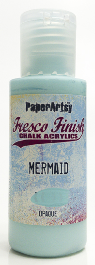
Lots of pattern and tone added to my ribbons now with Mermaid and Sand Fresco paints along with my previous 3 colours and the stencils PS001 and PS034.
Once
they were all dry I scrunched them up,and made them up into my
tassel,simply by folding them in half lengthwise, adding a length of
thin wire that I then threaded through a bead cap and various other
beads before twisting off into a circle at the top.
My
Bee charm is made with an image from ETS27 stamped onto shrink plastic,
once shrunk I backed it with a piece of scrap paper, added glossy
accents and a few beads.
I attached this to the tassel with a jump ring and wrapped a scrap of my coloured ribbon to the larger bead on the tassel.
My tag was cut from White Smoothy Card, coloured with Scottish Salmon, Peachy keen and Elephant Paint.The stencil PS124 was used to add layers in Peachy Keen. Then images from the Stamp set ETS24 and Scottish Salmon were used to add another layer of colour.
I used Black archival ink and stamped images from ETS27, smudged Little Black Dress paint around the sides and then ran a line of machine stitching around the edges.
Flourish
added using Elephant Fresco paint and Stencil PS156. I meant to do this
before the stamping but I forgot, so I had to be very careful to avoid
my images and the stitching.
I attached my tassel to the tag and this is now ready to gift to someone.
Before
I added the glossy accents I coloured the bee's body yellow with an
alcohol pen. As I added the glossy accents It started to bleed into the
accents and I did think "wrecked this now", but I was lucky and it
stopped and I ended up with a hazy yellow over the body area which I
think looks better than I was intending.
This
was a fun colour pallet to work with and as I said previously it is
amazing how far you can go with just a few different shades of paint.
Thank you for reading my blog post and you can find me at the following places. Carol Xx