Hi everyone
Jo (jofy.co.uk) here with you today. Christmas can be a busy time so its nice to take some time out of the hustle, bustle and 'hohoho' to sit and create. When I began thinking about this blog post I knew I wanted to create something festive so to get me in the mood I turned on the Christmas tunes and festive films. Do you do the same?
I settled on creating Christmas cards using one of my new Christmas stamp sets JOFY131- but because I've used the main image (the wreath) quite a lot already I wanted to focus on the smaller images in the set. The single berry motif is really versatile (cut off the holly leaves and it can be used all year), the tag is super cute & it would be shame not to use the teeny tiniest stamp I think I've ever designed (the berry 'centre') in some way!
I like to combine different elements when making cards so I gathered up a set of bold word dies, stencils for gel printing, paints and stamps (of course!) and started making what was needed to create the patchwork/collage cards I had in mind.
I began by selecting paints from the PaperArtsy Fresco range that reminded me of a 1950's Christmas colour scheme - colours that inspire me.
Pinterest is a great resource for colour schemes - lots of images to suit and inspire themes and projects like the one shown below. Its a wonderful colour resource.
The overall plan was to create gel printed papers, painted stamped motifs and die cut elements that I would assemble into patchwork backgrounds and assembled clusters on greeting cards.
First I created bespoke background papers by pulling plain and patterned gel prints and adding stamping and mark-making to break the patterns up and make them 'daintier' and more detailed they needed this as they would be cut up in to small pieces.
I wanted the papers to mix and match so I used the above colours for background and details.
I wanted the papers to mix and match so I used the above colours for background and details.

I printed lots of backgrounds, here are a few... I didn't use all of them for these cards but that's ok - they'll be used or upcycled for other projects.
Clean up/ghost prints are great as they often have lovely texture as shown above. I over-stamp prints with a background stamp (like this one from JOFY125) and use inks rather than paint (eg Crimson Archival ink).
This is a lovely background stamp - looks especially great when stamped and embossed in Gold, as shown below.
The Red Lipstick Fresco spotted print on a Cloud9 background (below) was quite bold so I tried to soften it by added painted spots and red & gold mini stars/flowers....
I printed a selection of pages:
.... in cream/gold... the Gold Fresco paint is fabulous when its gel printed!!
...and Aqua Duck Egg/ Caribbean Sea...
I added to detail to these gel prints by stenciling on top (PS313) and adding white dots (Cloud9 and Snowflake):
I took the photo below while I was making the cards - its the pile of 'discarded'/waiting to be used bits and pieces - I loved how they looked together. Seeing different elements together like that can be quite inspiring. The dies ('Big Tidings' by Tim Holtz from Sizzix) were cut from gold and white cardstock - those 'neutral' colours would work really well with my colour scheme... and the gold card links nicely with the gold embossing and paint detail added to the gel prints.
I really like this way of creating - messing around with all the elements to see how they look together, which background papers work best and cutting and stamping other elements where necessary to add to the look/design of the cards.
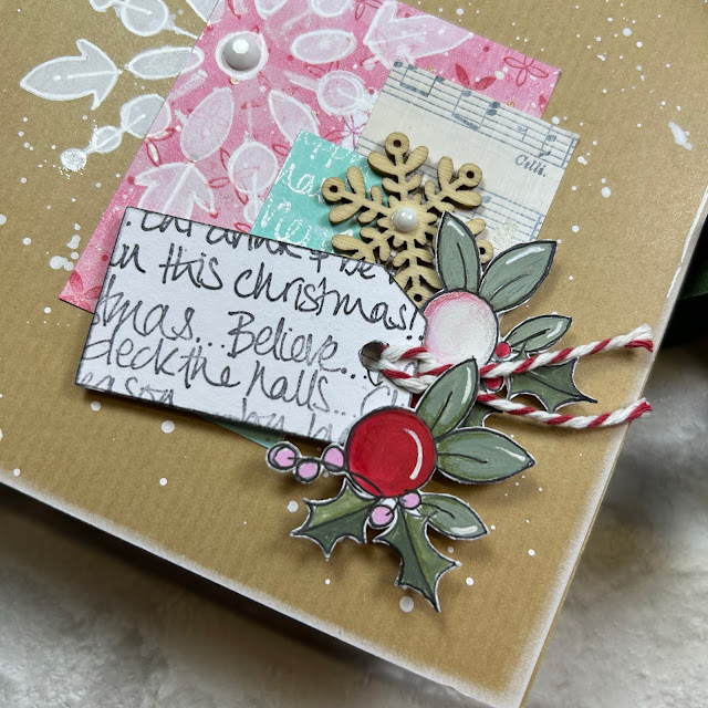
Here are the cards I created - lets start with the 'pink' ones. Each of the cards features the berry motif painted in shades of pink/red, and a tag.
The addition of a wreath die-cut (Sizzix) give the card focus, and somewhere to place the berries and other embellishments. Embossing the pink card stock added texture to the piece.
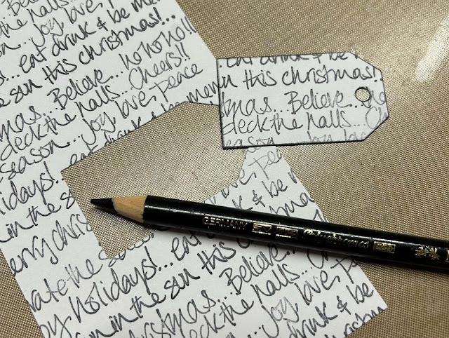
Paint splats make great snowflakes don't they! lol The tag on this card is cut from a block of text I created by repeatedly stamping the word block from JOFY131.
The size of this word die allowed me to layer the die cuts and stamping on this card.
The panels of paper on this card have been attached with machine sewing - a similar effect can be achieved by hand sewing a simple running stitch or by drawing a stitched line with a white (or black) pen.

My creations aren't all cards - I had small bits and pieces of each of the background papers leftover and, as I don't like to see those go to waste, I planned out a grid style greeting card on a black card base...
but I wasn't keen on that so I transferred all the pieces to a page in my grid journal- much nicer! (a grid journal is a great way to keep all those lovely bits and pieces out of the rubbish bin!)
I loved working with the bespoke papers I created, & teaming them with dies and stamps - I STILL have pieces left over!! The more I made the more I was inspired to change it up: add different greetings, add a snowflake here and there - slightly addictive - in a good way! Its fun to see how many cards can be created from relatively few supplies.
I encourage you to gather your supplies, turn on your Christmas tunes, wear your Christmas sweater if it will get you in the mood (lol) and get making!!! Take a look at the smaller motifs in a stamp set and see what you can create with them - you'll be surprised!!
Finally - HAPPY CHRISTMAS!! I wish you all the very best for the festive season - enjoy! See you next year.


6 comments:
This was very inspiring, I was actually making Christmas cards using one of your older Christmas sets Jo. I'm tempted to make some more now!
Great inspiration. Love the gold and the big words. X
Gorgeous cards Jo, and I love all your gelliprints. Might have to start making my 2024 Christmas cards in January 😊
Don't know how I commented as anonymous 😂
I, too, like to choose a range of colors before I begin creating. However, your idea to think about an era to choose the colors is different yet very inspirational. Thinking I will review my package of Christmas cards I received from the past to choose a range of colors for next years' creations!
Those tags with your writing are especially cute! Thanks!
I'll be spending the day this Sat. With Michelle at ESS in Florida. Now I know what I want to PLAY with! Love ALL your creations!
Post a Comment