Hi everyone, it's Asia Marquet (Lemon Creation) with you today, and I'm here to share with you my very first project for PaperArtsy- Stamp Mash-Up.
I found this topic to be fun and challenging at the same time. It is not easy to create outside of your comfort zone. But it is rewarding at the end as it makes you to go through all this unusual process and often making you find new ways of expression, techniques or styles. Hopefully discovering something along the way which you will truly love to do?
I use for this project 3 completely different sets of stamps and stencil: ZinskiArt, Kay Carley and Hot Picks. The challenge for me came from the fact that some of these stamps I would not thought of using together at al! How can I possibly make an art journal page with quirky rabbits, industrial elements and very sweet looking stencil? I was not really sure I am going to pull that off. I was wrong and I am happy to show you that mixing between different genre/ styles is possible and fun.
The idea for this art journal page was a sort of welcoming of Spring- so there is this Rabbit family, standing in line in front of the very first blossoming tree. Waiting so impatiently for a Spring to come. I started by the easiest part - gathering all the products I was going to work with. Baby steps.
It was important to me to start by creating my main characters, which were the rabbits from Zinsky Art (ZA53) stamp. Based on them I could decide on the paper size (a little atypical as the stamps are quite big and I wanted to use at least 3 rabbits).
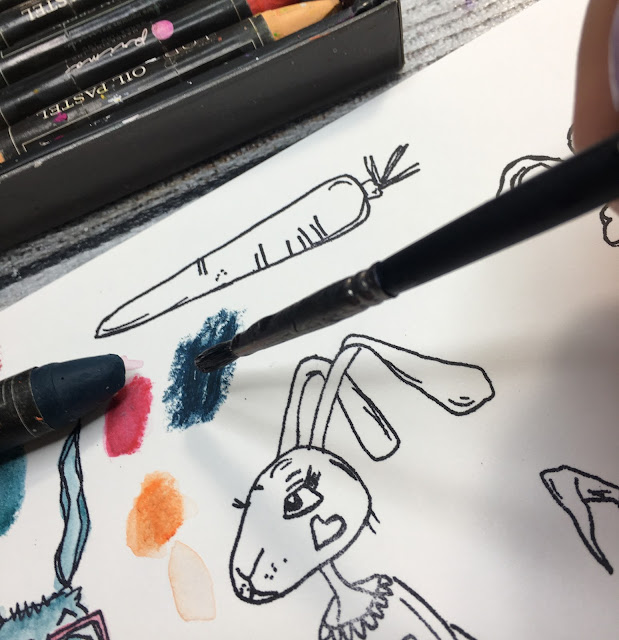
I stamped the Rabbits with Ranger Archival Ink (Jet Black) on a Paint On paper (250g). Even though this particular type of paper is very smooth and perfect for stamping, I wanted to be sure that the stamped lines are crisp enough, so I used stamping platform. Using a stamping platform is really important if you need to colour your elements afterwards - if, by accident, you add colours over the stamped lines, at the very end you can always re-stamp on top of your image once again (but be sure not to remove your stamps from the platform until your colouring is finished).
I stamped all four rabbits thinking that I was not entirely sure if I am going to use them all and pretty sure that I will make some colouring mistake later on. At least I will have a choice in between all of these bunnies. I was right. About the colouring mistake that is.
I used Prima Water Soluble Oil Pastels to colour all the rabbits. One of my favourite techniques of adding colour with water-soluble pastels is to simply apply them onto the piece of paper and then take a brush, dip it in water and pick the colour out from the paper.
Now I can use colour-charged brush to paint with it like with watercolour. I find this is the way which gives you the more control, as opposed to applying the crayon straight between the stamped lines and then diluting it with water to achieve a watercolour effect.
As for the colours I used - I decided to stay in more earthly tones, simply because I didn't want to steal the spotlight from the blossoming tree.
I did sometimes colour on the stamped lines, so at the end, when all my bunnies were coloured and dry, I re-stamped them again using my stamping platform. That may seem like such an unnecessary step, but believe me- the crisp, black outlines of the stamp adds much more coherence and contrast to the images. Finally I decided on not using the last and the tallest rabbit - I didn't really like the colours I used on it and I thought I made him look sad, even though he is cute and smilling.
After fussy cutting everything out I added some Ranger Glossy Accents to the noses, glasses and cheeks of the Rabbits- another small detail, but at the end it adds more interest to the whole project.
Let's move on to my background- this was the easiest part for me. I love creating backgrounds and stamping away as much as I can. I was going to use PaperArtsy Hot Pick stamp (HP 2103)

True to myself I decided to stamp away until the bottom of my page was well filled with images and it looked quite busy (and grungy). I added small stamped images throughout the page to make a sort of link and coherence all around. The stamping may look l bit chaotic to you, but it's done on purpose. I wanted to create a "mess" with some blueprints and script stamps. I started with a smaller and more intricate images, then added darker, more prominent stamping to create visually more "layers". Another great thing to do is to stamp an image and then stamp again a little bit off of the first one and without re-inking the stamp- the second image will be less crisp. You can create this way a sort of deepness to the whole page. You can also use on the side a bit of scrap paper to remove access ink from your stamp. This messy background has also a huge advantage- small stamping mistakes are not really visible here. And even though I am crazy about stamping, it's important to me to leave a lot of negative (blank) space on my page. In my opinion that gives a lot of contrast and makes the whole project looks better.

After I stamped everything there was to stamp, I found out that there is not enough contrast on my page. I mean there was a black stamping, but to me it wasn't "loud" enough. So I grabbed PaperArtsy Fresco Finish Chalk Acrylic -Little Black Dress (FF19), some old plastic card and added some lines in between and on top of already done stamping. To add line like you could see on the photo below, all you have to do is put some paint on the flat surface (I used my flat palette), dip the edge of your card or palette knife in the paint, and then add it to the paper by pulling the card across the paper. Thanks to this beautifully rich black colour I got much needed contrast.

Let's move to my very important Spring part of the project - the blossoming tree. Firstly I wanted to use a stamp to add the tree to the project and then decided against it. Why? Simply because i wanted it to be a very important part of this page. Stamping the tree would probably not be a good solution on a very busy background. I opted for the beautiful PaperArtsy stencil by Kay Carley (PS079) and PaperArtsy Grunge Paste.
Here comes the tricky part - embossing still-wet grunge paste. Why did I need to emboss it? To get these beautiful flowers - all yummy and pink. My time-consuming way to do it was to take a small brush, pick up with it embossing powder (I used Lindy's Gang Hi-Maintenance Magenta EP) and sprinkle it over the flowers. I have to be honest- this took some time, a lot of precision and patience (which I am not known for). But after drying it with a heat gun, I was really happy with the end effect. Last thing to finish the tree was to paint its trunk and branches with the same Fresco Finish Chalk Acrylic (Little Black Dress)
It was supposed to be a Welcome Spring type of page, so I had to add some spring-y colours. Not too much as it is just a beginning of the Spring and Winter is still dragging on. That's more "poetic" explanation, but the truth is that between the rabbits and a tree there was already plenty of colours on the page. I choose to work with PaperArtsy Fresco Finish Chalk Acrylics (Weathered Copper and Deep Sea). I used small palette knife to add them only at the bottom of the page, kind of where the grass would grow. In the hindsight I think I should have add more blue on the right hand side (more wintery colour) and more green on the left hand side. Instead I mixed them a little. Also the palette knife was not a great choice and next time I would definitely go for the brush. But those were a small mistakes and I was happy to leave it at that. Later on, with some make-up sponge I traced through the same Kay Carley stencil the word Spring (with Weathered Copper Fresco Chalk Acrylic).
The best part is of course putting it all together. I took 3 beautiful bunnies and adhered them to the page with foam tape- once again to create extra deepness.
The last touches to the page was to draw outlines to the word Spring (with Uni Pin fineliner)- once again for more contrast, and to add one of my Messy Christmas Words to finish the page off.
Finally I felt like there was nothing more left for me to do! Here is the finished project:


3 comments:
Love this blog post Asia. I must admit to scratching my head a little when thinking how these very different design styles were going to come together when I read this weeks blog topic. You have achieved this really well. Great also to read the thorough step by step thought process and own critique on the journey getting there!
Thank you so much! I admit it was a challenge with fe small mistakes along the way, but still worth it to try sth new :)Big hugs!
Asia, I love you you used the pastels to color these bunnies and I can imagine the glossy accents really looking fab in real life. Great project sweetie! xx, Autumn
Post a Comment