2021 Topic 14: Mash Up LPC EGL EEV EAB
And just like that we are at the end of the stamp mash-up topic.
Amanda has a stunner for you today, lots of gorgeous layers, and tips
with crackle effect backgrounds and grunge paste stamped brick walls!
What more could you ask for!
~Leandra
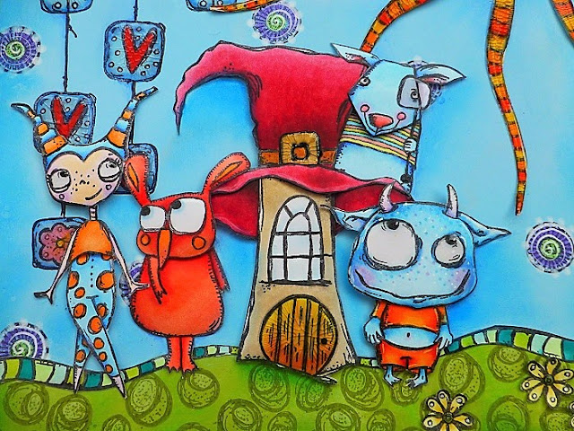
Hi everyone, it's Amanda Pink (ink-a-pink) with
you today, and I'm here to share with you an 'art panel' I have created
for the current 'mash up' topic where we get to create project/s using
stamps from different designer collections. This time the designer
collections are Lynne Perrella, Ellen Vargo, Gwen Lafleur and Alison
Bomber.
I
do love a good mash up but it's the first time I've joined in one of
PaperArtsy's here on the blog so I was keen to give it a go and see
where my 'mash up' creativity would take me especially as I had no set
idea what I was going to make when I began.
I
remember at some point thinking maybe a journal page which my finished
make could very well be but settled on making it into an art panel so I
can have it out on display rather than tucked away in a journal.
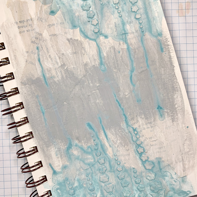
I had heaps of creative fun making all the layers and elements of the art panel. Fun that included painting,
a little paint mixing, some crackle glazing and stamping with inks and
grunge paste. Inevitably that makes for a long post that shares the creativity story and includes a few hints and tips along the way too
Usually
when I set out making something I begin with the background and then
work from there but this time I started with the focal image. With no
clear creative direction at this stage I hoped that once I saw the image
stamped and painted it may spark ideas for the rest of the project and
it did!
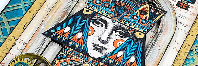
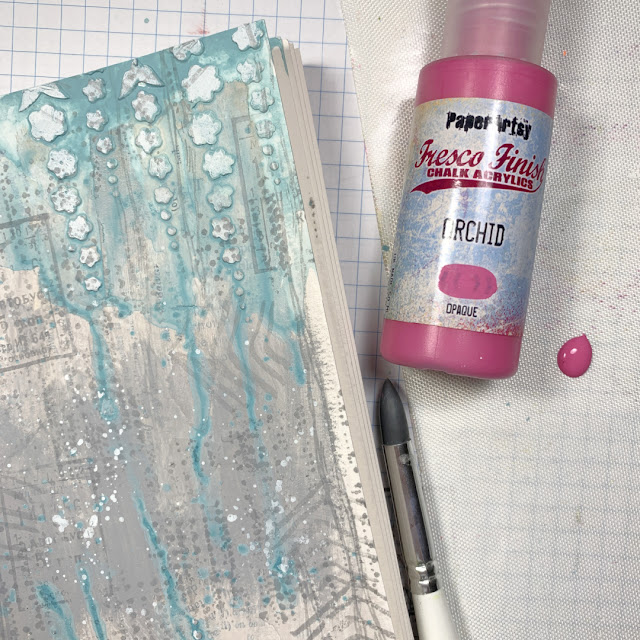
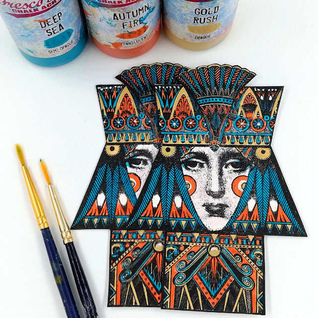
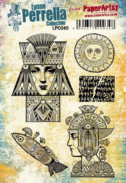
I
chose one of the images from Lynne Perrella Collection 40 (LPC40) and
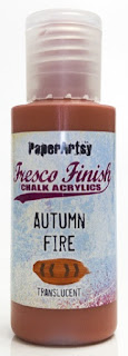
picked out a few Fresco Chalk Acrylics (Deep Sea, Autumn Fire, Gold Rush) as the main colours for the image.
In addition, I selected 3 Fresco Chalk Acrylics (Pixie Dust, Nougat, Chalk) that I blended together to use for the face testing it out on a scrap of card. I mixed the paints on my glass mat but it's worth mixing them on a
palette because if there's any
left over mix when you're done painting it can be covered with a piece of
cling film to use later. The cling film helps to slow the process of the paints drying out. I did test this out and the blended mix was still good to
use 24/ 36 hrs later. Same for Fresco's straight
from the bottle too.
The
images were stamped twice in Ranger Archival ink (Jet Black) using a
stamping platform. A great tool to use when painting a detailed image.
If you lose some of the stamped detail while painting the platform
allows you to put it back in by over-stamping the image with precision
once its painted.
Note:
for precise over-stamping the stamp must remain where it was on the
platform when it was first stamped and if the stamped card is removed
from the platform to paint it must be placed back in exactly the same
place it was when first stamped.
Just look at all that detail! WoW!
I
painted the images 'off' the platform as I like to be able to turn the
stamped image around when painting smaller detailed images. It allows me
to always be painting in the direction that feels most comfortable for
me which tends to be brushing from left to right. (excuse my painty
fingers)
Detail
painting for me is so calming. Once I get going I totally 'zone out'
and this particular image of Lynne's was a joy to paint. It's design
lent itself well to the tri-colour palette. Although some elements of
the design were more intricate than others to paint it wasn't anything a
fine paint brush couldn't handle.
The straight outer lines of the stamp design made them super easy to cut out too.
With
Lynne Perella stamp images painted and really liking how they looked, how the
colours worked together I drew from those colours to create the 3 layers
of my art panel.
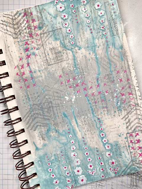
The
first layer I created was the largest and this is where I introduced a
stamp from one of Ellen Vargo's designer collection stamp sets.
In
contrast to the fine detail painting of the images this background was
all about loose,free painting with 2 of the 3 main colours I'd used for
Lynne's images: Fresco Chalk Acrylic (Autumn Fire, Deep Sea).
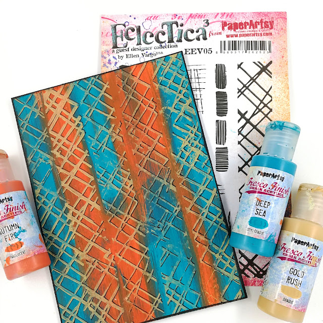
Fresco Chalk Acrylics are great for stamping so I used Fresco Chalk Acrylic (Gold Rush) with the long slim stamp from Ellen Vargo's Set 5(EEV05) to stamp all over the painted background.
Note: Be sure to clean stamps straight away if you are stamping with paint.
Some black drop shadows using a black pen really helped to lift the gold stamped design.
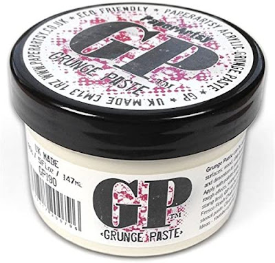
Continuing with Ellen Vargo's stamps I used a second stamp from set 5 on my next background. Rather than use the stamp with inks, or paints this time I used it with PaperArtsy Grunge Paste which I thought would add some texture to the finished project.
I
was thinking along the lines of creating a brick wall effect in
adjacent corners of this layer and thought the stamp from Ellen
Vargo's Set 5 (EEV05) with the 4 uneven rectangles had potential. I roughly applied some PaperArtsy Grunge Paste to a piece of heavy kraft card primarly concentrating it in the upper left , bottom right areas of the card.
Now I don't claim to be a Grunge Paste
stamping expert, I'm still very much an enthusiastic novice but I can
share a few helpful tips that I've picked up along the way. To get the
best result spritz the stamp lightly with water before pressing it into
the Grunge Paste and use the stamp on an acrylic block as this generally gives a better impression.
I
was really pleased with how the stamp design and the Grunge Paste worked
together to create the textured 'brick wall' effect I was after. Loved how the
Grunge Paste even picked up the fine line detail on the stamp design!!
Once
dry I drybrushed 'the wall' with PaperArtsy Fresco Chalk Acrylic
(Nougat) and enhanced the 'bricks' with touches of PaperArtsy Fresco
Chalk Acrylics (Gold Rush, Little Black Dress)
I chose a stamp that I thought suited Lynne's images - its one that really speaks to me.
I
wasn't after a clean and crisp stamping of the full quote I wanted it
to be more broken to suggest it may have worn away in places.
The third and final background layer was all about the crackle.
I'm sure a lot of you are familiar with PaperArtsy Crackle Glaze,
but for anyone who isn't it's a glaze that you apply between 2 layers
of paint, usually different colours to create a crackle effect. The
crackle effect you get with the glaze will vary depending on what you
use to apply it. In this instance I applied the crackle glaze with a
sponge on a base layer of PaperArtsy Fresco Chalk Acrylic (Little Black Dress).
Note each layer, be it paint or crackle glaze has to be completely dry before applying the next.
While the Crackle Glaze was drying on the black it reminded me of wet tar!
For the top layer of paint I used PaperArtsy Fresco Chalk Acrylic (
Gold Rush) again applied with a brush.
As soon as the top layer of paint is applied the cracks start to form.
Depending how thick the Crackle Glaze
is applied determines the size of the cracks once they are fully dry.
Thicker = bigger, thinner = smaller!IF you apply the glaze with a
sponge, as I did you will get round cracks, and if you apply the glaze
with a brush, you will get cracks that follow the direction of your
brush strokes.
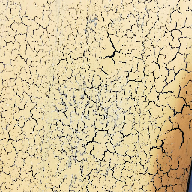
It's important to keep in mind that when applying the
top layer of paint not to work over the same area twice as doing so
will lessen the chances of the cracks forming. Also apply in one
direction with a generous layer of paint. Simply load up the sponge/
brush, apply and repeat.
Remember I mentioned that what you use to apply the Crackle Glaze affects the crackle results? I thought I'd create a second panel where I applied the Crackle Glaze with a brush so you can see/ compare the difference. Sponge on the left, brush on the right.
Applied with a sponge gives more of a 'crocodile skin' effect , applied
with a brush more of a 'weathered wood effect', don't you think? It's
great to be able to determine the outcome just by varying how you apply
the glaze to your base layer. Another tip is that both the base layer
and the top layer give a more striking effect if they contrast with each
other, and it is also a good idea to use an opaque paint on the top
layer.
With all my background layers and focal images made I just had a few extra 'bits' to make.
One of the stamps on Gwen Lefleur Set 9 ( EGL09) caught my eye. I thought it would be good to use as an embellishment on the finished art panel.
I had a feeling it may be longer than I needed so simply cut it down to size.
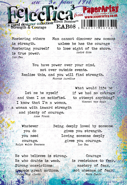
I was still short of a title for my art panel so reached for Alison Bombers stamps again, this time Set 7 (EAB07)
Just like the quote I'd use on the brick work background I thought this one suited the image too.
If you've stayed with me through all
the creative fun, thank you. Just a few close ups of the finished art
panel now so you can see how all the creativity came together in the end.
Starting with the painted images that took centre stage one sat behind and one on top of a Tim Holtz window frame embellished with metal gears.
All the background layers and the order in which they were placed.
Where I positioned Gwen's embellishment.
Not forgetting the title.
I love that Alison 's quote stamps can easily be cut so you can use just part of the quote as I have done here.
'She lives in a world of private dreams'
I
really enjoyed creating my art panel for this 'mash up' topic. Mashing
up the products and the techniques as well as the designers stamps meant
things never got 'boring'. There was always something sparking the
creativity.
Personally
I find mashing up designers stamps makes me look at my stamps/ stamp
sets closer, familiarise myself with them, play around and experiment
with them and ultimately use them more often and I'm all up for that.
If
a 'mash up' is something you've never done before or don't do often,
I'd really encourage you to give it a go/do more often. I'm sure you'll
have fun.
The
topic draws to a close tonight but be sure to check out the 'mash up'
projects the other designers have created over the last couple of weeks.
They are all amazingly inspiring.
Thanks for spending time with me today/ tonight.
Enjoy the rest of your weekend.
Creative wishes
Amanda
Blog: ink-a-pink
Facebook: Amanda Pink
Instagram: p1nkart
Pinterest: PinkArt


.png)

