Hi everyone Etsuko (My favorite things) here with you today. The cold season is passing by and I can feel the breath of spring in my garden. And my mind can't stop thinking about the tropical landscapes that are just around the corner.
Our first topic of the year is 'Miniature' and I was tempted to create a small tropical world using my favourite artist Gwen's stamps. I had a bit of time to create the project, so I decided to create three pieces incorporating resin and glass in this season's theme 'Glazed'. Today I'd like to share with you what I did well in the process of making these, and what I unfortunately did notdo so well. Please enjoy with me to the end. Thank you.

Making jewellery is always a pleasure, especially Boho jewellery which excites me!! Usually I decorate with ethnic fabric scraps, beads or embellishments, but today I tried it with what we had on hand.


The anemone fish stamp made by Gwen is a must in tropical aquariums, and tribe stamps were used because I thought they would make interesting pendants with decorative faces. I used these pastel colours for this project and added coloured pencils in some areas.
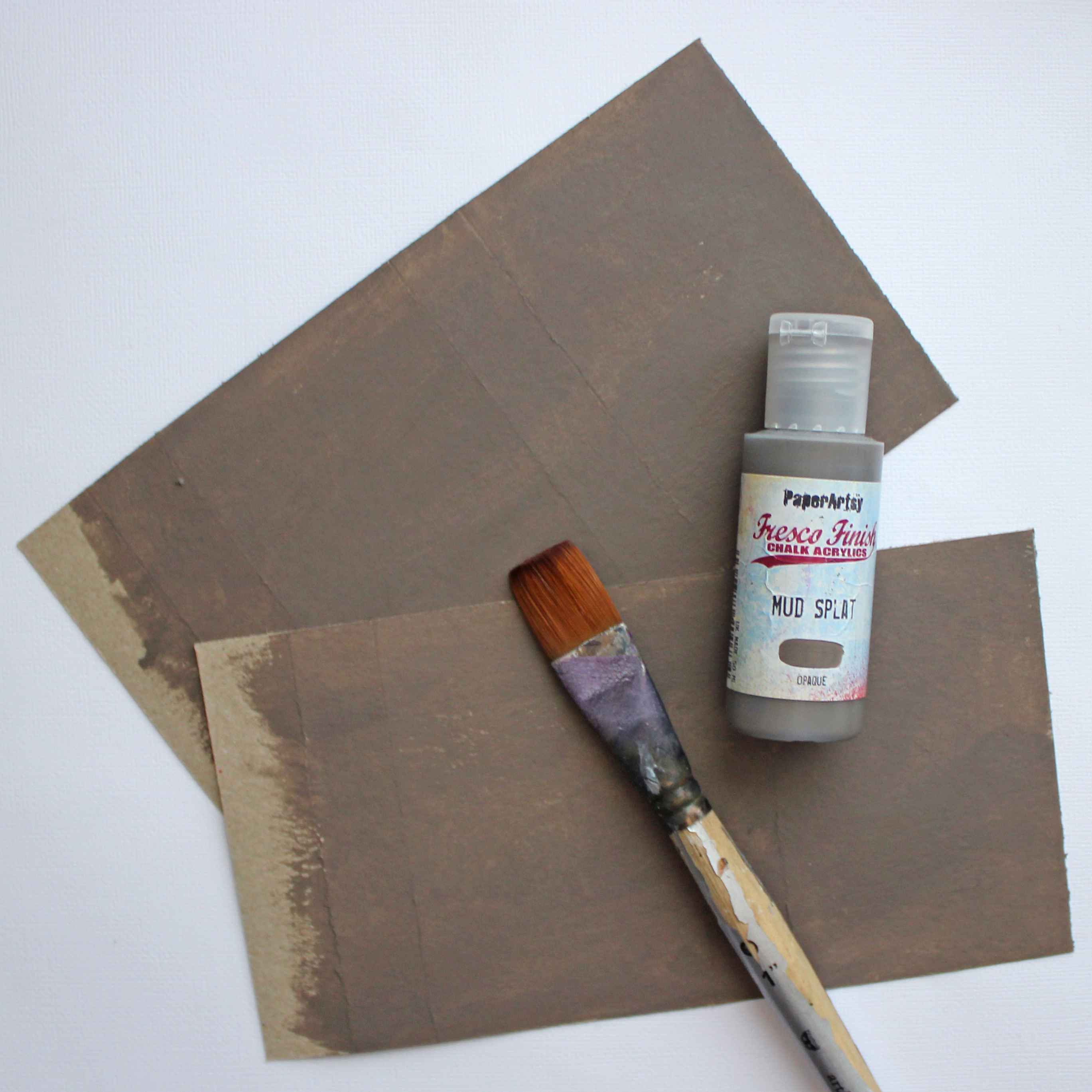
Colours are Fresco Finish Chalk Acrylics ( Dolly Mix, Wisteria, Blue Oyster, Cerulean, Fuzzy Cactus, Vanilla and Mahogany )

The first step was to make an aquarium pendant using a small Cloche Dome. The star of the show inside is the Anemone fish. I made jellyfish, starfish and seaweed, and the rhinestones were added to make it look like jewellery.

The image of the fish is stamped onto a paper with any black ink, scanned into the printer and fed into the computer to set the opacity of the image to 50%, which is then printed onto inkjet shrink plastic. The reason for the 50% opacity is that 100% produce a darker colour baked in the oven. The fish image on the left has been coloured with paint, the on the right is just an outline. After the plastic is cooked, it shrinks to 1/4 of its actual size.


In my experience, toaster ovens seem to be less likely to fail than shrinking plastic with a heat tool.


Just the outline of the image can be stamped or printed on plastic and then coloured in later with oil-based coloured pencils for a beautiful finish.


Finally everything was glued down with PVA glue and glass glitter was sprinkled around the bottom on top of the glue, the dome was installed and the chain was attached to finish.
The first miniature with glitter and glass dome glazing. So did you get a bit of the tropical vibe?
This glass dome freebie site by Stephanie Rubiano's Studio Rubiano.


The second piece is the Boho pendant and necklace. I love this tribal stamps and have used them in various forms, but this was the first time I had used it in jewellery and I was very excited. The theme 'Glazed' is explored with the shiny resin finish.

In addition to the above, most of the materials are things that everyone has, such as resin solution, clay, clear document folders, clear tape, glass glitter gold wax and PVA glue.


Cut the coloured images into the oval shape.

.
Gwen stencilled excess papers attached to the reveres.


As all tribal image are on paper, apply Paper Sealer on both sides to prevent the resin solution bleeding onto the paper.

There are no ready-made bezels to fit this irregular oval shape, so I usually use flat copper tape and solder the bezel, but this time I thought of a different and convenient method and remembered that resin does not stick to clear folders, so I decided to use this.

I cut the clear folder into 5mm wide strips and stick them onto the wide clear tape in the shape of the bezel and protect the outside of the bezel with PVA glue to prevent a resin liquid leakage.

Fill the bezel 1/2 full with resin, allow the resin to dry, place the tribal image on top of the resin and pour the resin until the paper is covered, holding it up with a stick to remove any bubbles. Small bubbles disappear easily with heat tool. After the bubbles have been removed, pour the resin until the bezel is full again. -Always wear surgical or polyethylene gloves when using the resin.-

Leave it to dry for two days (in winter) when the resin completely dry, remove the tape underneath and remove the surrounding bezel to complete the process.

I chose to use glass glitter and beads to decorate the the pendant's edges, and using a strong glue to prevent peeling.

I was thinking of sari ribbons for the necklace, but thought it would be nice to add handmade beads, and the idea of printing tribe stamps on clay come to mind. Now let the enjoyable work begin!! The images below were stamped on the clay stretched into an oval shape, how clear the image appeared.


This is the Boho pendant and necklace finished look, I still wanted to use the sari ribbons so I added the back of the neck to adjust the length and make it more comfortable. And it has a Boho taste.


I hope you all have a bit more fun with me. This is the last piece Boho earrings.

This time the background and tribe faces was painted over acetate. This way it would not be too thick when seen from side. This is because the earring edges remain intact.


The original plan for the earring technique was to drip 2-3 colours of alcohol ink onto the resin and stir it a little to create a marbled pattern, and then insert the acetate with the tribal face printed on it into the resin which is nice, but when I actually tried it, the colours developed too dark and did not work as shown in this picture.


This image is from the side view of the earrings, so sorry although it may be difficult to see.


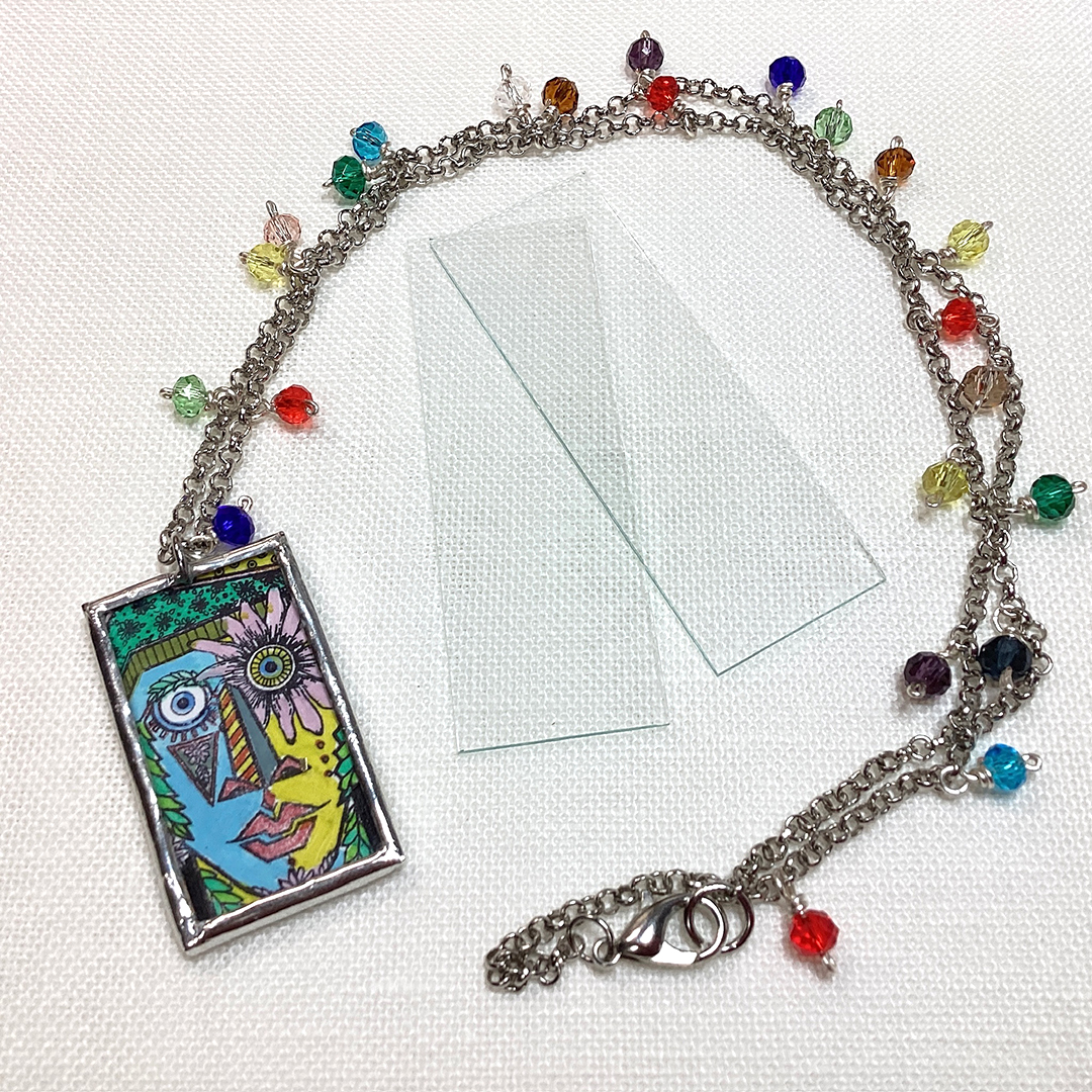
Finally, I add another pendant picture. (I'm soldering with micro slide glass.)