Showing posts with label EEV05. Show all posts

Thursday, 11 April 2024

2024 Topic 2 : Mattints {by Amanda Pink} on the PaperArtsy Blog


Hi Everyone

Amanda Pink (p1nkart) here with you today.

It's good to be back having had to take some 'time out' from my creativity last year and how lucky am I that my return comes with the opportunity to 'play' with Ellen Vargo stamps and the new PaperArtsy Mattints, especially as I'm feeling like a 'newbie' myself having been away for awhile !! 

I didn't really have any creative direction with regards what kind of project I would make for this topic prior to starting (which is often the case) but I knew given the PaperArtsy Mattints were new to me I would spend some initial time getting to know them, getting a feel for them. There was no grand experimentation but we had fun together swatching, colour blending, mixing, splatting and spraying. It was this play time along with the Ellen Vargo stamps I'd chosen to work with that sparked up ideas for my project/s.  


I combined some pattern play with some PaperArtsy Mattint fabric painting which resulted in a decorative cushion and complementing patterned panel along with a few 'added extras'. Plenty of fun was had along the way with a little 'drama' thrown in too! 


I gathered together a few supplies that I knew I would be needing throughout my creativity.  Although I would be using all 8 PaperArtsy Mattints (MT01,MT02, MT03, MT04, MT05, MT06, MT07, MT08) for my initial 'playtime' I ended up narrowing my colour palette down to only 3 for my projects: PaperArtsy Mattints (Glow MT01, Squeezed MT06, Dragonfly MT07). This trio of colours was very much influenced by a colour wheel I made during my 'playtime' which you'll see soon. 
As I planned to swatch the PaperArtsy Mattints on a range of different substrates I rounded those up too. 
Ellen Vargo stamp set 09 (EEV09) was a definite choice while Ellen Vargo stamp set 05 (EEV05) and PaperArtsy mini stencil (PM025) were possible/ maybe additions.


So my PaperArtsy Mattint 'play' began.

Swatches 
I made a collection of PaperArtsy Mattint colour swatch panels using a range of different substrates to not only get a feel for painting with the PaperArtsy Mattints but to also get a general idea of their colours when painted on each of the substrates and see if the substrate had any affect on the depth/intensity of their colours. 
They'd also be a handy resource for future reference. 
 
The unpatterned 'petal' stamp on Ellen Vargo stampset 09 (EEV09) provided an ideal space to paint the PaperArtsy Mattint colours within. 


The selection of substrates were a mix of those I use regularly: PaperArtsy Smoothy (SCA4H), watercolour paper, mixed media paper, cartridge paper......


.......and those I use every now and again: tissue (the regular 'gift wrap' kind), tracing paper, canvas and fabric (a thin soft cotton).

(I only painted the 'petals' once with the PaperArtsy Mattints, the tissue back and front.)


From swatching out the PaperArtsy Mattint colours I noticed:
  • Their consistency. Loose and fluid so they moved with ease and made for effortless painting. I personally found them very relaxing to paint with too. 
  • All the colours are generally quite light and subtle when painted (to be expected given they are a transparent tinted glaze), however by painting more layers they will become richer or in the case of the tissue paint both back and front. 
  • Generally, the substrate does affect the depth/ intensity of the PaperArtsy Mattint colours as you can see from the photo's above.   
Colour blending and splatters

With the PaperArtsy Mattints being quite a fluid medium they lend themselves to colour blending and do so with great ease, flowing effortlessly from one colour to another and without the need for any water! 
In just minutes I made a few colour blend samples with all of the PaperArtsy Mattint colours using a wide brush on mixed media paper. Loved the results. 

As they are a fluid medium then I was sure they would splatter. I do like splattering paint around and they liked being splattered around too ;) and without the need to add water. Although they are a transparent tint the splatters they make are rich in colour. 


Spraying

Once decanted into 'mister'/ 'spray' bottles PaperArtsy Mattints can also be sprayed. I found by spraying them, much like when splattering they give a rich colour. Once sprayed they can be moved around either by tilting the substrate they've been sprayed on or by spraying with water or both. 
I had fun spraying a sample page using 3 PaperArtsy Mattint colours (Glow MT01, Squeezed MT09, Dragonfly MT06).  


Colour Mixing / Colour Wheels

PaperArtsy Mattints are happy to be mixed together too and they create some gorgeous new colours when mixed as I found when I made a few PaperArtsy Mattint Colour wheels.

I used the colour wheel PDF (you can find it here) and PaperArtsy Mattints in groups of 3:
Top left: (Fern MT03, Jam MT05, Squeezed MT06)
Top Right: (Glow MT01, Squeezed MT06, Dragonfly MT07)
Bottom Left: (Glow MT01, Nutty MT02, Dragonfly MT07)
Bottom Right: ( Shark MT04, Dragonfly MT07, The Pink MT08)


Alot of what I learnt about the PaperArtsy Mattints from spending some time getting to know them will have already been covered here on the blog but as this is the final post for this topic I thought it might be worth sharing as a very basic recap. 

I also thought it worth sharing as most of what I've made so far I used in my main creativity and as I mentioned at the start it was this 'play' time along with Ellen Vargo stamp set 09 (EEV09) that sparked the ideas for my project/s.
Those 'sparks' came primarily from how I found the PaperArtsy Mattints so relaxing and effortless to paint with, the lovely warm colours of the colour wheel I made using PaperArtsy Mattints (Glow MT01, Squeezed MT06, Dragonfly MT07) and the depth of colour they gave when painted on fabric!

So I jumped right in to make my fabric painted project. 

At this point I was thinking along the lines of a tapestry ring as I could envisage the 'petal' and circle shape stamps from Ellen Vargo stampset 09 (EEV09) making a lovely focal flower pattern framed within the ring. 

I used to do alot of fabric painting back in my younger years before the days of blogging and sharing our art/ creativity on social media. I used to hand draw and paint t shirts, primarily vinyl/ LP covers using fabric inks/ paints of that time so I was keen to touch base again with something I used to love doing.

One thing I remember from those fabric painting days was that I always stretched the t- shirts over a board so they were nice and taut for drawing / painting on.  

So, I stretched a piece of thin cotton fabric (the same as I'd used for the fabric swatch) over a greyboard panel......


....holding it in place on the reverse with some masking tape.  


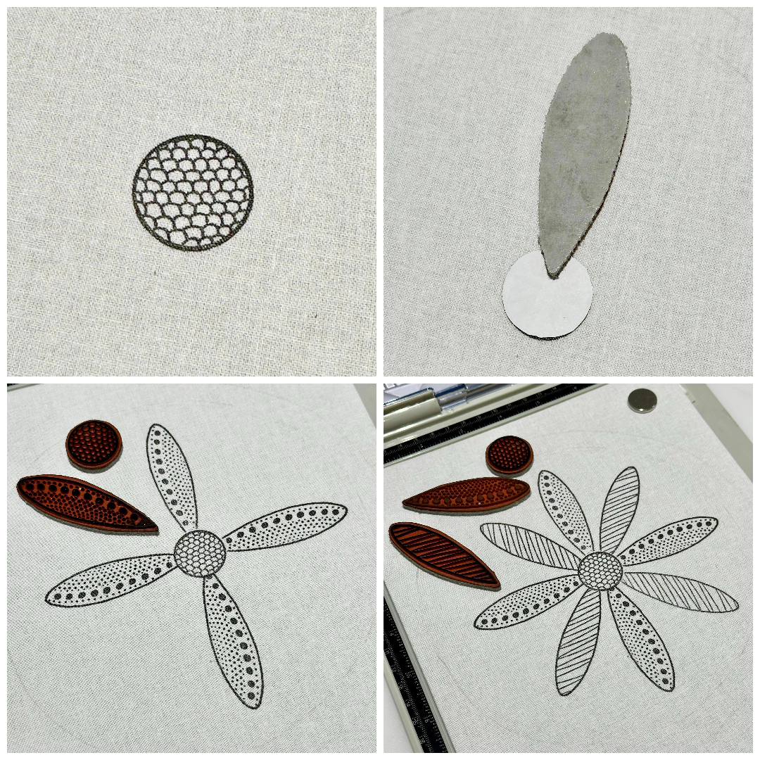
I used my stamping platform to stamp mainly for ease of stamping (for me) but also to allow me to restamp/ over stamp with precision if required. 

As I was thinking of using a tapestry ring it served as an aid to 'guestimate' where to position the centre of the flower when I began stamping.


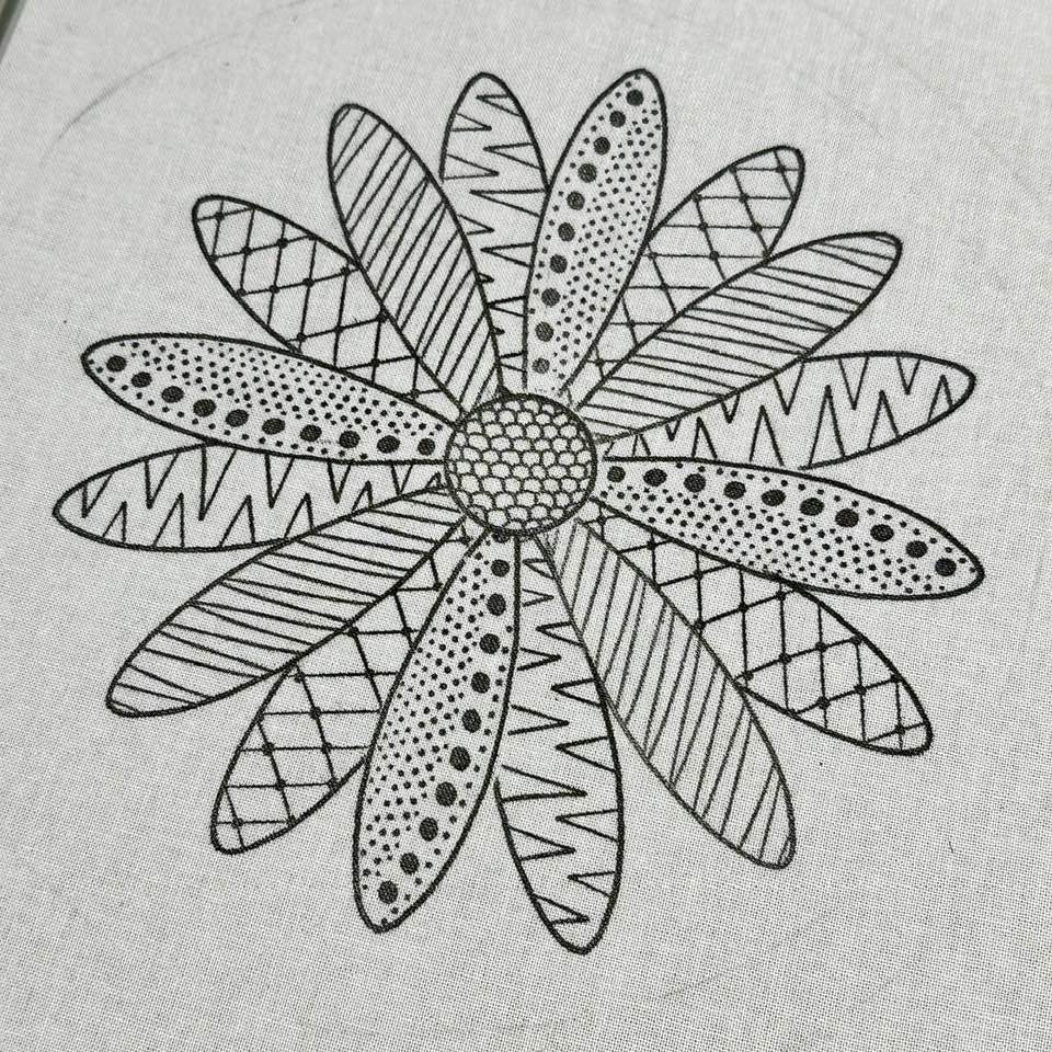
I picked out 4 of the different patterned petals and one of the patterned circles (all quite randomly) from Ellen Vargo Stampset 09 (EEV09) to create the flower.

The flower design was such that I wanted some of the petals to look like they were behind the others while also wanting them all to look like they sat under (not up to or on top of) the centre of the flower.  So to achieve this there was some 'masking off' involved when stamping.   

'Masking off' is when you cover a section/area of a stamped image to protect it from being stamped over when another image is to be stamped anywhere near it.

I stamped what would be the centre of the flower on the fabric then masked it off with a paper circle. I then positioned one of the patterned petals on the fabric making sure the tip of the petal sat on top of the circle mask (that was the part of the petal I didn't want to stamp) and stamped.
Keeping the circle mask in place throughout I then stamped the patterned petal 3 more times then repeated this process with one of the other patterned petals. 


The petals I went on to stamp were the ones I wanted to look like they were behind those I'd already stamped so that required 'masking off' the two petals either side of where I would be stamping my next patterned petal, aswell as the centre circle .


I continued masking off/ stamping with the rest of the patterned petal stamps until I had a fully stamped flower. 
I was really happy with the result. The stamps stamped so easily and effortlessly onto fabric  producing such clear crisp detailed results every time. I didn't have to restamp/ over stamp once!  I used Versafine ink (Onyx black) to stamp with and was impressed with it's blackness' on the fabric and that it didn't 'bleed out' at all.   


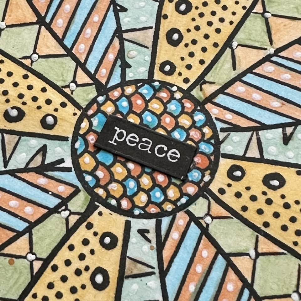
Time now for some relaxing Mattint painting!

I kept the fabric stretched on the board for this but disguarded of the stamping platform as I knew even though I would be painting over the detailed stamping it would still remain visible through the PaperArtsy Mattints because they are transparent tints! 

To paint the flower design I referenced the colour wheel I'd made earlier with PaperArtsy Mattints (Glow MT01, Squeezed MT06, Dragonfly MT07). It was these colours/ combinations of these colours (the primary colours 1,5,9) that I used to paint the petals to the fore of the design.


Those that sat behind I painted with combinations of the 'mixed' colours from the colour wheel (the  secondary and tertiary colours: 3 and 11, 6 and 10).
From what I learnt earlier during my PaperArtsy Mattint 'play' time I knew the 'mixed' colours would be slightly deeper/ richer on the fabric than they were on the colour wheel as I'd made that on PaperArtsy Smoothy. 


For the centre I returned to PaperArtsy Mattints (Glow MT01, Squeezed MT06, Dragonfly MT07)


As the PaperArtsy Mattints have a matte finish I was able to add some white pen highlights to the painted flower knowing they would be well received. 

It was so pleasing to see the flower design once I'd finished painting it with the PaperArtsy Mattints and what a relaxing, chilled out time I'd had. 
Thanks to referencing the PaperArtsy Mattint Colour wheel the colours all worked well together.


So far so good ....... but then it all went 'pear shaped'! 

You know I was thinking of using a tapestry ring, well I got to the point of cutting away the excess fabric that was at the back after I'd pulled it through the ring all nice and taut and I only went and cut too close to the ring so the fabric came away from the ring!! :( Arghhhhh! 

I hit panic mode (so forgot to take photos - sorry) and tried to rescue but as there was now very little excess fabric left I had nothing really to play around with to pull back through the ring and the more I did the more the fabric frayed!!     
I was gutted ! What now???? My project was ruined........ 

 
..... or maybe not ?? (Truth be told the 'or maybe not' didn't happen quite as quick as that in real time ;))
I looked at what I had left, especially with regards the excess frayed fabric and wondered if there might just be enough to allow me to sew it to another piece of fabric and make something, maybe a cushion, albeit a small one??? 

So with the help of some careful sewing, some 'filling' and the addition of some PaperArtsy Mattint splatters and stenciling using PaperArtsy Mini Stencil (PM025) with a micron pen my once to be tapestry ring morphed into a cushion! 


...And relax!!!!

In a bid to do so and restore some inner calm after all the 'drama' I spent a bit of time creating and painting some patterned panels (6x6) one of which was the same flower design as on the cushion, this time on PaperArtsy Smoothy. 

As I used all the same stamps, PaperArtsy Mattint colours/colour wheel and creative techniques that I did for the cushion I'll just share a few photos of the finished panel that I mounted on card and entered into a journal which I've decided will be my 'pattern play and mindful colouring' journal. 


A quick scroll up of a few photos and then back and you'll see (if you haven't already) the  difference in the depth of colour of the PaperArtsy Mattints on PaperArtsy Smoothy in comparison to them on fabric!  


The word seemed appropriate! ;) 


I only set out to create a couple of pattern panels but ended up creating quite a few as the pattern ideas just kept coming. Some involved the masking off technique, others didn't. 

These I have yet to paint/ colour but I will as and when and especially now I have my 'mindful colouring journal ! 

(I set them against black to share for a clearer visual) 


I thought it would be a good idea to have something to put them in to keep then all together (and clean) until I coloured them. Remember the PaperArtsy Mattint sprayed sample page I'd made during my initial playtime? I used it to cover the back of a regular white envelope. The front I left uncovered as I think I might adhere it to the inside of the back cover of the journal so everything's kept together. 


PaperArtsy Mattints (in this case Glow MT01) can be used to tint/ stain light coloured wood too as I discovered when I made a wood chip 'button' to act as a closure. I decorated the 'button' with a stamped circle from Ellen Vargo stamp set 09 (EEV09) painted with PaperArtsy Mattints (Dragonfly MT06).


If the spare pattern panels had a place to stay together and keep safe and clean then surely the swatch panels deserved one too, right?  
The colour blend samples (again from my initial 'play') became theirs.


Some of the stamps from Ellen Vargo Stampset 05 (EEV05) highlighted with white pen and PaperArtsy mini stencil (PM025) provided some detail.  


Another wood chip 'button' made in the same way as the other sat at the back of the envelope.... 


.... while at the front some big die cut letter's spelt out the word  'Mattints'!  


I think it was save to say at this point my inner calm was fully restored ! :) 

As its a long scroll back to the start (thanks if you've stayed with me until now) here's the photo I shared back there of my PaperArtsy Mattint / Ellen Vargo creativity.   


What fun that was - even the drama ( I can say that now I'm all chilled and relaxed ;)) !  PaperArtsy Mattints are such a versatile product, true 'multi taskers' and I'm looking forward to exploring them more as I feel our 'friendship' has only just begun!

If you have the opportunity to give them a try I would say 'go for it' and be sure to share with us your mattint 'play' and any projects you make- we would love to see! 

Thanks for stopping by today/ tonight
Creative Wishes
Amanda
x


Facebook: Amanda Pink 
Instagram: p1nkart
Pinterest: PinkArt


Monday, 16 October 2023

2023 Topic 10: Tags {by Mags Woodcock} with Ellen Vargo stamps


Hi everyone
Mags here with you today.

Anyone who knows me and my artistic style knows that I love texture, rust and typography. So when I learnt that this quarters theme was typography I was very happy. I immediately decided I wanted to create something with lots of texture. 

Many years ago I created a mini canvas project using strips of leftover collage papers, it was, and still is, one of my favourite mixed media pieces. I thought the idea would be great on a series of decorative tags for this topic. My idea was to create all the papers for the project using the fabulous stamps by Ellen Vargo. Combining these with book page papers also linked into the theme I discovered a few new things along the way and also had fun playing with Rusting Powder and PVA glue.


I had so much fun playing with the Infusions, stamps, Rusting Powder and different papers. I ended up with tons of textured papers and learnt a lot about how the Infusions react when combined with glossy photo paper. I also tried a new (to me) way of adding rusting powder to papers.


The most important thing about this project for me was the need for texture, and lots of it ! I also wanted a touch of metallic shine as well as some rust. I tend to steer towards a fairly subdued vintage colour palette when creating, but this time I wanted a splash of something brighter to combine with the rest.


When creating collage and background papers I love stamps that give visual texture, especially those that can be used in different ways. The two stamp sets by Ellen were an obvious choice. Crunchy Waxed Kraft paper is fabulous when embossed and I added some Fresco Finish chalk Acrylics to highlight the texture on some sheets. As you will see later in the blog post, the Golden Sands Infusions add a pop of brighter colour to a fairly neutral colour palette. Grunge paste and Rusting powder also added texture to the Grey-board tags.


To create the base for the tags I used Grey-board, cutting to 9cm wide by 17cm high. I covered them on both sides with book pages, using matte medium as an adhesive, brayering to remove any air bubbles. Using book pages added visual texture and also tied into the theme.


To knock back the text a little I added a coat of watered down Fresco Finish Chalk acrylic, Heavy Cream (FF203). Once this was dry I added PaperArtsy Grunge Paste (GP190) through a Sara Naumann Stencil (PA 271). Whilst the paste was still wet I sprinkled over  PaperArtsy Rusting Powder (RP45) and tipped away the excess.


Once the Grunge Paste was completely dry I brushed away the loose powder. Next I placed a paper towel soaked in malt vinegar over the paste, this activates the Rusting powder. Leaving in a well ventilated area overnight let it develop fully.


Once dry I carefully removed the paper towel to reveal the gorgeous rust beneath, keeping the paper towel to use later in the project.


My next job was to create an easy way to add and space the papers that I was going to place on the base of the tag. I striped back the top layer of paper from some corrugated cardboard and glued a section of the remaining cardboard to the tag.


I always love the reveal of seeing the Rusting Powder once it has reacted with the vinegar, this was no exception, but this time I had the added bonus of rusty tissue with text on it too.
It was now time to move on to creating those interesting papers.
 

As I said previously, I wanted to create as many textured and interesting papers as possible. I had a ton of ideas in mind and had great fun playing with the stamps and supplies I had chosen. The choice of paper made a lot of difference to the outcomes, as you will see shortly. I gathered a selection, including glossy photo paper, watercolour card, tea stained copy paper and patterned book pages.

I started by making a spray stain with PaperArtsy Infusions, Golden Sands (CS05) This is one of my favourite ways to use the Infusions. I love the way they can be used in so many ways. I always mix the powder in a small pot with water, stirring to completely dissolve the crystals before pouring into the mini spray bottle and topping up with more water.


The first paper I wanted to try with the sprays was glossy photo. It sucked up the colour well and I discovered that once they were dry I could use a damp cloth to wipe away the brown walnut ink and leave a much more vibrant yellow colour. This photo shows the 'before' colour.


Whilst I had the spray to hand I wanted to stamp using the dye stain. I sprayed a little onto a craft mat and used this like an ink pad to pick up the colour and stamp onto the photo paper. I loved the effect that stamps from Ellen's collection (EEV05) achieved with this technique. 


I also picked up any leftover Golden Sands dye stain from my craft mat with a sheet of watercolour card. Once this was dry I added some stamping from the second set of Ellen's stamps (EEV06) I didn't want perfect images, stamping randomly without an acrylic block created a distressed effect which was exactly what I wanted 


Next I wanted to create some rusty papers, so out came my all time favourite art supply, Rusting Powder ! I had an idea to try something which I had thought about many times, but never actually tried. I brayered some PVA glue onto my craft mat and used one of Ellen's stamps to pick up the glue and stamp onto some heavy copy paper. Whilst still wet I added the Rusting Powder and tipped away the excess. When it was dry I added some vinegar soaked tissue to activate the rust. I also tried this on some Crunchy Waxed kraft paper, the results weren't as obvious, but still great.


As you can see in this photo, the results were very pleasing and the texture was subtle but very  interesting. The bonus of some rusty tissue was also great !


Moving on from the Rusting powder I tried an experiment with PaperArtsy Crunchy Waxed Kraft paper (WKPA5) I found some Sizzix typography embossing folders and embossed several sheets of the waxed kraft paper. 


The embossed papers were gorgeous, but I decided to highlight the text even more, which would in turn, give a more textured look. I chose to brayer on some Fresco Finish Chalk Acrylics. I went for Little Black Dress (FF19) and Heavy Cream (FF203). The results were even better than I expected. 


I also needed some thinner stamped papers to go with the more textural and thicker elements. I used some tea-stained copy paper and more of the stamps from EEV05, this time overlapping them to cover more of the surface.


I created yet more stamped papers using my Gel Plate. First brayering out a coat of Fresco Finish Chalk Acrylic, Gold (FF20), using the stamp to pick up the paint and apply to the paper in a random pattern. I worked quickly and was also able to pick up the leftover paint from the plate to create a second sheet.


I now had enough papers to create the textural element of the tag. In fact I knew I had enough to create several tags with lots of leftovers for other projects.


You can see from this selection of papers that the visual texture created with the stamps is lovely, even before adding in the book pages and rusty tissue.


The Infusions on glossy photo paper was lovely but I knew I needed something with a little more impact. This was when I decided to wipe away the walnut ink with a damp cloth and stamp repeated circles using Ellen's stamp from EEV06. I liked the effect but wanted some more contrast, so added random circles with a white gel pen.


I was now ready to start assembling the elements for the bottom half of the tag. Using a ruler as a guide, I tore strips of the papers approximately 2 cm, 1.5cm and 1cm  wide and folded them all in half width ways. The rusty tissue proved a little difficult to tear evenly but with care I achieved it.


Remember the corrugated cardboard I added to the tag ? well it was now time for it to come into play. Using PVA glue and a fine nozzle glue bottle I added glue along a groove and tore a paper strip the correct length to fit in, pushing down well to secure in place. I kept repeating this until all the grooves were filled. I made sure to use a varied selection of papers for contrast in colour, texture and paper weight.


Once all the initial strips were dry I positioned the second set of strips between the first (on the peaks of the cardboard). Arranging them first before gluing helped me to decide if the colours, textures etc. contrasted enough. Once I was happy I glued them in.


To complete the textured look I wanted to add some of the rusty strips of tissue from the vinegar soaked kitchen roll. I added these, along with a few of the very thin 1cm wide strips of paper, on top of the first layer. 


 I was very happy with the texture, colour and composition of the tag at this point, but something made me want to add just a few more details..

The tag was nearly finished, it just needed a little more. I nearly always ink the edges of my projects, whether it's a tag, journal page or card. This tag was no different, I used Ranger Archival ,Vintage Photo ink and a sponge.


The next step was to add a little Fresco Finish Chalk Acrylic in Gold (FF20) to the edges and also to dry brush a little onto the rusty stencilled letters.


The last thing to finish the tag was to add a focal point to the top. A touch of the rusty tissue added interest to the top. I used some of the embossed Crunchy Waxed Kraft and  fussy cut elements from the stamped Infusions papers. A rusty paperclip added the last touch of texture.


The last thing to do was add an eyelet at the top


I had so much fun creating the papers for this project and I will definitely be using some of the techniques again, especially the Fresco Finish paints on embossed Crunchy Waxed Kraft paper. 

I'm really keen to try the gold paint on the embossed paper. I also love stamping with the Infusions sprays, such a cool effect. I have lots of papers left, even after creating two extra tags using the same idea but with different shaped areas of textured papers. I'd like to try creating some pen storage using the same techniques, but with the cardboard wrapped around a recycled tin can. What do you think ? Have you any alternative ideas ? 

I would love to see what you create.
Have fun and happy crafting    

Mags


Facebook:https://www.facebook.com/mags.woodcock
Instagram:Instagram