
Showing posts with label 2022 Topic 5. Show all posts

Sunday, 27 March 2022

2022 Topic 05: Stamp Mash-up {by Renata Peley} with Zinski, Kay Carley and Hot Picks stamps

Hi everyone, it's Renata Peley with you today, and I'm here to share with you a new art journal page that I made, with a sneak peek of a stamp set from the upcoming release by Zinski Art. This coming week PaperArtsy has 4 releases for your pleasure, and these large ZinskiArt faces are the first of those tomorrow, Monday 28th March. 

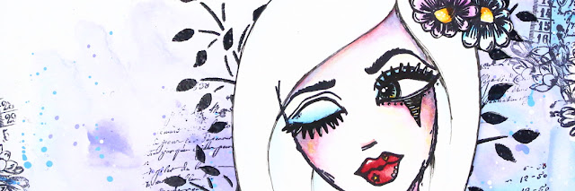
In my opinion, the girl from the Zinski Art stamp set ZA72 is so feminine, flirty and a bit mysterious that just by looking at her, she inspired me to make a page in exactly that kind of style. For me, the mix of blue and purple colors gives such mysterious and a bit magical feeling, and my chosen stencil by Kay Carley and Hot Picks stamp give my project that feminine and floral feel.



As I said before, the color scheme for this project was decided in my head as soon as I looked at the girl in the Zinski Art stamp set, and I also knew that I will use the Fresco Finish Acrylic Paints by Paper Artsy, but what kind of background did I want? Well, what goes better with the mysterious and flirty feeling than the lose watercolor look, I thought, and with that I started working on my background.


I put my chosen colors (PeriwinkleForget Me Not and Smurf) on my craft mat and prepared a glass of water. For paints to mix in a way the watercolors do, I had to wet my paper, as well as dilute my acrylics with a lot of water. When blending colors, I always tend to start from brighter colors and slowly add darker shades until I achieve the desired result.  And, of course, when the base color was done, I had to add some splatters, because I just couldn’t resist. For that I used the same colors as for background plus some opaque white color (Snowflake).


Now that I laid down my colors, I wanted to do some stamping and for that I chose the HP1301 stamp set. Since, as mentioned earlier, I wanted a feminine feel, I decided to stamp the script and flowers from the stamp set. I placed the flowers a little bit more toward the edge of my paper to give it sort of a framing.
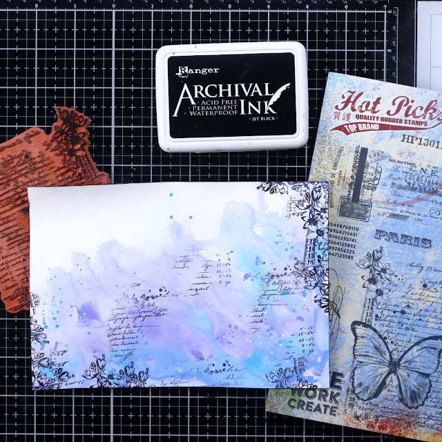


The next step for me was to introduce a stencil from Kay Carley. The stencil of my choice was PS061 as, in my opinion, it adds more to the floral feel of my page.
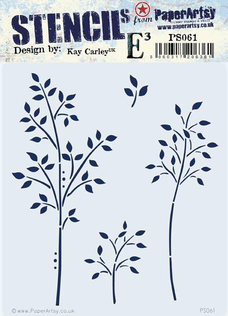

For a bit, I was debating on which stencil technique I should use, but at the end I decided to go with the heat embossing. As I've seen, some people dab the ink pad directly over the stencil, but I prefer to pick the watermark ink with the ink blending tool and dab it through the stencil that way. I think this option is better if you wish to keep your watermark ink pad clean, though mine isn’t as pristine as I would like it to be.


With the heat embossing done, I considered my background finished and the time came to work on my focal image. For that I chose the soon to be released stamp set ZA72.

This stamp is honestly really cool because it gives so much possibilities for varying the elements. I was playing around for a bit, as I will show you soon, but at the end I decided to give my girl some hair, so I freehand drew it with a pencil at first and when I was satisfied with the looks, I reinforced my drawing with an archival ink pen.
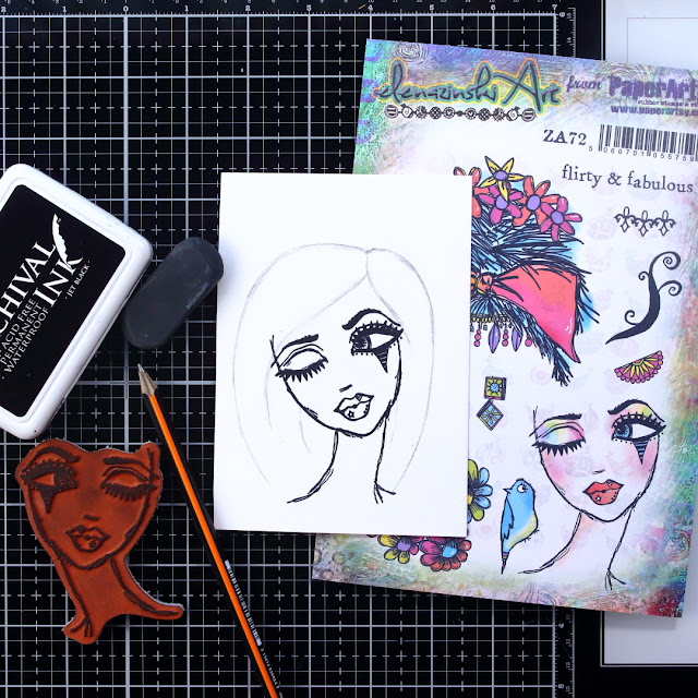

I mean there are just so many options. If you decide to draw her hair, you can go crazy with it. You can do long hair blown in the wind, crazy hairstyles, simple ones, realistic ones, or you can use the stamp set as it is and give her a gorgeous flowery hair.
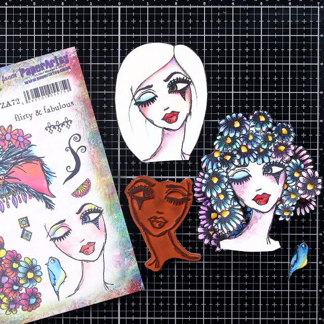

To be honest, my original idea was the flowery hair and I loved it, but at the end I decided to go with the other one only because I felt that my background was busy enough and the flowery hair would just overwhelm it. Anyway, depending on your background, you can choose which way you want to go with the hair. And let’s not forget that there is one more hair style included in the stamp set as it is.


Like many of you, I like adding little quotes or sentiments to my art journal pages and I found the perfect one for this page included in the stamp set. I did the heat embossing once again on this project. On the picture below, you can see that I decided to heat emboss with white embossing powder on a black cardstock and for that it’s really important to prep the cardstock with some baby powder so you won't have the little white speckles all over your text strip.


For this project, I decided to go with a bit thicker black frame, so I just glued my page on a piece of a black cardstock. I have some other art journal pages like this floating around, and one day I might just bind them all together. And with enough of a black frame, I won’t have to pierce my project for the page binding.



I was thinking to remake this project at some point. My plan is to go with a bigger piece of paper for the background, so I will have enough space to go wild with the hair making. I feel that with stamps like this, there are just so many options for combining the elements. And this also applies for some other stamp sets by Zinski Art that will be released at the same time as this one. So, my advice to you is to go crazy, let your imagination go wild and most importantly have a lot of fun.

Renata


Facebook: Renata Peley

Thursday, 24 March 2022

2022 Topic 05: Stamp Mash-up {by Nikki Acton} with Zinski, Kay Carley and Hot Picks stamps


Hi everyone, it's Nikki from Addicted to Art with you today,  and I'm here to share with you a Mash Up of three PaperArtsy designers - Kay Carley, Hot Picks and Zinski Art. Three very different styles, floral, vintage and quirky!


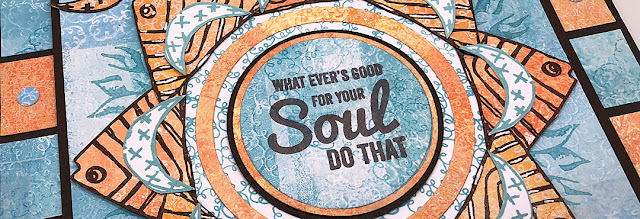
I always say I love a Mash Up - but this one was a challenge! I try to feature all the designers in a mash up rather than using one (or two!) for backgrounds only - this time it wasn't easy. Anyone who follows me may have noticed I am stuck in a geometric phase at the moment - so I decided to stick with this style to construct my piece of wall art.

I began with some gel prints using the flower imagery from PaperArtsy Stamp Set EKC44 by Kay Carley. For some of my prints I stamped off the gel plate, for some I stamped onto it. As I used groups of colours of Fresco Chalk Acrylic paints for each colour this gave some subtle contrast and texture.


For most of the prints I used a small gel plate and built up my backgrounds in blocks. For the blue prints I used Fresco Chalk Acrylics - CeruleanBlue Moon and A Bit Fishy.
 

For the orange prints I chose FirebirdPersimmon and Butter. I have learned to always create more backgrounds than I think I need, as ideas develop (and things don't work!), there is nothing worse than running out of coordinating prints!
 

I mostly used the large flower stamp from Kay Carley Set 44 (EKC44) for my prints, but the smaller stamps were used later!
 

This was originally going to be my base layer until I decided on the additional square frames. I took one of the gel prints and marked some faint pencil lines through the middle to divide into 8. I then stamped part of the large stamp from Hot Picks Set HP1507.


You can see my stamp positioning was not perfect, but good enough as the central area was going to be covered. I used Ranger Archival ink (Aquamarine) to stamp the image. Look closely and you can see my pencil marks - which I erased later.
 
 
You might have noticed I cut into the stamp, rather than use it all. I do this sometimes when I know I want to use part of a stamp on their own rather than as the whole.
 

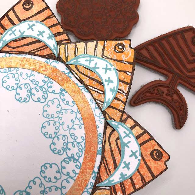
Next layer - my fish! I fussy cut the stamped fish (keeping the moon shaped tail for later) from Zinski Art Set 29 (ZA29).


These were layered onto a circle cut from white card and stamped with one of the flower stamps from Kay Carley. I also stamped some extra tails to add to this little collage.

 
I had stamped my fish onto two different background pieces which were slightly different, I added highlights with a white gel pen onto some of them to add to the contrast.
 

While positioning everything I decided I needed another layer so punched (or you could easily cut) some 1 inch squares which I mounted onto some greyboard that I had painted with PaperArtsy Fresco Acrylics.

Good job I had spare gel prints! Also used my hole punch to add a few mini circles.
 

There was always going to be one of the word stamps in the centre - but I could not decide which. I still haven't decided, and haven't adhered it! Any thoughts which looks best?


Mash-up's really challenge your creativity! I probably haven't used any of these stamp sets as the Designers intended them to be used - but that's ok. I have said this before, but I do find limiting myself to restricted supplies forces me to think 'outside the box'.
Nikki


Instagram: @a2a.craft
Pinterest: nikacton

Tuesday, 22 March 2022

2022 Topic 05: Stamp Mash-up {by Laurie Case} with Zinski, Kay Carley and Hot Picks stamps


Hello everyone and welcome!! It's Laurie with you today and I'm super excited to share this art journal page with you! Full disclosure: I'm fairly new to the world of art journaling. My journal pages tend to lean towards cute, quirky and fun without any actual "journaling". But I always try to make the quote a little personal to reflect my mood or what's on my mind at the time.


I wanted to create a page that would simply make me smile. Normally, I would use a rainbow of colours but I wanted to give myself a challenge and keep it fairly muted. I also wanted the focal point to be the star of the show!


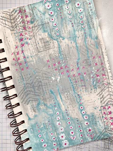
I usually use a disc-bound journal system. This allows me to take the pages out, work on them and place them back. This has always seemed "safe" to me. If I didn't like what I had created, no problem, I can just get rid of it. So, for some added excitement, I chose to use a spiral bound journal! I chose some some nice muted colours for the background along with a bright pink for just a little added colour.


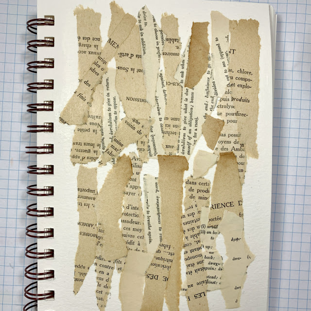
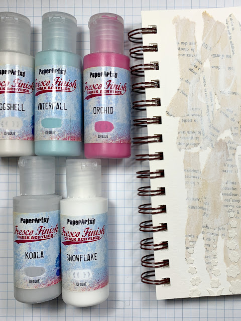
This is where I began. Ripping some old book paper into strips and using a gel medium to adhere them to the page (poof...the blank page has disappeared!). I added a thin layer of white gesso just to lighten things up a bit.


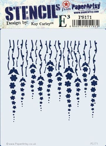
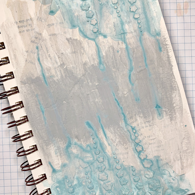
To add a little texture, I used the PaperArtsy Kay Carley Stencil PS171 PA along with some Grunge Paste. I kept the texture to the upper right and lower left corners.


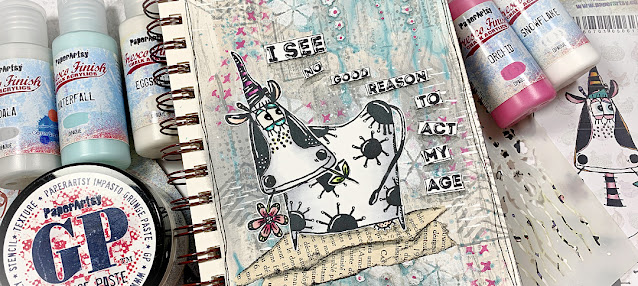
Once the Grunge Paste had dried, it was time to add the paint! I chose KoalaEggshellWaterfallSnowflake frescos and for the little pop of colour...Orchid. I used a wee bit of water to thin the paint on the centre of the page and quite a bit of water to achieve the drip effect with the Waterfall paint in the corners.


As you can see, the texture of the stencil is awesome but I really wanted it to stand out a bit more. I lined the stencil over the paste and added some PaperArtsy Snowflake Fresco Finish Paint over the top. This really brightened the corners up!


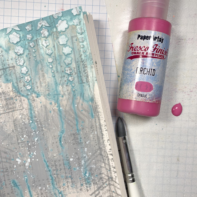
Of course, every background needs some stamping. I found a few stamps that are great for mark making and used Ranger Distress Archival Ink (Smokey Grey) for the stamping.

Now that the bulk of the background was done, it was just a matter of adding some details, including the Orchid paint!


Using a silicone tool for mark making (Dina Wakley), I added dots of colour to the stencilled areas. This really gave it the small pop of colour it so desperately needed.  I also decided to add a bit more Snowflake to the centre portion of the page using a small stencil from my stash.


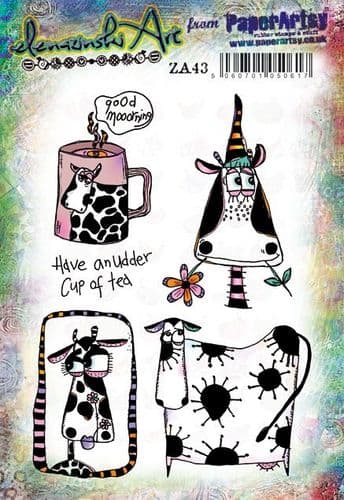
Now, let's work on the focal image! I adore ALL of Zinski Art stamps but the cows from Set 34 had me cracking up!!
 

Rather than use only one image, I thought it would be fun to combine a couple.


I used alcohol markers to colour then fussy cut them out. I LOVE the way those two images work together!
 

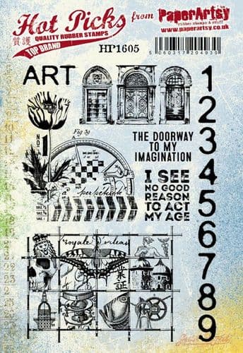
All that was left to do was create a quote/sentiment and put everything together. The PaperArtsy  Hot Pick 1605 had the most perfect quote for this page..."I See No Good Reason to Act My Age".


I stamped the sentiment out onto a piece of white cardstock using Ranger Archival Ink (Jet Black) and trimmed each word apart so they could be spaced throughout the page.


As you can see, I added some torn strips of book paper to represent a hill and ground my cute cow.


And to finish everything off, I added some white gel pen details the black areas of the cow which adds even more whimsy!


This project was a lot of fun but it was also a challenge...which I really enjoy! Combining your stamp sets not only gives you more bang for your buck but also makes you think outside the box. The products I used here today are quite different from one another and truthfully, I wasn't sure how I was going to bring this all together. But they work beautifully with each other and I couldn't be more pleased! 

I hope you'll dig deep in your PaperArtsy stash and challenge yourself to mix, match and make something amazing!!

Laurie
                  @my_art_journal_journey