Showing posts with label Pattern Play. Show all posts

Monday, 19 December 2022

PaperArtsy Blog - 2022 Year in Review {Topics 1 to 4}

Season's Greetings from PaperArtsy HQ,

As we look back at 2022, I personally find this feature is often a time to reflect on the past year. This year, I find myself looking back at the past 3 years, something I have been really reluctant to do as it's been such a weird period, the likes of which most of us have never experienced before, and I am sure we have all been impacted directly in ways that we probably really want to move away from. But I'm going to jump in and dig a little bit deeper.

For us here at PaperArtsy we also moved our business mid-pandemic from England to France. We have moved country once before, 20 years ago from New Zealand to England, and that was pretty challenging in many unexpected ways, but this time, to move to a country that speaks a language we are not fluent in, that was never going to be quite so straightforward! It was a decision we had researched for 3 years prior to the move, and one which we knew was going to be equal parts exciting and terrifying. But our life changing challenge was diminished considerably as we came to learn of the deep losses many suffered over the same timeframe due to a pandemic.

In this post, I'd like to pay special tribute to retailers, we work closely with a handful in various countries across the world. They were so supportive of our move, and at the same time were dealing with thier own challenges juggling so many new unknowns in such a short space of time; from getting stock online, to kerbside pick ups, quarantine, and all the while ensuring the safety of customers and staff alike. They took everything in thier stride, got stock online rapidly, as well as demos, classes, unboxing deliveries, flash sales and even being personal shoppers. There were many times where I realised how fortunate we were as a sector. We were already pretty familiar with various online platforms for education, communication and shopping. We are still navigating some delivery delays, and so I take this moment to thank customers the world over for supporting their independent retailers, and being patient with us all!

Anyhow, enough from me, Dounia has selected some posts from Topics #1: Opposites Attract, #2: Pattern Play, #3: Second Life and #4: Interactive. It's agony choosing just a couple of posts to showcase each topic; there are just so many that really are incredible creative offerings! If you want to seek the entire topic, then she has included links to the topic intro, and you can go from there to look back at each of the posts, you might even like to leave a comment. In 2022 we announced a few new blog teamies, and they have all settled in just beautifully and will continue with us for another year in 2023. We deliberately added a more international flavour to this creative space, I love to see how people craft and if their style is reflective of the flavour of their home country.
 
Get ready for a bit of bling, brightness, and blooming good fun as we look back on the first 4 topics of 2022!

Leandra 


For this new year, we decided to be a bit educational as well as inspirational! Colour is a huge part of any crafters world but we do not always feel confident experimenting and playing with it. Worry sets in that we might make mud or end up with clashing results. Teaching you (gently) about colour theory is a way to help you understand why colour works better some times than others, and how you can deliberately make mud if you need to!

Throughout 2022, the blog has offered topics exploring the colour wheel, how to make one, how to use it and how to spice it up to try new and unexpected colour combinations. We hope the topics introductions and our bloggers' posts will become a reference for you to fall back on and further your colour game. 

To compliment our introduction to this yearly theme, Leandra showed live how to create your own colour wheel, with an emphasis on branching away from the classic bright Magenta/Blue/Yellow primaries. The community had fun with our wheel template and the results were amazing! Once you have your own wheel (downloaded from the @paperartsy Instagram  linktree bio), this first topic focuses on the most famous and simple colour combination: opposite colours! A sure way to achieve the greatest of colour contrasts, our bloggers also show you it is also a bit more versatile than you might expect!

Let's start with a classic: Orange & Blue with this journal page by Claire Snowdon. The opposite colours create immediate contrast between the background and the focal images, making the elements 'pop'. That is what opposites are all about, a tension between 2 colours that conflict with each other directly, yet when balanced together there is an energy and 'POP' that makes art zing!

I love the balance and openness of Claire's composition, which allows us to really enjoy her gorgeous layered background, the perfect backdrop for the sunny flowers. Check her original blog post to discover all the steps of this fun and intuitive project.


Kate Yetter also choose to work with bright and fun colours but in the less ubiquitous Magenta/ & Yellow Green combination. Magenta really takes the lead here, as a bold background. The slightly less saturated green makes the contrast more subtle but no less effective! I love how Kate used stamped tissue paper to create a softer transition between her two colours. Go to original blog post to see all the yummy textured she put into this piece of mail art!


Jennie Atkinson is generally more a tonal type of crafter and approached this combination of Light Orange & Blue-Purple cautiously! Her beautiful memory book, with its softer tones and delicate layers, really shows that opposites colours do not need to be bold and bright to work. Her original blog post is a great example of how unexpected inspiration can be, as she gradually gets to know her colours and experiments with tone and contrast.


Patterns are everywhere around us, from natural compositions to architectural constructions, from leaves to skylines, butterflies to textiles and everything in between. They are also the backbone of arts and crafts, populating backgrounds, creating textures or bringing depth to simpler images. 

With this topic we wanted to shine a light on those humble patterns and explore the joy they bring both during and after creation. To help you on your pattern journey, the introduction post includes a very useful video by Tracy Scott, demonstrating how she goes about her own pattern play and sharing some tricks for repeat stamping. Our team of bloggers then offered their own interpretation of the theme, adding patterns from the background to the foreground with a variety of techniques. Here are a few examples.

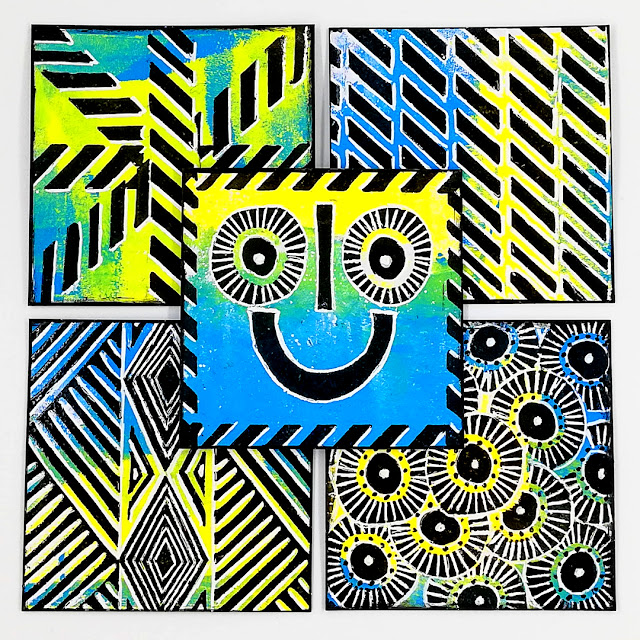
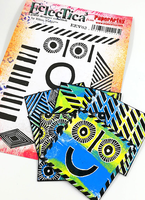
Amanda Pink took advantage of Ellen Vargo's abstract stamps, perfect for pattern play, to create a 'Happy Box' and its cards. The bright colours and black stamping contrast beautifully to achieve a striking and cohesive look. The patterns truly are the stars of the show! Her blog post gives you a closer look at all the cards that went into this box, and shows how fun and addictive pattern play can be. It is full of techniques to get the most out of your stamps, a must read!

Martha Ponsanesi managed to make her background the main feature in this peppy journal page! I love how the yellow green is so eye-catching while still showcasing the other elements. Notice how the pink circle are both embellishments and part of the pattern? Go to her original blog post to see all the subtle layers of this deceptively simple project, a real play on tonal colours. Proof that you don't necessarily need lots of supplies to create interest and impact!


In this beautiful journal spread, Renata Peley used subtle pattern in her background to provide interest and make the focals pop! Her original blog post details her play session with her gel plate, some pretty blue Fresco acrylic paints, her stamps and repurposed packaging to create a whole series of patterns. Another simple and addictive technique and a great way to make coordinated papers. Her trick to avoid choosing among them - use them all!


Another focus this year on the blog was sustainable crafting, developed along several topics this year. This is the first of those where our team tries its hand at repurposing objects and giving them a new life as art! 

We all are used to incorporating book-text in our projects, or keeping pieces of pretty packaging,  but here we wanted to go a step further and look at how (somewhat) ordinary objects can be transformed and elevated. They can provide unusual materials, build an original substrate or structure, or be unique embellishmentsThe idea is to encourage us to look at everyday objects differently and see potential use and beauty in all things! Keren's introduction post is full of such creative ideas and our bloggers were also inspired, have a look.

My first pick is a classic, always wonderful: altered boxes and tins. The perfect way to either secret away or display little treasures! Here Autumn Clark made matchboxes into two delightful and intricate art dolls. All the layers and the subtle colouring really make the most out of those Lynne Perrella stamps! Check her original blog post to see her process and how she dissected and reassembled her stamps for truly custom-made dolls.


Jennie Atkinson mixed two of her favourite hobbies: papercrafts and needlecrafts into a whimsical pin cushion. A beautiful and useful new life for this lonely teacup! She really had great fun making it not just a practical object but a complete scene with intricate details. I just love the butterflies that seem ready to flutter away if you reach for a pin. Go to Jennie's original blog post for interesting techniques with Infusions and details of all the tiny elements.


Liesbeth Fidder de Vos was certainly inspired by the topic and used her imagination to transform a book cover and some old jeans into a classy handbag! How crazy is that! I am impressed by how well she was able to match the various elements for a cohesive look. Especially considering she had no concrete plan when she started... Her original blog post details this extensive process and makes it achievable if you are on the look for a new accessory.


One could argue that any art or craft piece is interactive: it certainly is a conversation between the maker and viewer. This topic was all about pushing that aspect further, building connections and creating surprise. 

You can find interaction between layers of a project: using cheeky peek-a-boo windows, overlaying delicate lace pages, or taking advantage of transparent layers. Creating ways to make the viewer physically interact with your work is also great fun: flaps, folds and doors you can open revealing little secrets; tabs, strings or levers you can pull to animate the artwork; shaker niches, pop-up elements or turning cogs to bring that 'wow' moment. Large scale artwork can even blur the line between viewer and actor, check the great examples in Keren's into post. Let's not forget pieces that interact with their environment, to initiate movement like mobiles, paper lanterns or candle carrousels, or to involve the senses like wind-chimes, sun-catchers or tactile art. Interaction can be a small tentative connection or a full body experience but it always deepens and enriches our experience of art. 

Laurie Case did a bit of stamp deconstruction to create her city for this cute and dimensional panel. Not sure the result is the most structurally sound, as the tallest house can apparently easily loose its roof, revealing a beautiful message on a tab! The background is subtly complex and helps to give the project a cohesive look despite using the whole rainbow. A great balancing exercise! Check her original blog post to see the twists of this project's journey.


Etsuko Noguchi chose to play with depth and layers with this intricate and colourful carrousel book. Her original blog post details the process and dimensions, it is not as complicated as one might think! I love how the open layers play with each other for a very delicate look. This is also a throwback to topic #1, turquoise and orange being opposites on the colours wheel! They provide great contrast between the background and frames, leaving a wide stage for the focal images to shine in subtler colours.


Riikka Kovasin went full on articulated and playful, mixing jumping jack and art doll. She was inspired by orthodox icons and between the rich purple colours and the gold embellishments, that certainly translated in the result. I love the unexpected use of Seth Apter's stamps: apparently they make great byzantine decorations! Her original blog post explains the construction of the doll: the face is casted with hot glue, available to anyone, how great is that!


Well, wasn't that a fabulous array of wonderful!? We are so spoiled by our blogging team and the lengths they go to creating their projects. I hope you can appreciate the time they put into each piece, but more importantly, how much they enjoy what they do while creating.

We'll be back tomorrow with more highlights from the PaperArtsy Blog, hope to see you again!

Dounia 

Thursday, 3 February 2022

2022 Topic 02: Pattern Play {by Renata Peley} with JoFY Stamps


Hi everyone, it’s Renata Peley with you today, and it's my first time here on the PaperArtsy blog, I'm one of the 2022 newbies! As you will see, my style is bright and fresh, and that's what I will show you today for an art journal page that I made with some super-fun JoFY stamps.


I very much enjoy making backgrounds. I know many people say that the focal point is what matters the most and be that as it may, I think that a well-made background makes the focal point stand out, be more beautiful and have more meaning. For today’s topic, “Pattern Play”, I wanted to create patterns that would complement the focal point, grab some attention but still not “steal the show” from the main image.


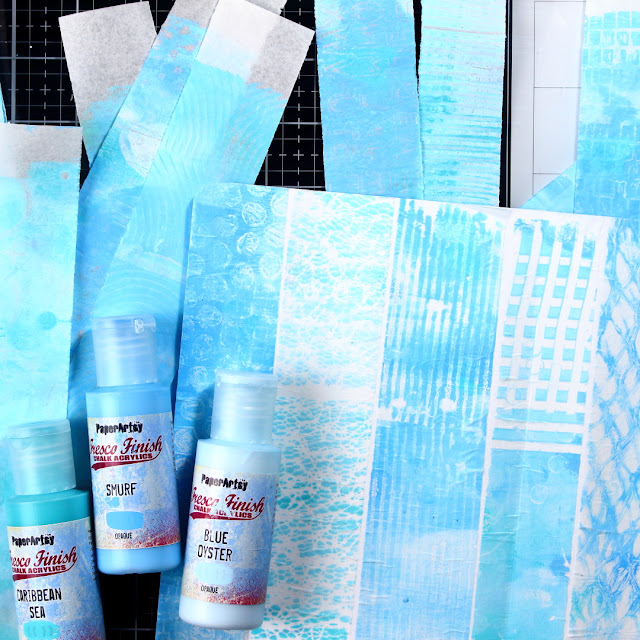
When I think about patterns, what always comes to my mind is the gel-plate and all the ways you can play with the stuff just laying around in the house. And that was as far as I had it planed out. I took some parchment paper, pieces of cardboard, a straw, some plastic cards for texture making (I don’t know the proper name for these), a brush, a bubble wrap and so on. I also tried stamping my stamps on the gel-plate and that turned out pretty, as expected. But now the problem was which pattern to choose. So, at the end I decided to use as many of them as I can. Since I used parchment paper for gel-printing, they were easy to rip into thin, more or less similarly sized strips.


Of course, me being me, I used blue and turquoise colors, or to be more precise Caribbean SeaSmurf and Blue Oyster. The shades that I chose are gentle, beautiful and just ideal for subtle backgrounds. I chose not to use the shades or colors that are too much different from each other, because I think that gives the feeling of a too busy background, as the patterns were already giving enough interest on their own. The next step was to glue them all down to my paper with matte medium. When gluing the parchment paper, some wrinkling happened, but to be honest, that didn’t concern me much and I decided to look at it as a fun texture element.


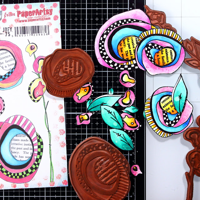
With that, the skeleton of my background was done and now came the time for stamping. On a separate piece of paper, I stamped, embossed and colored the images from the JOFY75 stamp set, as I have planned them for my focal point.


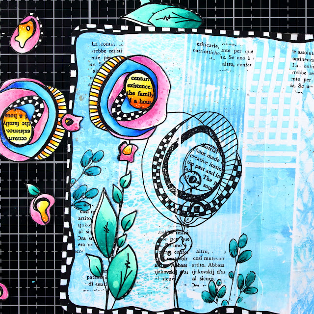
To further embellish the background, I used JoFY102 stamp set. I also decided to stamp the focal image onto the background, so I would determine the position of my focal images in advance, but also more importantly to get the stems of the flowers onto the background. At that time, I fell into my own art journaling process patterns and added some splatters.


The following step was to add an edge doodle that would complement the patterns of the main images. My idea was to imitate the patterns of the doodles from the stamp, so that they would serve as a connecting element between the focal image and the background. For these, I used acrylic markers and gel pen.

As my background was complete, I decided that it is time to start paper piecing my focal images.


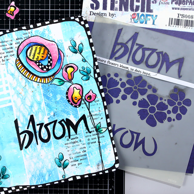
When the majority of my project was done, I felt I need a sentiment to make it complete. I like when my quotes refer to the picture that I have just composed, so I thought that the JoFY PS008 stencil would be just perfect. There was this quote that I heard some time ago “Where the flowers bloom, so does hope” by Lady Bird Johnson, so I have decided to print it out.


I cut the printed sentiment in to pieces and glued it to a black scrap paper, so that it would give it a frame of a sort. I also tried to emphasize the word bloom with adding some white highlights with my gel-pen.


I think, sometimes my impatient nature gets the better of me. Otherwise, when I think back about what I would have done differently is that I would have played with pattern-making some more. I guess, a lot of us have the same regret after packing up our gel-plates…why, oh why didn’t I try the print of that thingy from my husband’s toolbox…or something like that. Also, perhaps instead of the strips I could have cut the parchment paper into little cubes and that way I could have fit more of the various patterns on my background. Anyway, in general I am happy with how it turned out and I definitely love the colors.

Well, this was my first post for the PaperArtsy blog. I hope you enjoyed my creative process and even more, I hope I inspired you to try pattern play in your own ways.

Renata


Facebook: Peley Renata
Instagram: @renata_artjournaling

Tuesday, 1 February 2022

2022 Topic 02: Pattern Play {by Amanda Pink} with Ellen Vargo Stamps


Hi everyone, it's Amanda Pink (ink-a-pink) with you today, and I'm here to share with you the project I have made for the current topic 'Pattern Play'.
 
Every New Year I say I am going to start a 'Happy' Jar/ box that I will fill with happy moments, memories, events (no matter how big or small) that happen throughout my year which at the end of the year (or at certain times throughout the year) I will have a jar/box full of 'happy's' to look back and reflect on. 'Saying' is as far as I've ever got though so this pattern play topic gave me the perfect opportunity to turn my words into actions and finally make myself a 'Happy Box' for 2022!


I thought I would make a box rather than a jar so I could create patterned panels for the sides and top of the box. I'd also create some patterned cards, leaving one side of the card blank to record my happy moments/ memories/ events on the reverse. For both I'd use Ellen Vargo stamps, maybe the odd stencil and what I think of as 'happy' uplifting colours. I had no preconceived ideas of what patterns I would create I simply had fun 'pattern playing' as the topic suggests and I actually ended up with 7 different patterns one of which I 'm sure will make you smile-it did me! :D

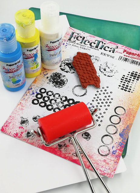
My creativity began by selecting my 'happy' colours -Blue and Yellow or more precisely PaperArtsy Fresco Finish Chalk Acrylic - Shutters (FF207) and Zesty Zing (FF47).  Blue is my  favourite colour so I guess its almost a given it makes me happy and yellow, well its bright , uplifting and makes me think 'sunshine' and who doesn't love a bit of sunshine and all those happy endorphins it releases within us. I also gathered together a few other supplies, tools I thought I'd need to kick start my creativity.

I knew I had quite a lot of square panels to make for both the box and the cards so a real speedy way to make these was to pull lots of 'painty' gel prints in my chosen fresco colours.
Of course when blue and yellow blend/ mix together they create green and I was happy to see this happening on my prints and what a lovely shade of green it is too! So although I started out with just the 2 colours I now had a third colour creeping in here and there all playing so effortlessly together.
 

The tiny open circles stamp from Ellen Vargo stamp set 6 (EEV06stamped randomly  on the coloured panels in PaperArtsy Fresco Finish Chalk Acrylic- Snowflake (FF15) was a great stamp to introduce a subtle background pattern in preparation for the full on 'Pattern Play' that came next.


Now for the full on 'Pattern Play'....

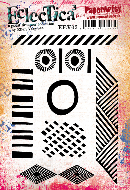
Initially, I thought I'd create one pattern that would feature on all the panels of the box but that changed along the way. Once I got into the 'pattern playing' zone using Ellen Vargo Stamps sets 3 and 6 (EEV03EEV06) I realised there were many possibilities so my one pattern idea went out the window and I made two different patterned panels for the box, (All the other patterns I created were used for the cards).
I wanted the patterns to be really bold and striking so for me it was a given they would all be black.
 
For the first pattern panels I created (for the box) I used three Ellen Vargo stamps from the sets mentioned above. This pattern would probably be considered a 'repeat pattern'. It also required some accurate alignment of the stamps to improve the overall appearance of the pattern.

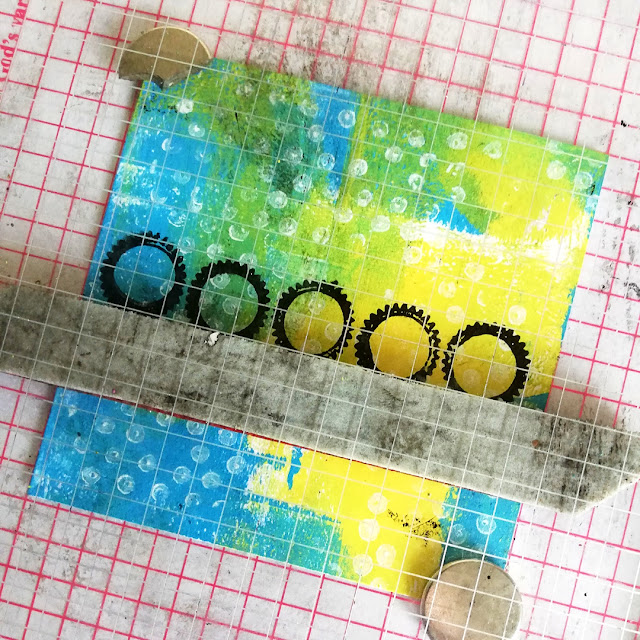
I stamped from the centre out starting with the '5 cog' stamp. Using a gridded stamping platform enabled me to find the centre point of this stamp with ease and therefore position and align the stamp with more accuracy. Then, using this stamp as my guide along with the grids on the platform I stamped the 'chevron' stamp either side, finally repeating the process with the 'thick/ thin block line' stamp.


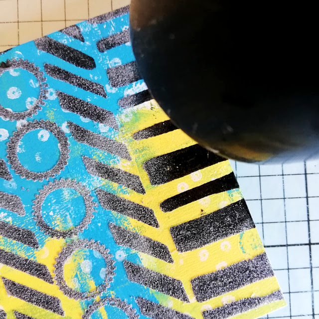
Although the black stamping was bold and striking I thought embossing the black ink with clear embossing powder would make it even more so.  I also liked the idea that it would add a touch of sheen to the otherwise matt finish of the panels. I doubt I'll ever tire of watching the embossing process happen! Are you the same?
 
 
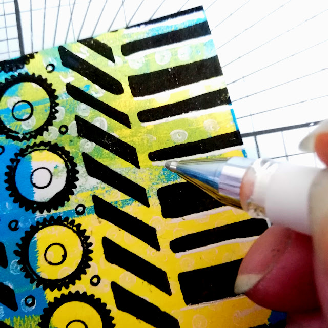
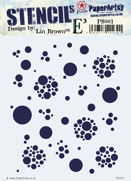
PaperArtsy Stencil by Lin Brown (PS001) proved to be a great stencil to assist me in drawing some appropriately sized circles inside each of the 'cogs' and in the gaps between the 'cogs' to add some extra detail to otherwise quite open areas.


To finish this pattern (and indeed all the patterns I created) I added some white pen marks/ highlights to help the embossed stamping really pop.


The second patterned panels I created ( for the box) were more 'freestyle' patterns, kind of funky too! They are an example of how you can create patterns by using full stamp designs along with single elements/ parts of full stamp designs. Again I used stamps from Ellen Vargo stampsets 03 and 06 (EEV03EEV06).
 

These were fun to create so much that I neglected to take any process photos at the time (oops). No worries, I made a sample panel later  (and had more fun) to show you my stamping steps.

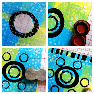
The top left photo shows how I started by stamping two of the stamp designs in full - the 'large open circle' stamp with the 'single cog' stamped in the centre of it. The top right photo shows just one of the 'cogs' on the '5 cog' stamp inked up ready to stamp and in the bottom left photo you can see it being stamped around the large circle  The photo bottom right shows how I stamped just part of the 'thick/ thin block line' stamp to create a border around the sides of the panel.
 
Just like the first patterned panels, the stamping was embossed with clear powder and the patterns were treated to some circle stencilling using the PaperArtsy Stencil by Lin Brown (PS001) and white pen mark making/ highlights.
 

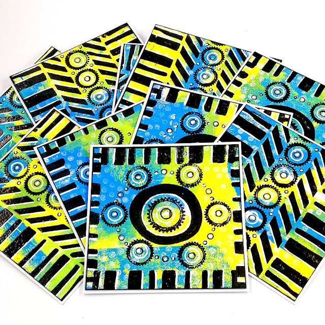
Here they are all gathered together in a blanket spread?
Now it was time for the patterned cards that I would be writing my 'happy's' on...

Creating patterns with stamp designs really is one of those activities that once you start it's hard to stop. The more you play the more ideas you have.  I ended up with 5 different patterns to those featured on the box, and that was just using stamps from Ellen Vargo stamp set 3 (EEV03).


The patterns on the cards were created in much the same way as the patterned panels I created for the box so I'll spare you a repeat rendition of the creativity.  Probably the only thing that differed is that these patterns didn't included any stencilling.
 
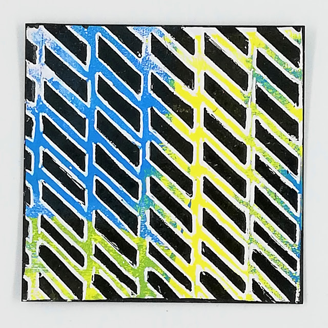
Some of the patterns (like the the first patterned panel I created for the box) benefitted from  more accurate stamp alignment each time it was stamped The chevron pattern being one of them. Again, this is where a stamping platform came in handy as it allowed me to butt the 'chevron' stamp up against the top rule bar of the platform, each time I stamped it.
 
 
I didn't achieve 100% accuracy all through the pattern but there were areas were it was pretty close. I'll take that!

 
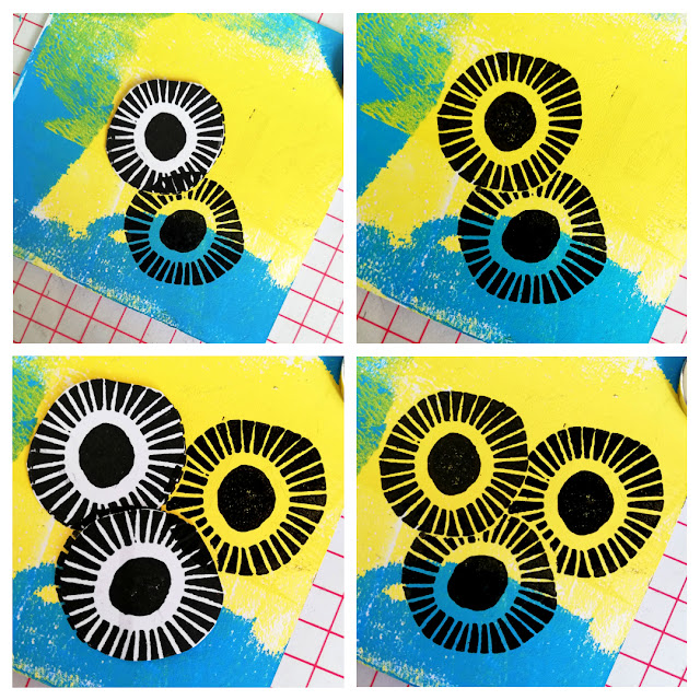
Other patterns involved 'masking off' stamped elements while creating the pattern which allowed for me to layer up the stamped 'elements to give the impression once stamped that they appeared to be in front/ behind each other which ultimately gave the overall pattern a sense of depth.

The 'multi 'circle' patterned card that I created using just one of the 'circles' from the 'double circle/ bar' stamp on Ellen Vargo set 3 (EEV03was one of those patterns.
 
 
I made 3 or 4 paper masks of the 'circle' stamp and then used them to cover the relevant stamped 'circles' as I worked.

Starting in the centre of the card I stamped a 'circle', covered it with one of the masks and  stamped a second circle to the side of the masked one. I then covered both the stamped  circles with masks and stamped a third circle close to both. I continued in this way, moving the masks around to cover the two or three circles closest to the one I was about to stamp until the card was covered.


If I were to add photos of all the pattern cards individually it would make this post much longer than it already is so I hope you will be able to appreciate them 'all in one'.

I'm sure you'll spot the one that I said in my intro would make you smile! :D. 
Ok, it may not be deemed a 'pattern' as such but these are 'happy cards' to write my 'happy thoughts/ memories on so I couldn't resist!


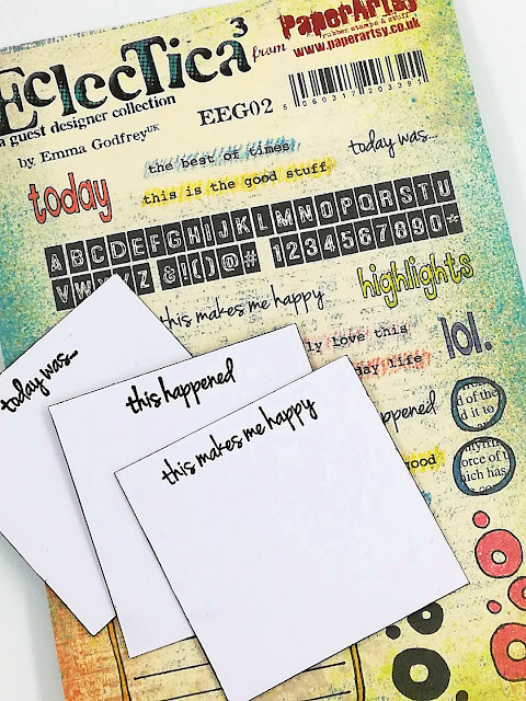
I had thought I'd leave the reverse of the patterned cards blank as that's where I would be writing all my 'happy's' but then Emma Godfrey stamp set 2 (EEG02) caught my eye and some of the single line sentiments/statements jumped out at me.
 

It was liked they were waiting to be 'prompts' stamped on the back of the cards especially 'This makes me happy'.  It couldn't have been a more ideal fit!


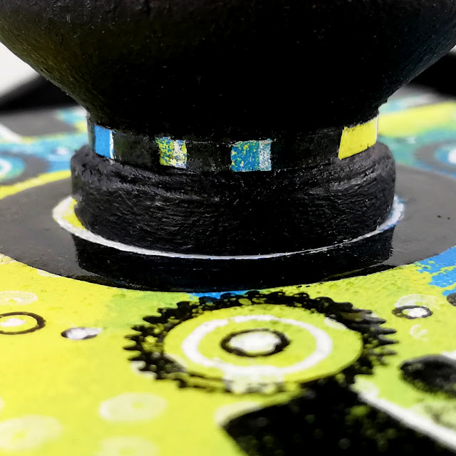
All that remained was to paint my box (a That's Crafty! MDF ATB) with PaperArtsy Fresco Finish Chalk Acrylic - Little Black Dress (FF19) and adhere the chosen patterned panels to the sides and top of the box. I also dug out a old wooden door knob that was hiding in the back of a drawer (you know THAT drawer you meant to clean out ages ago), painted it like the box and adhered it to the box lid. From door knob to box handle with just a quick lick of paint! 


To break up the solid black of the box handle and to compliment the patterned panels of the box I decorated its neck with a thin patterned band.
 

The top with a 'patterned circle' cut from one of the cards. 
 
 
The patterned 'happy' cards will be kept in the box (for now)...
 
 
As the box becomes full of  cards holding recorded happy moments/memories/ events the blank cards will probably then sit at the side of the box to keep me focused on seeing,  recognising  and noting the 'happy's' throughout the year,  however big or small they may be. 
Every 'Happy' counts!


I had a lot of fun 'Pattern Playing' that's for sure. I was surprised with how many patterns I created from just a few stamps, a stencil and a couple of pens. Definitely not what I envisaged when I began playing and I'm betting I haven't really touched the surface of endless possibilities. I found it made me look that bit closer at the stamps and get to 'know them' more than I might otherwise have done  as I thought about how they may or may not work together.
 
If creating your own patterns, playing around with existing patterns isn't something you've ever tried I'd encourage you to give it a go sometime.

Hey, what about this for an idea? How about hosting a 'Pattern Play' party/ get together with some of your creative friends. You could either create your own patterns or join forces and  make one large pattern all together!  Now that would be impressive to see especially if there's a range of creative styles contributing!

This topic draws to a close later this week but be sure to check out all the other 'Pattern Play' projects the other bloggers have created and shared over the duration of the topic. I'm sure you will agree they are all absolutely fabulous and so inspiring.
 
Thanks for spending time with me today/ this afternoon/ tonight depending where you are are in this big wide world.

Have a lovely week 
Creative wishes
Amanda 
x
 
 
Blog: ink-a-pink
Facebook: Amanda Pink
Instagram: P1nkart
Pinterest: PinkArt