Hi everyone
Mags here with you today.
Anyone who knows me and my artistic style knows that I love texture, rust and typography. So when I learnt that this quarters theme was typography I was very happy. I immediately decided I wanted to create something with lots of texture.
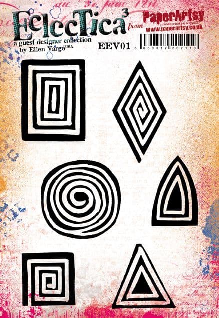
Many years ago I created a mini canvas project using strips of leftover collage papers, it was, and still is, one of my favourite mixed media pieces. I thought the idea would be great on a series of decorative tags for this topic. My idea was to create all the papers for the project using the fabulous stamps by Ellen Vargo. Combining these with book page papers also linked into the theme I discovered a few new things along the way and also had fun playing with Rusting Powder and PVA glue.


The most important thing about this project for me was the need for texture, and lots of it ! I also wanted a touch of metallic shine as well as some rust. I tend to steer towards a fairly subdued vintage colour palette when creating, but this time I wanted a splash of something brighter to combine with the rest.

When creating collage and background papers I love stamps that give visual texture, especially those that can be used in different ways. The two stamp sets by Ellen were an obvious choice. Crunchy Waxed Kraft paper is fabulous when embossed and I added some Fresco Finish chalk Acrylics to highlight the texture on some sheets. As you will see later in the blog post, the Golden Sands Infusions add a pop of brighter colour to a fairly neutral colour palette. Grunge paste and Rusting powder also added texture to the Grey-board tags.

To create the base for the tags I used Grey-board, cutting to 9cm wide by 17cm high. I covered them on both sides with book pages, using matte medium as an adhesive, brayering to remove any air bubbles. Using book pages added visual texture and also tied into the theme.

To knock back the text a little I added a coat of watered down Fresco Finish Chalk acrylic, Heavy Cream (FF203). Once this was dry I added PaperArtsy Grunge Paste (GP190) through a Sara Naumann Stencil (PA 271). Whilst the paste was still wet I sprinkled over PaperArtsy Rusting Powder (RP45) and tipped away the excess.

Once the Grunge Paste was completely dry I brushed away the loose powder. Next I placed a paper towel soaked in malt vinegar over the paste, this activates the Rusting powder. Leaving in a well ventilated area overnight let it develop fully.

Once dry I carefully removed the paper towel to reveal the gorgeous rust beneath, keeping the paper towel to use later in the project.

My next job was to create an easy way to add and space the papers that I was going to place on the base of the tag. I striped back the top layer of paper from some corrugated cardboard and glued a section of the remaining cardboard to the tag.

I always love the reveal of seeing the Rusting Powder once it has reacted with the vinegar, this was no exception, but this time I had the added bonus of rusty tissue with text on it too.
It was now time to move on to creating those interesting papers.

As I said previously, I wanted to create as many textured and interesting papers as possible. I had a ton of ideas in mind and had great fun playing with the stamps and supplies I had chosen. The choice of paper made a lot of difference to the outcomes, as you will see shortly. I gathered a selection, including glossy photo paper, watercolour card, tea stained copy paper and patterned book pages.
I started by making a spray stain with PaperArtsy Infusions, Golden Sands (CS05) This is one of my favourite ways to use the Infusions. I love the way they can be used in so many ways. I always mix the powder in a small pot with water, stirring to completely dissolve the crystals before pouring into the mini spray bottle and topping up with more water.

The first paper I wanted to try with the sprays was glossy photo. It sucked up the colour well and I discovered that once they were dry I could use a damp cloth to wipe away the brown walnut ink and leave a much more vibrant yellow colour. This photo shows the 'before' colour.

Whilst I had the spray to hand I wanted to stamp using the dye stain. I sprayed a little onto a craft mat and used this like an ink pad to pick up the colour and stamp onto the photo paper. I loved the effect that stamps from Ellen's collection (EEV05) achieved with this technique.


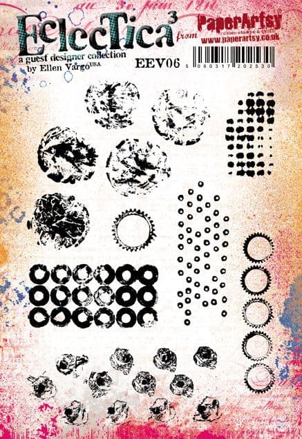
I also picked up any leftover Golden Sands dye stain from my craft mat with a sheet of watercolour card. Once this was dry I added some stamping from the second set of Ellen's stamps (EEV06) I didn't want perfect images, stamping randomly without an acrylic block created a distressed effect which was exactly what I wanted


Next I wanted to create some rusty papers, so out came my all time favourite art supply, Rusting Powder ! I had an idea to try something which I had thought about many times, but never actually tried. I brayered some PVA glue onto my craft mat and used one of Ellen's stamps to pick up the glue and stamp onto some heavy copy paper. Whilst still wet I added the Rusting Powder and tipped away the excess. When it was dry I added some vinegar soaked tissue to activate the rust. I also tried this on some Crunchy Waxed kraft paper, the results weren't as obvious, but still great.

As you can see in this photo, the results were very pleasing and the texture was subtle but very interesting. The bonus of some rusty tissue was also great !

Moving on from the Rusting powder I tried an experiment with PaperArtsy Crunchy Waxed Kraft paper (WKPA5) I found some Sizzix typography embossing folders and embossed several sheets of the waxed kraft paper.

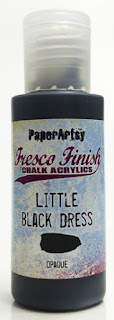
The embossed papers were gorgeous, but I decided to highlight the text even more, which would in turn, give a more textured look. I chose to brayer on some Fresco Finish Chalk Acrylics. I went for Little Black Dress (FF19) and Heavy Cream (FF203). The results were even better than I expected.


I also needed some thinner stamped papers to go with the more textural and thicker elements. I used some tea-stained copy paper and more of the stamps from EEV05, this time overlapping them to cover more of the surface.

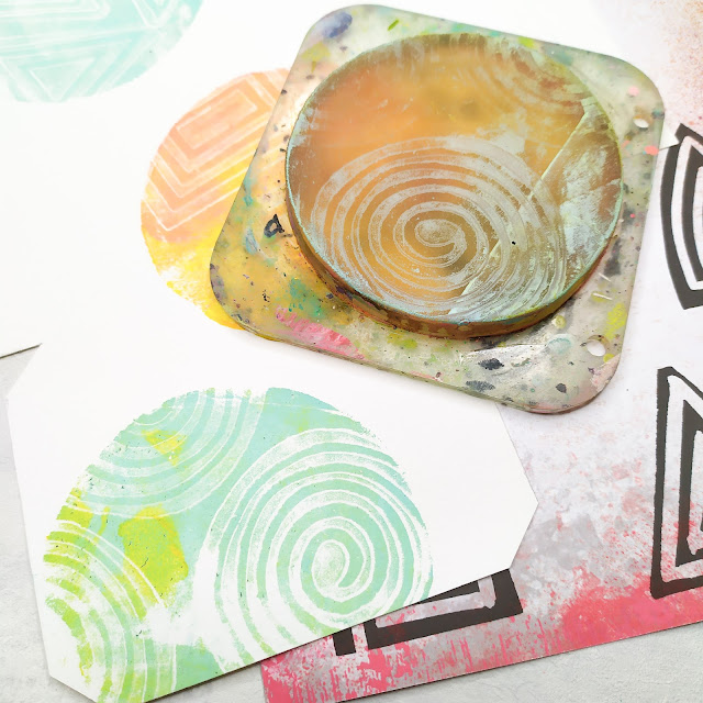
I created yet more stamped papers using my Gel Plate. First brayering out a coat of Fresco Finish Chalk Acrylic, Gold (FF20), using the stamp to pick up the paint and apply to the paper in a random pattern. I worked quickly and was also able to pick up the leftover paint from the plate to create a second sheet.

I now had enough papers to create the textural element of the tag. In fact I knew I had enough to create several tags with lots of leftovers for other projects.

You can see from this selection of papers that the visual texture created with the stamps is lovely, even before adding in the book pages and rusty tissue.

The Infusions on glossy photo paper was lovely but I knew I needed something with a little more impact. This was when I decided to wipe away the walnut ink with a damp cloth and stamp repeated circles using Ellen's stamp from EEV06. I liked the effect but wanted some more contrast, so added random circles with a white gel pen.

I was now ready to start assembling the elements for the bottom half of the tag. Using a ruler as a guide, I tore strips of the papers approximately 2 cm, 1.5cm and 1cm wide and folded them all in half width ways. The rusty tissue proved a little difficult to tear evenly but with care I achieved it.

Remember the corrugated cardboard I added to the tag ? well it was now time for it to come into play. Using PVA glue and a fine nozzle glue bottle I added glue along a groove and tore a paper strip the correct length to fit in, pushing down well to secure in place. I kept repeating this until all the grooves were filled. I made sure to use a varied selection of papers for contrast in colour, texture and paper weight.

Once all the initial strips were dry I positioned the second set of strips between the first (on the peaks of the cardboard). Arranging them first before gluing helped me to decide if the colours, textures etc. contrasted enough. Once I was happy I glued them in.

To complete the textured look I wanted to add some of the rusty strips of tissue from the vinegar soaked kitchen roll. I added these, along with a few of the very thin 1cm wide strips of paper, on top of the first layer.

I was very happy with the texture, colour and composition of the tag at this point, but something made me want to add just a few more details..

The tag was nearly finished, it just needed a little more. I nearly always ink the edges of my projects, whether it's a tag, journal page or card. This tag was no different, I used Ranger Archival ,Vintage Photo ink and a sponge.

.jpg)

The last thing to do was add an eyelet at the top


I had so much fun creating the papers for this project and I will definitely be using some of the techniques again, especially the Fresco Finish paints on embossed Crunchy Waxed Kraft paper.
I'm really keen to try the gold paint on the embossed paper. I also love stamping with the Infusions sprays, such a cool effect. I have lots of papers left, even after creating two extra tags using the same idea but with different shaped areas of textured papers. I'd like to try creating some pen storage using the same techniques, but with the cardboard wrapped around a recycled tin can. What do you think ? Have you any alternative ideas ?
I would love to see what you create.
Have fun and happy crafting
Mags


Facebook:https://www.facebook.com/mags.woodcock
Instagram:Instagram
YouTube:(340) Mags Woodcock - YouTube