


Hi everyone, Riikka from Paperiliitin here with you today to share a set of gilded cards. I was thinking of upcoming holidays when creating these, but especially with the change of color scheme, they work as greeting or congratulations cards as well.
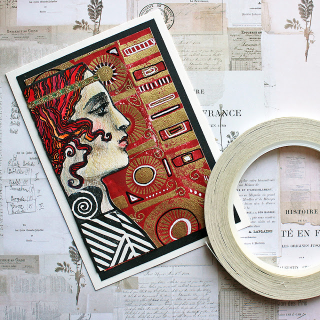
The topic of "Gilded" immediately made me think about an Austrian painter I've used as a source of inspiration before, Gustav Klimt. It's peculiar that my thoughts steer immediately to him as there's a plethora of artists who use gold in their work! It might be the impact he had on me back in school when I was doing a presentation about the art nouveau style and stumbled upon his paintings. I also love the juxtaposition of the detailed, more naturalistic faces of the characters, and the meticulously painted patterned backgrounds or robes.
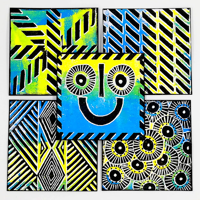
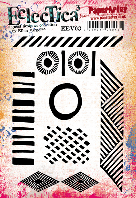
To achieve similar look, instead of using just stamps from one designer I paired two to create a Klimt-like piece of my own. The graphics of Ellen Vargo echoed the geometrical shapes of Klimt's work, while the gorgeous ladies of Lynne Perrella seemed the perfect pairing for the more detail features of his characters.

Recently, I've crafted my projects for PaperArtsy slightly differently from my usual process as I've done sketches and planning for them. On this project, however, I followed my natural "go with the flow" style and adjusted the project as I went along. Naturally, I had an idea what I wanted to create when I started creating, but I needed to tweak my design as my original thought didn't seem to work. This is the way I love to work, even though the saying goes that one hour planning can save you 10 hours of doing. To me the joy of creating is in the making, even if that means more work that could have been avoided with planning! But more about the tweaks and process later.


Like I wrote earlier, I chose to use two stamp sets for this project. The Ellen Vargo set (EEV03) seemed the perfect fit for those little geometrical details of Klimt's and the beautiful flowy-haired women of Lynne Perrella's set (LPC070) possessed a striking art nouveau feel.
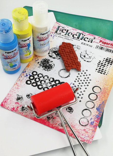
Gold was an obvious color choice for the topic. I decided to use golden embossing powder to add the gilded look to my project. This was an easy solution to be used with stamps. Otherwise, I had a whole rainbow to choose colors from. Luckily, I had pitched the color palette of white, black, gold, and red, so when I actually started creating, the color choice was easy. Thinking back, why I chose that particular palette, I'm not sure, but I think I was inspired by the contrast Klimt's paintings have and how many characters have striking black hair. His colors are also vibrant jewel tones, almost bursting out of the picture plane. To get that striking red effect and also a hint of upcoming Holiday season, I chose Fresco Finish Blood Orange (FF62) as my colorant.
To incorporate "Nature", the theme running across several topics, I chose to add some leaf-like stickers to my project. Initially, I was thinking of framing the picture using those, but when it came to that stage in the process, the frame was hiding the lady too much, changing the atmosphere of the whole card. So, instead I used them as decorations.

But let's get started with the actual creating process!
One of the few things I knew for certain, when starting, was the focal image lady I was going to use. In this stage, I was still thinking of doing a one layer card, so I cut A6-sized cards from the cardstock and stamped the image quite in the middle of them using black ink.

Next step was then to add the geometrical shapes to the background. The first draft was no good as I forgot to heat set the black ink before adding the embossing ink patterns. That meant that everything started turning golden!
I then did another trial by heat setting the image first and then adding the pattern. Now the problem with the square-like design of the lady came obvious - the background wasn't flowing effortlessly but there was two segments to the card.
To mask the geometric stamping, I had cut the head loose from the background and that then lead me to the solution I used in my cards. Instead of doing a one layer design, I would have to make a separate background piece and add the head on top.
Now thinking back, there would have been a one layer option available, too, but I didn't come to think of it at the time. Instead of masking, I could have used "stenciling" and created a stencil to stamp the head through getting rid of the extra designs I didn't need this time!

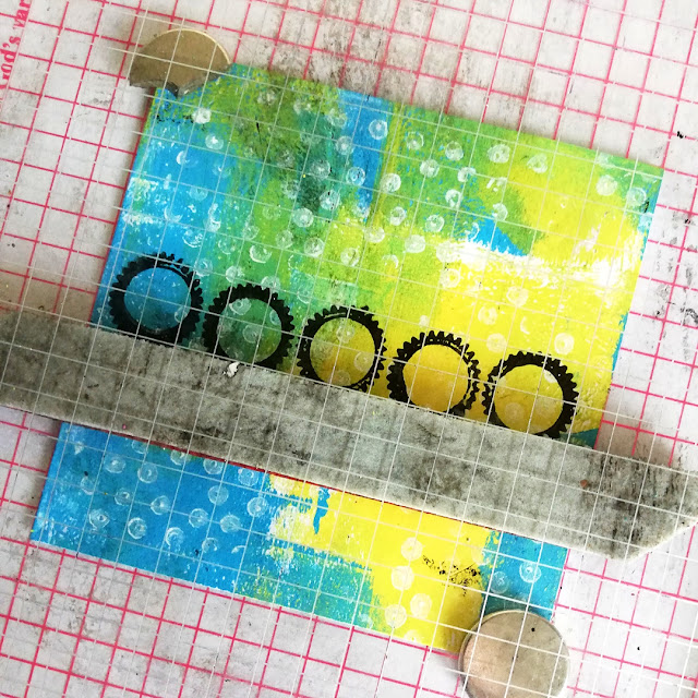
Using the mask as my guide, I then made separate background piece using the Ellen Vargo set (EEV03) and golden embossing powder. I combined the different designs and played with the patterns. I left the area underneath the character unstamped as it would be covered anyway.

I really liked the geometrical structure of the stamped background, but it needed some tweaking in order to resemble Klimt's work more. So, I grabbed a glue pen and added some swirls and lines to the mix and then embossed those markings using the same golden embossing powder. I would have used an embossing pen, if I had one, as the texture of the ink and the glue differs when embossed.

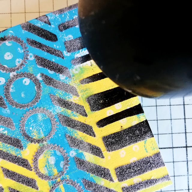
Now I had my pattern done, so it was time to add color! This may seem like an illogical way to do it, but I wanted to use the resist quality of the embossing to make the pattern a bit different looking than it would be with the layers other way around. So, I painted the whole background piece using Fresco Finish Blood Orange (FF62) and then used a wet baby wipe to reveal the pattern.
In the picture below, you can see some of the paper being rubbed off. This was because the wipe was a bit too wet. I like the look, because it makes the project feel more vintage, but if you want to avoid that from happening, use more rubbing and less moisture as the paint will lift off the smooth plastic surface of embossing powder. Also, be mindful about the paper warping and straighten the piece if necessary. Raised areas of the paper will naturally get more abrasion than the grooved or flat ones.

After getting the background piece done, I turned my attention back to the character coming on top. I still had one of the ladies I stamped in the beginning and foolishly thought to use her. With the other two cards, I then stamped the character to the top of the paper, so I could make her longer.
I first masked the face and stamped a pattern to make her garment. I then used first a pencil and then a black marker to draw the outline of her torso. Next, I colored the face and hair. I wanted a softer look for the face and a strong, more abstract look for the hair. To achieve that, I used colored pencils for the face and brush-tip markers for the hair. I took my time especially with the face, building subtle layers of color rather than immediately going heavy handed with a color.

Then it was just cutting the character loose and adding a few golden details to blend her better to the gilded project!
To make sure I got the gold just where I wanted it, I first heated the image again and then used the glue pen to trace the delicate headband. I'm not sure if you can see from the picture, but I also colored the gemstones in the band using green, going for a contrasting color to her flaming red hair.

I'm happy that I found a way around the problem the one layer thought caused me. I'm also very happy how the coloring of the character turned out. Maybe that's the reason, when I then run into another problem a bit later, I couldn't discard her and make another character, but instead worked around that issue. You can be the judge, how I managed that, just read on!

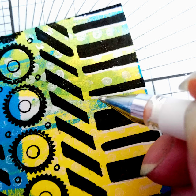
I now had my main elements ready - the background and the character. Putting one on top of another and peeking a look to some Klimt's work, I realized something needed to be added. More pattern! To echo the black and white dress she's wearing, I added some black and white lines to the background. I used two thin paint markers and traced the rectangle and circle shapes I had created using the Ellen Vargo stamps.

Now that the project looked more cohesive, I could secure the layers together. I cut a framing piece out of black cardstock, trimmed the gilded background smaller and adhered everything together using double sided tape.
If you look closely to this photo underneath and compare it to the other two cards I created using (almost) the same steps, you realize that there's two things different. First of all, she's not as high up in the card than the other two. The reason for this is that the character was too short! As I used my initial stamped lady, stamped to the middle of the paper, I just couldn't get enough height to her to reach the top. The other one is the placement of her in respect of the frame. Here I placed her on the frame and others were adhered inside the framing piece.
Then it was time to add the "nature" layer. I'm sorry to say I didn't take a photo of the piece when I had these vines surrounding the focal area. She looked like she was trapped! The atmosphere of the flowing design changed to a boxed and oppressing, and I didn't want that. So, I removed all those framing vines and started again. This time I used the leaves to highlight the head band and also added a couple to the bottom of the card. Now it's more like she's emerging from the vines than being restrained by them.
What I also did was to "ink" the edge of the focal area. In previous step, I cut the background piece smaller in order to add the frame around it. By choosing a black piece to frame the focal area, the contrast between the cut white paper edge and the black cardstock was just too much. It was distracting from the main element. As I didn't dare to use an inking tool to hide the edge at this stage, and didn't want to risk of ruining the whole thing by ripping it apart, I instead used a paint marker and traced the focal piece with it. This then caused a tiny drawn detail but more over got rid of the distracting white edge! With the other two cards I inked the edge before adhering the layers together.

I took my time pondering, if I should add a sentiment to the card or not, or if another little element should be added. As it was hard to come to any solution, what I then did was to create two more cards and used those ideas to them! ...or rather, I added more details to this original one, kept one of the new ones plain and added a sentiment to another.

Here's the trio of the cards ready! The one in the middle is the one I made while shooting the step by step photos, the one on the left is the plain one, and then the one on the right has the sentiment, some added details and a different color of card base! They are there to show, how the little details shape the over all look of the card.

The card on the right and here below, I decided to make into a Holiday greeting. I added some red half pearls to her hair and garment to resemble berries and added a sentiment sticker. The label says, freely translated "an atmosphere of Christmas". I also used red cardstock to make the base rather than white.

Here underneath is the card I made shooting the steps. You can see that she's a bit lower in the background than the other two and she has a bigger leafy crown. That crown is to distract the fact that her head is flat! I did use markers to mimic the flowing hair to the gap between the head and the frame, but hoped that the vines would hide the straight edge more. As there was a lot of bulk coming from the leaves, I added also some rhinestone stickers into the mix, trying to make the headpiece more elaborate that way. That crown now has echoes of another favorite of mine, Alphonse Mucha!

I'm very pleased how the trio turned out! It's always a magical moment to see how much a small thing can effect the whole project - like how much the change of the card base influences the mood of the card. I'm also happy the way I colored the faces of the ladies. To tell you the truth, I needed to use my daughter's colored pencils for those! It was eye-opening to realize that even though I have several drawers with paint mediums and other colorants, I don't own a good set of colored pencils! Well, I now know what to get myself for Christmas, then!

With this project I'm wishing happy Holidays to you all! May the season be filled with warmth, kindness, and coziness. Thank you for stopping by today!
Xoxo Riikka


.png)

