

Hi everyone, it's Claire Snowdon with you today, and I'm here to share with you an art journal page I created that I think is fun and flowery!

I absolutely love working with opposite colours on the colour wheel - it's one of my favourite go to techniques for art projects as it's a sure-fire way to make your project pop! It can take a little bit of practice to get the colour wheel theory - but you can always refer to an online colour wheel or even create your own with mediums you have in your stash.
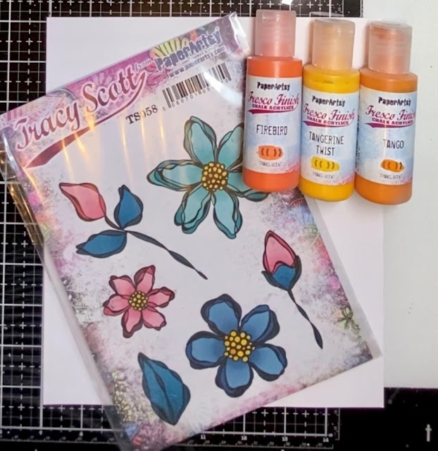
I started out by gathering my opposite colours for the project plus my large art journal - as you can see just placing the oranges and blues together creates a lovely contrast.
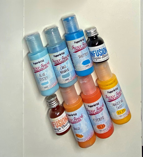
I gave the whole page a nice opaque coat of Fresco Chalk Acrylic (Shutters) and then scrubbed on some Fresco Chalk Acrylic (Lake Wanaka) with a mostly dry brush.
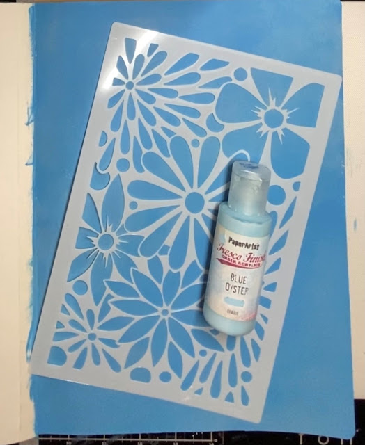
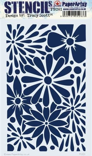
Next I used Tract Scott stencil 201 (PA 201) with Fresco Chalk Acrylic (Blue Oyster) to create the start of my background.
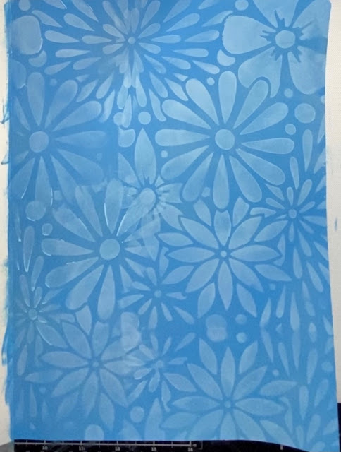


The background was looking a bit too 'clean' at this stage so I went in with the PaperArtsy Infusions (Royal Blood), adding some stamping in black ink using Tracy Scott Set 52 (TS52) before finally adding white in the form of PaperArty Grunge Paste and PaperArtsy stencil 21 (PA21).


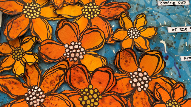
Next it was on to the orange elements of my page - using Fresco Chalk Acrylic (Firebird, Tango and Tangerine Twist).


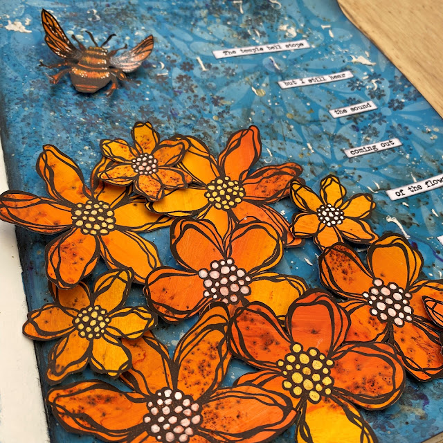
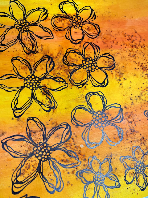
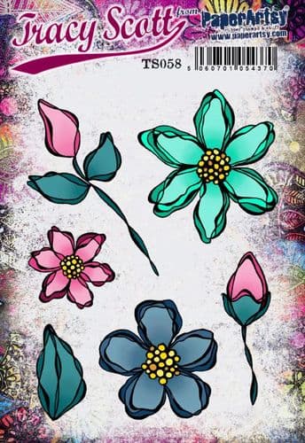
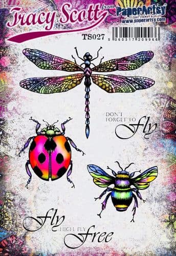
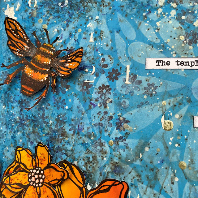
I painted a piece of PaperArtsy Smoothy Card with blended stripes of the three orange shades then gave it a little sprinkle with Infusions (Orange County). I stamped a selection of the flowers from Tracy Scott Set 58 (TS058) in black ink onto the page. I also stamped the bee from Tracy Scott Set 27 (TS027).
I cut out all the elements for my page and added highlights in white and gold pen to each of them - I did it at this stage as once they are on the page it can be quite fiddly!
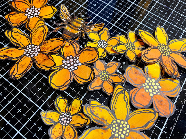
I layered all my flowers on the page and used foam pads to adhere them so they have good dimension. I also stuck the bee on with foam pads - leaving the wings free to lift up.
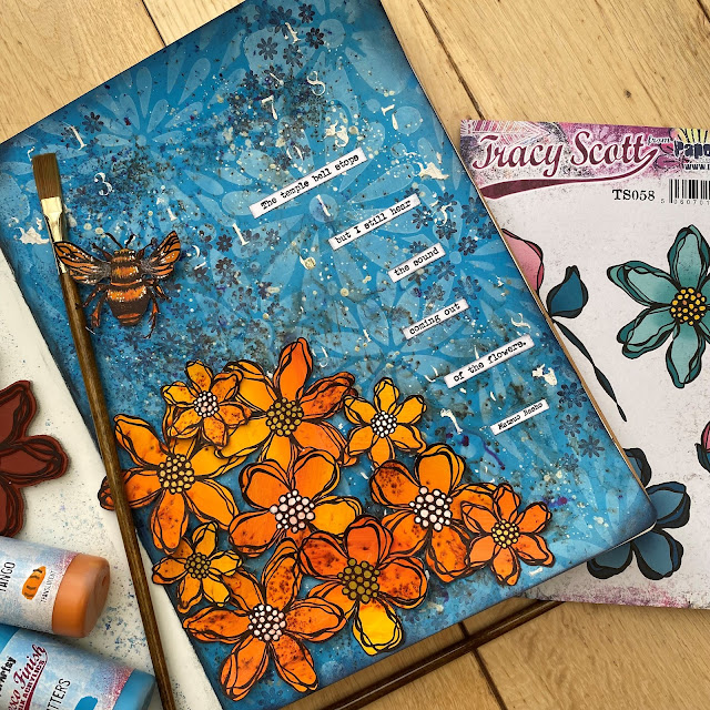
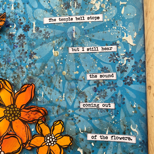
I stamped out the quote from Alison Bomber Set 01 (EAB01) onto PaperArtsy Smoothy Card using black ink, cut out each line and edged with black ink before arranging and gluing to the page.


I protected the flowers and bee before adding some white and gold splatter (Fresco Chalk Acrylic in Cloud 9 and Gold) to the page, this ties in the white and gold in the centres of the flowers to the background.
I love this quote - it sums up the finished page beautifully and also the white background on the quote pops against all the blue and orange tones.
The final finishing touch was to edge the whole page in black to frame the completed page - I did this with a combination of black ink and a water soluble black pencil along the spine.
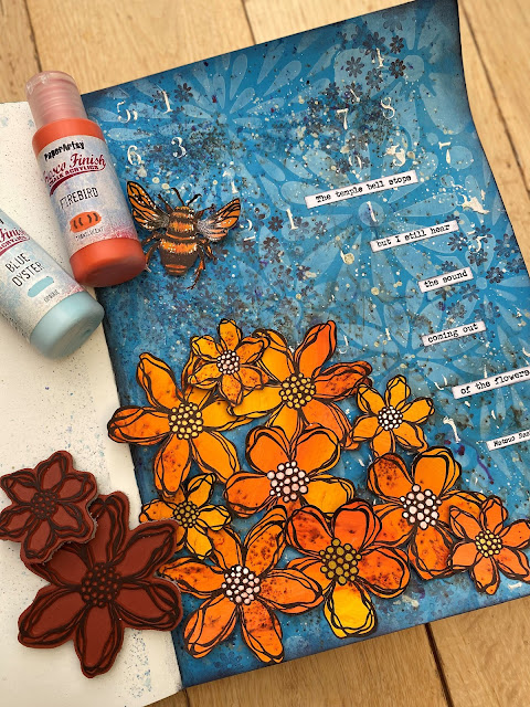
One very final last touch was to coat the wings of the bee with PaperArtsy Metallic Glaze - catches the light beautifully and gives them a lovely shimmer :)


This type of project really calls to me; it's my favourite way to create...loose and free in my art journal, lots of stunning flowers and contrasting colours to boot! I loved every minute. I hope you can spend some time looking at the colour wheel and trying out a colour combination you haven't tried before!
Thank you for joining me today,
Claire x


5 comments:
Such a fabulous combination of two very contrasting colours ... I love it !!! Jennie x
Gorgeous colour combination for your page - love it!!
Love the vivid contrast and the sunshine cheerfulness of those flowers - and of course the words!
Alison x
Love the blue and orange combo with those flowers 😍
Absolutely striking Claire! I love how you added the Infusions, it adds such great depth to the painted patterns. xx, Autumn
Post a Comment