Showing posts with label JOFY102. Show all posts

Thursday, 30 November 2023

2023 Topic 12: Designer Focus: JoFY {by Renata Peley}


Hi everyone, it’s Peley Renata with you today with a fun and crafty little project. A long time ago, when I just started doing mixed media, very soon I realized how beautiful and magical this world is. And instead of being a responsible grownup, I spent many nights browsing the internet for some amazing stencils and stamps. Even now I remember seeing the PaperArtsy line the first time, but the first designer that draw my eyes was JoFY, with her whimsical and colorful designs. And that’s when I started assembling my early Christmas wish list. Luckily my husband fulfilled my desires and bought me two gorgeous stamp sets. And those two stamp sets were some of the first ones that I got in my now beautiful collection. So, I thought it was fitting that I make a project highlighting some of Jo Firth-Young’s beautiful stamp sets, that she released this year.
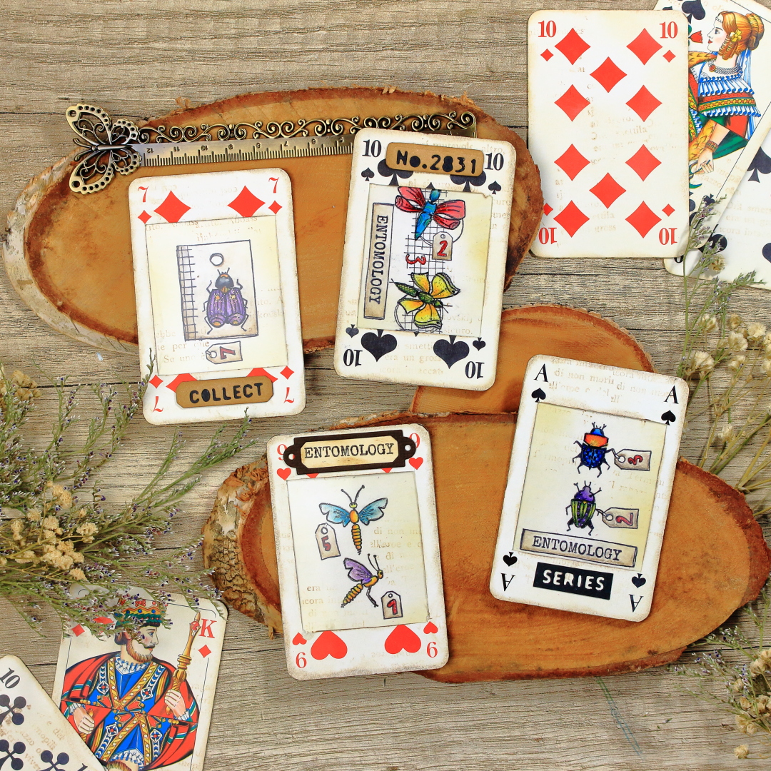
You know that feeling, when you feel like crafting, but don’t have the mood or time to commit to a whole art journal page, or any larger mixed media project? Well, for such occasions, what’s better than creating tags or artist trading cards. Though it is also a really fun format to work in and a perfect format for experimenting. This time I won’t be experimenting much, but I do promise some fun and good time.  


Recently we visited my husband’s parents and that place is like a treasure trove. I almost always find something that inspires me to create a project. They have some amazing vintage items, just laying around the house and collecting dust, but also some items that they got as an advertisement. And that’s precisely how I found my substrate and inspiration. On one of the shelves, they had an incomplete deck of cards with some company logo on the back. They weren’t vintage, or too pretty, but you know we crafters always find a way to make stuff look more interesting.

Now the two things came together for me: an old ugly deck of cards and new, gorgeous JoFY’s stamps.


Now that I had my main items for this project, I just had to figure out how to make them work together. But also, not to forget this quarterly topic: Typography. To be honest, the whole idea developed really fast, but soon I will tell you more about it.


Not long ago, in my previous blog, I was talking about my junk journaling crafting phase. That was the time when I was searching for ideas to make all sorts of fun pocket inserts. And one of my favorites was making something like specimen windows…or at least I think that’s how they are called. Anyway, that is what I have planned for this project, just in an artist trading card format.
The first step for this was to make windows in my cards. This took a couple of attempts as first I tested making windows with some of my cutting dies. None of them really fit my imagination so at the end I decided to create my own custom windows.


Those three cards on the left are the ones I cut using cutting dies, but the rest were the ones with my own measurements. I already said that my cards had an ugly back, so I decided to take two cards and adhere them back-to-back. In between two cards I would put JoFY’s stamped designs. To help the cards’ windows fit well and stay in place, using blue masking tape, I attached two cards to each other and cut them at the same time using a craft knife.


I cut out altogether ten cards, creating five atc bases this way. I planned to make three or four only, but you know the saying: “Two is one and one is none.”, and I was expecting to mess up up at least one. 😊

Anyway, now the basic frame for my cards was done. Simple enough, right? But now on to the second stage: making the middle layer and focal interest.

I originally intended to stamp on a plain thin paper or vellum (which I still think would look gorgeous), but then the typography topic came to my mind. So, I thought of a paper pad that I had for ages. This one is from Docrafts – Papermania: Bookprint. It is a very old paper pad and I can’t find it anymore for sale, but it looks something like this: one side has usually text in various fonts and languages with or without images, but the other side is plain white. Which was perfect as I needed one side to be blank so I could do some stamping. If you don’t have such paper pad, there are alternatives. Either book pages (sometimes if there is an end of a chapter, the other side of the page can be blank) or take a paper and stamp text on one side.


 For each card, I chose a different paper, just for fun. Of course, the next thing to do was stamping. My chosen stamps were PaperArtsy stamp sets by Jo Firth-Young (JOFY125 and JOFY126).


I cut the papers from the paper pad roughly to the size of the atc’s and drew in the outline of my window with light lines and graphite pencils, so that I would know where to stamp precisely. I stamped most of the stamps with a stamping platform and Ranger Archival Ink in Jet Black color, but again, there were some stamps that I didn’t want to stamp fully. For those cases I used Pigma Micron brush pen in black color.


As you can see on the image above, I really liked the stamp with those two insects on a tag, but I didn’t want the tag outline. Of course, you can solve that either like me, with partial stamping, or with some masking tape. Two ways but the same result.

Additionally, I stamped those two mini tags, and drew in some numbers using Pigma Micron pen again. I did try to imitate the style of Jofy’s numbers, but I’m not really sure how successful I was. :) 


Very soon, all four papers were stamped in the same way and it looked something like this:


Obviously, the next step was to color my images. As the paper on which I stamped was very thin, I didn’t dare to go with any heavy medium, so I opted for Prisma Premier colored pencils.


I always enjoy adding some subtle touches to my images so I thought to add a bit of shine to my colored insects using Art by Marlene Special Effects Glamour Glitter in Gold color.


I was happy with how the images turned out with bright and bold colors, but also with that touch of shine. Now obviously it was time to start making my artist trading card sandwich.


Originally, I imagined the cards with clean designs and bright and bold colours. I don’t know why, but at this point I started feeling attracted to an idea of adding just a tint of brown and making my cards look…not so neat and new. Anyway, let me show you what I mean.

First, I applied just a touch of the Antique Linen Distress Oxide ink by Ranger, using an ink blending brush. I applied the color on both sides of my paper but also on the cards.


After that, using Vintage Photo Distress Oxide ink I added some discrete interest using a text stamp from the PaperArtsy stamp set by Jo Firth-Young (JoFY102). The effect was very subtle, but I really liked it this way. Also, I added a bit of the same ink on the edges of my cards and windows.


Now was the time to assemble my sandwich, going something like this: on the back of one of the cards, I adhered the paper with the stamped image, over that the acetate and finally I adhered the second card.


I repeated the process for all the cards and in my opinion, they looked really pretty. But I still felt like something was missing.


For better or worse, very often I can’t resist adding small details. This time, one of those details was adding some more texture and interest using cutting dies. The die set that I found perfect for this set of cards was from Sizzix and Tim Holtz, called Specimen.


For each card, I made one embellishment and adhered it using a paper glue.


This was the moment when I decided to stop before I spoil the cards. Though I was considering adding some more interest using either dry, pressed flowers or some die cut florals. Maybe even a piece of thread…but not for me this time. 😊

Oh and a bonus fun fact, as the paper that I used for stamping is very thin, when I turn my cards towards a light source it becomes semitransparent and I can see the both sides of the paper. 


So cool, right? :) 


This was one of the projects where the idea and inspiration came easily. It all went smoothly and I was happy with the result. But when I try to make something like this next time, I will try either stamping directly on acetate, or use vellum paper. Also, I might really go for using pressed flowers and threads. Perhaps even add a metal charm as well. These are just some ideas for you or me to play with next time.

Anyway, this was my last blog post for this year, so I will use this opportunity to in advance wish you all a Merry Christmas and Happy New Year!

Renata 💜

If you enjoyed this process, but some technicalities are still not clear, or if you are a more visual type (like me), I have also prepared a full step by step tutorial for this project on my YouTube channel.


Monday, 2 January 2023

2023 Topic 01: Shrines {by Victoria Wilding} with JoFY stamps


Hi everyone

Victoria here with you today.

I hope you all had a magical festive season and welcomed 2023 with peace and happiness. The start of a new year is always so full of possibility, with new opportunities and adventures ahead, but, it is also a time of reflection and looking back at memories past. The topic 'Shrines',  naturally led me to thinking about how we remember those no longer with us, who won't join us on 2023's journey.

Pocket shrines have been used in many religions, over hundreds of years, as a way of keeping faith close during travels. Traditionally containing imagery of religious icons and prayers, they are extremely personal pieces and highly portable. The concept of something, or someone, leaving a mark also ties in nicely to the first theme of 2023 'Tracks'. Tracks leave a mark and this led me to thinking about the many ways marks may manifest. I started to consider the physical marks left behind by a person, through objects and possessions (e.g. jewellery, photos, clothes) and the emotional marks made in the memories of those they leave behind (e.g. characteristics, sayings, favourite pastimes and music).

It struck me that instead of using a pocket shrine as a religious object, one could also be made to celebrate the life of a loved one and so, I decided to create a deeply personal pocket shrine project, for my Mum, who I sadly lost in 2021. This would literally carry her with me into the new year, keeping her memory alive and make another kind of mark, one on the present from the past.


My finished pocket shrine is perfectly imperfect. It's a little treasure trove of Mum and provides a beautiful visual reminder of her. It celebrates who she was and offers a way for me to figuratively hold her close. And it got my new year off to a positive start, encouraging me to grow by developing new creative skills with embroidery, almost like Mum was giving me a little nudge.


I started out by deciding what objects and materials to use for my pocket shrine. I wanted to use fabric from Mum's old clothes as the main substrate and gathered some photos and jewellery that she was really fond of. In her final years she had dementia and she kept a small jewellery box of treasures close at hand which offered comfort and reassurance in her times of confusion. These were the perfect choice for inclusion in my pocket shrine.

I wanted to keep the project within my pretty floral style. My love of flowers comes directly from Mum and she nurtured my creativity from a really young age, so the combination of the two was always a very natural direction to take my creative practice in. I selected two PaperArtsy A5 stamp sets by JOFY (JOFY102 and JOFY103) and decided to use the simple outlines as a template to create some floral embroidery as a focal point on the finished piece.

Finally I decided to construct a tri-fold shrine case from fabric using a rectangular template which would be easy to put together with my limited sewing experience. My plan was to decorate the outside using the JOFY florals before placing Mum's jewellery and photo's on the inside.


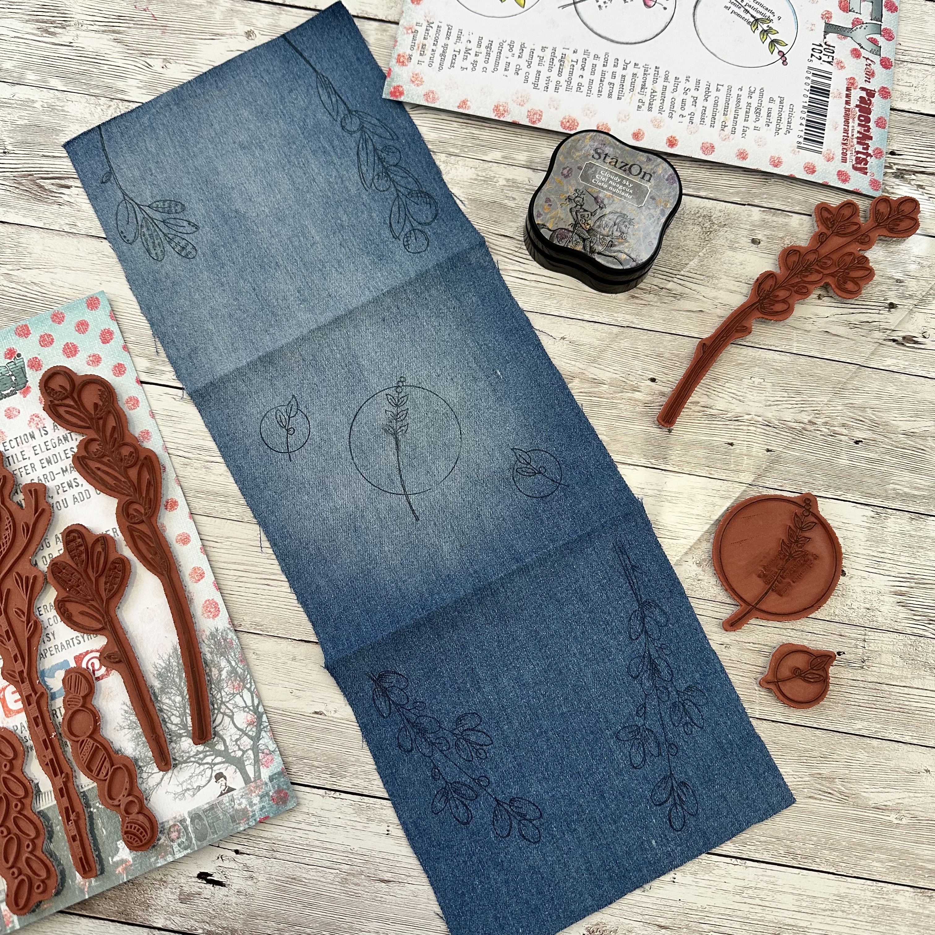
I selected one of Mum's denim skirts (some of her favourite items in her wardrobe) to use for the fabric in the project. I marked out a rectangular piece of fabric (15 x5.5 inches) and split it into three sections (5x5.5 inches) before cutting it out.


Next I ironed in a folding line for each section to help me place the images on the top side. I then repeated these steps with a second piece of fabric (natural cotton) which I could use as a lining on the inside of the project.


I then selected some of the stamps and stamped out the images on the top of the denim using StazOn (Cloudy Sky) as I needed the outlines to be clearly visible but not too dark, just in case my embroidery revealed some of the outline. Remember that the finished panels will be folded, so the direction of your stamping needs to change according to each panel so that stamps are all the right way round once finished.


With the main elements of the pocket shrine, cut out and ready to go, it was time to learn some embroidery stitches and start work on the decoration.
 

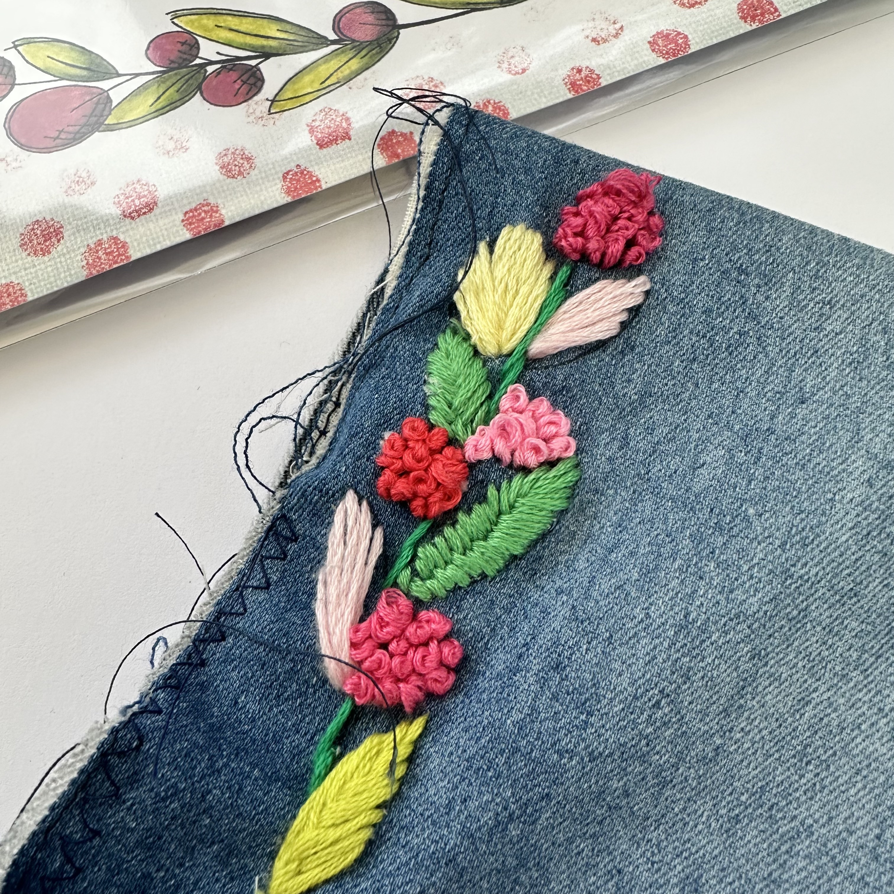
Embroidering the flowers was always going to be the most time consuming part of the project, especially since I haven't done any embroidery before! To keep costs low since I'm not sure how much embroidery I'll do in the future, I bought a cheap pack of embroidery threads in a large range of colours from Amazon. I did a quick search for instructional videos of basic embroidery stitches on YouTube and with my iPad at hand, got comfy in front of the TV and made a start on filling in the flowers and leaves.


It's slow progress and I do begin to wonder initially if I've bitten off more than I can chew! I selected threads in a range of pinks and greens, to provide a nice contrast to the blue denim background. After a couple of attempts the stitches really started to take shape and I started to get a bit faster. I used the 'French Knot' stitch for the flowers, the 'Fishbone' stitch for the leaves, the 'Stem' stitch for the stems and a 'Split' stitch for the circles.


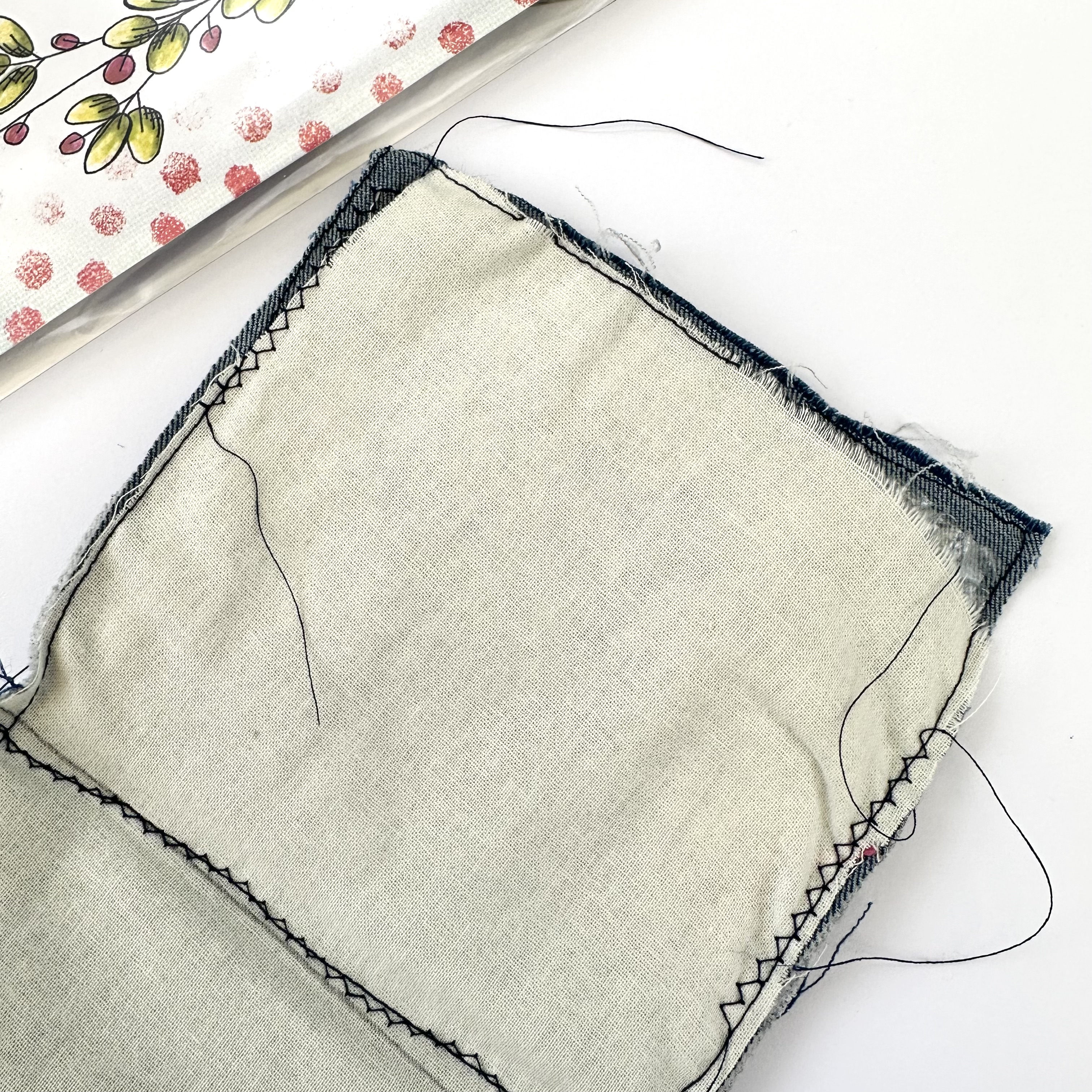
With the embroidery complete I needed to assemble the outside and inside fabrics. I hadn't initially considered how bumpy the underside of the embroidery would be so needed some padding between the two fabrics. I decided to use what I hand to hand and this happened to be some used plastic bubble wrap!


I cut three squares and secured it with double-sided tape to the back of the denim fabric first before placing the natural cotton on top.
 

It was then time to stitch the two panels together on my sewing machine. I have limited sewing experience so kept this really basic with open outside seems, stitching all around the outside edges. I then stitched along the two folding lines to create extra definition for the folding sections.


This was never going to be a perfectly finished fabric construction due to my limited sewing experience, but on the plus side, I actually really like the handmade quality of imperfections! This can most clearly be seen on the inside construction on the pocket shrine where the natural cotton is exactly cut in the top and bottom corners. 
To enhance the imperfections as a feature, I also kept the loose threads from the stitching to add an extra element to the project.


There are also some loose stitches to the embroidered flowers as it was tricky to pull the stitching tight without the use of an embroidery hoop. With hindsight I would definitely purchase one to keep the fabric flat and help with stitch formation when following the outlines.


With the pocket shrine construction complete it was time to include the jewellery, photos and sentiments.


Deciding which sentimental items to place inside was the trickiest part of the project. There's so many ways you could do this, but in the end I decided on the same design for each section so that the focus of the eye was on the objects themselves. I cut out four pieces of card (4x3 inches) and used a corner punch to give them a decorative edge. I also printed a range of photos, of Mum throughout her life, on my home printer. Finally I selected two PaperArtsy Fresco Finish Acrylics (Venice Blue and Steel Grey) to provide some background colour for the card and my trusty fountain pen to hand letter the text.


I decided to use my gel plate to apply the colour to the card, as this would give a more grungy finish. I started by applying the PaperArtsy Fresco Finish Acrylic in Venice Blue.
 

I then switched out the Steel Grey colour for Snowflake in order to soften the overall effect of the colour and make sure it wasn't too dominant. I wrote out the text on plain white paper and ripped around the edges and then glued these to the background cards, together with the photos. The cards were secured to the pocket shrine using fabric glue. The final step was securing the jewellery pieces with pins.


My finished pocket shrine turned out so much better than I expected. The embroidery adds a really unique touch to the stamp designs and the sense of accomplishment when all those little elements are complete is amazing! I love the texture that the embroidery adds to the stamp designs and can definitely see me incorporating this into future projects.

The outside feels like a real extension of Mum, and me living on in her memory; her denim and love of flowers, combines with the crafty, creative streak she helped to nurture. And the inside clearly shows this pocket shrine is in honour of my Mum, Christine Rowan, for who 3 really was the magic number!

I hope you feel inspired to create a shrine of your own, remembering someone special in your life as you embark on a new year of memory making and adventure.

Wishing you a creative, happy week

Victoria