Hi everyone Jenny (
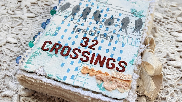
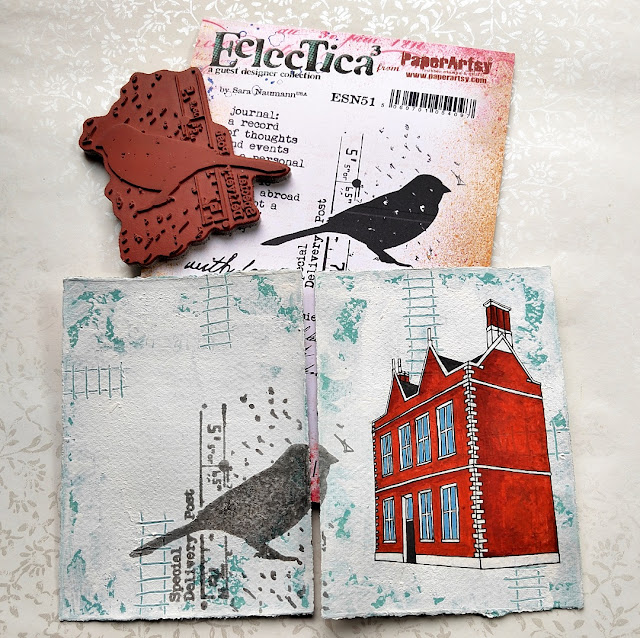
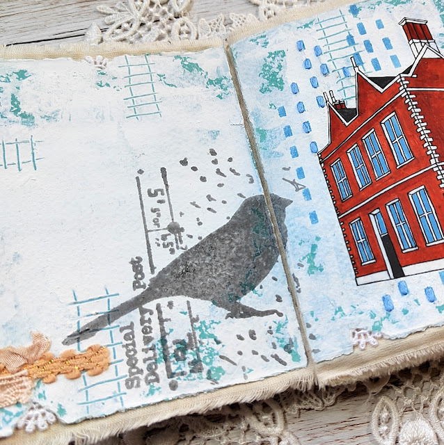
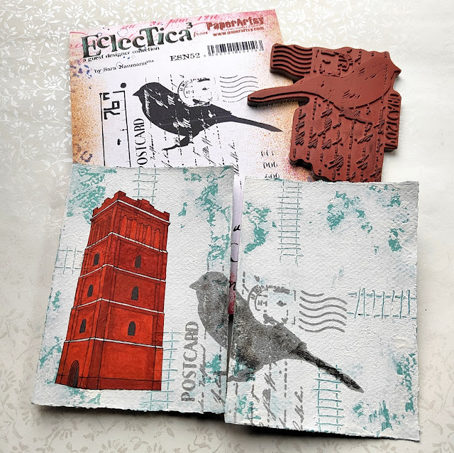
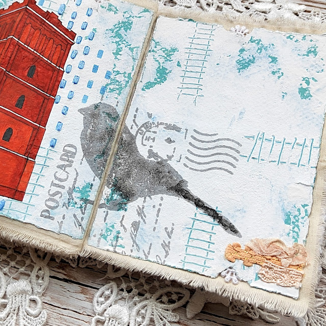
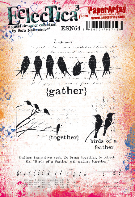
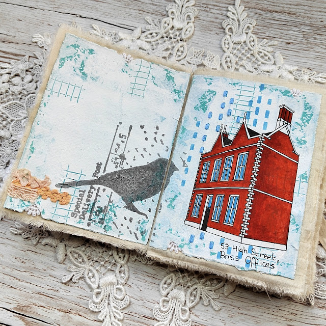
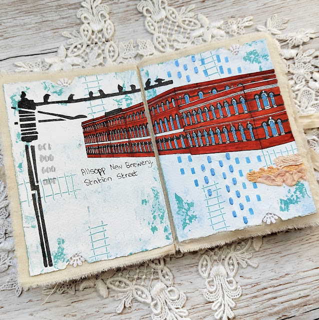
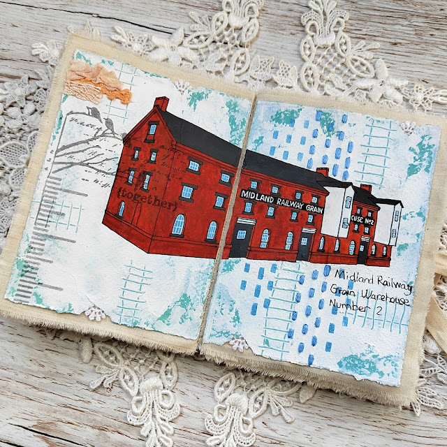
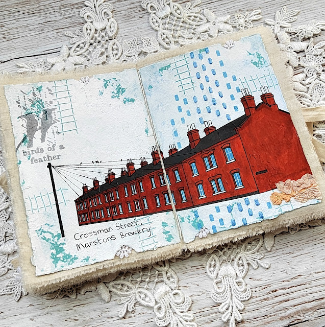
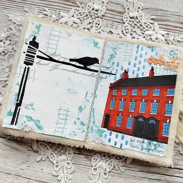
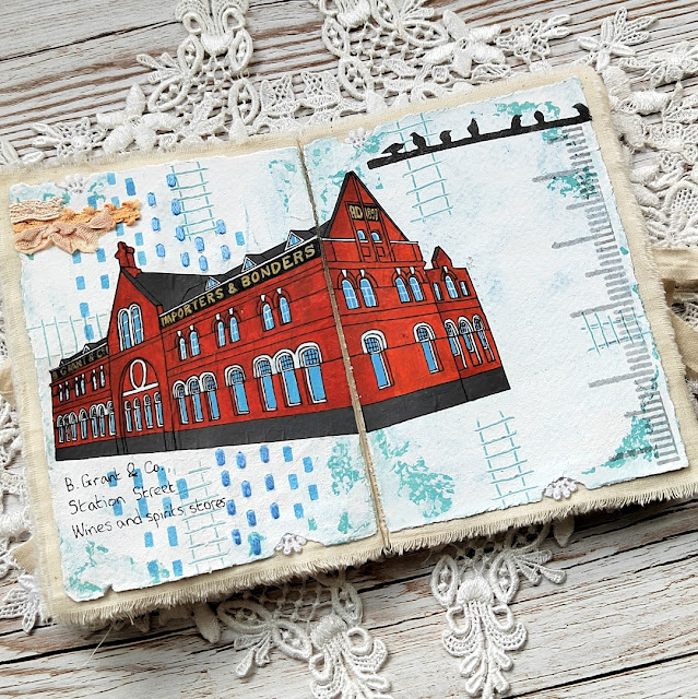
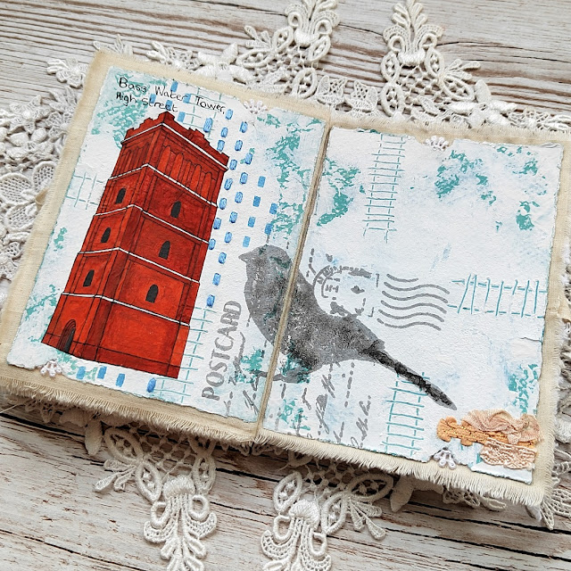
Pushing The Right Buttons) here with you today. The first theme of 2023, 'Tracks', immediately made me think of my home town which used to be criss-crossed by a network of brewery railway lines. You can walk a trail around the town and see the historic Georgian and Victorian industrial buildings which remain from those times. Flocks of birds are a familiar sight, perched on the spider's web of power lines which still connect the rows of terraced houses. These are very reminiscent of Sara Naumann's designs, and it got me thinking about creating a journal recording some of this architectural history.
I really enjoyed taking the time to walk around my home town taking photos of a few of the buildings and hope it inspires you to go out and do the same!
The part that often puts people off is the idea of attempting to draw/paint buildings and I totally get that; it can take time and even then you may be unhappy with the results. So I used a simple trick learned from an amazing artist called
Brittany Soucy which makes the whole process much more achievable. Going forward I will definitely be using it a lot more for adding architectural elements in new journals!
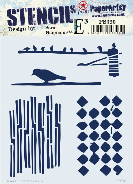
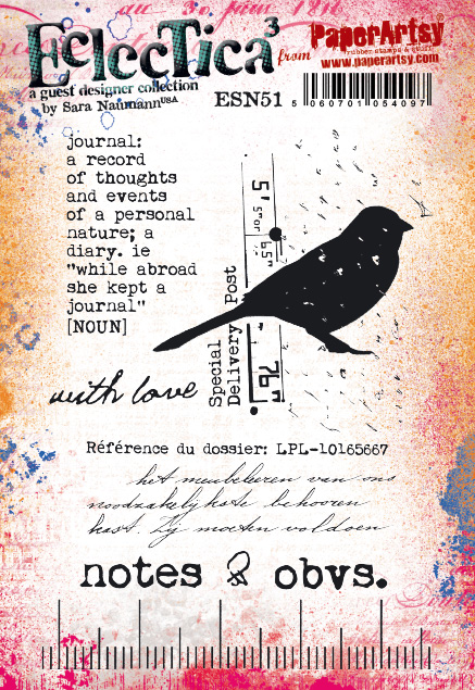
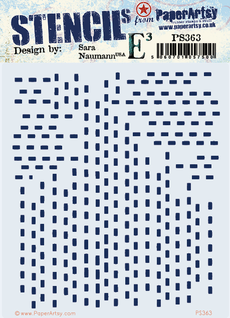
My starting point for this journal was choosing the colour scheme, in this case a tetradic one based on the results from playing with a PaperArtsy Colour Wheel. I'd chosen one of Sara Naumann's newer PaperArtsy stamp sets and a couple of her stencils but confess to pulling out a couple of her older stamp sets too because they worked together so well. I would always encourage you to delve into the PaperArtsy stamp sets and stencils you already have in your stash whenever you begin planning your projects - you may be amazed by what you find!

If you haven't already, make sure to read the comprehensive introduction to the Tetradic Colours topic
HERE; I was fascinated to find I've used this type of colour combination many times before - clearly it's intuitively a favourite! Do you find yourself drawn to certain colours too? After creating a colour wheel, I colour-matched the results choosing existing PaperArtsy paint colours close to my chosen 4 on the wheel made from Mustard Pickle, Mahogany and Blue Bayou.
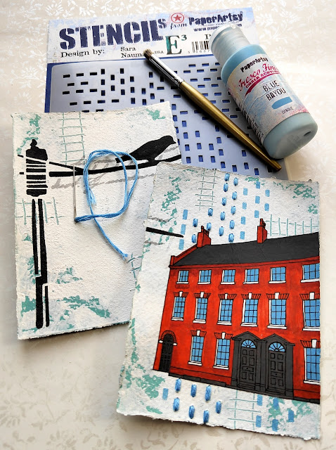
I went with a 'slim rectangle' selection of colours partly driven by the need for a brick red shade for the buildings; this included PaperArtsy Fresco Finish Chalk Acrylic Paints in '
Waterfall', '
Blue Bayou', '
Brown Shed' and '
Autumn Fire'.
Now it's time to get some colour and texture on the pages of your journal. By spreading a layer of heavy body white gesso over a painted background it gives you the option to make some of your own marks with a wooden skewer (or similar) on each page; train tracks were an obvious choice for my journal but you could use other shapes, flowers, lines, etc. to fit with your theme.
Here's the clever bit if you feel less confident with drawing or are simply lacking time; trace over your photo with a permanent ink pen and cut out the image! You can choose to leave out fiddly details or change the drawing to personalise it even more. Once cut out stick your image onto the page. I used a gel medium but you could also experiment with a sticky glue stick, adhesive sheets or similar, making sure the tracing paper remains stuck down securely on your painted background.
You can always add those trickier, finer details directly on your page when your building is stuck down and painted.
When the glue holding your image is dry it's time to start painting. I added layers of PaperArtsy Fresco Finish Chalk Acrylic Paint in '
Brown Shed' and '
Autumn Fire', making use of their translucency to make some shaded parts darker than other lighter areas. Use your original photo as a reference but don't be afraid to put your own spin on it!
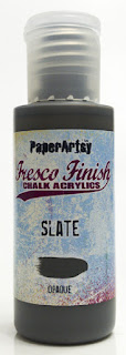
Finish painting your building and add in any of the details you may have lost with the same permanent ink marker. I also decided to add a couple of neutrals into my colour palette, using PaperArtsy Fresco Finish Chalk Acrylic Paints in '
Blue Bayou', '
Slate' and '
Snowflake' to complete the windows, roof, doors and window frames. Paint pens with a fine nib/tip can also prove helpful with this bit.















6 comments:
This is beautiful and a brilliant idea! So different to the norm. Well done.
Love this - love the industrial buildings and the way you've added hand stitching.
Jenny, this is an amazing piece of artwork.
Absolutely love all the detail you have put into it, and the story behind it xxx
Another fabulous showcase of your love of art and architecture.
Phenomenal project Jenny. So many ideas and a masterful use of the stamps and stencils. Love every bit of it!
So cool!!! I really love these pages. Makes me want to try it myself!
Post a Comment