Showing posts with label Brown Shed. Show all posts

Monday, 30 January 2023

2023 Topic 02: Tetradic Colours {by Jenny Maples} with Sara Naumann Stamps


Hi everyone Jenny (Pushing The Right Buttons) here with you today. The first theme of 2023, 'Tracks', immediately made me think of my home town which used to be criss-crossed by a network of brewery railway lines. You can walk a trail around the town and see the historic Georgian and Victorian industrial buildings which remain from those times. Flocks of birds are a familiar sight, perched on the spider's web of power lines which still connect the rows of terraced houses. These are very reminiscent of Sara Naumann's designs, and it got me thinking about creating a journal recording some of this architectural history.


I really enjoyed taking the time to walk around my home town taking photos of a few of the buildings and hope it inspires you to go out and do the same!

The part that often puts people off is the idea of attempting to draw/paint buildings and I totally get that; it can take time and even then you may be unhappy with the results. So I used a simple trick learned from an amazing artist called Brittany Soucy which makes the whole process much more achievable. Going forward I will definitely be using it a lot more for adding architectural elements in new journals!


My starting point for this journal was choosing the colour scheme, in this case a tetradic one based on the results from playing with a PaperArtsy Colour Wheel. I'd chosen one of Sara Naumann's newer PaperArtsy stamp sets and a couple of her stencils but confess to pulling out a couple of her older stamp sets too because they worked together so well. I would always encourage you to delve into the PaperArtsy stamp sets and stencils you already have in your stash whenever you begin planning your projects - you may be amazed by what you find!


If you haven't already, make sure to read the comprehensive introduction to the Tetradic Colours topic HERE; I was fascinated to find I've used this type of colour combination many times before - clearly it's intuitively a favourite! Do you find yourself drawn to certain colours too? After creating a colour wheel, I colour-matched the results choosing existing PaperArtsy paint colours close to my chosen 4 on the wheel made from Mustard Pickle, Mahogany and Blue Bayou.

I went with a 'slim rectangle' selection of colours partly driven by the need for a brick red shade for the buildings; this included PaperArtsy Fresco Finish Chalk Acrylic Paints in 'Waterfall', 'Blue Bayou', 'Brown Shed' and 'Autumn Fire'.


Now it's time to get some colour and texture on the pages of your journal. By spreading a layer of heavy body white gesso over a painted background it gives you the option to make some of your own marks with a wooden skewer (or similar) on each page; train tracks were an obvious choice for my journal but you could use other shapes, flowers, lines, etc. to fit with your theme.


Here's the clever bit if you feel less confident with drawing or are simply lacking time; trace over your photo with a permanent ink pen and cut out the image! You can choose to leave out fiddly details or change the drawing to personalise it even more. Once cut out stick your image onto the page. I used a gel medium but you could also experiment with a sticky glue stick, adhesive sheets or similar, making sure the tracing paper remains stuck down securely on your painted background.


You can always add those trickier, finer details directly on your page when your building is stuck down and painted.
 

When the glue holding your image is dry it's time to start painting. I added layers of  PaperArtsy Fresco Finish Chalk Acrylic Paint in 'Brown Shed' and 'Autumn Fire', making use of their translucency to make some shaded parts darker than other lighter areas. Use your original photo as a reference but don't be afraid to put your own spin on it!


Finish painting your building and add in any of the details you may have lost with the same permanent ink marker. I also decided to add a couple of neutrals into my colour palette, using PaperArtsy Fresco Finish Chalk Acrylic Paints in 'Blue Bayou', 'Slate' and 'Snowflake' to complete the windows, roof, doors and window frames. Paint pens with a fine nib/tip can also prove helpful with this bit.


At this point you'll have a set of journal pages with colour, texture and a focal point, but embellishment with your stamps, stencils and more is always going to add interest to the finished book/journal.
 

Start with your stencils and don't be afraid to combine images on the page for more impact. Here I used different parts of PaperArtsy PS090 Stencil by Sara Naumann to sit the bird on a telegraph pole. Later on I stamped a script image over the bird with a grey permanent ink.


Talking of stamps, that script image can be found included in PaperArtsy ESN51 Stamp Set by Sara Naumann and it was the bird from that set which found it's way onto the first page of my finished book. Sara's collage style stamp designs cleverly combine images which is why I love to use them on painted pages.


And remember how it's always worth diving through your stash for older stamp sets... sure enough, you can find another bird included in PaperArtsy ESN52 Stamp Set by Sara Naumann.


It was the birds on the wire from PaperArtsy ESN64 Stamp Set by Sara Naumann that was part of the original inspiration for this project and they combine beautifully with the measurement image from ESN51, in this case extending the branch image and replicating part of the bridge I had to look over to get the photo of this warehouse.


We've seen stencils used for adding images to the pages and now it's time to use them in a more decorative way.


At this point you have the focal points and additional images in place and these can begin to compete for attention. It's important to ensure the viewers are initially drawn to the main building when they first look at the page. One way of doing this is by adding extra stencilling around it using a colour which blends well with the background.


Don't just think of using paint with your stencils, particularly when they are a simple geometric design like PaperArtsy PS363 Stencil by Sara Naumann. I found a matching colour embroidery thread which could be stitched through the page following the stencilled lines.


With the pages almost complete it's time for those finishing touches.

Bind your pages into a book using fabric (as I showed HERE) or paper and add your covers. My covers were created in the same way as the pages and I tore away parts of the pages to insert a little glimpse of lace behind. It's at this point you finally get to see what your pages look like sat together as a book and I decided to add some extra trims to them. If you don't have the correct colours to hand try dyeing them with Paper Artsy Infusions. The 'Rusty Car' shade worked well, contrasting nicely against the aqua coloured 'Waterfall' background.


With the book complete it's time for a final flick through of the finished pages. Not shown here are the 'blank' pages where I've written a little about the brewing history of the town and some personal observations. And if you are wondering why I added the title '32 Crossings' to the front of the book that refers to the 32 level crossings which used to cover the town!


It's good to reflect on what you enjoyed (or didn't!) after completing a project to help steer you in the direction of future experiments. I for one will be taking what I've learned about tracing images into my future book/journal making adventures and hopefully you will be able to take some ideas from this post too.

Jenny
Pinterest: https://www.pinterest.co.uk/jennymarples73/ 

Tuesday, 4 October 2022

2022 Topic 14 : Colour Study: Triads {by Alison Bomber} with Alison Bomber stamps


Hi everyone, it's Alison here from Words and Pictures, and I've been playing with some of my botanical stamps and an autumnal colour wheel.


The first inspiration for this project happened before any craft table action, and that was a feeling of autumn starting to creep in to my world.  The weather has turned chillier, the trees are just starting to show signs of changing colour, and (with frost forecast quite soon) I'm having to think about getting the garden ready for the long Czech winter.

With all that going on, I wanted an autumnal palette, so my colour wheel didn't start with the three primary colours (red, yellow, blue), but is closer to the three primary colours of light (red, green, blue).  Even then I wanted to go with quite earthy autumnal shades of those three basics, so for my three Fresco Finish Chalk Acrylics I picked Brown Shed (FF38)Tinned Peas (FF55) and Summer Sky (FF150).


I adored the autumnal colour palette that the mixing process gave me.  It was a little frustrating to restrict myself to just three of the colours!  But I decided that I really wanted that fresh clean blue for the sky behind the acorns, so working with colours separated by three segments, that gave me the three pure paint colours to play with... no mixing involved.   And here's where I ended up.


It's hard now to remember which came first - the idea for an autumnal palette or the choice of stamps.  I think I already had the acorns in mind - my botanical Eclectica³ {Alison Bomber} Acorn Edition (EAB25) - when I started thinking about what paints to choose, but it became clearer and clearer as I played with the colour mixing that those were the stamps to go with.


I very much enjoyed mixing the colours for the wheel.  It's a really meditative process... and you get lovely moments of surprise at the colour tones appearing... that smoky grey at no.12, for instance, the soft duck egg at no.2, or the perfect burnished acorn at no.8!  I will definitely be deploying both this palette and the colour wheel mixing process again.  When you create a limited palette by mixing your paints, you're always going to end up with a harmonious effect as all the colours "belong" to each other.

 
So yes, no.8 would have made the perfect ripe autumnal acorn, but that would have meant using 4, 8 and 12 - and, as I said, I really wanted the blue of the Summer Sky (yes, I know it says it's summer not autumn, but it definitely has a cool cast to it), as well as the yellowish green of unmixed Tinned Peas, so 1, 5, and 9 it had to be.

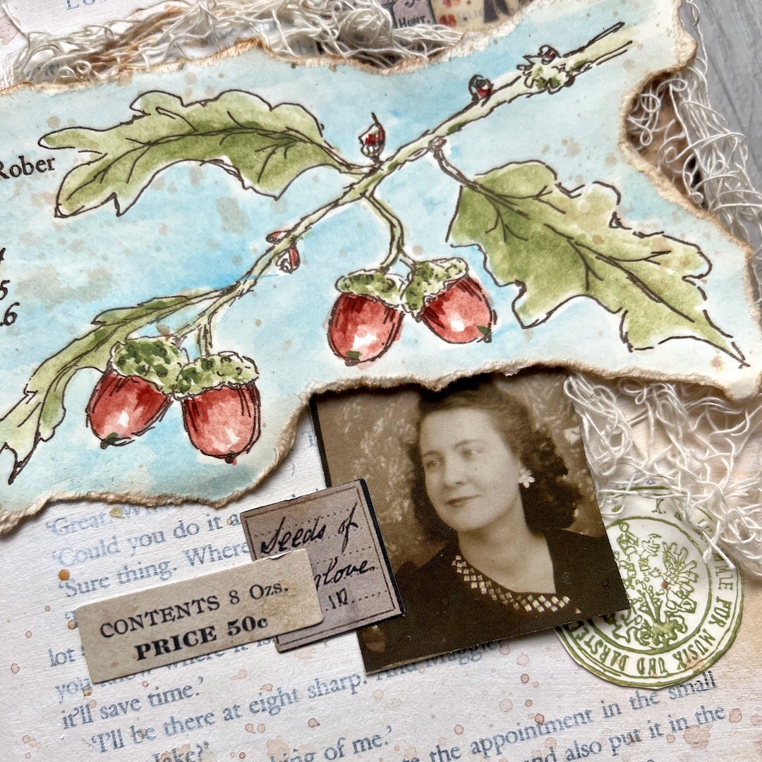
At this stage, I had no long term plan, I just wanted to try out my chosen colours by painting the images.  I used a stamping platform and Potting Soil Archival ink to stamp both the large acorn branch, and the close-up stem along with its 1653 advice from Nicholas Culpeper for using oak medicinally.  (I'm not recommending doing any of it today!)
 

When I'm painting with Fresco Finish Chalk Acrylics, I like to use a water brush.  This gives me the ability to thin out the pigment to create lighter tones, working in a more watercolour kind of way, even with the opaque paints.  (You can see on the colour wheel, I've deliberately lightened each colour towards the outside edge of the wheel to see the kind of tonal gradation that's possible.)  I put a small splodge of paint direct on the craft mat and spritz it with a bit of water, as well as using the water brush itself to control the pigment.
 

With these botanical stamps, I'm often trying to get dimension and light and shade for a natural look, and with the restriction of using only three colours, I needed the tonal changes to create that sense of 3D.  The dark tones retreat into the background. Lighter tones appear to emerge towards you out of the paper, so you can work to create that sense of the rounded acorns.  And white = light when you're painting, so leaving that little area of white space helps with the illusion of glossy reflectiveness that you would hope for on the surface of an acorn.
 

And it was definitely the right decision to use the stamping platform as, after I'd added my blue sky softly around the branches, I was able to restamp to get back all that lovely sketchbook detail.
 

(Sshhhh... don't tell anyone, but while I had the stamping platform and the stamps and the paints all sitting there ready, I also painted a version using more colours from the colour wheel.  On the plus side, that gave me a dark brown for the branch, and also some more colour variation in the leaves, not to mention those richer, riper acorns.  But there's a freshness and a brightness to the three colour version - those contrasting colours which live across the wheel from one another give the painting real vibrancy, compared to the earthier natural look.)


I had meant that painting to be just an experiment, to see how the colours worked, but once it was done, I liked it so much I thought I might as well use it somehow for the actual project... but how?  My little hardback book journal came to mind, so I tore around the acorns, and started playing with some layered elements on the gessoed pages.


It needed something more, so I decided to add the round seal stamp from the same Acorn Edition set to the mix.  I wanted it to match exactly, so I stamped it in Tinned Peas.  When I'm stamping with paint, I paint a thin layer onto the craft mat and press the stamp down into it.  (Always make sure you clean your stamps immediately when you're stamping with paint... I did it even before I took the photo!)
 
 
I stamped it multiple times (as you can see) which gave me plenty of nice circular elements to echo the Idea-ology ephemera vellum clock which I'd already cut in half to add to the page spread.  And it wasn't long before I was reaching for the quote which comes in the set too!


The words are stamped in Potting Soil Archival (I very rarely stamp in black... brown is my most common choice - it's a softer look).  But you can see that the deep carving and strong rubber gives you an incredibly sharp image on the green seal, even stamping with the paint... that's the sign of a quality stamp!


Collaging for me these days almost always seems to include the wonderful Idea-ology tiny labels and number strips.  I think the pharmaceutical labels and specimen records work so well with my botanical imagery.
 

And I enjoyed finding the two women in the Photobooth snapshots and positioning them so that the collaging is balanced and harmonious, leading the eye around the pages.


I'm really pleased with the texture from the torn edges - now inked with Vintage Photo Distress Ink - as well as the ragged netting in the layers.


And I love the effect of that brightness from the contrasting colours in the painting popping beautifully against the neutrals.  

 

It's in the final stages of a project, as I'm looking at what's there and wondering if there's more to add, that I start to understand how some of the instinctive choices I've made along the way (without thinking much about them) actually connect and have meaning.  As I was adding the final splatters of watery Vintage Photo ink, I started to notice the relationship between the two women...

I love how the woman on the right is gazing over at her friend on the left-hand page, while she is making direct contact with us, demanding our attention, drawing us in to the pages.


And then I realised that they also connect to the words... I feel sure that between them these two bright-eyed, intelligent women have plenty of plans and ideas, those little acorns from which mighty oaks - and indeed whole forests - can grow.


I realised I do a version of a colour wheel whenever I'm creating, especially when I'm watercolour painting.  I've never really formalised my colour blending in a wheel before, but I almost always work with a fairly limited palette of colours, mixing those as I go.  So it was fascinating to deconstruct the process like this, and see it all laid out so clearly.  Plus it's always a thrill to see how colours combine to make new colours! 

I most often work with colours closer together on a given wheel, but it's really refreshing to pick out the colours furthest apart and work with the contrasts that throws up.  I definitely enjoyed the fresh, bright results that gave me here.

So I thoroughly recommend that you take a colour wheel out for a spin.  I know I'll be exploring this method again, and you already know that the full palette of this particular wheel has been out to play... you've seen the results!  

I'm really looking forward to seeing the colour wheels in store for the rest of this topic, and I hope you are too.
Alison x


Blog: Words and Pictures 

Facebook: Words and Pictures
Brand new website (hopefully going live in the first week of October!): Words and Pictures
Instagram: @w0rdsandp1ctures and @b0hem1anh0me
Pinterest: butterfly crafter