Showing posts with label Tetradic Colours. Show all posts

Thursday, 10 August 2023

2023 Topic 8 : Master Wheel - Tetradic {by Victoria Wilding} with Tracy Scott stamps


Hi everyone

Victoria back with you today and I'm so excited to get all colourful with you as we revisit tetradic colour schemes as part of the 'Master Wheel' topic. I'll be creating an art journal spread using a skinny rectangle tetradic colour palette, but before we start I must confess that I'm not the most disciplined colour mixer, so prepare yourself for my rather slap dash approach!

Whilst I'm on a roll with the confession thing, I also thought I'd share that I'm a bonafide art journal junkie! I have dozens of different art journals and sketchbooks that I create in simultaneously and keep the journal I'm working in today, just for colour swatching and mixing. Here's a couple of reasons why I enjoy creating in art journals:
1. Art journals provide a safe space to play and experiment. They are relatively inexpensive and there's really only ever you going to be flipping through the pages.
2. They're a great reference tool for techniques, colours and compositions. Each page holds a lesson for next time and looking back on past pages is both inspiring and rewarding. It's a great way to see your progress and will teach you more about the things you love and the things you don't like so much.

I'm also going to share how the use of negative space in my pages, fits with this quarter's transparent theme, since you can see through to the white of the paper. Negative space is an important consideration in the composition of a piece and it consistently features in many of my creations. I'll show you how to use it to your advantage when creating loose florals and collaging geometric shapes like those in Tracy Scott's Minis.


The pastel colours I mix turn out really pretty and I really enjoyed all the playful elements of putting these pages together. I hope it inspires you to have a play in your art journal too!


These art journal pages use a minimal number of PaperArtsy supplies and a handful of other creative essentials. To mix my tetrad colours I use PaperArtsy Fresco Finish Acrylic colours; Butter (FF129), Candy Floss (FF70) and Aqua Duck Egg(FF199). I then use two mini stamp sets TSM10 and TSM12 to create some collage shapes for the main focal point.


Before we get into the detail of the page creation, let's spend a couple of minutes revisiting the colour wheel and tetradic schemes.

In segments 1, 5 and 9 of the wheel below you can see our three primary colours; Butter, Candy Floss and Aqua Duck Egg. Secondary and tertiary colours are created by mixing different combinations of these three colours. To mix a secondary colour (segments 3, 7 and 11) combine an equal amount of two of the primary colours. To mix a tertiary colour (segments 2, 4, 6, 8, 10, 12) mix a bit more of the primary colour into the secondary colour.


Tetrads are four colours which are distributed evenly around the colour wheel, which means there is no clear dominance of a single colour.

They can either be found in the formation of a square (see image below).


Or in the formation of a rectangle (see image below for a skinny rectangle).


I decided to use a skinny rectangle tetrad scheme for my journal pages, selecting the colours in the top middle. This tetradic scheme is organised into two complementary colour pairs making it a rich and vibrant colour choice.


I started off by mixing my colours and testing these out in swatches on the lefthand page and had a couple of attempts at creating the secondary and tertiary colours from the tetradic scheme.


Once I was happy with my colour mixes I created some background papers, applying a single colour at a time to the paper, with a sponge.


I then added patches of one of the other colours on top, using a mix of complimentary (colours opposite each other) and analogous (colours next to each other) colour pairings from my colour mixes.


Finally I created some single coloured sheets and set them all aside to dry.


Hand-lettering and loose florals are some of my go to options for mark making on my art journal pages. I adore the pretty effect they create and they pair so nicely with a really wide range of other images. Whilst I was waiting to move onto the main focal point, I lightly sketched out some cheats handlettering in pencil (this is basically a swirly capital letter combined with cursive script).


Sketching in pencil first takes a bit of the pressure off as you can rub out any errors and once you're happy you just go over the lettering in ink. I chose a dark grey ink to tie into the ink I will use for stamping in a few more steps.


Next I used up the leftover paint by painting a smattering of loose florals. At this point I had the thought that I should have painted the swatches in clusters to mix in amongst the floral clusters and create a more harmonious composition, but hey ho, something to remember for next time.

The loose florals I use here have become part of my signature style and I find myself coming back to them time and time again. They are so easy to put together and the trick is in laying gaps between the shapes you put down on the page. That transparent (or negative!) space, provides closure and helps the eye decode the assortment of shapes and recognise them as flowers and leaves.


Paint four uneven circles in a cluster to form the flower petals. A sport of stickles glitter in the centre of each cluster represents the pistil and pulls the flower together. Use different colours to provide contrast and help the eye see individual flowers. Paint in wonky oval/teardrop shapes for the leaves, again in a different colour.


Next I moved on to creating the main focal point for the page to the right. I stamped out a selection of the circles and squares from 
TSM10 and TSM12.


 I then cut out all of the shapes and organised into piles.


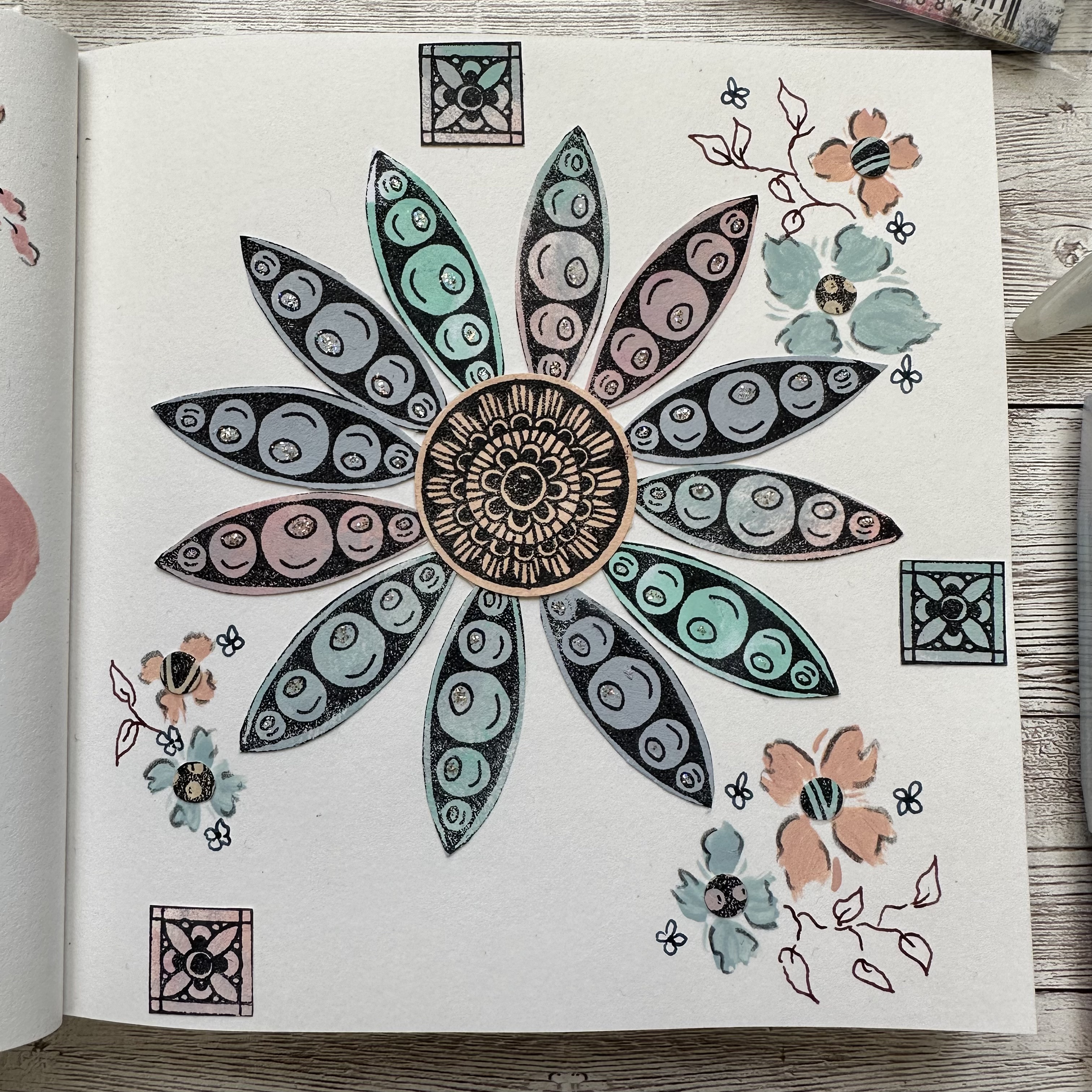
I'd decided that I wanted to create a college flower from the geometric shapes to compliment the loose florals I'd already painted on the lefthand page. So I cut the centre petal shape from each of the squares and set to one side.


I then decided to use a circle punch to create some tiny circles from the offcuts. I thought these could be used to create some smaller flowers on the outer edges of the page.


The next step was to assemble the collage flower. I stuck the petal shapes to the back of a circle with masking tape, spacing them as evenly as possible around the edge.


Here are the flowers ready to be used.
 

At this point I was ready to pull the pages together with all the final elements and finishing touches. The collage flowers were a bit bigger than I initially anticipated, so I only needed one of them. I glued it to the righthand page and painted some larger loose flowers in the same style as before to create repetition across both pages and bring unity to the piece as a whole.


I then used the small circles I created from the off cuts as the centres for the loose flowers, gluing them in place. This provides further continuity from the large centre flower.
 

To create balance on the page of a tetradic colour scheme, you should let one colour slightly dominate in the composition. You can see here how I used colour segments 8 and 9 of my selected scheme, more often on the page.
 

Finally, it was time to add the finishing touches. I added some watercolour pencil in Payne's Grey to outline the edges of the petals and leaves.


And drew in some leaf vines in fountain pen ink to give a final element of visual contrast to the overall piece.


Working in the rule of threes for an even composition, I added three small squares to each outside page edge. This mirrors the three clusters of painted flowers and helps create layers within the composition. The eye naturally moves from the centre of the page and the large collage flower, to the painted flowers and finally to the three small squares at the edges of the page.


I hope you feel inspired to get out your paints and create your own colour wheels and triadic colour palettes. Working with colour in this way is a great way to explore new colour schemes and discover different colour palettes from just a small selection of initial colours. I'll definitely be playing some more with this same scheme, but using a different skinny rectangle or square for other triadic combinations.

Wishing you a creative, happy week

Victoria


Monday, 7 August 2023

2023 Topic 8 : Master Wheel - Tetradic {by Liesbeth Fidder-De Vos} with Hot Picks stamps

Hi everyone!

Liesbeth here with you today, here at the PaperArtsy Blog we continue the Colour Wheel adventure, and this time we  bloggers use the same three Fresco Paint colours. So many possibilities, so much fun! Read everything about this Master Wheel Topic Introduction HERE! 


After the mixing fun, I ended up with an art journal spread in my altered book. Without the colour wheel I would never have chosen the coulors I used here, it's so surprising and I really love it!


As you can also read in the Topic Introduction we use this three ,icecream' colours of PaperArtsy Fresco Finish paint as the three primary red, yellow and blue colours: Candy Floss, Aqua Duck Egg and Butter.


At this early stage I also chose this two wonderful PaperArtsy stamp sets! Hot Picks HP2201 and HP2203:


How I love this stamps! The vintage style, the beautiful faces, the many fine details and the texts, so amazing!


I started by filling in the colour wheel, despite there are pictures of it in the Topic Introduction. I wanted to experience and enjoy it myself :-)       


Starting with the primaries Butter and Candy Floss, I mixed the colours between those two.


And of course the same with Aqua Duck Egg, till the entire wheel was filled and lovely new colours appeared. I always paint every colour onto a scrap of white paper as well for an easier choice later on.


My challenge was to choose a Tetrad: a 4-colour sheme. I choose this two opposite pairs in a rectangle shape. I didn't want to much pinks and I love the grey one (7)!


So I ended up with two primary colours (PaperArtsy Fresco paints Butter and Aqua Duck Egg) and two mixes. Here I mixed a bigger amount of my chosen colours.


And here they are, ready to go! A warm, vintage soft colour combination...I think they will work well with the stamps! Let's try! I took my altered book, an old book to do Art Journaling in, and started..no idea in this stage where, what, or how it will end! I always just start.


Breaking the blank canvas...oh oops not blank of course! Because it's an old book I'm working in it already has a beautiful printed background. I started the spread with the two warm colours: Yellow (Butter) and the pink mix, I just applied it using my fingers. A thin layer, I wanted the letters to shine through a bit.


The two faces from the stamp sets will be the focal points, one on each page. I indicated where the faces should go and marked the spots with a pencil. I will keep those circles free from all that is yet to come.


It needed a bit of structure, so I tore out some small pieces of old music sheet paper and glued them here and there onto the spread, I painted them with some yellow and pink. After that I took the two cool colours, Blue (Aqua Duck Egg) and the grey mix, and made stripes/smudges and dots with my fingers.


I spread a thin layer of the same colours (blue and grey) onto a craft sheet and used it as an ,ink pad'. Using that paint,  I stamped the numbers (HP2201) and the block pattern stamp (HP2203) spread out over the pages. (After stamping with paint, clean your stamps directly)


Then suddenly I got the plan of making circles. I used the three small circles/windows from the stencil  you see here below. (PaperArtsy stencil PS269).


 For this I used the grey mixed paint and some white gesso and stencilled the circles here and there on the spread. On half gray, the other half white, blending the colours a bit in the middle. I tried to make a nice composition.


And even more circles: using a small lid I stamped with gesso some nice open circles.


Now it`s time for the focal points of the journal spread: the two wonderful faces! First I erased my pencil circles where I indicated the right place with. Using a waterproof black ink (I used Tsukineko StazOn-Jet Black) I stamped the men (are they both men?? I think they are :-) ) onto the pages and also on a one layer  piece of kleenex tissue paper that I tore out. 
I mixed a bit of the pink paint with a tiny bit of gesso to make it lighter and painted the faces on the page with it, as shown here below, to smooth and brighten the faces.


When the paints was dry I added the tissue faces with some gel medium and let dry well.


At this stage I looked at my journal spread and I really love the colours...but it was so boring and to empty, it needed a lot more interesting details and maybe a whiff of a bright colour. I started to fill the page with some other stamps from the two sets with black ink: the measuring things, the tag stamps... and then some colour: I stamped the numbered diamonds with Memento Luxe-Morocco. Exactly what it needed!


I set my eye on the lovely stamped tags and wanted to let them pop out and shine! In my stash I found some design paper in exactly the right colours, I stamped the tags, cut them out and punched the holes. I glued them onto the tags on the journal spread. I also cut out some bigger butterflies and stamped the text.


A detail of the tags, left page.


As soon as I was satisfied with the page it was time for the finishing touches: With watered down (transparent) gesso I painted the lid circles. As the quarter theme here at the PaperArtsy Blog is Transparency... that was perfect!

Using a charcoal pencil and my finger, I made shadows on one side of the stencilled circles to create depth and I outlined them with a black fineliner. I coloured both faces a bit with colour pencils, very subtle... and drew some accents with a white gel pen. 


Another detail. I glued down the cut out butterflies and drew the legs. I sponged the edges of the pages with black ink.


A second Transparency item was Glossy Accents. I applied it on the circle around the right head, on some other spots as an accent and also onto the glasses! I like the effect!


I let the Glossy Accents dry overnight and now it looks like real glass!


The finished art journal spread! I'm so happy with how it turned out in the end!


All credits to the protagonists of my spread: The wonderful PaperArtsy Hot Picks stamp sets HP2201 and HP2203. And of course the three primary colours PaperArtsy Fresco paint I made the mixed Tetrad colours with: Butter, Aqua Duck Egg and Candy Floss.


What fun this was to do again! Just like the previous times I worked with the colour wheel, it was very surprising and exciting again how it would turn out. I would like to recommend everyone to watch the Topic Introduction and apply the ,rules' and tips. Now I  understand colours and colour mixing, and this way colours always work perfectly together. Nothing but benefits. Give it a try and have lots of fun! See you next time!

Liesbeth 😀