
Hi everyone, it's Amanda (ink-a-pink) with you today, and I'm here to share with you the project I've created for the current topic: Minimalism.
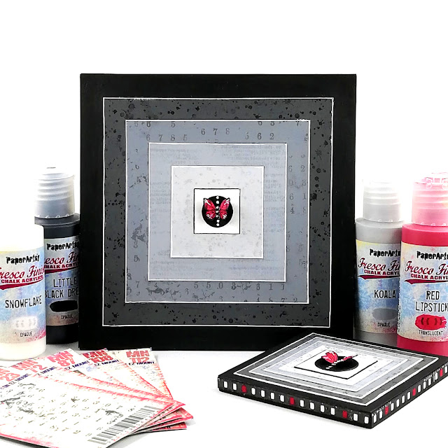
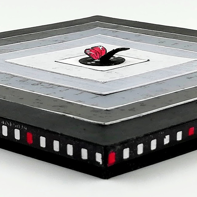
I've created an art block inspired by some of Frank Stella's paintings.
Frank Stella was a leading figure in the minimalist art movement being one of the first artists linked to this style of art . He was known for his use of geometric patterns and shapes that often had clear transition between areas of colour. His earlier paintings often featured squares and rectangles and it was some of these that caught my eye and served as initial inspiration for my project.
I've also kept my creative processes minimal - just painting and stamping which is in the main unusual for me as I often include a good few more in my work like crackling , adding texture paste, texture stamping, printing etc.
In keeping with Frank Stella's earlier paintings my art block would feature a series of squares that decrease in size from the outside in as that generally was what my viewing eye was seeing when I first saw these paintings. I know there's far more to Stellas paintings than what first meets the eye but as he said himself 'What you see is what you see'!
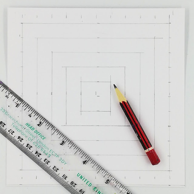
I drew out my design on a piece of PaperArtsy White Smoothy.
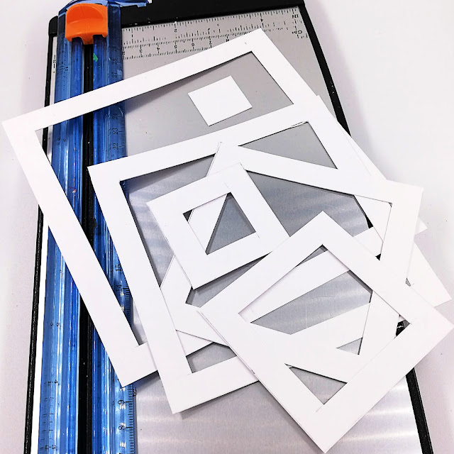
Then cut along the pencil lines of the squares so I had 6 'open' squares as I thought this would be the easier way to retain their straight lines when painting than if I tried to paint between the lines of the drawn out design.
An alternative option to drawing and cutting out your own squares would be to use nesting dies . (I don't have any this size)
I had always had a classic monochrome colour palette (black, white, grey) in mind for this topic as from my reading early minimalist art tended to be monochromatic with colour (if used) being just an accent. It just so happens to be one of my favourites too ;)
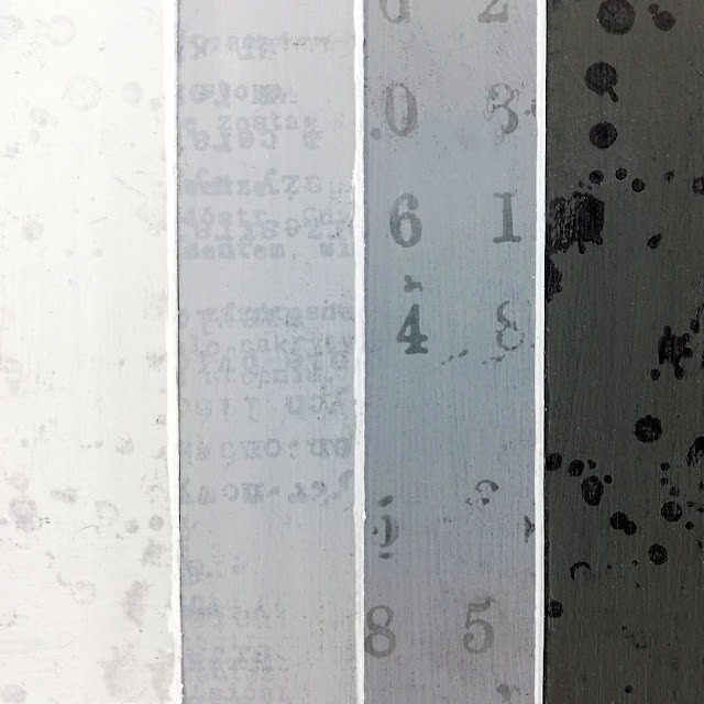
Now though I wanted each of my 'open' squares to have their own colour so when they come together there would be a clear transition of colour from one to the other. I also wanted the colours of the 'open' squares to flow from dark to light (outside in) so with these things in mind I looked to the colours in PaperArtsy's Grey family of Fresco Finish Chalk Acrylic: Snowflake (FF15), Concrete(FF63), Koala(FF141), Elephant (FF64), Slate (FF84), Little Black Dress (FF19).
6 squares, 6 colours = serendipity!

Frank Stella said 'a picture was a flat surface with paint on it - nothing more' and from what I could see that was true of his early minimalist painting's that had initially served as inspiration for this project but I liked the idea of adding some detail to my painted 'open' squares.
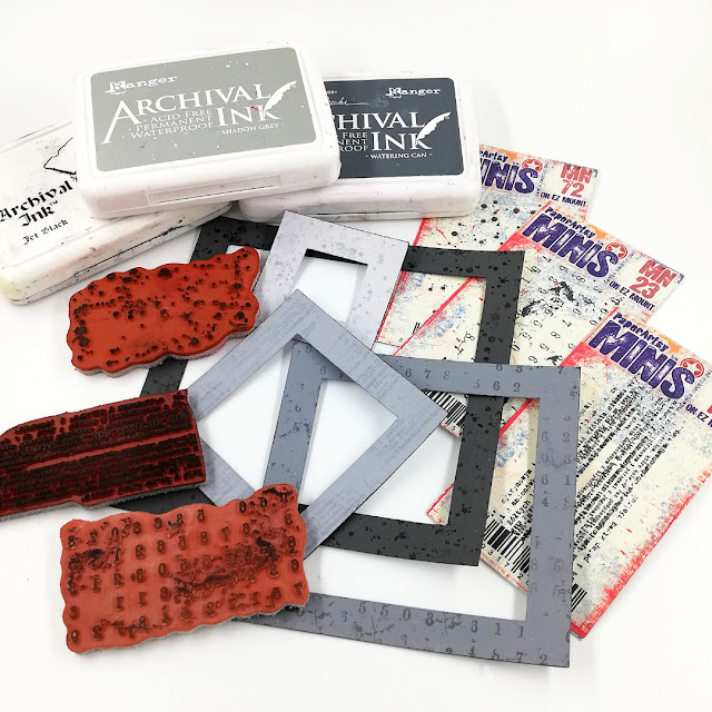
I selected a few Ranger Industries - Archival inks similar to the PaperArtsy Fresco colours I'd used so they wouldn't be too overpowering and 3 of the PaperArtsy Mini stamps (MN23), (MN72), (MN108) I felt would add subtle touches of detail in the form of text, numbers and speckles.
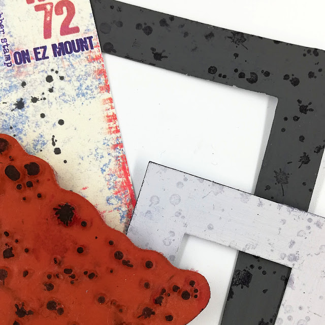
PaperArtsy Mini stamp (MN72) was teamed with Ranger Industries - Archival Ink (Jet Black) on PaperArtsy Fresco Finish Chalk Acrylic - Slate (FF84) and Ranger Industries Archival Ink (Shadow Grey) on PaperArtsy Fresco Finish Chalk Acrylic- Concrete (FF63).
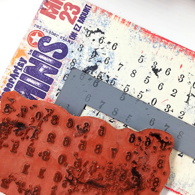
PaperArtsy Mini stamp (
MN23) with Ranger Industries - Archival Ink (Watering Can) on PaperArtsy Fresco Finish Chalk Acrylic - Elephant (
FF64).
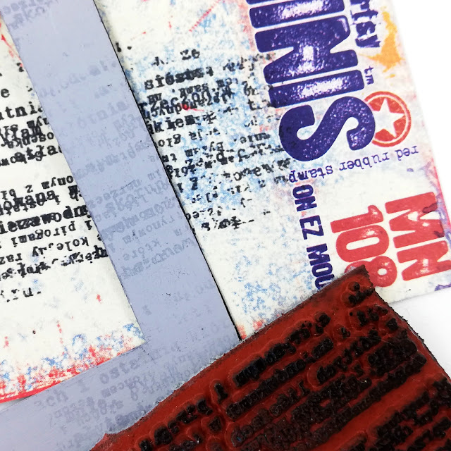
Finishing with PaperArtsy Mini stamp (MN108) with Ranger Industries Archival Ink (Shadow Grey) on PaperArtsy Fresco Finish Chalk Acrylic- Koala (FF141).
I left the PaperArtsy Fresco Finish Chalk Acrylic- Snowflake (FF15) and Little Black Dress (FF19) 'open' squares unstamped as as I thought that would work better in the overall design.
I'd be mounting the squares on an art block so considered how and if I could take the design around the sides of the block in a very minimalistic way.
I spotted PaperArtsy Mini stamp (MN87) film strip stamp and thought I could use one of the sides of the strip for this and the small rectangles would play to the geometric characteristics of Minimalism.
Extending the part of the stamp I wanted would allow me to create lengths that I'd cut to fit the sides of the block. The easiest way to do this was by using a stamping platform as it made stamp realignment much easier and far more accurate than if I used an acrylic block.
Rather than painting the card with PaperArtsy Fresco Finish Chalk Acrylic - Snowflake (FF15) prior to stamping I took the 'scenic route' and stamped the part of the film strip stamp I wanted, left the stamp and the stamped image in place on the platform then painted each of the small rectangles.
It didn't matter too much if I slipped and painted outside the lines as I was able to stamp over it with precision thanks to the stamped image and stamp still being where I'd left them after the initial stamping.
Admittedly doing it this way took a while but when I tried the way I thought would be quicker - painting the card first and then stamping I found I had to stamp and over stamp numerous times to get the 'black' I wanted even with a juicy ink pad so on balance I doubt there wasn't much to choose between the two regarding time taken.

Now I was ready to start bringing things together so my wood block was painted with PaperArtsy Fresco Finish Chalk Acrylic- Little Black Dress (FF19).
To help define the straight clean edges of the squares I caught them with PaperArtsy Fresco Finish Chalk Acrylic- Snowflake (FF15) before adhering them to the the block.
At this point although my project was looking ok the centre square was looking a little barren to me. I felt like it needed something...a focal element , but what exactly?? Mmm...
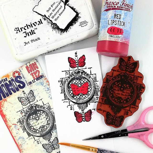
After some consideration I went with a butterfly (a really small one) and PaperArtsy's Mini stamp (MN112) was just the stamp to use as it's design includes 3 lovely little butterflies that I could choose from. I thought they'd look good in PaperArtsy Fresco Finish chalk Acrylic - Red Lipstick (FF160) and this would also be a great accent colour to the monochrome palette. Their bold clean outline took the 'fussy' out of cutting them out.
PaperArtsy Fresco Finish chalk Acrylic - Red Lipstick (FF160) is translucent so the stamping was visible through the colour. No need for any overstamping! .
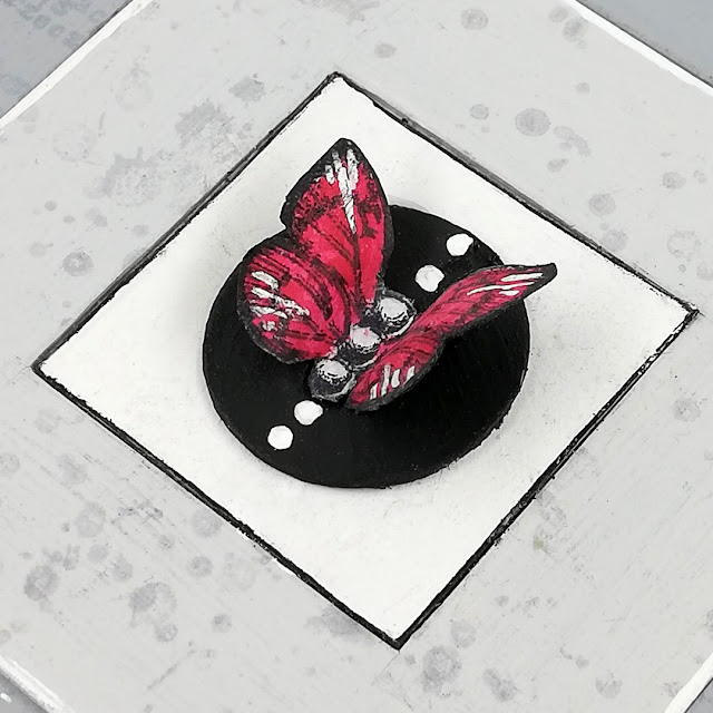
I added a few white highlights to my chosen butterfly rested it on a circle (another geometric) painted with PaperArtsy Fresco Finish Chalk Acrylic - Little Black Dress (FF19) marked with a few white dots and set it down in the centre square.
Carrying some of the accent colour through to the occasional small rectangle on the side strips helped unify the overall composition.
I couldn't resist making a mini art block too. Well it is a 'Mini'malist topic after all ! ;)
The mini was created in exactly the same way as the larger one but rather than drawing and cutting the squares myself for the mini I used square stacking dies instead. (I do have some this size.)
I think they make for quite a complementary pair!
I've enjoyed creating for this topic and learning more about some of the Minimalist artists and the Minimalism art movement. I touched on it when I studied art history back in my college days so it was good to revisit.
I'm a grungy mixed media girl at heart so it was a refreshing change to limit the creative processes I used. By creating with geometrics and monochrome (both often used in my creativity) I never really felt overwhelmed creating in the minimalistic way I have.
We always love when you join us and create your own art inspired by our topics. So why not give Minimalism a go even if it's not your usual style of creativity and don't forget to share what you make either in PaperArtsy's Facebook group "PaperArtsy People' or use the hashtag #PaperArtsy on Instagram.
Thanks for spending time with me today/ tonight.
Keep on Creating
Amanda
x











2 comments:
This shows that there is beauty in simplicity. Didn’t say it was easy! Very creative and thoughtful. I love it.
thank you so much Anonymous xx
Post a Comment