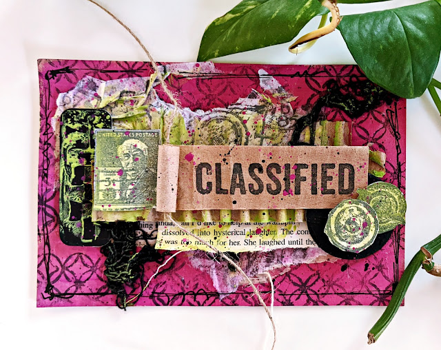
Hi everyone, it's Kate (Kate Yetter – Musings, Tea and Drippy Paint) with you today, and I'm here to share with you a fun piece of mail art full of layers, texture and color.
Knowing what colors work well together on the color wheel is something I have always struggled with. I can't tell you how many times I have created a project, picking colors that I love, and then half-way through it, I can't figure out what is off. Only to find out later it was my color combination.
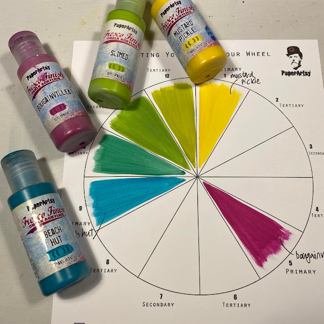
Since venturing into watercolor painting, I have found out the importance of color theory and working with a limited color palette. The two colors I am working with today work together beautifully, because they are directly opposite each other on the colour wheel.
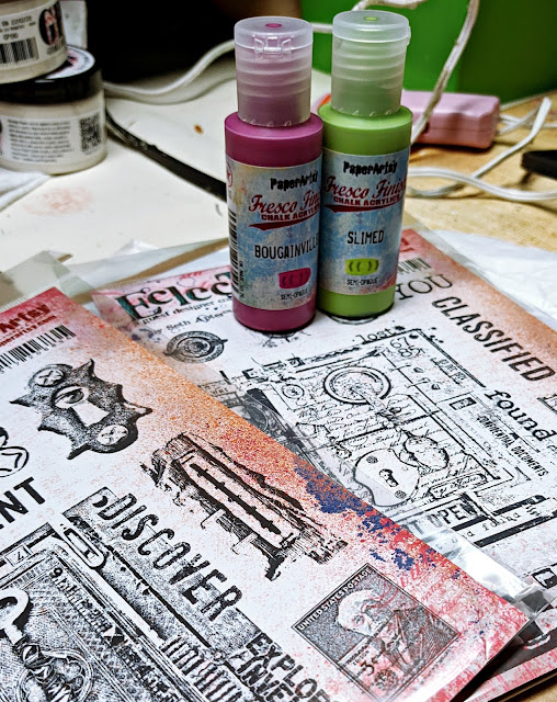
To start off, I gathered my supplies. Stamps: ESA07, ESA08 Fresco Finish Chalk Paints: Bougainvillea and Slimed.
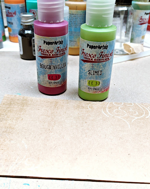
The background for my mail art is a piece of patterned paper cut to 3 1/2 x 5 and backed with a cereal box to give it some stability.
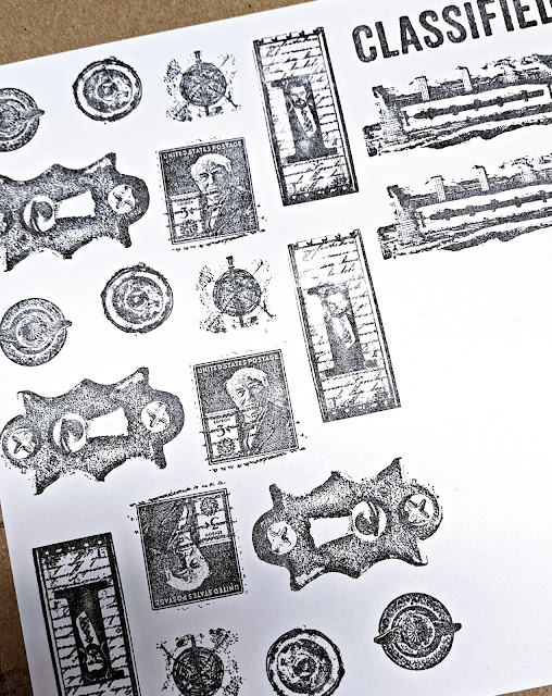
I selected various images from my stamp collections (ESA07, ESA08) and stamped them onto a piece of white cardstock. I like to have plenty of images to pull from once I start the decorating process.
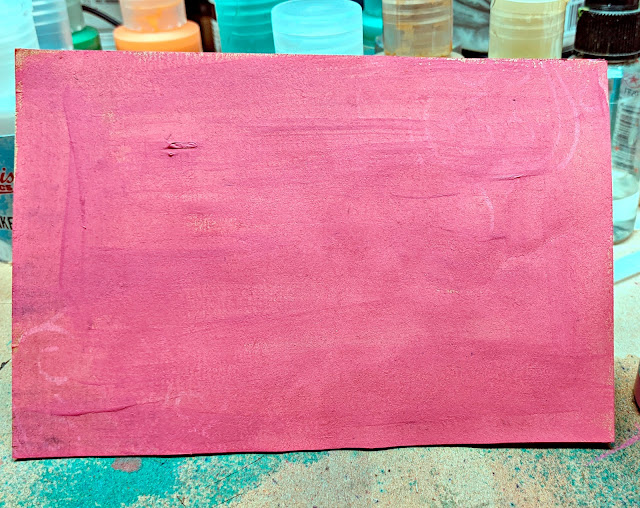
I covered my background in Fresco Finish Chalk paint (Bougainvillea). Since I only had two colors to chose from, I had to decide which was going to be my accent color and which one would be the primary color. It was a difficult choice but since the Slimed paint was so bright, I figured it would make a great eye-popping accent.
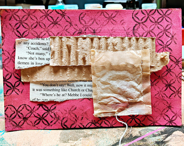
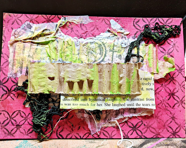
I chose a background stamp to get started on the texture. Next, I layered some old book paper, cardboard and a tea bag. I like how they add more texture to the piece.
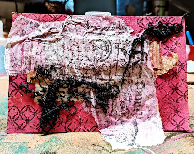
While doing this, I noticed some white tissue paper on my desk that my PA products came wrapped in. I wasn't planning on using it but I love the transparency of tissue paper so I stamped it and used clear glue to attach it to the front. The wrinkles just add more character in my opinion. I went a little heavy on the glue so I used a bit of scrap fibers to cover up the blobs.
After tearing away some of the excess tissue paper, I layered a few more pieces of book paper and cardboard. I lost what I originally put down after adding the tissue paper. Now came the time to start adding my embellishment color Fresco Finish Chalk paint (Slimed).
When arranging the paper, I like seeing little bits of each thing that I lay down, so I am careful to make sure some is peeking through even if it is a little.
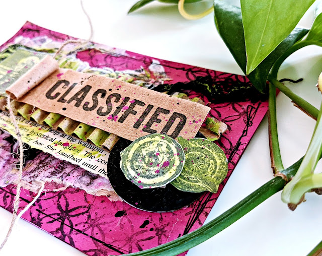
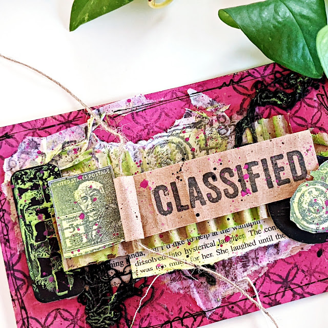
The final part is adding all the embellishments. For me, that is stamped images. I carefully take the time to place each image in a way that pleases my eye. I completed the piece by splattering black gesso and Fresco Finish Chalk paint (Bougainvillea).
The Seth Apter stamp sets (ESA07, ESA08) that I chose, have so many fun little elements that can be used to embellish. When I started paper crafting, I thought I needed all the newest and greatest metal and paper embellishments. I still have a whole craft room full of them but I never use them. Now I find that I love using soley stamps to embellish.
Believe it or not, I was sick with Covid when I made this project. I was surprised that it turned out to my liking despite how I was feeling. There is something to be said for working with inspiring products. I know it would have turned out very differently if I had a stack of stamps to work with that didn't strike my fancy.
Overall, I would have liked to have spent more time layering stamps and experimenting with the two colors. Maybe I will give this color combination another try when I am feeling better. There are so many possibilities. What about you? What color would you use to embellish vs put in the background.
Until Next Time,
Kate










4 comments:
Fantastic colour choice - love your project
Amazing colour combinations! I love what you have created Kate x
Would never have put those colours together! Thanks for the inspiration!
Love your signature style of layering and these awesome pops of color Kate!
Post a Comment