Hi everyone, Seth here. Happy to be sharing my third post as a
guest designer on the PaperArtsy site. I am a mixed media artist from
New York City and love to create with a variety of mediums and using
a multitude of techniques. My work includes painting, assemblage,
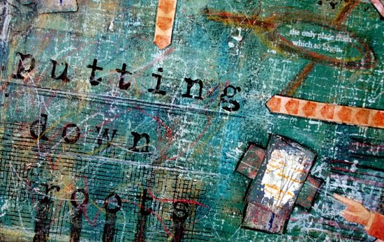
collage and book arts. Today I am highlighting a page from my
journal, which is the place I am most free to experiment, develop
ideas, and simply play.
My journal is a 9 x 12 inch wire bound book filled with 140lb watercolor paper. I start every page with a layer of black gesso as I love the depth it provides when I add more layers. And for me, layering is what it is all about. if you do not have black gesso you could start with Little Black Dress.
I began this page by collaging a bit of
torn paper to the surface, thereby adding texture and dimension
before I even add any paint. The surface was then covered with loose
layers of Caramel, Inky Pool and Concrete Fresco Finish Paint. The
evergreen color was made by mixing Caramel and Inky Pool. One of the
best qualities of this paint is that it is a highly matte finish.
This allows me to use any and every writing tool on the painted
surface. Once painted, I collaged a small vignette in the corner that
included a black and white photograph of the bare branches of a tree
along with some hand-altered paper.
This small addition determined the
direction of the entire journal page.
My next step was to create a second
collaged vignette using another black and white tree photograph. Once
adhered to the surface, I used a series of PaperArtsy rubber stamps
and a variety of ink pads to add detail to the surface. I did not use
an acrylic block as I wanted the background to look grungy. The
stamping adds a great deal of dimension to the journal page. The
stamps I chose were from the PaperArtsy sets Hot Picks HPXT01 and
Eclectica ESN03, as well as Minis 72. I also scribbled on the page
using wax pastel crayons.
 |
| HPXT01 |
 |
| ESN03 |
 |
| Minis 72. |
Once the background was completed, I
added more collaged elements, additional mark making, and rub-on
letters to share the sentiment of the page: putting down roots.
The background and marks were
intentionally made randomly to reflect the chaos that sometimes
occurs in life before we choose to settle in and settle down.
Thanks a million for taking the time to
follow along!
Seth
A huge thanks to Seth from all at PaperArtsy, we adore this page. The use of photographs is a wonderful idea, even more so using trees. There is something very special about tree images, they speak to us. These layers of paper and paint and stamping are so deliciously grungy.
We
would love you to join in with our monthly challenge. If you are
inspired by any of this month's guests who have blogged between Nov 1st 2014 and Nov 30th 2014 then join in and link up your creativity HERE. You will go in
the draw to win a voucher to spend on products of your choice from
the PaperArtsy online store. You need to add your link by 19:00
(London time) Nov 30th 2014


15 comments:
Great details on this fab page, Seth.
This is glorious, Seth. It has a tremendously masculine feel, and lots of texture and depth. I love it!
Lucy x
Stamping, collage, and textures... great work! Right up my street.
Thrilled to see you back Seth...fantastic page!
Great layers as always Seth!
I love all the layers & the little photo was a wonderful addition.
Stunning as always, Seth! X
Incredible work Seth. I wish I was a fly on the wall watching you work.
Great page! Gorgeous paintings and wonderful the layers.
I was inspired xx
A fabulous page!!!
I really love the little tree elements!
Gorgeous colors and marks and the tree with roots is just perfect Seth! Truly a very inspiring journal page! Although, I'm thinking you need to pull it out and mount it on canvas! ")
Thank you for sharing!
How is the white grid background made?
Wonderful work and stunning page, full of tiny details absolutely gorgeous... I love it!!! Coco x
Wow awesome journal page, love the whole grungy effect, amazing. Happy Creating :-) Kezzy xxx
Post a Comment