Showing posts with label watercolour. Show all posts

Thursday, 14 March 2024

2024 Topic 2 : Mattints {by Victoria Wilding} on the PaperArtsy Blog


Hi everyone

Victoria here with you today.

Since I was last here with you on the PaperArtsy blog, I’ve squeezed in a house move and built a new craft space, so I can’t wait to get stuck into some creative play with you today. I’m really enjoying having all my supplies back on hand and PaperArtsy HQ have been busy creating colour magic with the new Mattints, so let’s take them out for a spin and see what they can do. 

The Mattints topic immediately had me thinking about exploring all the different ways you can use them. After all, this is the first time I’ve had the product in my hands and I was keen to figure out how they would fit into my mixed media makes. After watching Leandra’s Facebook live in the PaperArtsy People group, I was inspired to create a journal page from a series of square swatches, which would let me play with combining the Mattints with other supplies.


I love the effect of all those swatch squares, laid out next to each other on the journal page. Not only is it a visual feast with all the textures and colours, but it also perfectly demonstrates how versatile the Mattints are to use. And this was only using a handful of different combinations and techniques! Read on for all the details of what I’d did to bring this journal page project together.


My first task was choosing which PaperArtsy products I wanted to include in the project. 

The colour palette was the first selection I tackled by picking out three Mattints. I wanted to pick some colours that would play nice together, so I went with a blue (Shark), a pink (The Pink) and an orange (Squeezed).

I knew I wanted to include some text as a background element to some of the swatches and decided that PaperArtsy HotPicks Printed Tissue (PT01) was a must. I also picked Kay Carley’s stamp set EKC54 and her stencil PS061, for some floral focal points. 

Finally, to give some extra colour variation, I decided to include some other PaperArtsy colour mediums to mix with the Mattints. I selected PaperArtsy Infusion in Are You Cerise and PaperArtsy Fresco Finish Chalk Acrylics in Eggshell. 


The first step of my project was creating all the squares to experiment on using the Mattints. I cut some smooth white card using my paper cutter, creating 12, 1 3/4 inch squares and 1 larger square for the main focal point measuring 3 1/2 inches square.

Next I put my thinking cap on and wrote on the back of the cards, ideas for different supplies to combine each Mattint with. I don’t end up using all of these in the final project, but it’s left me with some things to try out next time!


With the basic prep done, it was playtime. I love swatching and learning about new supplies, so this bit was going to be fun!
 

Mattints and Printed Tissue

Mattints are a matte effect tinted glaze and they can be used to both colour and stick. They have a toothy and slightly tacky texture, so one of the first things I wanted to test them out with was some PaperArtsy Printed Tissue. I started off by applying a generous coat of the Mattint (Shark) to the card. I then placed the tissue paper over the top and added another coat of Mattint over the top. Whilst it worked well at generally holding the tissue in place, I did find it peeled up slightly at the edges and applied a bit of extra glue to hold it down. I really liked how the colour builds with each layer of Mattint applied, so you are in total control of how vibrant the colours are on your final piece. So my tip is, apply it liberally so you get good adhesion.

Mattints and Infusions

As a watercolour addict, Infusions are a colour supply of choice for me. They are made to shift with water, so I knew combining them with the Squeezed Mattint would require some thought. I decided that I wanted to test how much the colour shifted if I used the Mattint as a glaze, over the top of the Infusions. I sprinkled some Infusions (Are You Cerise) onto a square of card and spritzed with water. Once dry I applied a coat of Mattint (Squeezed) with a paint brush. The key to this is a gentle, light hand! The walnut crystals in the Infusions were definitely shifting, so go carefully to avoid stripes.

Mattints and Ink Sprays

With their matte finish, I wanted to test out how other mediums might sit on top of a coat of Mattint. I applied a coat of Mattint (Squeezed) to the card and let it dry. Then I used a Distress Oxide Spray (Weathered Wood) for a spray pattern in a contrasting colour. Because they are matte, the spray grabbed onto the surface nicely.

Mattints and Coloured Pencils

Continuing with the idea of applying mediums on top, next I wanted to test out how coloured pencil would sit on top of a coat of Mattint. I stamped one of the florals from stamp set EKC54 on the card and then applied a mix of Mattint (Squeezed & The Pink), blending the colours with the brush. Once dry, I coloured the florals with coloured pencils. I was pleasantly surprised at how smoothly the colour went down, and again, as the finish of the product is matte, it make sense that offers some tooth for a coloured pencil to grab onto. The Mattints are definitely going to be great for layering in mixed media pieces. 


Mattints and Grunge Paste

I scraped out some PaperArtsy Grunge Paste onto my craft mat and squeezed out a blob of Mattint in Shark, on top of it. I then mixed this with a palette knife. I’ve had my grunge paste for a while and it was actually a little bit dried up as I scrapped it out, but mixing it with the Mattint reconstituted it nicely making it much easier to apply through stencil PS061, creating a leafy floral texture.


Mattints and Watercolour

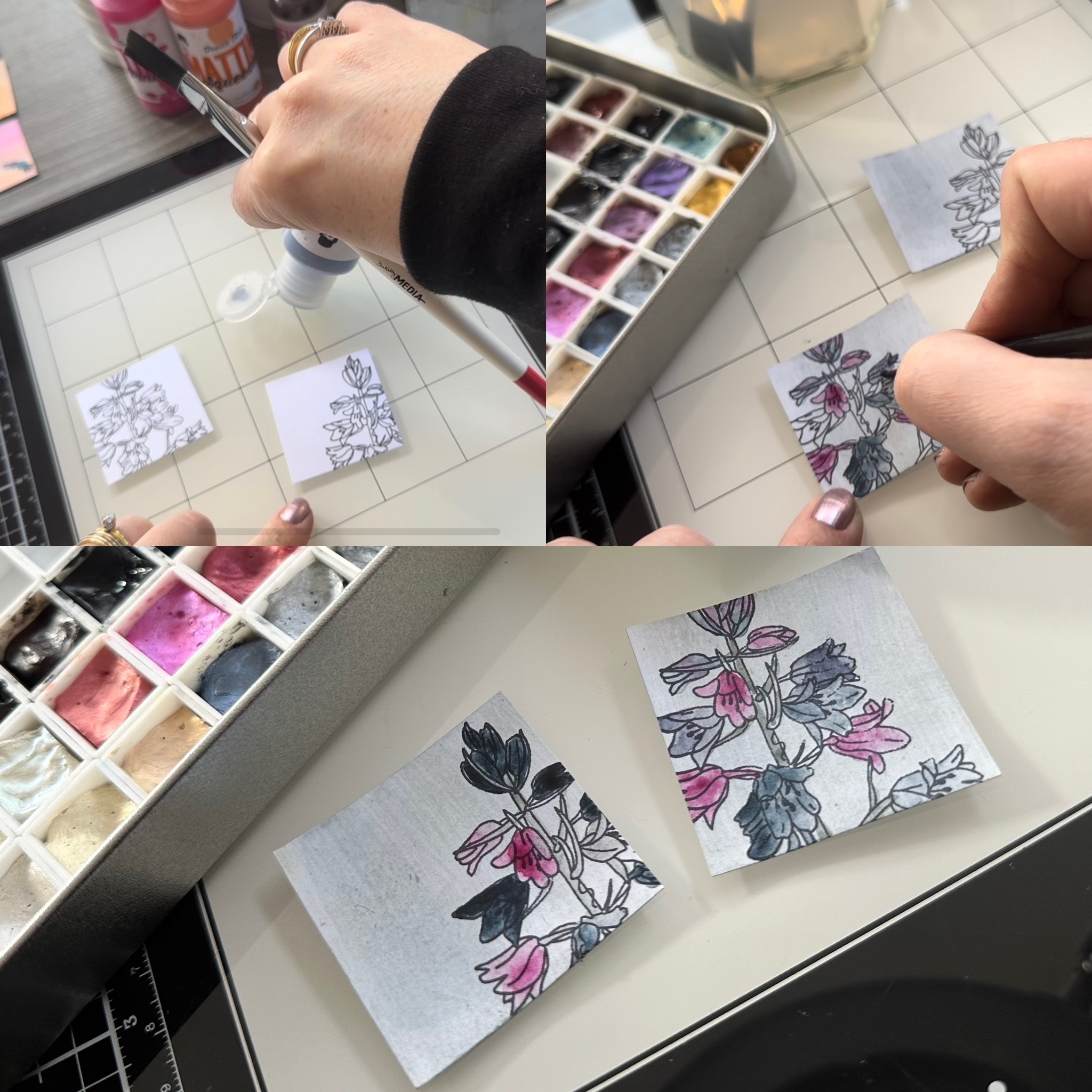
Watercolours are a medium I always come back to, so of course I was going to test out how they layer on top of the Mattints. I stamped one of the florals from stamp set EKC54 and coated the square with Mattint in Shark. I then painted the flowers with watercolours, which were so easy to lay down on top of the Mattint. This really excites me for future mixed media projects!  You would assume a sealant like this would prevent my watercolour from staying in place, but once again, that matte feature of this product stands out as a feature that can be explored in many ways with companion products.


Mattint and Fresco Finish Chalk Acrylics

Finally, it was time to colour the main focal point. I wanted to try out the Mattint as a colouring medium both on it’s own and mixed it with a neutral, PaperArtsy Fresco Finish Chalk Acrylics in Eggshell, to give a different tint. I applied this to the stamped image and finished the floral by colouring the stem and leaves with coloured pencil. I love the subtle colouring effect that you can achieve with Mattints. Whilst the colour looks very dark in the bottle, when applied it is actually very subtle. It gives you all the options as the maker, as you can continue layering for a darker colour if you wish.


With the squares all complete, I added the final finishing touches. I distressed some of the edges on each square and added brown ink using my blending brush.


Then I backed each square onto black paper, to provide some more contrast once assembled on the journal page. I didn’t measure this and just cut them by eye, using my trimmer. In hindsight, measuring them out would have provided a more exact finish when sticking them into the journal. 


Finally, I placed all the squares on the page, placing the large square in the middle and arranging the smaller ones so there is a variety techniques and patterns on each side. I secured them with double sided tape and with that, the page was finished. 


I know Mattints a whole lot better, thanks to creating this journal page. Playing with the different techniques and mediums on the little squares really increased the permission to play. The small scale and easy replacement if needed, stops creative fear in its tracks. 

The finished layout in the journal is simple, but really effective, due to the mixture of colours and textures on the finished piece. I’m definitely excited to use Mattints more, in future projects, especially knowing how well they work with some of my other favourite mediums. They’re certainly going to be a great tool in my mixed media kit. 


Wishing you a creative, happy week!

Victoria.


If you’d like to watch me putting this project together, hop over to my YouTube channel on the link below, where I talk you through all the steps of this project. 

Monday, 16 August 2021

2021 Topic 10: My Favourite Colour TOPIC INTRO

2020 Topic  10 - My Favourite Colour


Hi everyone, Keren here. My favourite colour ? Well if we were talking MY favourite colours- it would be a mix of  Red Bus, Banana, Aquamarine, Cerise and...make that the whole rainbow! Without wanting to want to teach you all to suck eggs, I thought I'd pop up the colour wheel and use it as a platform to talk about colour and ideas with colour. We all get times where the ideas aren't flowing and perhaps we're in a colour rut. Maybe bookmark this post and when you need a creative poke, try out a new collection of colours and see where it takes you creatively.


Let's start with the basic combinations; primary. zingy reds, bold blues and bright yellows. When I'm thinking about that selection of colours, I'm drawn to Mondrian - a great example of a primary scheme.


I thought this was a beautiful example- with cream rather than yellow and rust rather than red specifically.


Wondering which colours would work?


If we go to a more subtle collection of colours - something like the secondary scheme: using green, purple and orange.


Corrie Herriman did these fun tags using a perfectly secondary scheme.


There's plenty of PaperArtsy colours that might work.


There are a couple of options with tertiary schemes. We'll continue with the triadic schemes.


Firstly, the Red/Purple, Blue/Green and Orange/Yellows.


This canvas from Elizabeth Borer is delightful; a plethora of colours with a slug of this tertiary scheme.


I love the almost neon quality of the colours in this trio of amazing tags.


Or the Blue/Purple, Orange/Red and Yellow/Green.


This beautiful journal page from Linda Cain has the triadic scheme with some extra colours. I haven't stuck rigidly to the specific schemes but I hope it's giving you ideas.


Corrie Herriman has some small art journal pages in this blog post, sticking more closely to the original colour scheme I listed.


Those schemes were all triadic (the colours being at equal positions away from each other on the wheel). Now we can look at complementary colour schemes; anything that that has the colour directly opposite it on the colour wheel.


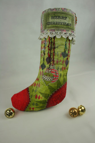
This sumptuous quilting stocking by Darcy Wilkinson shows just how impactful two colours can be (of course you can add tones and shades too).


Then there's split complementary.. think of a 'y' on the colour wheel..


These stacked wooden blocks from Lotte Kristenson are wonderful and this is also one of my favourite Christmas colour schemes too!


We can also think about analgous colour combinations; colours that are next to each other in the colour wheel.

Using pink, purple, orange and red makes this an analgous scheme of sorts (minus the blue) and Lauren Hatwell dials up the fantastically quirky style too.


We can't forget about the monochromatic colour scheme either. A simple enough concept although making choices that include colours with the same hues will give the most cohesive effect.

Who can forget this wonderful printed collage piece by Pam Thorburn, making an arresting image of a woman?


Ruth Mescall created an intriguing series of dominoes (using blue also) and it's amazing how just slight changes in hue can still create difference.


The last (although this list isn't exhaustive) group of colours - which you'd be well within your rights to argue with me that these aren't colours is a grayscale scheme.

Amanda Pink was the first artist I thought of for this scheme (and the monochromatic one for that matter). Here's an example (with a little blue sneaking in).


I was initially tempted to approach this colour post focusing on all of our stamp designers and seeing what their typical colour schemes are- and whether we could adequately pigeon-hole them! Think of one of your favourite designers. Can you picture a typical scheme from them? Maybe we'll look at that another time. 

If you fancy creating your own colour schemes for future reference- how about grabbing this superbly useful set designed by Everything Art which you could bundle together to make a reference pack of colour schemes.


Colour brings...colour to our lives!! Imagine a greyscale world; it wouldn't inspire us in the same way. I hope that thinking about combinations of colour might inspire you to try a new combination. I certainly want to try and dial it down with the colours I use, but I can also feel some neon colours calling my name!

If you want to create along with us while we explore this topic, please share your makes on our social feeds so we can follow along. Instagram @paperartsy or why not join us and post in the PaperArtsy People Group on Facebook. Make sure you tag us in your contributions, we love to see what you get up to in your creative world!