Hi everyone, Dounia here with a new colour focussed topic!
Throughout 2022 and 2023, we featured colour topics based on colour wheels with Fresco paints to inspire you to try colour mixing and making your own wheels and colour combinations. This month we are pulling it all together in ONE Master Colour Wheel, hoping to show you the extensive potential of just one colour wheel. Yes, it was really hard to choose only 3 colours for this from the fresco range! But armed with one Seth Apter, one Tracy Scott, and one core fresco colour, we have a summer-inspired vibe to give you over 100 combinations - pretty amazing!
Using Fresco Finish Acrylic Paints in Butter, Candy Floss and Aqua Duck Egg as our starting colours, we have built for you a summer-loving wheel, of ice-cream-ish colours.
To revisit details presented across the 5 previous colour topics, this introdutory blog post will detail all the colour schemes you can create from this one wheel, offering a wide range of options and atmospheres. To better illustrate this, our amazing team of bloggers has selected some of the possible colour schemes, and of course will be sharing their projects with their chosen colours over the next few weeks. Here is the star of the show:the MASTERWHEEL
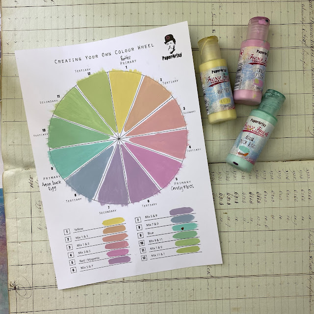
I will add here a little disclaimer: as most of you are probably aware, photographing and displaying on screen colours true to reality is hard! Even doing our best with lighting and exposure, there is generally a slight colour shift between a project and its picture. For example, here is our wheel photographed and scanned:

The reality is somewhere inbetween the two. To give you the best idea possible of the colour schemes, I have done my best to match the reference colour swatches as seen on my screen with the physical wheel. However, some variation is to be expected and, I hope, forgiven!

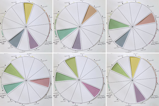
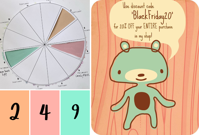
The most famous and simple colour combination: complementary colours! We explored in more details in 2022 Topic #1: Opposites attracts. Picking 2 opposites on the colour wheel is a sure way to achieve the greatest of colour contrasts. Just be careful to not mix them (that is how you make brown by the way!). Our masterwheel will give you 6 different possibilities:

Opposites are always going to offer a striking, high impact result with some energy, even with softer colours. Butter, true to its name, is a medium yellow, creamy with no trace of acidity and its opposing purple is quite desaturated and muted. With two light colours, the contrast is softer than with in the saturated classic primary wheel where the purple is naturally much darker than the yellow. The resulting combos is delicate and soothing, relying on temperature difference to create interest and impact.
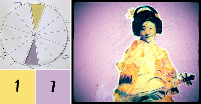
Picture by Wonderlane
This wheel might look like icecream, but opposites always offer punchy colour contrasts. Candy Floss and its zingy green opposite create a fresh and fun combo, great for flowers and other summer fun. As they are still moderate value colours, the resulting scheme is bright without being too loud; attention grabbing without punching you in the face with colour!

Picture by David~O

Let's add a third colour and a little bit more nuance and complexity in our palettes with the split-complementary scheme. It is comprised of one of the 12 colours of the wheel, the base colour, buddied up with the two colours either side of its direct opposite, creating a 'Y' or a thin triangle on the wheel. Learn all about it in 2022 Topic #8: Split complementary! You have 12 different possible combinations within one wheel:
Flyer by Glitter and Frills
Of course, this is far from the only possibility. In this example, all three colours are present in pretty much equal amounts, but the base colour (1) is very distinctly separated while the split-complementaries (6 & 8) are mixed in one colour block. The colour contrast between the two blocks is maximal but so is the 'texture' contrast. The uniform and flat background highlights the shifts and shadows of the main subject.

To create even more interest and complexity in a project, you can develop the split-complementary scheme even further with the double split-complementary, where you add the two colours beside the split ones explained above. Leandra played a little with double split-complementary in her Triad post with JoFY stamps. Sneaky, sneaky! With one wheel, you get another 12 possible combos:


Art by Susan Murtaugh

Keeping on playing with 3-colour schemes, let's explore triads or 3 colours evenly spaced on the wheel. Those colours can separated by 3 wedges, 2 wedges or 1 wedge for 3 different atmospheres. You can see more those versatile combos in 2022 Topic #14: Triads.
The most classic triad is the equidistant one, where the colours are separated by 3 wedges, covering the whole wheel. This is a very balanced scheme, offering a lot of clean colour contrast as the colours are as far as possible from each other. As all parts of the wheel are represented, this combo is quite diverse and impactful. One wheel yields 4 3-wedges triads, one made of the 3 primary colours, one made of the 3 secondaries and 2 made of tertiary colours for fresh to complex looks.
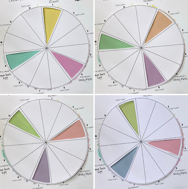
On our summer wheel, the primary triad is peppy fun, while the secondary one is softer and richer. The 2 tertiary triads are unexpected and full of subtle and complex half-tone for more original palettes. The colour contrast is strong but less than in a complementary or split-complementary scheme, limiting the risk of clashing while still making the colour pop against one another.
Art by Marcello
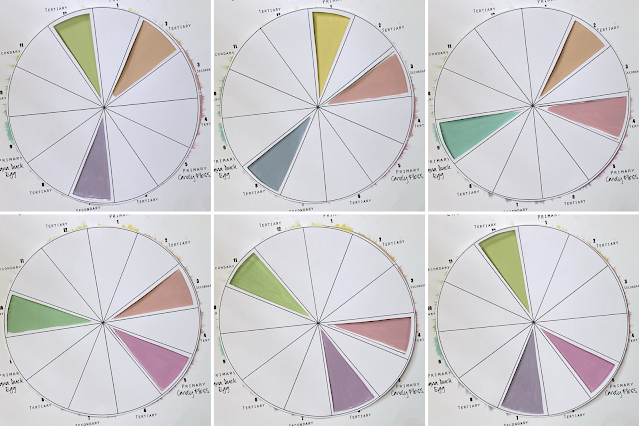
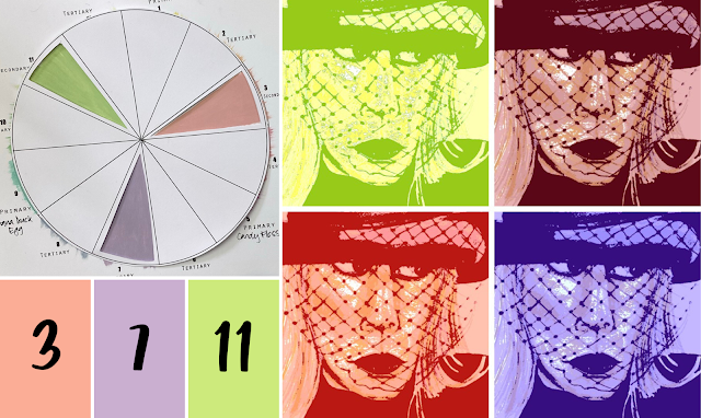
When reducing the spacing between colours to 2 wedges, you end up with two opposites and a third colour balancing both. It is an easy way to bring some softness to the classic complementary contrast. In this scheme, the colours vibes differently when taken in two by two as the to complementaries contrast strongly against each other while pairing much more mildly with the third colour. This creates a lot of interesting colour plays and atmospheres in your palettes. One wheel gives 12 possibilities for this scheme:

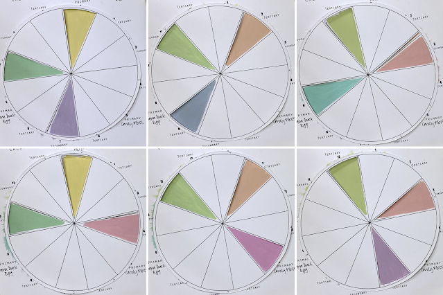
Focusing on half of the wheel, this scheme creates a tighter colour range in your work. You will always have two colours of a temperature against one of the other (2 warm colours for 1 cool, or 2 cool for 1 warm) which is another type of contrast. For this portrait, the artist took advantage of that: the warm colour (3) is on the focal, catching the eye and setting it apart from the other elements in cool colours (6 & 9). We can also notice that the two complementaries (3 & 9) cover the most space with the third colour creating a bridge and providing balance.

Art by Toon F-X based on a picture by Mickael Casol
Finally, with only 1 wedge between your colours, colour contrast is greatly reduced: you are ignoring more than half your wheel! This scheme is perfect for layering similar tones, creating texture and for softer atmospheres. Harmony is generally easier to achieve as the risk of colours clashing is quite low. However, achieving great contrast with just colour will be hard, and you will probably need to involve value (light/dark) and/or saturation (bright/dull) to create a greater impact. One wheel offers 12 possible combos:


With such a tight selection of colours, a lot of the possible combos involve only warm or only cool colours. This is a great opportunity to explore gradient and soft transitions. The colours of our wheel are all of the softer, lighter side, with little value contrast, perfect for harmonious palettes. For example, using a warm combo, it makes for a beautiful gradient sky. To still create impact in this photograph, black is added to stand out against the soft tones.
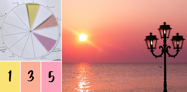
Picture by LadyB
Here is another example going the opposite way with a completely cool triad. This time pretty much nothing adds contrast which allows us to focus on the colour variations. This enhances the texture effects creating interest among the colour harmony.

Picture by Rookuzz..

We are now entering the land of 4-colour schemes! In a tetrad, there are two pairs of opposite colours. A 12-segment colour wheel will create 3 types of tetrads: a square, a rectangle and a slim rectangle, depending on the space between the pairs. You can find more details in 2023 Topic #2: Tetradic Colours, as well as some tips to tackle them!
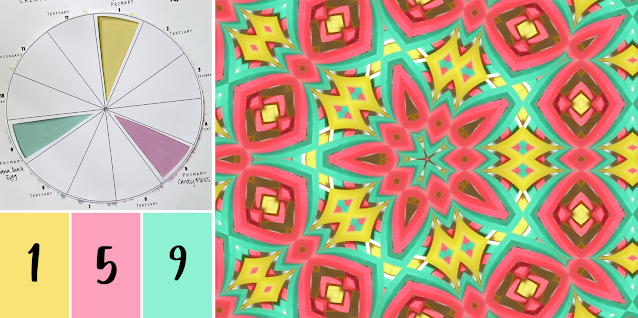
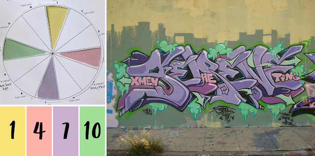
As we know, the further apart two colours are on the wheel, the more they will contrast. For 4 colours to be the furthest apart they can be, they have to be equidistant on the colour wheel, and separated by 2 wedges, creating a square. This is a very balanced and contrasting scheme. 3 possible combinations are possible within a wheel, each composed of a primary colour, its secondary opposite and 2 tertiary colours:

Square scheme are very diverse in colour, covering the whole wheel and might be a bit tricky to make work without clashing! In our wheel the generally soft, and sometimes muted, colours help reduce this risk and make the combos easier to use. A little tip: a great rule of thumb is to not try and use all the colours in the same quantity. Here for example, the yellow-purple complementary pair (1 & 7) cover the most space. The yellow (1) is in the background, creating contrast with the purple (7) main word and making it stand out. The second pair, pink and green (4 & 10) are less present, appearing only in details and embellishments to add interest and complexity.
Picture by A Syn

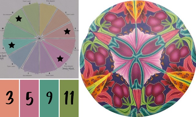
A rectangular scheme has two group of close colours, that will often be separated into cools and warms. An easy way to handle this tetrad is to allocate one of the groups to background and one to the focal. The two colours in a group will create strong and interesting variations in between them while contrasting sharpely with the other group. This is obvious in this abstract artwork where the cool group (9 & 11) provides the backdrop to the warm volutes (3 & 5).

Art by Rebecca L. Daily
A more blended use of the 4 colours is of course also possible, like in this digital fantasy portrait. Here all the colours are used together in a gradient to create highlights and depth. However, the warms (1 & 3) are still contrasting against the cools (7 & 9) to lead the eyes to face and the center of the flower.

Art by Alan
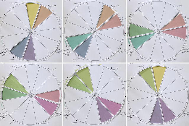
A classic use of this scheme is to have the adjacent colours together in a colour block. The close colours will create variations and texture within this block, while contrasting nicely with the other colour block containing the opposite colours. Maximum contrast with some subtle harmonies!
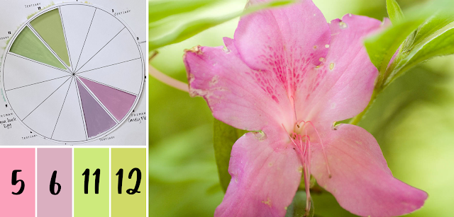
In this double-exposed picture, the colour blocking
is the same: the adjacent colours are together to create relief in a block. However, the colour zones are random and spread out, with fuzzy borders,
resulting in a completely different style and impression.
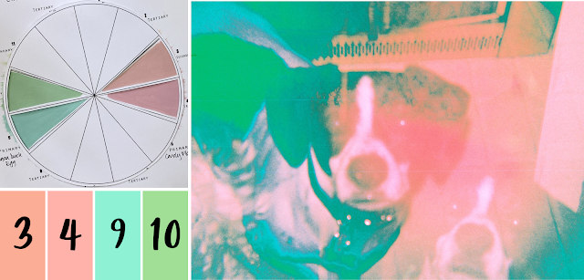
Art by J.B. Hill
Of course, the opposites colours do not have to be separate, you can play with whatever combination you like! In this gorgeous sunset, the 4 colours blend together in an soft gradient moving gently from warm to cool tones.
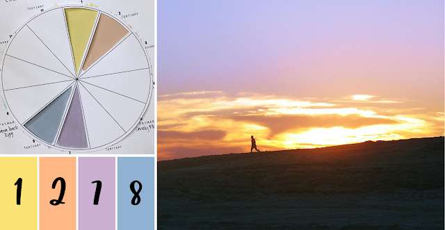
Picture by Mark Siebels

As you have seen, from one wheel, you can create a total of 73 different colour schemes, from simple to more complex, cool to warm, soft to punchy. That's already a lot of possibilities and hours of potential fun! But maybe you have not found the one that is just right for you and your project. Well, it might be time to play with value and saturation, as explored in our 2023 Topic #5: Tinged blue.
While we played mainly with blue in that topic, all the concepts can be applied to any and all colours of your wheel! Here are some examples with colour #9, the pure Aqua Duck Egg. To change the value, or lightness, of your colour, you can add some white to it and create a whole range of tints. On the flip side, you can add black and obtain new shades. If you want more muted and sophisticated colours, try lowering the saturation of your starting colour by mixing in grey and creating tones.

Tints, being lighter, make for softer looks and gentle atmospheres. They also reduce the risk of colour clashing and help create subtle variations. For example, Butter (1) is already a creamy yellow but a full background of it would still be quite 'in your face'. However, in the tint version, it makes for a warm and delicate page.

Art by Playing with Brushes
Most colours we see everyday are natural tones, containing a little bit of grey. This By contrast, fully saturated hues are attention grabbing and can easily appear garish if not balanced with more neutral colours. Think bright packaging, Pop Art or Barbie! Creating a more relaxing atmosphere, visibly toned down colours are often considered subtle and sophisticated, and are associated with luxury and comfort. In practise, tones created using the same grey are sure to play well together, with no clashing!
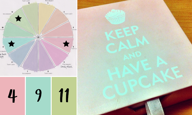
Picture by Jamie
Shades are the darker colours, often described are deeper or richer. They make for more refined, grown-up but also masculine atmospheres. They are amazing to create shadows and depth in your work and are perfect for a touch of mystery!
Art by Carol L Simmons
Those are only a few example as you can create a dozen tints, tones and shades of each of the 12 colours of the wheel! We hope to give you a little tester to get hooked on colour mixing!
For more information, examples and inspiration, do not hesitate to revisit the introductions for those topics as well as the beautiful projects by our blogging team!
For this introduction post, I had the find picture displaying the colour of our chosen wheel. While not easy, I had a lot of help in the form of the Multicolor Engine by TinEye Lab. With this picture search engine, you can select up to five colours in addition to key words. Each colour is adjustable and you can also change the ratio in between colours. the search is limited to Creative Commons images on Flickr but that is still 20 million pictures! The colours from the wheel were extracted and swatched using Adobe Color, a free online colour wheel and colour palette tool.
You could tag us on Facebook, Instagram @paperartsy , Twitter, or post in PaperArtsy People Group on Facebook. We really love to hear about how the blog topics have inspired you, so don't be shy!!